
Windows Store Apps Succinctly®

CHAPTER 2
XAML, Controls, and Pages
When WPF was first released, one of the technologies it featured included a new XML-based language for declaratively specifying user interfaces, called the Extensible Application Markup Language (XAML, pronounced zammel). At its core, XAML is a mechanism for declaratively defining and setting properties inside hierarchical object graphs. Although its main use to date has been for user interface layout—with several “dialects” for WPF, Silverlight, and Windows Phone 7—it has also seen other uses, including being at the core of XML Paper Specification (XPS) for documents and being used for the design of object graphs used in Windows Workflow Foundation.
For Windows Store apps created with .NET, XAML continues to be the primary mechanism for user interface layout and design. As with WPF and Silverlight, there are specific elements that are different with the XAML dialect used for Windows Store apps. However, understanding XAML for user interface design in any of the previously mentioned platforms will provide a solid foundation for how to go about using XAML to build a Windows Store app.
This chapter will initially provide a high-level look at some foundational XAML concepts and their application to laying out Windows Store apps. Along the way, it will introduce several of the new user interface concepts and elements that have been introduced for Windows Store apps. Finally, it will conclude with a discussion of the Page control, which will contain the other XAML controls within a Windows Store app, and related mechanisms that support navigation and layout orientations.
Declaring User Interfaces with XAML
As a platform for user interface design, XAML and several related technologies combine to enable rapid development of sophisticated user experiences. One of the primary features of XAML-based user interfaces is a separation between an application’s user interface layout and its behavior, with the layout of the UI elements declared in the XAML markup and the behavior exhibited by those UI elements defined in .NET code, tied together through code-behind files and other mechanisms. As mentioned in the previous chapter, the main tools used for building XAML user interfaces include Visual Studio and Expression Blend. Visual Studio will be familiar to most Windows application developers, whereas Expression Blend is targeted more toward visual and graphic designers; however, many developers use both Visual Studio and Expression Blend in tandem to design and structure their user interfaces, taking advantage of the strengths of both IDEs. Although initially the layout engines used by these tools were distinct, several of the visual design tools used for XAML editing that are in Visual Studio 2012 have actually been brought over from Expression Blend.
Tip: Experienced developers who have access to multi-monitor environments often have a project open on one monitor in Visual Studio and the same project also opened in an adjacent monitor within Expression Blend, simultaneously taking advantage of the strengths of both IDEs. In fact, right-clicking on a XAML file in Visual Studio displays a context menu that includes a command to open the file directly in Expression Blend, and Blend includes a context menu option to open files in Visual Studio. It is important when doing this to remember to save content when moving between applications, since the unsaved edits are not automatically kept in sync, though both IDEs detect changes made to any open files and will prompt to load in a new version of the file when the other application has made and saved some modifications. |
The following markup shows a bare-bones page that is created when a blank Page element is added to a Visual Studio project:
<Page
x:Class="WindowsStoreAppsSuccinctly.DemoBlankPage"
xmlns="http://schemas.microsoft.com/winfx/2006/xaml/presentation"
xmlns:x="http://schemas.microsoft.com/winfx/2006/xaml"
xmlns:local="using:WindowsStoreAppsSuccinctly"
xmlns:d="http://schemas.microsoft.com/expression/blend/2008"
xmlns:mc="http://schemas.openxmlformats.org/markup-compatibility/2006"
mc:Ignorable="d">
<Grid Background="{StaticResource ApplicationPageBackgroundThemeBrush}">
</Grid>
</Page>
Just this small snippet of XAML provides a starting point for discussing several of the fundamental concepts underlying XAML-based UI development.
Class and Namespace Specifications
At its most basic, the XAML sample instructs Windows to create a top-level Page control. The x:Class identifier indicates that the specific Page subtype that is being created should be an instance of the DemoBlankPage class, defined in the WindowsStoreAppsSuccintly .NET namespace (this class is referred to as the “code-behind class”). At design time, a “semi-hidden” partial class file named DemoBlankPage.g.i.cs is created from the XAML that includes corresponding fields for any XAML elements that are identified with the x:Name property. An implementation of the InitializeComponent method is also created. It is called in the class’ constructor and is responsible for loading and parsing the XAML markup file at run time, creating instances of the desired objects, and setting the values of the fields mentioned previously to the actual corresponding UI elements.
Note: While the previous description of what happens with the x:Class attribute and the code-behind class file may sound complex, it is usually a process that is fairly invisible to developers. Having a high-level awareness of what is going on here is helpful for the occasional circumstance when something goes wrong in this connection, which is usually caused by either the code-behind class being renamed or moved into a new namespace without the x:Class declaration also being updated (resulting in a compile-time error), or some bad markup failing to be properly parsed at run time during the call to InitializeComponent. |
Along with the call to InitializeComponent, the code-behind class will contain the .NET code that defines the XAML control’s overall behavior. In addition to being able to access any elements identified with the x:Name property in the XAML via the fields that are automatically created, any event handlers that are established declaratively within the markup will refer to corresponding methods within this type.
Following the x:Class property, the markup also includes the declaration of several namespaces. Namespace declarations are specified with xmlns identifiers and are used by XML to help provide scope for the content contained within a document. In the case of XAML, they provide information about where the UI elements defined in markup originate, and sometimes disambiguate similar classes that are defined in different .NET namespaces, similar to how alias declarations are done with the using keyword in C# code. The markup sample includes the root namespace—the one that has the xmlns declaration not followed by a “:alias” term—that applies to the core XAML controls, and the x namespace which identifies various XAML utility features. These namespaces will be in every XAML document. Additionally, it includes the d and mc utility namespaces primarily used in Windows Store apps to identify items that are only interpreted at design time, most often to provide access to design-time data. This data can be used to visualize XAML elements in the IDEs with simulated or actual application data. The final namespace to mention is the local namespace, which is an instance of a custom namespace declaration. XAML files can use multiple namespace declarations to provide scope for internal and third-party controls that originate in various .NET namespaces. Declaring a custom namespace allows the object in question to be included in the XAML document by qualifying it with its namespace alias. The following markup example shows how a custom namespace declaration is used to reference a third-party control—in this case, the TileView control from Syncfusion’s Essential Studio for WinRT control suite.
<!-- Custom namespace declaration/alias. -->xmlns:syncfusion="using:Syncfusion.UI.Xaml.Controls.Layout"
<!-- XAML element qualified using a custom namespace alias. --><syncfusion:TileView> <!-- Content omitted for brevity. --></syncfusion:TileView>
Note: It is important for WPF, Silverlight, and Windows Phone developers to note that the syntax used for custom namespace declarations has been changed and simplified in the XAML used for Windows Store apps. For Windows Store apps, the syntax follows the convention xmlns:alias="using:.NET-namespace", as opposed to the older xmlns:alias="clr-namespace:namespace;assembly=assembly" syntax (e.g., xmlns:phone="clr-namespace:Microsoft.Phone.Controls;assembly=Microsoft.Phone"). This difference in syntax is the first of many reasons why sharing XAML markup without modification between Windows Store apps and other application types is nearly impossible. |
Resource Dictionaries and Resource References
Following the initial Page element declaration, the markup then specifies the addition of a Grid element. The Grid is a powerful control used in XAML-based UIs to provide row-based and column-based layout, and will be discussed in more detail shortly along with several other related controls. Within the Grid declaration, its Background property is specified using a specialized syntax known as a "markup extension.” Markup extensions provide extensions to XAML and can be spotted by their use of braces within quotes. In this case, the markup extension element refers to a StaticResource element and uses the resource system included in XAML-based UIs to set the grid’s background to use the ApplicationPageBackgroundThemeBrush—a system-defined resource to set a standard color for the background of a page based on the currently selected desktop theme.
One of the core base classes inherited by items that are to be included in XAML-based UI layouts is the FrameworkElement class. Any element that inherits from the FrameworkElement class exposes a Resources property which returns a ResourceDictionary reference, as does the app’s root Application object. A resource entry in a resource dictionary is simply an object instance along with the key that designates the resource’s name. While most often the key is specified using the x:Key attribute, for the cases of implicit styles and control templates, there is a TargetType specification that serves as a surrogate key (implicit styles and control templates will be discussed shortly). Resources can be added through XAML property syntax, or they can also be added programmatically. The following example shows several different kinds of resources added to the previously shown grid’s resource collection. These include a color definition, a Brush that can be used to draw user interface elements with the previously defined color, an implicit style that applies to text elements and sets their foreground color to use that brush, and a String definition.
<Grid Background="{StaticResource ApplicationPageBackgroundThemeBrush}">
<Grid.Resources>
<!-- Define a color called “ForegroundColor”. --> <Color x:Key="ForegroundColor">#1BA1E2</Color>
<!-- Define a brush element called “ForegroundBrush”. --> <SolidColorBrush x:Key="ForegroundBrush" Color="{StaticResource ForegroundColor}"/>
<!-- Define an implicit style resource to be applied to TextBlock elements. --> <Style TargetType="TextBlock">
<Setter Property="FontSize" Value="32"/>
<Setter Property="Foreground" Value="{StaticResource ForegroundBrush}"/>
</Style>
<!-- Define a String resource. --> <x:String x:Key="Sample">Hello World</x:String>
</Grid.Resources>
<TextBlock Text="{StaticResource Sample}"/>
</Grid>
Once resources have been defined, the process that XAML uses for looking up their values is recursive, so when a resource is referenced from within a XAML element, the resource management system searches through the item’s parent elements until the first match is found within an element’s resource collection. This traversal will also include the Application object’s resources, as well as a special collection of platform-defined resources. The use of the phrase "first match” is deliberate—resources defined at a higher level in the hierarchy can be overridden at lower levels, allowing for customization. As can be seen in the previous example, resource lookup in XAML occurs through the StaticResource markup extension. Additionally, resources can be retrieved programmatically using the indexer on any given ResourceDictionary property; however, this programmatic lookup only includes the current item. It does not use the same parent traversal that the StaticResource markup extension does.
In addition to the resources defined in the locations described, XAML also allows for the definition and inclusion of stand-alone resource dictionary files which contain collections of defined resources. These dictionaries can be merged with an existing ResourceDictionary via MergedDictionary elements. Windows Store app projects created using Visual Studio templates other than the Blank App template include a StandardStyles.xaml resource dictionary file that defines dozens of layout-related resources for use in Windows Store apps. This file is brought in as a Merged Dictionary in the App.xaml file:
<Application.Resources>
<ResourceDictionary>
<ResourceDictionary.MergedDictionaries>
<!--
Styles that define common aspects of the platform look and feel
required by Visual Studio project and item templates.
-->
<ResourceDictionary Source="Common/StandardStyles.xaml"/>
</ResourceDictionary.MergedDictionaries>
<!-- Application-specific resources. -->
<x:String x:Key="AppName">Windows Store apps Succinctly</x:String>
</ResourceDictionary>
</Application.Resources>
Tip: Expression Blend includes a Resources panel (typically a tab on the right side of the IDE, adjacent to the Properties tab) that shows visual representations for the resources defined in a XAML project. Both Visual Studio and Blend also include the ability to assign a resource value to a property through the GUI by selecting the small square adjacent to values in the property panels that support resource values and selecting Local Resource for a list of applicable locally defined resources or System Resource to see the applicable platform resources. Furthermore, locally selected properties can be “promoted” to resources by selecting the Convert to New Resource menu option. |
Properties and Events
Within XAML elements, attributes are used in the XML to set the properties of the declared objects. The value that is set in the XML is simply assigned to the target property. In the likely event that the target property is not actually a String type (for example, a number value to specify a size or a member of an enumeration), the XAML parser works with some helper objects called type converters to convert the text value declared in the markup to the appropriate type. For properties that cannot be converted or that otherwise need to be set to more complex object values, XAML provides a property-element syntax that allows a nested XML element to be used as the value for a property. This syntax can be used by nesting the value to be assigned within an additional XML element with the form ParentType.PropertyName. The following code shows the Background property of a Grid element both with simple and complex values. In the first case, the “Blue” value is implicitly converted into a SolidColorBrush with its Color value set to the Blue color member of the Windows.UI.Colors enumeration. In the second case, the property is set to a LinearGradientBrush which defines a gradual color shift between the specified child values, and within that brush, the GradientStops collection is set to a set of discrete GradientStop values:
<!-- Grid with a simple property setter. -->
<Grid Background="Blue"/>
<!-- Grid with a complex property setter using property-element syntax.-->
<Grid>
<Grid.Background>
<LinearGradientBrush>
<LinearGradientBrush.GradientStops>
<GradientStop Offset="0" Color="Orange"/>
<GradientStop Offset="1" Color="Blue"/>
</LinearGradientBrush.GradientStops>
</LinearGradientBrush>
</Grid.Background>
</Grid>
In addition to setting property values, XAML can be used to attach event handlers to the objects that are declared in the markup. To create such a connection, a handler method with the correct parameter structure needs to be defined in the related code-behind class. That method’s name is assigned to the desired event name in the markup in the same way simple property assignments are made. The following code sets the Button_Click_1 method to handle the Click event on a Button control:
<!-- Button with a simple property setter and a listener for the Click event. -->
<Button Content="Click Me" Click="Button_Click_1"/>// The related event handler in the code-behind file.
private void Button_Click_1(object sender, RoutedEventArgs e)
{
// Code omitted for brevity.
}
Note: In this example, the target function was automatically created by Visual Studio as a result of typing the event name followed by an equals sign and selecting the <New Event Handler> context menu entry that appeared in the Visual Studio XAML editor. Alternatively, double-clicking the text box next to an event name in the event listing of the properties panel can be used to also automatically generate an event handler method that is connected to the event within the markup. |
Dependency Properties and Attached Properties
Almost every element that can be used to include UI elements in the XAML markup ultimately inherits from the DependencyObject class. This class is at the core of a special property framework that supports several of the advanced layout and interactivity features available in XAML-based UIs. Properties defined using this framework are known as dependency properties. Dependency properties can be read and set like ordinary properties, but they also bring several important features along with their implementation, including:
- Built-in property change notification, which allows these properties to participate in data binding, which will be discussed shortly.
- Hierarchical value resolution, which allows these properties to internally hold a hierarchy of values at any given time, with a set of precedence rules used to determine which one is to be returned.
- The ability to set default values and change callback functions to be used by the property.
The first step involved in declaring a dependency property is the creation of a static DependencyProperty object that includes the configuration information for the property and registers the new property with the dependency property system. This declaration can also provide an optional default value for the property and an optional callback function to be called when the property’s value is changed. Once the static DependencyProperty object is defined, a regular property can be declared that uses the DependencyProperty as its backing store by using the DependencyObject GetValue and SetValue methods. The following code shows a dependency property called SampleDependencyProperty being registered and exposed as an instance property:
// Using a DependencyProperty as the backing store for SampleDependencyProperty.
// This enables animation, styling, binding, etc...
public static readonly DependencyProperty SampleDependencyPropertyProperty =
DependencyProperty.Register(
"SampleDependencyProperty",
typeof(Int32),
typeof(DemoBlankPage),
new PropertyMetadata(0, changeCallback));
// The public property backed by a value registered in the dependency property system.
public Int32 SampleDependencyProperty
{
get { return (Int32)GetValue(SampleDependencyPropertyProperty); }
set { SetValue(SampleDependencyPropertyProperty, value); }
}
Note: It is important to avoid including any additional code in the public property getter and setter. In several circumstances, .NET bypasses this particular property declaration and works directly with the dependency property that was registered, so any special logic included will be skipped. If special logic needs to be included in the property set calculation, the property change callback value should be provided when the dependency property is defined and registered. |
There is a specialization of the standard dependency properties that can be defined, known as an attached property. Attached properties allow one class to set property values on a property that is actually defined in a different class, effectively “attaching” an externally-defined property to the class. Examples of an attached property are the Grid.Row and Grid.Column properties that can be set on an object contained within a grid to indicate where it should be situated within the grid, as shown in the following code:
<Grid>
<!-- Element with the grid row and column attached properties set.-->
<TextBlock Grid.Row="0" Grid.Column="0" Text="Hello World"/>
</Grid>
Note that in this case the TextBlock element has some values set as to where it should be positioned within its parent grid, but this has been accomplished without explicitly adding grid-specific properties to the TextBlock type.
Attached properties are defined in a manner very similar to how dependency properties are defined, except that the RegisterAttached method is used instead of the Register method. Also, it is customary to include static methods to facilitate setting and retrieving attached property values from a supplied DependencyObject.
// Using a DependencyProperty as the backing store for MyAttachedProperty.
// This enables animation, styling, binding, etc...
public static readonly DependencyProperty MyAttachedPropertyProperty =
DependencyProperty.RegisterAttached(
"MyAttachedProperty",
typeof(Int32),
typeof(DemoClass),
new PropertyMetadata(0, changeCallback));
public static Int32 GetMyAttachedProperty(DependencyObject obj)
{
return (Int32)obj.GetValue(MyAttachedPropertyProperty);
}
public static void SetMyAttachedProperty(DependencyObject obj, Int32 value)
{
obj.SetValue(MyAttachedPropertyProperty, value);
}
Animations
XAML user interfaces also feature first-class support for animations. Animations apply changes to dependency property values over time, and are coordinated in container objects called storyboards. Animations take advantage of the dependency property hierarchical value resolution mechanism mentioned previously. When an animation is applied to an element in the user interface, the end-state value it sets on the targeted dependency property is only applied as long as the animation is running. The property internally retains its original value plus a few other possible values, and when an applied animation is either stopped or removed, the property value hierarchy reverts to returning the pre-animation value. This behavior is especially valuable for updating the application layout when the display view changes, as will be discussed later in this chapter.
There are two basic types of animations: interpolation-based animations and key-frame based animations. Interpolated animations gradually apply changes linearly to the values which the animations affect over the duration of the animation. Key-frame animations identify values at discrete intervals of time within the animation timespan. When the animation arrives at the key-frame target time, the new value is applied without any use of intermediate values. Interpolated animations include the ColorAnimation, DoubleAnimation, and PointAnimation types, which can be applied to colors, double values, and point values respectively. The key-frame animation types include ColorAnimationUsingKeyFrames, DoubleAnimationsUsingKeyFrames, PointAnimationUsingKeyFrames, and the added ObjectAnimationUsingKeyFrames. While the first three apply to the same types as their counterpart interpolated animations, the ObjectAnimationUsingKeyFrames can be used to apply key-frame animations to objects for which a specialized animation class is not already available.
The main properties set on animations include the property being affected, the duration for the animation, and the target value that the affected property should have when the animation time has elapsed, or in the case of key frames, when the target key-frame time is reached. The following storyboard scales a rectangle to 50% of both its original height and width and gradually turns its contents red:
<Storyboard x:Name="DemoStoryboard">
<DoubleAnimation Duration="0:0:2" To="0.5" Storyboard.TargetName="Rectangle" Storyboard.TargetProperty= "(UIElement.RenderTransform).(CompositeTransform.ScaleX)"/>
<DoubleAnimation Duration="0:0:2" To="0.5" Storyboard.TargetName="Rectangle" Storyboard.TargetProperty= "(UIElement.RenderTransform).(CompositeTransform.ScaleY)"/>
<ColorAnimation Duration="0:0:2" To="Red" Storyboard.TargetName="Rectangle" Storyboard.TargetProperty= "(Shape.Fill).(SolidColorBrush.Color)"/>
</Storyboard>
To help provide more natural or interesting transitions during animations, a set of “easing functions” have been provided that can be appended to animations to provide additional effects. Additional information about easing functions as well as other content on applying animations in Windows Store apps can be found at http://msdn.microsoft.com/en-us/library/windows/apps/xaml/hh452701.aspx.
Note: Manually creating the markup required for most animations can be tedious and error-prone. Fortunately, Expression Blend provides a powerful set of tools for visually exploring, implementing, and managing animations and storyboards. |
Once an animation is defined, it can be triggered programmatically by calling the Storyboard Begin method. Animations in Windows Store apps are “independent animations.” They run independently of the main UI thread, and therefore should not be negatively affected by work the app is doing on that thread while the animation is running. When the animation reaches its end, it will either hold its value (the default) or stop depending on the value of its FillBehavior property. As previously mentioned, when the animation is stopped or removed, the property being animated will revert to the next value in the hierarchy that is maintained by the affected dependency property. An animation can be programmatically stopped by calling the Storyboard Stop method. Finally, the Storyboard object also exposes a Completed event that is raised when the animation is completed.
The following code shows an animation being either started or stopped programmatically in response to a button click event as well as a subscription to the Storyboard Completed event:
// Locate the storyboard as a resource on the page object.
var storyboard = (Storyboard)this.Resources["DemoStoryboard"];
// Subscribe to the storyboard completed event.
storyboard.Completed += OnStoryboardCompleted;
// Note: Code to only subscribe to the event once omitted for brevity.
// If the storyboard is stopped, start it. Otherwise, stop it.
if (storyboard.GetCurrentState() == ClockState.Stopped)
{
storyboard.Begin();
}
else
{
storyboard.Stop();
}
Theme Transitions and Animations
In addition to creating and triggering custom-defined animations, Window Store apps can access a built-in animation library that includes a variety of prepackaged animations already in use throughout the Windows user interface. Access to these pre-built animations is provided through either theme transitions or theme animations.
Theme Transitions
When they are defined on controls in a Windows Store app, theme transitions are automatically triggered in response to some UI change, including items being added or removed from the element where the transition is applied, or when child item locations and sizes are updated within that element. The key aspect of theme transitions to remember is that once defined on an item, the animations they incorporate are tied to a specific set of triggers and are automatically applied when these triggering events occur.
There are several elements that work with theme transitions by supplying properties where the transitions can be defined. These include:
- The UIElement Transitions property. The transitions defined apply to the current control.
- The Panel ChildrenTransitions property. The transitions defined apply to all of the content items (children) of the panel.
- The ItemsControl ItemContainerTransitions property. The transitions defined apply to items generated in the Items control.
- The ContentControl ContentTransitions property. The transitions defined apply to the content contained in the control.
- The Popup ChildTransitions property. The transitions defined apply to the child element of a Popup control.
These properties accept an instance of the TransitionCollection class, which itself can contain one or more of the following transition items, depending on the context:
- AddDeleteThemeTransition: Used in panels when content is added or removed.
- ContentThemeTransition: Applied when a content control’s content changes.
- EdgeUIThemeTransition: Applied to animate an item’s appearance from the edge of the UI.
- EntranceThemeTransition: Applied when the applicable controls first appear.
- PaneThemeTransition: Applied to animate a panel’s appearance from the edge of the UI.
- PopupThemeTransition: When items are added to a collection, they pop into view.
- ReorderThemeTransition: Applied when the items in an Items control change order.
- RepositionThemeTransition: Applied when items' positions are changed.
In the following XAML markup, a StackPanel is configured such that when new items are added to its Children collection, an animation is applied that moves items in from the bottom of the panel.
<!-- Animate new content being added by scrolling content from the bottom. -->
<StackPanel x:Name="ThemeTransitionPanel">
<StackPanel.ChildrenTransitions>
<TransitionCollection>
<PopupThemeTransition/>
</TransitionCollection>
</StackPanel.ChildrenTransitions>
</StackPanel>
Theme Animations
Theme animations are similar to theme transitions in that they define standard animations, but they do not attach them to any particular triggers. Theme animations need to be included within a Storyboard where one of the custom animations described previously would otherwise be. Theme animations must also define a TargetName property to identify the element to which they will be applied, and perhaps additional properties that set the characteristics of the animation. It is up to the app to invoke the animation, either programmatically as shown in the previous sample, or through the visual state manager, which will be discussed next. The theme animations included in the animation library include:
- DragItemThemeAnimation, DragOverThemeAnimation, DropTargetItemThemeAnimation: Used to provide animations for drag and drop events.
- FadeInThemeAnimation, FadeOutThemeAnimation: Used to fade items in and out.
- PointerDownThemeAnimation, PointerUpThemeAnimation: Used to react to touch and mouse-based pointer interaction with elements
- PopInThemeAnimation, PopOutThemeAnimation: Used to make items pop in and pop out of the UI.
- RepositionThemeAnimation: Used to reposition elements on the screen
- SplitOpenThemeAnimation, SplitCloseThemeAnimation: Used to apply a split effect.
- SwipeBackThemeAnimation: Used to slide items back into position after a swipe interaction.
- SwipeHintThemeAnimation: Used to indicate that an item can respond to a swipe gesture.
The Visual State Manager
The visual state manager (VSM) is a mechanism available to most of the XAML-based UI frameworks which allows a set of named visual states to be defined for a control. With each state, behaviors can be defined that affect the appearance of the control’s various elements when the control is put into the state.
VisualState values are defined within a named VisualStateGroup element, where the VisualStateGroup contains a set of mutually exclusive visual states. The control can only be in one of the states within any group at any given time. While states from several different groups may certainly apply to a control simultaneously, it is important that two or more states defined in different groups should not modify the same property. If they do, the results will be unpredictable as to exactly how these multiple applications will affect the control. For example, if State 1 in Group A sets a control’s Visibility to Collapsed, and State 2 in Group B sets the same control’s Visibility to Visible, when both State A1 and State B2 are applied it is unclear which Visibility value should “win.” Visual state groups are defined for a control by using the VisualStateManager.VisualStateGroups attached property.
The changes made to the UI elements for a given VisualState value are specified as a set of animations contained within a Storyboard. The following XAML illustrates a sample VisualStateGroup defined for a control which includes two states: Normal and Abnormal. When the control enters the Abnormal state, a control named DemoButton is located and its background is set to Purple. When the control leaves the Abnormal state, the control’s background is reset to its original color.
<VisualStateManager.VisualStateGroups>
<!-- Define a state group called DemoStates. -->
<VisualStateGroup x:Name="DemoStates">
<!-- DemoStates has 2 states: Normal and Abnormal. -->
<VisualState x:Name="Normal"/>
<!-- In the Abnormal state, the DemoButton control turns purple. -->
<VisualState x:Name="Abnormal">
<Storyboard>
<ObjectAnimationUsingKeyFrames Storyboard.TargetName="DemoButton"
Storyboard.TargetProperty="Background">
<DiscreteObjectKeyFrame KeyTime="0" Value="Purple"/>
</ObjectAnimationUsingKeyFrames>
</Storyboard>
</VisualState>
</VisualStateGroup></VisualStateManager.VisualStateGroups>
A control is put into a visual state by making a call to the VisualStateManager static GoToState method as a result of some application logic. This method is given a reference to the control to which the state should be applied, as well as the name of the state it is being told to enter. A Boolean value indicates whether any defined state transitions should be applied as a result of the call.
// Tell the control to enter the Normal state.
VisualStateManager.GoToState(control, "Normal", false);
// Tell the control to enter the Abnormal state.
VisualStateManager.GoToState(control, "Abnormal", false);
Beyond being useful for providing a logical abstraction between a control’s state and its appearance, visual states and the VSM play an important role in responding to device layout and orientation changes in Windows Store apps. This concept will be discussed in more detail later in this chapter.
Styles
Having to repeatedly specify the same property values in markup in order to provide a consistent look and feel throughout an application can be a tedious and error-prone process. Fortunately, XAML-based UIs can take advantage of styles to organize and reuse formatting values. Basically, a style is a collection of property values that can be applied to an element in a single call. This is similar in concept to how CSS entries are used in HTML page layout.
Styles are defined in markup within an element’s resource dictionary, or within the application’s resource dictionary, or within a merged dictionary. Values in styles are set using one or more Setter elements, where each Setter is used to specify the desired value for a named property. Note that the values being set can be simple and defined with a string, or they can be complex values expressed using the property-element syntax described previously within a Setter.Value element.
Styles can be either explicit or implicit. All styles require a TargetType property to be set with the name of the object types to which they will be applied. Explicit styles are declared with a specific key identifier and are applied to an element by setting the element’s Style property to locate a specific named Style resource. The following sample shows a set of buttons using a style defined in the resource collection of the grid they are contained in. Note that individual style properties can be selectively overridden in the objects to which a style is applied, as is done for the background of the second button in the following code:
<Grid>
<Grid.Resources>
<!-- Style defined on a button to specify the background color and width. -->
<Style x:Key="ButtonStyle" TargetType="Button">
<Setter Property="Background" Value="Blue"/>
<Setter Property="Width" Value="250"/>
</Style>
</Grid.Resources>
<StackPanel>
<Button Content="Style Applied As-Is"
Style="{StaticResource ButtonStyle}"/>
<Button Content="Style Applied and Modified"
Style="{StaticResource ButtonStyle}"
Background="Orange"/>
</StackPanel>
</Grid>
Implicit styles are created by omitting the x:Key identifier, and instead they only include the TargetType designation. When a style is defined in this way, any elements of the indicated type that occur as descendants of the element where the style is defined will automatically have this particular style applied. In the following code, the previous example has been updated to include an implicit style, and a new button has been added to the display which implicitly picks up the new style. Note that the buttons that have their style attributes explicitly set do not pick up the value set up in the implicit style declaration.
<Grid>
<Grid.Resources>
<!-- Style defined on a button to specify the background color and width. -->
<Style x:Key="ButtonStyle" TargetType="Button">
<Setter Property="Background" Value="Blue"/>
<Setter Property="Width" Value="250"/>
</Style>
<!-- Implicit style defined on a button to specify the foreground color. -->
<Style TargetType="Button" BasedOn="{StaticResource ButtonStyle}">
<Setter Property="Foreground" Value="Black"/>
</Style>
</Grid.Resources>
<StackPanel>
<Button Content="Style Applied As-Is"
Style="{StaticResource ButtonStyle}"/>
<Button Content="Style Applied and Modified"
Style="{StaticResource ButtonStyle}"
Background="Orange"/>
<Button Content="Implicitly Applied Style"/>
</StackPanel>
</Grid>
Note that in the new example, the implicit style includes a BasedOn attribute. Style definitions support inheritance where one style’s definition can be based on another’s. Styles cannot be inherited implicitly, but explicit styles can be inherited through the use of this BasedOn attribute.
Tip: As mentioned previously, the StandardStyles.xaml resource dictionary is included with Windows Store app projects created using Visual Studio templates other than the Blank App template. StandardStyles.xaml defines dozens of styles that can be applied to elements in Windows Store apps in order to give them a standard look and feel that adheres to the Microsoft style for user interface design. |
One of the important tenets of XAML-based user interface controls is the idea of controls being “lookless.” The concept of looklessness basically means that a control is actually defined by its functionality rather than the visual elements that are used to expose that functionality—a button is an interface element that can be clicked, regardless of whether it has a rectangular or circular outline that moves when users interact with it with their finger or a mouse. The mechanism available for providing this separation between appearance and function in XAML controls is the control template. A control’s control template is actually a separate chunk of XAML markup that describes the look and content of the control.
Working with control templates is an advanced topic whose further discussion is beyond the scope of this book, but control templates are being mentioned here for two reasons. First, control templates are usually managed by applying styles in which updated templates have been defined. Second, the StandardStyles dictionary includes several examples where standard control templates have been overridden, and understanding why this is desirable can provide insight for developers interested in taking a closer look at how the custom styles in the StandardStyles dictionary have been defined.
Tip: Working with control templates is another area where Expression Blend excels. Expression Blend provides the ability to extract a control's template in order to use it as the basis for revision, and also provides several visual tools for navigating between hierarchies of controls, styles, and templates. While some of the advanced functionality for working with control templates that used to be unique to Expression Blend has been included in Visual Studio 2012, Blend continues to retain the more complete feature set. |
Data Binding
Data binding is the name given to the technique of connecting a property of one object—typically a user interface object—in such a way that it will automatically get its value from and set its value to a different property on another object, or occasionally another property on the same object. XAML-based user interfaces typically take advantage of data bindings that are declared in markup and connect a dependency property on an element that derives from FrameworkElement (the target) to a property on some object from which the data will be retrieved (the source). The type used to establish and manage this connection is the Binding class. The use of data binding simplifies and otherwise eliminates a lot of boilerplate event handling and property setting code that would normally be required in order to flow data values back and forth. Removing this code also goes a long way toward taking advantage of the natural separation that a XAML-based user interface implementation provides between the user interface layout and design, and the data and business logic the user interface is implemented to display.
Before discussing the mechanisms and options available for configuring data binding, the concept of data context needs to be discussed. Any element that derives from the FrameworkElement class inherits a DataContext property. Within a XAML layout, the DataContext value is inherited—child elements inherit the DataContext of their parents until a new value is specified, which propagates down the tree of elements from that point until it is overridden or the tree runs out of elements. To illustrate this concept, in the case of the simple markup that follows, if the DataContext of the page is set to an instance of the Person class as shown, then the data context for the Grid element is the same Person object, as is the data context for the Button element.
<!-- The Page’s XAML markup. --><Page
x:Class="WindowsStoreAppsSuccinctly.DemoBlankPage"
xmlns="http://schemas.microsoft.com/winfx/2006/xaml/presentation"
xmlns:x="http://schemas.microsoft.com/winfx/2006/xaml"
xmlns:local="using:WindowsStoreAppsSuccinctly"
xmlns:d="http://schemas.microsoft.com/expression/blend/2008"
xmlns:mc="http://schemas.openxmlformats.org/markup-compatibility/2006"
xmlns:sys="system."
mc:Ignorable="d">
<!-- The Grid inherits the Page’s data context. --> <Grid>
<!-- The Button inherits the Grid’s data context. --> <Button/>
</Grid>
</Page>
// Content from the Page’s code-behind file.
public DemoBlankPage()
{
this.InitializeComponent();
this.DataContext = new Person
{
LastName = "Garland",
FirstName = "John",
IsEditable = true
};
}
The concept of data context was presented because unless otherwise specified, data binding declarations use an element’s data context as the source data to supply information. To specify a data binding value for a property in XAML, the binding markup extension is used. A simple binding declaration would take the syntax <TextBlock Text="{Binding LastName}"/>, where the TextBlock element’s Text property, the text to display in the UI, displays the value of the LastName property from the object that is in the current data context. In this case, if the LastName property is either a dependency property or is a property in a class that participates in property change notification via an implementation of the INotifyPropertyChanged interface, changes to the LastName property would be reflected in the TextBlock.
Note: The INotifyPropertyChanged interface should be familiar to most .NET developers as a mechanism for providing property change notifications. The interface requires one item to be implemented—the PropertyChanged event—which when raised includes the name of the property that was changed. A simple example of a Person class that implements INotifyPropertyChanged follows. It is worth noting the CallerMemberNameAttribute introduced with .NET 4.5 simplifies the calls to the helper method that actually raises the event by removing the need to explicitly provide the property name in the function call. |
// Utility class to demonstrate data context and binding concepts.
public class Person : INotifyPropertyChanged
{
private String _firstName;
public String FirstName
{
get { return _firstName; }
set
{
_firstName = value;
OnPropertyChanged();
}
}
private String _lastName;
public String LastName
{
get { return _lastName; }
set
{
_lastName = value;
OnPropertyChanged();
}
}
private Boolean _isEditable;
public Boolean IsEditable
{
get { return _isEditable; }
set
{
_isEditable = value;
OnPropertyChanged();
}
}
public event PropertyChangedEventHandler PropertyChanged = delegate { };
private void OnPropertyChanged([CallerMemberName]String caller = null)
{
PropertyChanged(this, new PropertyChangedEventArgs(caller));
}
}
While the syntax specified in this example is the simplest possible syntax to use for data binding, there are several additional properties that can be specified when binding data. These include:
- Mode: Specifies a member of the BindingMode enumeration, which includes OneTime for bindings that only apply the data once, OneWay for bindings where the target only receives its data from the source, and TwoWay for bindings where the changes flow in both directions.
- ElementName: Used to specify an element in the current XAML that can be used as the source for data instead of the current data context.
- Source: Specifies a specific object, usually a static resource, to be used as the object for the binding.
- RelativeSource: A value of Self indicates the target element is the source for the data binding, which is useful for binding the values of properties on the same element to each other. A value of TemplatedParent instructs the binding to use the control where the control template is applied as the source for the binding data.
- Path: Specifies the property name in the data context, element, source, or relative source item the binding should be connected to. The example of <TextBlock Text="{Binding LastName}"/> is equivalent to <TextBlock Text="{Binding Path=LastName}"/>. If no path value is provided, the entire object referenced by the data context, element, source, or relative source is returned. Paths can include additional notations to indicate nested properties, attached properties, and both integer and string-based indexers.
- Converter, ConverterParameter, and ConverterLanguage: Used to specify a value converter and related properties to be used for the binding. Value converters will be discussed shortly.
In some cases, the values being provided by the objects that serve as the source for a data binding are not the proper type for the target property they are being bound to. A classic example of this mismatch is when a bound object exposes a Boolean property but the target property is a member of the Visibility enumeration (which has two values: Hidden and Visible) that is used to show or hide user interface elements in XAML-based UIs. To help deal with these kinds of mismatches, the binding system supports the use of value converters.
A value converter is a type that implements the IValueConverter interface. This interface specifies the methods Convert and ConvertBack which can be used to convert from the source data type to the target type and vice versa. For the Boolean/Visibility situation described previously, projects based on the templates supplied by Visual Studio other than the Blank App template provide an implementation of the BooleanToVisibilityConverter class, defined as follows:
/// <summary>
/// Value converter that translates true to <see cref="Visibility.Visible"/>
/// and false to <see cref="Visibility.Collapsed"/>.
/// </summary>
public sealed class BooleanToVisibilityConverter : IValueConverter
{
public object Convert(object value, Type targetType, object parameter, string language)
{
return (value is bool && (bool)value)
? Visibility.Visible
: Visibility.Collapsed;
}
public object ConvertBack(object value, Type targetType, object parameter, string language)
{
return value is Visibility && (Visibility)value == Visibility.Visible;
}
}
This implementation simply translates between a Boolean value and the corresponding member of the Visibility enumeration.
Value converters can also optionally receive parameters which specify the language to be considered for the conversion, as well as an arbitrary parameter that can be used to provide some other additional information.
Converters are specified as resources referenced in the binding expression that intends to use them. The following markup shows the use of a value converter to translate between the Boolean IsEditable property on the Person object, which is bound to a CheckBox, and the visibility of the TextBox that allows editing the person’s LastName property:
<StackPanel Orientation="Horizontal">
<StackPanel.Resources>
<common:BooleanToVisibilityConverter x:Key="BoolConverter"/>
</StackPanel.Resources>
<CheckBox Content="Is Editable" IsChecked="{Binding IsEditable, Mode=TwoWay}"/>
<TextBlock Text="Last Name: " VerticalAlignment="Center" Margin="0,10,10,10"/>
<TextBox Text="{Binding LastName, Mode=TwoWay}"
Visibility="{Binding IsEditable, Converter={StaticResource BoolConverter}}"/>
</StackPanel>
</StackPanel>
Adding Content
The XAML examples up to this point have included several different kinds of items without necessarily explaining their individual purposes and uses. This section will introduce several different categories of controls that can be included in a XAML-based UI and provide a high-level explanation for the strengths and uses of several of the most common controls.
In addition to the controls included out of the box, developers may opt to create new controls—either via compositing existing controls and providing code to expose their specific behavior, or by taking the significantly more complex task of creating new controls programmatically from the ground up. Besides custom controls created by developers, Microsoft offers a variety of specialized controls for Windows Store apps within various SDKs that can be downloaded. Furthermore, third-party tool manufacturers are already providing many unique and helpful controls for Windows Store apps that can be purchased, and in many cases the tools include trial modes for evaluating the functionality they provide.
Note: As an example, this chapter has already mentioned the Essential Studio for WinRT XAML control suite sold by Syncfusion, which also happens to be the publisher of this book. Additional information about this control suite can be obtained at http://www.syncfusion.com/products/winrt. |
Layout Panels
The first set of controls to consider are those whose purpose is to contain and lay out other controls. Most of the work that developers will do to lay out a UI for a Windows Store app occurs within the Page element. However, Page elements can only contain a single content element. In the rare case that a page only requires a single element to be displayed, this will be easy enough to work with. However, most of the time developers will want to include a variety of elements on a page, with different needs as to exactly how the elements should be positioned relative to each other and how changes in screen orientation and size should be reflected in this layout. To handle these needs, Windows Store apps can take advantage of several different kinds of panel elements, including the Grid, the StackPanel, and the Canvas. This section will also consider a couple of special panel controls which can be used within controls that are built to present lists of items to users: the WrapGrid and the VariableSizedWrapGrid.
Grid
The Grid is perhaps the most widely used and most versatile layout panel. A grid can be configured with a number of rows and columns into which other UI elements can be placed. Placement of items within the grid is managed primarily through the use of the Grid.Row and Grid.Column attached properties although there are a few other properties that can be applied to affect the layout as well. Row heights and column widths in a grid can be set to a fixed point size, automatically sized to the content they contain, or set in a notation called “star sizing” which allows a kind of dynamic, proportional sizing to take place. Star sizing is so named because it is indicated by using an asterisk and an optional multiplier value. A multiplier of 1 is used as the default if an explicit value is omitted.
Star sizing behaves as follows:
- For star-sized rows or columns, the total available size for the grid in that direction (horizontal or vertical) is determined.
- The total number of stars in a given direction is calculated by summing the multipliers of those rows or columns.
- The single-star size is computed by dividing the available size by the number of stars.
- The width for each column is determined by multiplying the single-star size by its multiplier.
This relationship is illustrated in the following XAML. It defines an 800-point wide grid with two rows and four columns. The first column is set to be a fixed width. The second is automatically sized to the size of its contents. The third and fourth columns are set to be 1-star and 3-star sized, respectively. As is shown in the comments, the second column sizes to 75 points due to the size called out in the content targeted to that column. The third and fourth are sized to 150 and 450 points each based on the 1-star and 3-star sizes.
<Grid Width="800">
<Grid.RowDefinitions>
<RowDefinition Height="Auto"/>
<RowDefinition Height="Auto"/>
</Grid.RowDefinitions>
<Grid.ColumnDefinitions>
<!-- Explicitly set to 125 points wide. -->
<ColumnDefinition Width="125"/>
<!-- Set to 75 points wide because of contents’ size. -->
<ColumnDefinition Width="Auto"/>
<!-- 150 points wide = (800-(125+75))/(1+3) x 1 star. -->
<ColumnDefinition Width="*"/>
<!-- 450 points wide = (800-(125+75))/(1+3) x 3 stars. -->
<ColumnDefinition Width="3*"/>
</Grid.ColumnDefinitions>
<Button Grid.Row="0" Grid.Column="0" Content="Column 1"/>
<Button Grid.Row="0" Grid.Column="1" Content="Col. 2" Width="75"/>
<Button Grid.Row="0" Grid.Column="2" Content="Column 3"/>
<Button Grid.Row="0" Grid.Column="3" Content="Column 4"/>
<Button Grid.Row="1" Grid.Column="1" Grid.ColumnSpan="3"
Content="This stretches over 3 columns"/>
</Grid>
This example also illustrates how content is added to grid cells using the Grid.Row and Grid.Column attached properties. It also shows the use of the Grid.ColumnSpan attached property to allow content to span multiple columns. The expected Grid.RowSpan counterpart is also available.
There are two additional things to be said about the Grid control. The first is that items placed within the same grid cell are composed; they are drawn on top of each other. The second is that a grid needs a background color to be set in order to respond to user interaction events like the Tapped event. By default, a grid’s background color is null. If the layout logic is such that the Grid should be able to raise these events, but no specific background color is desired, the background color can be set to Transparent, e.g., <Grid Background=”Transparent” Tapped/>.
StackPanel
The next panel to consider is the StackPanel. The StackPanel does as its name implies: it stacks the elements it contains either vertically (the default) or horizontally, based on the value that is set on the panel’s Orientation property. The StackPanel is often used in concert with controls that provide scrolling in order to present lists of information. The following markup shows a simple stack panel that stacks two buttons vertically along with another stack panel that stacks three buttons horizontally.
<StackPanel>
<Button Content="Vert Stack 1"/>
<Button Content="Vert Stack 2"/>
<StackPanel Orientation="Horizontal">
<Button Content="Horiz Stack 1"/>
<Button Content="Horiz Stack 2"/>
<Button Content="Horiz Stack 3"/>
</StackPanel>
</StackPanel>
Note: There is a specialization of the StackPanel available called the VirtualizingStackPanel. This control is useful when a large amount of items is being placed within the StackPanel. Under normal circumstances, the StackPanel will render all of the items it contains, regardless of whether they are outside the boundaries of the current screen. For large enough collections, this can cause performance issues and lead to a UI that seems unresponsive. The VirtualizingStackPanel only renders the items that appear on-screen, deferring the calculations and other resources necessary for the remaining items until they are somehow scrolled into view. This deferred calculation will result in a decrease in the “smoothness” of scrolling since items will only be able to be scrolled on screen one entire item at a time. Nonetheless, doing so can improve the overall responsiveness of the app by not making it responsible for tracking rendered items that are not being displayed to users. Ultimately, using the VirtualizingStackPanel is a trade-off whose applicability depends on each situation. |
Canvas
The main panels described so far have been based on the concept of providing flexible rather than coordinate-based layout. To support such a layout where items are placed at explicitly defined coordinates, the Canvas panel is available. While the Canvas panel is most likely to resonate with application developers coming from a background in WinForms or its predecessors, the control itself isn’t particularly suited to the layout flexibility that is expected in Windows Store apps. Therefore its use should be constrained to situations where it is targeted and best suited to the task at hand, which is primarily drawing-based application functionality and other specialized uses.
In addition to providing Canvas.Left and Canvas.Top values for the x-coordinates and y-coordinates for laying out items on a canvas, it is also possible to provide a Canvas.ZIndex value that determines how the items positioned on the canvas are overlaid relative to each other. Note that the Canvas.ZIndex property actually can be applied to other Panels where images are composited, such as the Grid panel discussed previously.
<Canvas>
<Button Content="Positioned at 75,20" Canvas.Left="75" Canvas.Top="20"/>
</Canvas>
Special Purpose Panels
There are two additional panels worth mentioning, though they are constrained in terms of only being able to be used in specific situations. The WrapGrid and the VariableSizedWrapGrid controls provide the ability to automatically position content in a wraparound grid rather than having to explicitly set row and column values. The benefit these controls offer is when the UI changes due to an orientation or screen size change, the content is automatically redistributed within the grid to accommodate the new size. Both controls support the ability to indicate whether the items should be oriented horizontally or vertically, which determines the order in which items are placed in the UI. Horizontal orientation adds content left-to-right, and then adds new rows as necessary; whereas vertical orientation adds content top to bottom, adding new columns as necessary. The determination to move to a new row or column is based on the value set in the MaximumRowsOrColumns property. For horizontal orientation, this value indicates how many column entries are made before a new row is added, and for vertical orientation it indicates how many row entries are made before a new column is added.
The VariableSizedWrapGrid enhances the behavior of the WrapGrid by allowing elements to specify a VariableSizedWrapGrid.RowSpan and a VariableSizedWrapGrid.ColumnSpan attached property. These properties are used to determine if the element should be given extra space in the UI, providing access to a mechanism that allows UI elements to be included that can take up additional space like the wide tiles do in the Windows 8 Start screen.
As previously noted, the use of these controls is restricted; they can only be used as panels for laying out elements inside controls that inherit from ItemsControl. Item controls will be discussed a little later in this chapter.
The following markup shows the WrapGrid and VariableSizedWrapGrid used to provide layout:
<!-- WrapGrid sample. --><ItemsControl>
<ItemsControl.ItemsPanel>
<ItemsPanelTemplate>
<WrapGrid ItemHeight="50" ItemWidth="200"
MaximumRowsOrColumns="2" Orientation="Vertical"/>
</ItemsPanelTemplate>
</ItemsControl.ItemsPanel>
<Button Content="Wrap1"/>
<Button Content="Wrap2"/>
<Button Content="Wrap3"/>
<Button Content="Wrap4"/>
<Button Content="Wrap5"/>
<Button Content="Wrap6"/>
</ItemsControl>
<!--VariableSizedWrapGrid sample. --><ItemsControl>
<ItemsControl.ItemsPanel>
<ItemsPanelTemplate>
<VariableSizedWrapGrid ItemHeight="50" ItemWidth="200"
MaximumRowsOrColumns="2" Orientation="Vertical"/>
</ItemsPanelTemplate>
</ItemsControl.ItemsPanel>
<Button Content="VarWrap1" Width="400" VariableSizedWrapGrid.ColumnSpan="2"/>
<Button Content="VarWrap2"/>
<Button Content="VarWrap3"/>
<Button Content="VarWrap4"/>
<Button Content="VarWrap5"/>
<Button Content="VarWrap6" Height="90" VariableSizedWrapGrid.RowSpan="2"/>
</ItemsControl>
Content Controls
The next set of controls to discuss is the controls used to add functionality to the display of a single piece of content (for the most part). Most of these kinds of controls are known as content controls because they derive from the ContentControl class.
Data Templates
As was mentioned, the ContentControl is used to display some content. This content can be another UI element, providing simple nesting of items, or it can be a piece of data, perhaps as a result of data binding. Content controls introduce the extremely powerful and useful concept of data templates. Data templates are pieces of XAML that typically include data bindings and are used to describe how a piece of non-visual data is to be rendered as a visual element in the UI. A data template is specified in markup using the DataTemplate class and assigning it to the content control’s ContentTemplate property. If no data template is provided through the ContentTemplate property, data content is simply rendered as a string. Otherwise, the data template is used to provide the layout that is to be applied to present the data.
Tip: For Windows Store apps, the ContentTemplateSelector property can be used to specify a DataTemplateSelector instance. The DataTemplateSelector takes the concept of data templates a step further in that the implementation of a class that inherits from the DataTemplateSelector can provide logic to examine the data being presented in order to dynamically select the data template to be used, providing simple and powerful data-driven UI. |
The following code shows several different approaches to displaying data in a basic ContentControl. The first control simply renders text, the second displays composite content within a horizontal StackPanel, and the third binds the content to the current DataContext and then applies a DataTemplate to render the content.
<StackPanel>
<StackPanel.Resources>
<local:Person x:Key="SamplePerson"
FirstName="John"
LastName="Garland"
IsEditable="True"/>
<Style TargetType="TextBlock" BasedOn="{StaticResource BasicTextStyle}"/>
</StackPanel.Resources>
<!-- ContentControl that shows simple text content. -->
<ContentControl Content="This is text content"/>
<!-- ContentControl that includes complex/composite content. -->
<ContentControl>
<ContentControl.Content>
<StackPanel Orientation="Horizontal">
<TextBlock Text="Composite Content"/>
<Button Content="Click Me"/>
</StackPanel>
</ContentControl.Content>
</ContentControl>
<!-- ContentControl that uses a DataTemplate to work with a bound Person object. -->
<ContentControl DataContext="{StaticResource SamplePerson}" Content="{Binding}">
<ContentControl.ContentTemplate>
<DataTemplate>
<StackPanel Orientation="Horizontal">
<TextBlock Text="{Binding LastName}"/>
<CheckBox Content="Editable"
IsChecked="{Binding IsEditable, Mode=TwoWay}"/>
</StackPanel>
</DataTemplate>
</ContentControl.ContentTemplate>
</ContentControl>
</StackPanel>
While data templates are often useful in content controls, their benefits really light up when used with items controls, as will be discussed later.
Common Content Controls
Having discussed the foundations of content controls, the next interesting aspect is the fact that many of the custom controls that are used within XAML UIs are in fact derived from content controls. This includes, among others:
- The Button control and its descendants (CheckBox, RadioButton, RepeatButton, ToggleButton, ToggleSwitch): Having the Button derive from the ContentControl makes it trivial to include more than just text content in button displays, including images and shapes.
- The Border control: The Border control is a lightweight control that can be used to provide outlines and background fills for the child element it contains.
- The ScrollViewer control: The ScrollViewer control allows content to be included that is potentially larger than the available display area, and it will handle the logic necessary to present scroll bars in order to bring the additional content into view.
- The AppBar control: The AppBar control provides an implementation of the application bar that is used as a standard mechanism for displaying commands in Windows Store apps. The AppBar will be discussed in more detail shortly.
The following code shows how simple it is to include both an image and some text inside of a Button control, taking advantage of its nature as a ContentControl:
<!-- A button showing the ability to include composite content. -->
<Button>
<Button.Content>
<StackPanel Orientation="Horizontal">
<Image Source="ms-appx:///Assets/Query.png" Height="20"/>
<TextBlock Text="Button with Composite Content"/>
</StackPanel>
</Button.Content>
</Button>
Items Controls
Whereas content controls are focused on presenting a single item of content, items controls are used to show collections of items in the UI. These controls derive from the ItemsControl class.
With items controls, the collection of items to be displayed is maintained in the Items property. Values can be added directly to this collection, or data binding can be used through the ItemsSource property to connect to the collection of data items to be displayed. Collections that are data-bound must implement the IEnumerable interface, and if there is a desire to display any updates in the UI, they must also implement the INotifyCollectionChanged interface. The .NET Framework provides a useful class that implements both of these interfaces: ObservableCollection<T>.
Note: It is possible to update the display of bound collections that do not implement INotifyCollectionChanged as long as the property they are exposed with participates in the INotifyPropertyChanged implementation. However, doing this refreshes the binding itself, causing the entire collection to be reset. This usually results in visible flickering and “losing your place” for collection displays that involve scrolling or selection. This may or may not provide an acceptable user experience, depending on the specific circumstances. |
The following code shows the two ways the Items list of an ItemsControl can be populated:
<!-- An ItemsControl with content added directly to it. -->
<ItemsControl>
<ItemsControl.Items>
<x:String>First Item</x:String>
<x:String>Second Item</x:String>
<x:String>Third Item</x:String>
</ItemsControl.Items>
</ItemsControl>
<!-- An ItemsControl data-bound to a collection. -->
<ItemsControl ItemsSource="{Binding SimpleItems}"/>
Configuring Individual Item Display
Just as with content controls, the way that individual items are displayed depends on a few factors. If the DisplayMemberPath property has been defined, the object being displayed is examined for the property specified in the DisplayMemberPath (nested properties can be used through “dot-down” syntax), and if it is found, that value is used as the item being displayed instead of the entire item. This provides a quick and handy way to bind a list of objects to an ItemsControl, but to display a particular property from each of those items. Without a DisplayMemberPath, if the item is a UI element, that element is rendered. Otherwise, the item’s ToString method is used to render the item as text, unless a data template has been provided.
A data template is provided for the items being displayed through the ItemTemplate property. When this value is set to a valid DataTemplate, the items in the list will be rendered using the XAML provided in the DataTemplate, with the DataContext of each item being rendered set to the respective list item. Coupled with data binding in the contents of the specified template, this is an extremely powerful way to present complex UI representations contextualized to individual items within list elements. Windows Store apps can tap into even more power and flexibility by using the ItemTemplateSelector to be able to select which DataTemplate should be presented based on the type or other attributes of the individual data items being displayed.
The following code shows an ItemsControl displaying a bound collection of Person objects using both DisplayMemberPath and a data template:
<!-- ItemsControl with binding using DisplayMemberPath to display a single property. -->
<ItemsControl ItemsSource="{Binding ComplexItems}" DisplayMemberPath="LastName"/>
<TextBlock Text="Using Data Templates" Margin="0,10,0,0"/>
<!-- ItemsControl with binding using ItemTemplate to control the display. -->
<ItemsControl ItemsSource="{Binding ComplexItems}">
<ItemsControl.ItemTemplate>
<DataTemplate>
<StackPanel Orientation="Horizontal">
<StackPanel.Resources>
<Style TargetType="TextBlock"
BasedOn="{StaticResource ItemTextStyle}"/>
</StackPanel.Resources>
<TextBlock Text="{Binding LastName}"/>
<TextBlock Text=", "/>
<TextBlock Text="{Binding FirstName}" FontSize="12"/>
</StackPanel>
</DataTemplate>
</ItemsControl.ItemTemplate>
</ItemsControl>
Changing the Display Surface
One additional property that can be set to affect the display of items in an ItemsControl is to change the panel used to determine how items are placed relative to each other. The normal default panel used in most items controls is the StackPanel control, which provides a vertical layout where items are stacked on top of each other. The actual panel used to control item placement is specified through the ItemsPanel property. Changes to this property can be as simple as using a StackPanel with its Orientation set to Horizontal to make the list stack left to right instead of top to bottom. As has been discussed, however, there are some additional panels that can be specified which provide additional layout options for content in an ItemsControl. These include the VirtualizingStackPanel used to conserve system resources when displaying large lists, or the WrapGrid and VariableSizedWrapGrid which can change the orientation and relative sizing of displayed items. The following code shows the panel swapped out to use a WrapGrid.
<!-- ItemsControl with an alternate panel to control the display. -->
<ItemsControl ItemsSource="{Binding ComplexItems}" DisplayMemberPath="LastName">
<ItemsControl.ItemsPanel>
<ItemsPanelTemplate>
<WrapGrid ItemWidth="100" MaximumRowsOrColumns="2"
Orientation="Horizontal"/>
</ItemsPanelTemplate>
</ItemsControl.ItemsPanel>
</ItemsControl>
Common Items Controls
The ItemsControl discussed so far does have its fair share of uses, especially when wrapped inside of a ScrollViewer control and used to display items where very simple list presentation is desired. However, in many cases, there’s some additional functionality required when presenting lists of items, such as single and multiple selection, item highlighting, and others. Windows Store apps have access to several out-of-the-box controls that inherit from the ItemsControls to get this additional functionality, while providing the DataTemplate, Panel, and other rich features offered by the ItemsControl (there are many third-party controls that offer excellent functionality as well). These controls include, among others:
- The ComboBox control: A familiar control used to provide a selection from a list of items that is displayed only when a selection is being made; otherwise it is in a closed state to preserve UI space.
- The ListView control: Used to provide an interactive display of a list of items to be shown vertically. The ListView includes support for displaying item groupings, single and multiple item selection, and responding to an item being clicked on. It also supports incremental loading of data for data sources that implement the ISupportIncrementalLoading interface. It is also one of the controls that can participate in a SemanticZoom view, which will be discussed later.
- The GridView control: A new control introduced for Windows Store apps. Like the ListView, the GridView control also provides an interactive display of a list of items, with its focus being the horizontal display of information. The GridView supports item groupings, single and multiple item selection, and responding to an item being clicked on. It also supports incremental loading of data for data sources that implement the ISupportIncrementalLoading interface. Like the ListView control, it can participate in a SemanticZoom view. The GridView control will be discussed in more detail later.
- The FlipView control: The FlipView control is also a new control introduced for Windows Store apps. It is a basic ItemsControl used in scenarios where a collection of items is to be presented one at a time, allowing either swiping or pressing small buttons on the control’s margins to move between items in the list. While ideally suited for image galleries, it is also very useful for other situations where a detailed view of one item in a list is desired without needing to see information about the remaining items. Pages in a book or a monthly calendar view are good candidates for a FlipView control.
The following code shows a ComboBox control bound to a collection of Person objects, along with a TextBlock that uses data binding to display the last name of the item selected in the ComboBox:
<!-- ComboBox populated from a set of Person objects, displaying the last name. -->
<ComboBox x:Name="ComboBoxDemo" ItemsSource="{Binding ComplexItems}"
DisplayMemberPath="LastName"/>
<!-- Bind to display the item selected in the ComboBox. -->
<StackPanel Orientation="Horizontal">
<TextBlock Text="Selected Person:"/>
<TextBlock DataContext="{Binding SelectedItem, ElementName=ComboBoxDemo}"
Text="{Binding LastName}"/>
</StackPanel>
Working with the GridView Control
The GridView is one of the more important items controls available for use in Windows Store apps. In fact, it is such a cornerstone of Windows Store app development that two of the three out-of-the-box, Visual Studio application-focused project templates are starter apps essentially built around interaction with a GridView control—the Grid App and the Split App project templates to be exact. As mentioned previously, the GridView is an ItemsControl focused on presenting collections of items that scroll horizontally. The GridView supports some advanced collection presentation features, including the ability to present grouped data. It is also one of the built-in controls that can work with Semantic Zoom, which will be discussed in the next section.
The GridView is actually an instance of a class derived from ItemsControl called the Selector class. The Selector class adds properties and events related to the selection of an item such as the SelectedIndex property, the SelectedItem property, and the SelectionChanged event. The GridView augments these selection members with a SelectionMode property that can be used to indicate whether the control currently supports item selection, and if so, whether the selection mode supports single selection, multiple selection, or extended mode selection. Extended selection allows multiple separate items to be selected when holding Ctrl, and multiple contiguous items to be selected when holding Shift. It also provides a SelectedItems property to support the mentioned multiple-selection modes.
Note: The GridView control also supports an IsItemClickEnabled property that determines whether clicking or tapping on individual items raises the control’s ItemClick event. There is a subtle interplay between the IsItemClickEnabled property and the SelectionMode value. When IsItemClickEnabled is true, tapping or left-clicking on an item raises the ItemClick event. If the single, multiple, or extended SelectionMode is applied, swiping down on an item or right-clicking on it will toggle the item’s selection state. When IsItemClickEnabled is false and the SelectionMode is set to one of these values, tapping or left-clicking and swiping or right-clicking both toggle an item’s selection state. |
GridView Basics
The XAML setup for a very basic GridView control is shown in the following code. It uses data binding to bind the control’s Items collection to an AllItems value in the current DataContext. It also sets the ItemTemplate property to a DataTemplate defined within the resources collection, and establishes event handlers for the SelectionChanged and ItemClick events which are enabled because the SelectionMode is set to Multiple and the IsItemClickEnabled property is set to true:
<GridView x:Name="DemoGridView"
ItemsSource="{Binding AllItems}"
ItemTemplate="{StaticResource Standard250x250ItemTemplate}"
SelectionMode="Multiple"
IsItemClickEnabled="True”
SelectionChanged="HandleGridViewSelectionChanged"
ItemClick="HandleGridViewItemClick">
</GridView>
The ItemClick event handler can retrieve which item was clicked through the arguments sent in the event:
private async void HandleGridViewItemClick(object sender, ItemClickEventArgs e)
{
// Determine the data item that was clicked.
var clickedItem = (SampleDataItem)e.ClickedItem;
// Show a message indicating the clicked item.
var message = String.Format("Item {0} was clicked", clickedItem.Title);
var clickMessage = new MessageDialog(message, "GridView Demo");
await clickMessage.ShowAsync();
}
Likewise, the SelectionChanged event handler receives information about which items have been selected and deselected. It is also possible to get the list of selected items by interrogating the GridView control’s SelectedItems property directly:
private void HandleGridViewSelectionChanged(object sender, SelectionChangedEventArgs e)
{
// From the arguments, determine the items newly selected or deselected.
var newlySelectedItems = e.AddedItems;
var deselectedItems = e.RemovedItems;
// Get the comprehensive list of selected items.
var allSelectedItems = DemoGridView.SelectedItems;
}
Tip: The control in the previous example was styled using the Standard250x250ItemTemplate data template. This template is included in the StandardStyles.xaml resource dictionary previously discussed in this chapter. This template is used in the default GridView pages created with Visual Studio Project templates and the Items and GroupedItems pages available from the Add New Item dialog. It is useful as either a baseline template or as a reference for getting started with creating GridView DataTemplates for use in Windows Store apps. |
Working with Groups
One of the big advantages of using a GridView is its support for presenting grouped data. To present data in groups, the GridView can work with the CollectionViewSource class. The CollectionViewSource class adds a layer of functionality over a collection of data, providing information about the relationship between group items and their child collections.
A CollectionViewSource is typically declared in a resources collection accessible to the GridView or other controls it will be used for. To provide grouping functionality, the CollectionViewSource item’s Source is either set directly or data-bound to the collection of groups to be displayed, the IsSourceGroup property is set to true, and its ItemsPath is used to identify the property within each of the group items that exposes the collection of items within that particular group.
<!-- Define a CollectionViewSource bound to the GroupedItems collection. -->
<!-- The ItemsPath property defines where items are located within each group. -->
<CollectionViewSource
x:Name="GroupedItemsViewSource"
Source="{Binding GroupedItems}"
IsSourceGrouped="true"
ItemsPath="Items"/>
Once the CollectionViewSource is configured, it can be bound to the ItemsSource property of a GridView control. The GridView control provides a GroupStyle property which is used to set the visual elements for presenting grouped data. The GroupStyle class includes a HeaderTemplate property that accepts a DataTemplate defining how the headers for each group item will appear. The Panel property defines the panel to be used to lay out the individual items in the group, and the HidesIfEmpty property is used to indicate whether empty groups should be shown or omitted from the display. The following code defines a HeaderTemplate as a Button displaying both its group’s title and a decorative chevron character. The button’s click event is configured to call a handler method named HandleGroupedHeader. The panel used for the groups is also defined, with each panel separated by 80 pixels.
<GroupStyle.HeaderTemplate>
<DataTemplate>
<Grid Margin="1,0,0,6">
<Button Click="HandleGroupedHeaderClick"
Style="{StaticResource TextPrimaryButtonStyle}" >
<StackPanel Orientation="Horizontal">
<TextBlock Text="{Binding Title}" Margin="3,-7,10,10" Style="{StaticResource GroupHeaderTextStyle}" />
<TextBlock Text="{StaticResource ChevronGlyph}" FontFamily="Segoe UI Symbol" Margin="0,-7,0,10" Style="{StaticResource GroupHeaderTextStyle}"/>
</StackPanel>
</Button>
</Grid>
</DataTemplate>
</GroupStyle.HeaderTemplate>
<GroupStyle.Panel>
<ItemsPanelTemplate>
<VariableSizedWrapGrid Orientation="Vertical" Margin="0,0,80,0"/>
</ItemsPanelTemplate>
</GroupStyle.Panel>
Note: The GridView control shares much of its programming interface with the corresponding ListView control. As has been mentioned, whereas the GridView control is primarily used to display horizontally scrolling data, the ListView control is used to display vertically scrolling data. Because of their inherent similarities, the majority of the concepts presented in this section for the GridView control translate directly and can be applied to the ListView control. |
Implementing Semantic Zoom
The concept of Semantic Zoom involves displaying different collections of interface elements as a user zooms in or out, usually presented as higher or lower levels of abstraction depending on the zoom direction. When applied to the display of grouped data, a user experience that supports Semantic Zoom typically shows a main zoomed-in view that presents individual data items, possibly segmented by some sort of grouping or other categorization. When users select the zoomed-out view, the interface then shows only the groups that contain those individual items. This experience is primarily helpful for scenarios where a large amount of data is being presented and a mechanism is needed to facilitate navigation to key locations within that set of data.
Several of the experiences built into Windows 8 provide Semantic Zoom implementations, including:
- People app: In its zoomed-in view, it displays a list of contact tiles grouped by letter. In its zoomed-out view, it displays a set of tiles corresponding to letters in the alphabet that can be used to quickly navigate to the corresponding section of the available contacts.
- Store app: In its zoomed-in view, it displays collections of tiles linked to information about either individual applications or organized collections of applications, grouped by application categories. In its zoomed-out view, it shifts focus to displaying the application categories.
- Windows 8 Start screen: In its zoomed-in view, it displays the users’ app tiles and app tile groups. In its zoomed-out view, it abstracts the individual tiles and focuses on displaying the groups into which the tiles have been clustered, allowing quick navigation to one of these groups.
Windows Store apps can include Semantic Zoom experiences through the use of the SemanticZoom control. This control exposes both ZoomedInView and ZoomedOutView properties. The values assigned to these properties must implement the ISemanticZoomInformation interface—the two controls that implement this interface are the GridView and ListView controls. The control provided for the ZoomedInView will be the primary UI display.
The code that follows shows a SemanticZoom control populated with two GridView controls. The ZoomedInView displays the same content as was shown in the previous discussion concerning the GridView. The ZoomedOut view binds to the same CollectionViewSource instance, but uses a path to the CollectionGroups property exposed by the CollectionViewSource to only display the group-level items. Each group is displayed within a 250 × 250 grid using the familiar 250 × 250 template discussed previously.
<SemanticZoom x:Name="SemanticZoomView">
<SemanticZoom.ZoomedInView>
<!-- The zoomed-in / primary view. -->
<GridView
x:Name="itemGridView"
ScrollViewer.IsHorizontalScrollChainingEnabled="False"
ItemsSource="{Binding Source={StaticResource GroupedItemsViewSource}}"
ItemTemplate="{StaticResource Standard250x250ItemTemplate}"
<GridView.GroupStyle>
<GroupStyle> <!-- Content omitted for brevity. -->
</GroupStyle>
</GridView.GroupStyle>
</GridView>
</SemanticZoom.ZoomedInView>
<SemanticZoom.ZoomedOutView>
<!-- The zoomed-out view -->
<GridView x:Name="ZoomedOutList"
ScrollViewer.IsHorizontalScrollChainingEnabled="False"
ItemsSource="{Binding Source={StaticResource GroupedItemsViewSource}, Path=CollectionGroups}">
<GridView.ItemsPanel>
<ItemsPanelTemplate>
<WrapGrid ItemWidth="250" ItemHeight="250" MaximumRowsOrColumns="2" VerticalChildrenAlignment="Center" />
</ItemsPanelTemplate>
</GridView.ItemsPanel>
<GridView.ItemTemplate>
<DataTemplate>
<ContentControl DataContext="{Binding Group}" ContentTemplate="{StaticResource Standard250x250ItemTemplate}"/>
</DataTemplate>
</GridView.ItemTemplate>
</GridView>
</SemanticZoom.ZoomedOutView>
</SemanticZoom>
The Application Bar
Windows Store apps make use of the application bar (app bar) to display application and navigation commands. The app bar will appear at either the bottom of a page, the top of a page, or both. The app bar is hidden by default and can be displayed through user interaction by swiping from the bottom of the screen up or from the top of the screen down, right-clicking if using a mouse, or pressing Windows logo key+Z if using a keyboard. It can also be invoked programmatically, which is most often used to display contextual commands when a list item is selected.
The general guidance for the use of the app bar indicates that the lower app bar should display application commands, whereas the top app bar should be used to display commands related to navigation through the application. Furthermore, care should be taken to ensure that the commands placed in the app bar do not duplicate functionality that is otherwise available in the charms bar, such as functionality related to settings, search, and sharing (these items will be discussed in a later chapter). Microsoft has published a set of guidelines illustrating proper use of the app bar in a Windows Store app. These guidelines can be found at http://msdn.microsoft.com/en-us/library/windows/apps/xaml/hh781231.aspx
In XAML-based Windows Store apps, the AppBar control is used to display content in an app bar. The AppBar control is actually a content control, meaning it can host a single child, so one of the previously mentioned layout panels must be hosted within the AppBar control in order to place controls for multiple commands on the app bar. The Page class contains BottomAppBar and TopAppBar properties that accept AppBar controls.
App bar command buttons usually follow a very specific visual style, especially when they are included in the bottom app bar. The previously mentioned StandardStyles.xaml resource dictionary includes a definition of the AppBarButtonStyle, which can be applied to a Button control to share this common look and feel. When using the AppBarButtonStyle, it is necessary to provide a glyph (the icon displayed inside the circular button outline) and a label to appear beneath the circled glyph. The Segoe UI Symbol font is ideally suited to provide symbols that can be used within a button with the AppBarButtonStyle applied. The content is specified using the Unicode character code for the desired glyph, which can be obtained from the Character Map application included in Windows. The label is provided by setting the AutomationProperties.Name property. The following code will produce the app bar buttons shown in Figure 8:
<!-- Sample custom app bar buttons.-->
<Button Style="{StaticResource AppBarButtonStyle}"
Content=""
AutomationProperties.Name="Demo 1"/>
<Button Style="{StaticResource AppBarButtonStyle}"
Content=""
AutomationProperties.Name="Demo 2"/>
<Button Style="{StaticResource AppBarButtonStyle}"
Content=""
AutomationProperties.Name="Demo 3"/>

- The Corresponding App Bar Buttons
The StandardStyles.xaml dictionary also contains several predefined styles for common-purpose app bar buttons. By default, however, these styles are all commented out in order to keep unneeded styles from unnecessarily consuming application resources. In order to use the styles they can either be selectively uncommented directly within the StandardStyles resource dictionary, or the styles that are desired can be copied into an appropriate resource dictionary elsewhere in the application.
<!-- Sample predefined app bar button styles. -->
<Button Style="{StaticResource AddAppBarButtonStyle}"/>
<Button Style="{StaticResource RemoveAppBarButtonStyle}"/>
Another important item included in app bar guidance relates to how app bars should behave when they contain commands that relate to selectable items on the current page, such as items contained within a ListView or GridView that is configured to support selection. In these cases, the app bar should be automatically displayed when one or more items are selected and should be collapsed when all items have been deselected. This can be accomplished using the AppBar control’s IsSticky and IsOpen properties. The following code can be included in one of these controls’ SelectionChanged event handlers and looks to see if any items are selected. If so, it sets the app bar to "sticky mode" and opens the app bar. Otherwise it clears the sticky mode and collapses the app bar.
// If any items are selected, force the app bar to be "sticky"
// and display it. Otherwise, clear the sticky behavior and
// collapse the bar.
if (AppBarListView.SelectedItems.Any())
{
this.BottomAppBar.IsSticky = true;
this.BottomAppBar.IsOpen = true;
}
else
{
this.BottomAppBar.IsOpen = false;
this.BottomAppBar.IsSticky = false;
}
If extra information is needed to perform a command selected from the app bar, it may make sense to show an additional UI element to allow users to enter that information. In Windows Store apps, this is typically accomplished by using a Popup control. Furthermore, as will be covered in the discussion concerning view states later in this chapter, care should be taken in Windows Store apps to ensure the app bar can accommodate the number of commands being presented, not only in the app’s landscape view, but also in portrait and snapped views. In some cases it may make sense to group several related app bar commands into a single parent command which when selected displays a PopupMenu control that lists the surrogate commands. The Popup and PopupMenu controls will both be explored in a subsequent section.
The Viewbox Control
The Viewbox control is a container control capable of holding a single element, but it is technically not a content control, hence its exclusion from that particular discussion. The purpose of the Viewbox control is to automatically resize the content it contains. There are four resize mode options available to the Viewbox control, which is set with members of the Stretch enumeration through the control’s Stretch property:
- None: The content is not resized
- Fill: The content is resized to fill the Viewbox control without preserving its original aspect ratio.
- Uniform: The content is resized to fill the Viewbox control while preserving the original aspect ratio. This is the default setting.
- UniformToFill: The content is resized to fill the Viewbox control while preserving the aspect ratio, though in this case content is clipped in order to make sure the content fills the entire Viewbox surface.
The direction in which content is resized in the Viewbox can also be limited to UpOnly, DownOnly, or Both directions through the StretchDirection property. Both is the default setting.
<!-- Viewbox resizing shape and text content. -->
<Viewbox Height="200" Stretch="Uniform" StretchDirection="Both">
<StackPanel>
<Rectangle Fill="Orange" Width="20" Height="20"/>
<TextBlock Text="Viewbox"/>
<Ellipse Fill="Blue" Width="30" Height="20"/>
</StackPanel>
</Viewbox>
Text Controls
There are several controls available for the display and collection of text in Windows Store apps. The controls that are meant strictly for displaying text include the TextBlock, RichTextBlock, and RichTextBlockOverflow controls. Text-based input can be provided with the TextBox, RichEditBox, and PasswordBox controls.
The TextBlock control is a stalwart XAML control and is the primary control used to display read-only text in Windows Store XAML apps. Content in TextBlocks can be broken up into sections using Run elements that can be further separated by LineBreak elements.
The RichTextBlock control provides additional text formatting options beyond what is provided by the TextBlock control, including the ability to include UI elements inline and a model that allows specifying an overflow container that will be used when the text overflows a RichTextBlock’s boundaries. Content in a RichTextBlock is contained within Paragraph elements. Within these elements, an InlineUIContainer can be included that allows XAML markup elements to flow with the displayed text. Finally, the RichTextBlock’s OverflowContentTarget property allows the name of a RichTextBlockOverflowControl to be bound. This control will be used to display any text that overflows the original container’s boundaries. The RichTextBlockOverflowControl also includes an OverflowContentTarget property that allows the overflow containers to be chained to whatever depth is desired.
The following code shows the TextBlock and RichTextBlock controls used to display various text combinations.
<!-- TextBlock with mixed text displays provided by Run elements. -->
<TextBlock>
<Run Foreground="Green">
This text is green...
</Run>
<Run Foreground="Yellow">
and this is yellow...
</Run>
<LineBreak/>
<Run>
And this is a new line.
</Run>
</TextBlock>
<!-- RichTextBlock with overflow and an inline image. -->
<RichTextBlock OverflowContentTarget="{Binding ElementName=FirstOverflowContainer}"
Width="60" Height="40" HorizontalAlignment="Left">
<Paragraph>
<Bold>
<Span Foreground="Green">This text is green and bold...</Span>
</Bold>
and this text is neither.
</Paragraph>
<Paragraph>
This text is a new paragraph
<InlineUIContainer>
<Image Source="ms-appx:///Assets/query.png" Height="20"/>
</InlineUIContainer>
with an inline image.
</Paragraph>
</RichTextBlock>
<!--Since the block above is thin/short, text will overflow between “and” and “this”.-->
<RichTextBlockOverflow x:Name="FirstOverflowContainer"/>
The TextBox control is used to enter and edit unformatted text. It can be made read-only, and can also be set to display either as a single-line or as a multiple-line control. The RichEditBox similarly allows text input, and includes support for formatted text, hyperlinks, and images. Both the TextBox and RichEditBox optionally allow enabling spell checking (including autocorrect) and text prediction (autocomplete). They both also allow InputScope values to be specified. InputScopes provide “hints” that provide guidance as to which layouts should be displayed by the on-screen keyboards that appear when a user taps into a text editing control. These hints are defined in the InputScopeNameValue enumeration. Commonly used values include:
- Url: The keyboard includes additional symbols that are useful for entering URL data. For example, a / button and a .com button are added near the Spacebar, and Enter reads “Go”.
- EmailSmtpAdddress: The keyboard includes additional symbols useful for entering URL data, such as an @ symbol and a .com button.
- Number: The keyboard is displayed in numeric mode by default.
- TelephoneNumber: Same as numeric.
- Search: The Enter key is changed to read "Search".
Note: The InputScopes are only used when the on-screen keyboard is displayed. They are meant to provide guidance to Windows to set the on-screen keyboard’s initial display to a mode that will help users accomplish whatever the current edit control is intended to do. InputScopes are neither meant to be nor do they function as a validation mechanism; they do not restrict keyboard entry into the field. |
The following code sample demonstrates the use of a ComboBox to display several common input scopes and bind the selection to configure a TextBox to show that scope.
<!-- Allow selection of some common InputScope values. -->
<ComboBox x:Name="InputScopeCombo" Margin="0,0,0,10">
<x:String>Default</x:String>
<x:String>Url</x:String>
<x:String>EmailSmtpAddress</x:String>
<x:String>Number</x:String>
<x:String>TelephoneNumber</x:String>
<x:String>Search</x:String>
</ComboBox>
<!-- Apply the selected InputScope value via binding. -->
<TextBox InputScope="{Binding SelectedItem, ElementName=InputScopeCombo}"/>
The final text control to discuss is the PasswordBox control. As its name implies, this control is typically used for entering password information. The control allows text to be entered, but the control itself displays a mask character instead of the actual typed value. The IsPasswordRevealButtonEnabled property indicates if a button will be included in the control that allows users to toggle the visibility of the text they entered. The values entered by users are available through the control’s Password property.
<PasswordBox x:Name="PasswordBoxDemo" IsPasswordRevealButtonEnabled="True"/>
<StackPanel Orientation="Horizontal">
<TextBlock Text="Password: "/>
<TextBlock Text="{Binding Password, ElementName=PasswordBoxDemo}"/>
</StackPanel>
The Image Control
The Image control is used to display bitmap content in Windows Store apps. It provides a Source property that designates what is to be displayed in the control. The Source is set via an instance of the ImageSource class, though in XAML, specifying the Source property with a String URI will implicitly create a BitmapImage object—which inherits from ImageSource—with the corresponding URI.
In addition to specifying HTTP-based URIs for the BitmapImage UriSource, Windows Store apps support several special URL schemes that can be used to specify content included in the app package or stored in the app’s local settings folders. These options will be discussed in more detail in the next chapter, and additional information can be found online at http://msdn.microsoft.com/en-us/library/windows/apps/xaml/Hh965322.aspx. Since the content obtained from the UriSource is loaded asynchronously, invalid URIs do not result in exceptions, but instead cause the BitmapImage to raise an ImageFailed event, which is echoed through the same event exposed by the Image control.
There are several options for how bitmap content is scaled to fit the dimensions of the Image control in which it is being displayed, which is determined by the value of the Image control’s Stretch property. A value of None indicates the source image is not resized. Fill resizes the source image to fill the Image control without preserving aspect ratio. Uniform fills the control as best as possible, maintaining the original image’s aspect ratio. Finally, UniformToFill also preserves the source image’s aspect ratio, but will ensure the entire Image control is filled, clipping the source image where necessary. Furthermore, Windows Store apps can specify NineGrid rendering values, which are used to specify how different segments of an image are stretched rather than allowing the entire image to be proportionately stretched.
The following markup features several different options for specifying the layout of content to be included in an Image control. The first option passes a URL to a web-based image (note that the app will need to have the Internet Client capability declared in order to access a web-based image). The second option shows the Image control configured to load content that’s been included in the Windows Store app project. The third loads an image from the application’s app data store (app data and storage will be discussed in the next chapter). The final option explicitly specifies the ImageSource as a BitmapImage instance. This allows the BitmapImage DecodePixelHeight to be specified, which restricts the size of the image loaded into memory as opposed to loading the full image into memory and resizing the display (DecodePixelWidth is also an option, and specifying one but not the other allows the omitted value to be dynamically calculated).
<!-- Reference a web-based image source. -->
<Image Source= "http://www.syncfusion.com/Content/en-US/Downloads/Images/ebooks/ebookbanner.png"/>
<!-- Reference an image that was packaged with the project as content. -->
<Image Source="ms-appx:///Assets/Logo.png"/>
<!-- Reference an image in the current application data folder. -->
<Image Source="ms-appdata:///Image.png"/><!-- Specify decoding information for the image to reduce memory impact. -->
<Image Height="75">
<Image.Source>
<BitmapImage UriSource="ms-appx:///Assets/Logo.png" DecodePixelHeight="75"/>
</Image.Source>
</Image>
Note: It is also possible to populate an Image control with an image built dynamically using an instance of the WriteableBitmap class as the ImageSource. The WriteableBitmap allows access to an image’s underlying pixels through its PixelBuffer property, allowing the bitmap to be written to and updated. |
The WebView Control
The WebView control allows embedding a web browser window within a Windows Store app. The browser technology used is supplied by the IE10 browser, though some features in the HTML 5 spec are not supported within these windows. The WebView can be instructed to navigate to a URI with the Navigate method or can be given a string of HTML to process with the NavigateToString method.
<!-- Gather a URL to display in a WebView control. -->
<Grid>
<Grid.ColumnDefinitions>
<ColumnDefinition Width="*"/>
<ColumnDefinition Width="Auto"/>
</Grid.ColumnDefinitions>
<TextBox Grid.Column="0" x:Name="BrowserURL"/>
<Button Grid.Column="1" Content="Go" Click="HandleBrowseToURLClick"/>
</Grid>
<WebView x:Name="WebViewDemo" Height="200"/>
// Code-behind event handler.private void HandleBrowseToURLClick(object sender, RoutedEventArgs e)
{
// Code to validate the supplied URL omitted for brevity.
var targetUrl = new Uri(BrowserURL.Text);
WebViewDemo.Navigate(targetUrl);
}
The ProgressRing Control
The ProgressRing control is used to communicate to users that an operation is ongoing, similar to the ProgressBar used in previous Windows UI development environments. Using the ProgressRing for operations whose duration is indeterminate instead of the ProgressBar control will provide a look and feel that is consistent with that of other Windows Store apps.
<Grid>
<Grid.ColumnDefinitions>
<ColumnDefinition Width="Auto"/>
<ColumnDefinition Width="*"/>
</Grid.ColumnDefinitions>
<!-- Use a ToggleSwitch to turn a ProgressRing on and off. -->
<ToggleSwitch Grid.Column="0" x:Name="ProgressRingSwitch"
Header="Progress Ring Sample"/>
<ProgressRing Grid.Column="1" Visibility="Visible" Width="70" Height="70"
IsActive="{Binding IsOn, ElementName=ProgressRingSwitch}" />
</Grid>
Using Popups
One of the characteristics of user interface design in Windows Store apps is a departure from the use of modal dialogs for simple data collection or command presentation. Modal dialogs present a sharp interruption in the workflow of an app, and generally tend to stand in contrast to the idea of a fluid user interface.
In order to support a lightweight UI for these activities when dedicating an entire UI page would be excessive, Windows Store apps can make use of the Popup and the PopupMenu classes. Both of these classes feature the ability to be displayed in a light-dismiss mode, meaning that the control will be automatically closed if users tap or click outside of its boundaries.
The Popup Control
The Popup control can be used in Windows Store apps to host custom user interface elements as a “flyout” display. The Popup control can host a single element in its Child property, which is usually implemented as a custom UserControl into which additional UI elements are placed. The Popup control instance can then be programmatically opened or closed using its IsOpen property, as well as set to close automatically by setting the control’s IsLightDismissEnabled property to true. Additionally, the control can raise Opened and Closed events at the corresponding times.
Note: Popup control contents should not generally rely on the Closed event to set application properties. Instead, changes should be committed automatically as they are entered. If the content being entered is data used as input for a particular action, a button can be included on the Popup control to trigger the action with the data collected in the control, closing the control when the action is triggered. |
The following code shows a Popup control being created to host an instance of the DemoPopupContentControl class. For an optimal user experience, the popup control should be positioned close to where the action that invoked it occurred. It includes setting handlers for the Opened and Closed events, adds the control to the page’s LayoutRoot container (see the tip following the code sample), and finally displays the Popup.
// Create the popup.
var popup = new Popup()
{
Child = new DemoPopupContentControl(),
HorizontalOffset = ctrlLeft, // Distance to left side of app window.
VerticalOffset = ctrlTop, // Distance to top of app window.
IsLightDismissEnabled = true,
};
// Event handlers for Opened and Closed events.
popup.Opened += HandlePopupOpened;
popup.Closed += HandlePopupClosed;
// Add the popup to the page's layout root to accommodate the on-screen keyboard.
LayoutRoot.Children.Add(popup);
// Display the popup.
popup.IsOpen = true;
Tip: If the Popup control being displayed contains any text entry controls, it is normally a good idea to add the Popup control to the current page’s visual tree before the pop-up is displayed. When the control is parented to a visual element within the page, it will automatically be moved up on the page to accommodate the appearance of the on-screen keyboard if and when it is invoked by a touch action within one of the text edit controls. Adding the Popup control to the page’s visual tree can occur by including the Popup definition within the page’s XAML declaration, or by adding the Popup element programmatically as a child to one of the panel controls contained within the page, such as the root layout panel. |
The PopupMenu Control
The PopupMenu class provides a quick way for showing a list of up to six commands that users can select from. Spacers can be inserted between commands, but they are included in the six item cap. Command items in PopupMenu controls are added with UICommand class instances which can be configured with a display label, a command to be executed when the command is invoked, and an object that can be used to identify the command or, since it is an Object, perhaps carry a data payload to be used when the command is executed.
PopupMenu controls are displayed through either ShowAsync or ShowForSelectionAsync. ShowAsync accepts a Point parameter which provides a location for the lower baseline of the PopupMenu display. Alternatively, the ShowForSelectionAsync function takes a Rect and an optional Placement parameter which dictates on which side of the Rect the popup should be aligned (the default is Above).
A PopupMenu is dismissed either by selecting a command or by clicking outside the surface of the control. In addition to executing the selected command’s callback function (or as an alternative if one is not provided) the ShowAsync and ShowForSelectionAsync functions return the selected command when the control is dismissed. If the control is dismissed via light-dismiss, the calls will return a value of null. The construction and use of a PopupMenu is shown in the following code:
// PopupMenu - up to 6 items - can be UICommands or UICommandSeparator()
var popupMenu = new PopupMenu();
popupMenu.Commands.Add(new UICommand("Show a Command");
// Show a separator.
popupMenu.Commands.Add(new UICommand("Then Show a Separator"));
popupMenu.Commands.Add(new UICommandSeparator());
// Show an option that invokes a Message Box.
popupMenu.Commands.Add(new UICommand("Show a Message Box", async command =>
{
var dialog = new MessageDialog("Message Box Contents", "Message Box Title");
await dialog.ShowAsync();
}));
// In addition to the selected command's callback (if it has one), the Show
// command will either return the selected item or null if dismissed without a command.
var result = await popupMenu.ShowForSelectionAsync(GetRect(sender), Placement.Default);
MessageDialog
No discussion of user interface elements would be complete without mentioning the venerable message box control. A message box is a modal dialog meant to communicate urgent information to users, display error information, or ask a critical question that users must answer in order to proceed with the application’s workflow. Because of the emphasis on not impeding a user’s ability to interact with Windows Store apps, message boxes should be used sparingly; pop-up content that features light-dismiss functionality is preferred over the modal nature of the message box, except for the specific circumstances just mentioned.
In Windows Store apps, the MessageDialog control is used to show a message box.
// Show a message box.
var dialog = new MessageDialog("Message Box Contents", "Message Box Title");
await dialog.ShowAsync();
Working with Pages
This chapter began by showing an example of a simple Page control as a basis for hosting UI content in a Windows Store app. This section will discuss the concepts related to the various layout modes that should be supported in Windows Store apps, as well as the mechanism that is provided for Windows Store apps to navigate between pages.
Layout and View States
As mentioned in the first chapter, Windows Store apps can be presented in several different viewing modes. An app that takes up the whole screen in landscape orientation is said to be running in fullscreen-landscape mode. When the display is rotated, the app is then turned to run in fullscreen-portrait mode. When the hardware is in a landscape orientation, there is also the ability to have two Windows Store apps on the screen simultaneously, with one app taking up a reduced sized display that is fixed at 320 pixels wide. This reduced display mode is referred to as snapped mode. When one app is running in snapped mode, the other app running alongside it that uses the remainder of the display area (the primary app) is said to be running in filled mode.
Note: Snapped mode is only available for displays that have a horizontal resolution of at least 1,366 pixels. Smaller display resolutions—such as the venerable 1024 × 768 resolution—will not allow applications to be positioned in snapped mode. Also note that there is no support for snapped mode when the system is in portrait orientation. When apps are being displayed in snapped and filled mode, switching the orientation to portrait mode results in the filled app transitioning to fullscreen-portrait, while the snapped app is suspended (suspension will be covered in a later chapter). When the system is rotated back to a landscape orientation, the view will be returned to display the filled and snapped app pair. |
While these various display modes provide end users with added functionality in terms of being able to orient their devices to suit their needs, as well as being able to snap an app to the side to have convenient access to one app alongside another, this added experience does mean that developers need to account for these additional display modes. This can be accomplished with a combination of the facilities provided by the LayoutAwarePage class and the visual state manager, which was discussed previously in this chapter.
The LayoutAwarePage Class
Earlier sections in this chapter have mentioned some additional content that is included when a Windows Store app is built using project templates other than the Blank App template. This content is also optionally provided when any of the page types other than Blank Page are added to an existing Visual Studio project. Regardless of the mechanism used to acquire the content, the content itself is placed into a Common folder within the project. Among the items included in this folder is the LayoutAwarePage.
As its name implies, the LayoutAwarePage class includes built-in support for layout changes. With the exception of the Blank Page, any of the default pages added from the Visual Studio Add New Item dialog are derived from the LayoutAwarePage and are inherently set up to support reacting to layout change events. The LayoutAwarePage provides this support by listening to SizeChanged events on the current application window. When these events occur, it determines the application’s current ViewState by retrieving the ApplicationView.Value property, which returns a member of the ApplicationViewState enumeration—each value of which maps to one of the portrait, landscape, etc., view modes discussed previously. It then calls VisualStateManager.GoToState for the current page with the corresponding state, triggering VisualState animation storyboards corresponding to the view states, and allowing the application UI to be tailored to the current view state.
While that process may sound a little convoluted, it is all managed within the internals of LayoutAwarePage. The only work necessary for a page to react to layout changes is for the page to provide the appropriate VisualState definitions that correspond to the states where custom layout is desired.
Providing Custom Markup for VisualStates
When a LayoutAwarePage is created, its XAML markup will include a VisualStateManager.VisualGroups element within the root grid element, which includes a VisualStateGroup element named ApplicationViewStates and VisualState entries for each of the four available VisualStates. In the simplest case (e.g., the Basic Page type), these states will only have storyboards defined for the FullScreenPortrait and Snapped views, which address changes in the positioning of the page’s Back button and its title.
These VisualState declarations can be extended to provide additional UI changes needed to support the different view modes for Windows Store apps. For example, it is very typical (and part of the default Grouped Items Page type) to include both GridView and ListView controls on a page and to use these states to toggle the Visibility property values of these controls in response to switching to a snapped mode where the vertical ListView is displayed in snapped mode and the GridView is used in the others.
The following markup shows this process in action, where TextBlock controls indicating the current state are enabled or disabled based on the current ViewState. Note that the Visibility of the TextBlock controls is initially set to Collapsed, and the respective ViewStates provide overrides for this value that are only applied as long as the page is in that particular state. When the ViewState changes, the override is released and the Visibility property returns to its previous inherent value. This is due to the hierarchical value resolution provided by dependency properties discussed earlier in this chapter.
<StackPanel>
<StackPanel.Resources>
<Style TargetType="TextBlock" BasedOn="{StaticResource SubheaderTextStyle}">
<Setter Property="Visibility" Value="Collapsed"/>
</Style>
</StackPanel.Resources>
<TextBlock x:Name="FullScrLandscapeTxt" Text="Enabled in Fullscreen Landscape"/>
<TextBlock x:Name="FilledTxt" Text="Enabled in Filled"/>
<TextBlock x:Name="FullScrPortraitTxt" Text="Enabled in Fullscreen Portrait"/>
<TextBlock x:Name="SnappedTxt" Text="Enabled in Snapped"/>
</StackPanel>
<!-- Visual states reflect the application's view state. -->
<VisualStateGroup x:Name="ApplicationViewStates">
<VisualState x:Name="FullScreenLandscape">
<Storyboard>
<ObjectAnimationUsingKeyFrames Storyboard.TargetName="FullScrLandscapeTxt"
Storyboard.TargetProperty="Visibility">
<DiscreteObjectKeyFrame KeyTime="0" Value="Visible"/>
</ObjectAnimationUsingKeyFrames>
</Storyboard>
</VisualState>
<VisualState x:Name="Filled">
<Storyboard>
<ObjectAnimationUsingKeyFrames Storyboard.TargetName="FilledTxt"
Storyboard.TargetProperty="Visibility">
<DiscreteObjectKeyFrame KeyTime="0" Value="Visible"/>
</ObjectAnimationUsingKeyFrames>
</Storyboard>
</VisualState>
<VisualState x:Name="FullScreenPortrait">
<Storyboard>
<ObjectAnimationUsingKeyFrames Storyboard.TargetName="FullScrPortraitTxt"
Storyboard.TargetProperty="Visibility">
<DiscreteObjectKeyFrame KeyTime="0" Value="Visible"/>
</ObjectAnimationUsingKeyFrames>
</Storyboard>
</VisualState>
<VisualState x:Name="Snapped">
<Storyboard>
<ObjectAnimationUsingKeyFrames Storyboard.TargetName="SnappedTxt"
Storyboard.TargetProperty="Visibility">
<DiscreteObjectKeyFrame KeyTime="0" Value="Visible"/>
</ObjectAnimationUsingKeyFrames>
</Storyboard>
</VisualState>
</VisualStateGroup>
Previewing Orientation-Specific Layout in Visual Studio
The orientation-specific layouts that are defined through ViewState values can be previewed in Visual Studio at design time. This can be accomplished through the Device panel, which is typically displayed as a tab adjacent to the designer’s Toolbox panel. The Device panel includes a View option which, when selected, will toggle the design surface to display the indicated view state. When selected, the Enable state recording check box will also apply changes made in the design surface to the current view state. The designer showing the snapped view state is shown in the following figure:
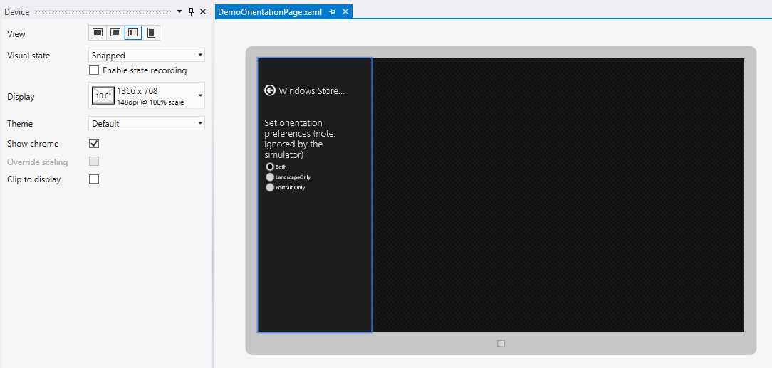
- The Visual Studio Designer Showing the Snapped View State
Suppressing Orientation Changes
It is possible to suppress orientation changes in a Windows Store app. This is useful when the data being displayed is strongly tied to a particular layout—examples include games built exclusively for portrait orientation or data reporting presentations that conform to a specific document layout. While many of the available hardware devices support screen orientation lock controls, Windows Store apps are also able to indicate which orientations they support.
There are two mechanisms for setting the supported orientations in Windows Store apps. First, the preference can be set for the entire app through the app manifest file. The Application UI tab provides Supported rotations settings which allow selection between landscape, portrait, landscape-flipped, and portrait-flipped orientations. If none of the values are selected, all values are assumed to be supported. These options are pictured in the following figure:
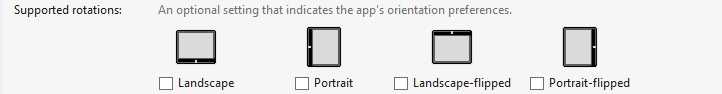
- Indicating Supported Rotations in the App Manifest
In addition to making an app-wide selection, supported rotations can be set programmatically, allowing a supported rotation to be set for a given page. This is accomplished by setting the DisplayProperties.AutoRotationPreferences property to the desired combination of the DisplayOrientations enumeration. The following code shows the device’s rotation preferences being set to only support standard and inverted landscape. The original value is obtained so that at some later point in time (perhaps when leaving the page) the original settings can be reapplied.
// Store the initial rotation preferences.
var originalRotationPreferences = DisplayProperties.AutoRotationPreferences;
// Set the display to only support being rotated in the landscape orientation.
DisplayProperties.AutoRotationPreferences =
DisplayOrientations.Landscape | DisplayOrientations.LandscapeFlipped;
// Some time later, reset the rotation preferences to their original values.
DisplayProperties.AutoRotationPreferences = originalRotatinPreferences;
Note: While it is possible to indicate a preference for landscape or portrait views in an app, it is not possible to prevent displaying an app in snapped mode. It is also important to be aware of the fact that the simulator ignores orientation preferences. |
Additional Considerations
In addition to handling whatever repositioning and/or restyling is necessary for on-screen controls when the application view is changed, the application’s app bar should also be considered. In portrait and snapped display modes, the app bar has considerably less horizontal space in which it can display commands.
The AppBarButtonStyle provided in StandardStyles.xaml does include visual states to help provide a better fit in the FullScreenPortrait and Snapped view states. However, by default, the app bar buttons are not connected to the ViewState changes. The LayoutAwarePage provides a registration and unregistration mechanism that will allow these buttons (and any other controls for that matter) to be notified of and react to view state changes.
To enlist a control like an app bar button in these notifications, the control’s Loaded and Unloaded events should simply be configured to call the page’s StartLayoutUpdates and StopLayoutUpdates event handlers. In the case of the app bar, this will reduce the size of the button and remove the label when in fullscreen-portrait or snapped modes, providing more space to include commands.
<!-- Register the app bar button with StartLayoutUpdates and StopLayoutUpdates. -->
<Button Style="{StaticResource AddAppBarButtonStyle}"
Loaded="StartLayoutUpdates"
Unloaded="StopLayoutUpdates"/>
Note: Depending on the number of commands involved, simply resizing the app bar buttons may not be enough to accommodate all of the commands when switching to snapped mode. Common techniques for resolving this situation include selectively reducing the number of commands being displayed when in snapped mode or splitting the contents of an app bar into two separate rows. The correct approach will vary depending on the specific application functionality that is needed. |
Page Navigation
In Windows Store apps, pages are hosted within an instance of the Frame control. The Frame control coordinates navigation between pages, including recording and managing navigation history. When a Windows Store app is created, one of the first things that happens is a Frame is created and set to the current window content. Usually this occurs in the OnLaunched method defined in the app’s Application class.
Invoking Navigation
Navigation is triggered by calling the Frame control’s Navigate method and providing the type of the page to be navigated to, along with an optional parameter to be passed to the destination page instance. Additionally, a page can move to its predecessor in the navigation stack by first checking if there is an available entry through the Frame control’s CanGoBack property, and then performing the navigation through the GoBack method. When a Page instance is created as a result of a Navigate call, the page’s Frame property is set to the containing Frame, making it easy to access in order to initiate navigation from within a Page. The following code shows typical ways in which navigation is invoked within a Windows Store app page.
// Navigate to an instance of the DemoNavigationPage without a navigation parameter.
Frame.Navigate(typeof(DemoNavigationPage));
// Navigate to an instance of the DemoNavigationPage with a navigation parameter.
Frame.Navigate(typeof(DemoNavigationPage), "Navigation parameter");
// Navigate back, if possible.
if (Frame.CanGoBack)
{
Frame.GoBack();
}
Note: Pages based on the LayoutAwarePage include a BackButton implementation that is wired up to the Frame CanNavigateBack and GoBack members, removing much of the need to handle this boilerplate code. Additionally, the LayoutAwarePage provides a GoHome method which will navigate back to the first element in the frame’s navigation history. |
Processing Navigation
When a navigation is requested, the Frame object coordinates a series of events and method calls that allow information about the navigation activity. This sequence includes:
- The Frame raises a Navigating event. This event indicates what kind of navigation is occurring (e.g., New, Forward, Back, Refresh) and the type of page being navigated to. It also exposes a Cancel property that allows subscribers to the event to cancel the navigation request at this point.
- If there aren’t any subscribers to the Navigating event that set the Cancel property, the page that is being navigated away from receives a call into its OnNavigatingFrom method override with the same arguments that were provided to the Navigating handler. This provides the current page a convenient opportunity to cancel a navigation request without needing to explicitly subscribe to an event.
- Following the OnNavigatingFrom override, an instance of the target page is constructed if necessary (see the paragraph following this list).
- Next, the Frame object raises a Navigated event. The arguments to this event include a Content parameter that refers to the instance of the page being navigated to as well as a reference to the navigation parameter, if one was supplied.
- Like the Navigating/OnNavigatingFrom tandem, the page being navigated away from can also override an OnNavigatedFrom method override that receives the Navigated event arguments.
- The entire process concludes with the target page’s OnNavigatedTo event being called.
By default, navigation in a Windows Store app always tries to create a new instance of the page being navigated to. However, pages in Windows Store apps can opt to participate in the navigation cache. When a page participates in the navigation cache, requests through frame-based navigation for a page of that type will first examine the cache for a matching page. If one is found, it is returned; otherwise a new instance of the page is created and placed in the cache, being available for subsequent requests.
There are two modes in which a page can participate in the navigation cache. First, it can set its NavigationCacheMode property to Required, which means that every call will use the cache. The second option is to set the page’s NavigationCacheMode property to Enabled. In this mode, the navigation cache works with the Frame control’s CacheSize property. If the frame has cached more pages than the CacheSize specifies, it drops the oldest page with a NavigationCacheMode set to Enabled from the cache in order to make room for the new page. Cached pages with a NavigationCacheMode set to Required do not count against the Frame control’s cache size limit.
Recap
This chapter has provided an overview of several fundamental concepts related to developing XAML-based user interfaces for Windows Store apps. As part of this coverage, the building blocks of a user interface—the controls—were reviewed, including some new controls that have been introduced for Windows Store apps, as well as some new ways in which older controls can be used. To provide context related to how these controls will be hosted and how users can switch between user interface displays, the related Page and Frame elements were also discussed. While quite a few elements were examined in this chapter, the landscape of XAML user interface design has grown tremendously, and hopefully this chapter has addressed the needs relevant to structuring most Windows Store apps.
The next chapter will introduce the life cycle of a Windows Store app, which relates to when and how a Windows Store app will actually run. The discussion will include coverage of several tools and techniques available for preserving and restoring application state information as well as other types of application data.
DISCLAIMER: Web reader is currently in beta. Please report any issues through our support system. PDF and Kindle format files are also available for download.
1. Core Concepts
2. XAML Controls and Pages
3. Application Life Cycle and Storage
4. Contracts and Extensions
5. Tiles Toasts and Notifications
6. Hardware and Sensors
7. Deployment
- 1800+ high-performance UI components.
- Includes popular controls such as Grid, Chart, Scheduler, and more.
- 24x5 unlimited support by developers.