WinUI Busy Indicator Control
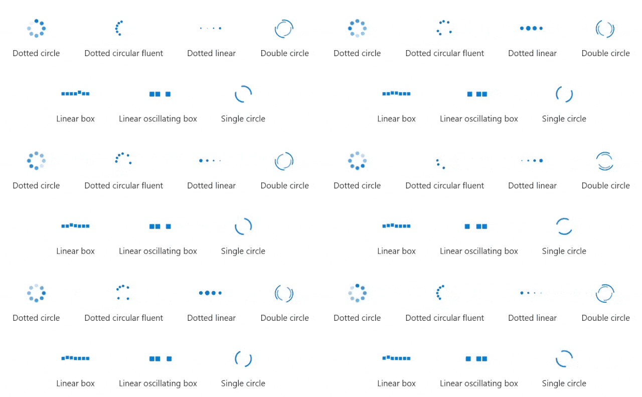
- Pick from the 7 built-in animations to easily match your design.
- Show busy indications with custom messages.
- Adjust animation speed.
- Customize the busy indicator color.
- Customize the content text.
Trusted by the world’s leading companies

Overview
The Busy Indicator control for .NET WinUI is used to display a predefined built-in animation when an operation runs in the background of the application and waiting for its completion. It can be customized in terms of size, color, duration, and content.
Animation types
Busy indicator includes 7 pre-built animations that can be shown within your applications.

Indicator loading content
It shows the loading progress of the content and it can be customized with position and template support.

Content
The content indicates the busy status of the control to the users.

Content position
The content can be positioned at the top, bottom, right, or left of the indicator.

Content template
The content can be customized using the data template.
Duration
The .NET WinUI Busy Indicator animation speed can be customized using factor values 0 to 1.

Size
The .NET WinUI Busy Indicator size can be customized using factor values 0 to 1.

Color
The .NET WinUI Busy Indicator color can be customized based on the requirement.

WinUI BusyIndicator Code Example
Easily get started with the WinUI BusyIndicator using a few simple lines of XAML and CS code example as demonstrated below.
<Page
    x:Class="GettingStarted.MainPage"
    xmlns="http://schemas.microsoft.com/winfx/2006/xaml/presentation"
    xmlns:x="http://schemas.microsoft.com/winfx/2006/xaml"
    xmlns:local="using:GettingStarted"
    xmlns:d="http://schemas.microsoft.com/expression/blend/2008"
    xmlns:mc="http://schemas.openxmlformats.org/markup-compatibility/2006"
    xmlns:notification="using:Syncfusion.UI.Xaml.Notifications"
    mc:Ignorable="d"
    Background="{ThemeResource ApplicationPageBackgroundThemeBrush}">
    <Grid>
        <notification:SfBusyIndicator IsActive="True"/>
    </Grid>
</Page>
// Creating an instance of the BusyIndicator control.
SfBusyIndicator busyIndicator = new SfBusyIndicator();
// Activating the SfBusyIndicator.
busyIndicator.IsActive = true;Syncfusion WinUI DataViz & UI Controls
Our Customers Love Us


Awards
Greatness—it’s one thing to say you have it, but it means more when others recognize it. Syncfusion® is proud to hold the following industry awards.


