The Syncfusion .NET MAUI Picker (SfPicker) is a fully customizable component that lets you select an item from a list. It supports multiple-column layout and header, footer, and selection view customizations.
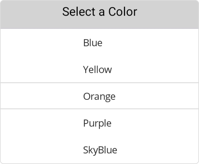
The .NET MAUI Picker allows users to add and customize header text.

The .NET MAUI Picker supports a customizable column header view to separate headings for each column.

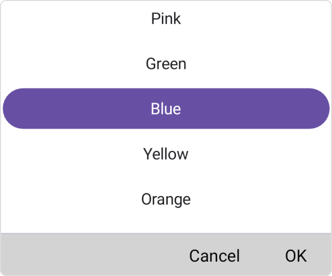
The .NET MAUI Picker provides validation buttons (OK and Cancel) in the footer view. The footer text and background color can be customized.

The customizable .NET MAUI Picker selection view is used to show the selected item.

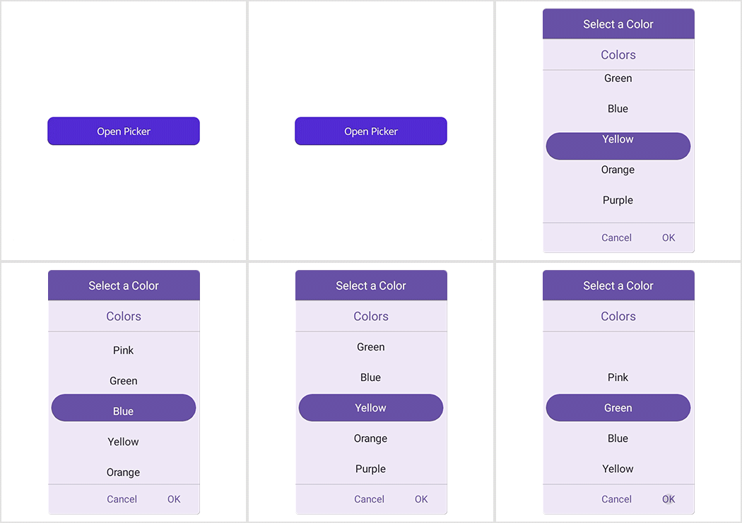
Show the Picker in a pop-up with the dialog mode. The relative dialog mode is used to align the picker in a specific position that makes the app look more impressive in the UI.

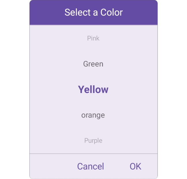
The .NET MAUI Picker allows users to display picker items based on the text display modes. It offers four modes: default, fade, shrink, and FadeAndShrink.

The .NET MAUI Picker allows you to select an item through tap and scroll interaction.

Customize the picker using an item template.

Greatness—it’s one thing to say you have it, but it means more when others recognize it. Syncfusion® is proud to hold the following industry awards.