Trusted by the world’s leading companies

Overview
The WinUI TreeView control is a hierarchical list view that represents hierarchical data in a tree-like structure with expand and collapse node options. The control provides an optimized reuse strategy, a smooth scrolling experience, and virtualization. It makes illustrating an office hierarchy, organizational structure, or nested relationships in an application easy. The control’s performance is enhanced with features like data binding, unbound node population, a template selector, drag and drop, selection with different selection modes, complete UI customization, and commands for MVVM.
Data binding
Use both ItemsSource binding and unbound node population. Easily customize the TreeView control to be a navigation control by populating nodes in the unbound mode. All the properties and commands of the WinUI TreeView can be used in the MVVM pattern.

Load on demand
The WinUI TreeView allows you to load huge amounts of data dynamically improving the control’s performance. Make use of a loading indicator while loading on demand.

Templates
Customize an entire tree’s nodes by hosting any image or custom view using a template. Customize each node through dynamic selection of the UI using a data template selector.

Selection
Use built-in support for selection with single, single-deselect, multiple, extended, and none modes. Background colors can be applied to selected items. You can also select using keyboard navigation.

Animation
The WinUI TreeView provides animation support when expanding or collapsing the TreeView nodes.

Checkboxes
Add checkboxes to each tree node and check or clear the corresponding node. The control provides built-in support for recursive checking between parent and child nodes. Recursive checking is the process where the checked or unchecked state of a child node is decided based on the parent when users interact with parent node and vice versa.

Context flyout
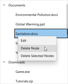
Show a context flyout when a node is long-pressed or right-clicked. Use the built-in commands to handle the context flyout, edit a node, and delete one or more selected nodes.

Appearance

Expander customization
Use a customizable expander UI, including size customization, for creating an elegant look and feel.

Indentation
Specify the required indentation space for child nodes in the WinUI TreeView control.

Root tree lines
Show a line between tree nodes. Decide whether lines should be drawn between tree nodes at the root of the WinUI TreeView control.
WinUI Treeview Code Example
Easily get started with the WinUI Treeview using a few simple lines of C# code as demonstrated below. Also explore our WinUI Treeview Example that shows you how to configure the Treeview.
<Page x:Class="syncfusion.treeviewdemos.winui.GettingStartedPage"
      xmlns="http://schemas.microsoft.com/winfx/2006/xaml/presentation"
      xmlns:x="http://schemas.microsoft.com/winfx/2006/xaml"
      xmlns:d="http://schemas.microsoft.com/expression/blend/2008"
      xmlns:mc="http://schemas.openxmlformats.org/markup-compatibility/2006"
      xmlns:local="using:syncfusion.treeviewdemos.winui"
      xmlns:treeView="using:Syncfusion.UI.Xaml.TreeView"
      mc:Ignorable="d"
      Background="{ThemeResource ApplicationPageBackgroundThemeBrush}"
      NavigationCacheMode="Disabled">
      <Grid>
          <treeView:SfTreeView x:Name="treeView" />
      </Grid>
</Page>
using Microsoft.UI.Xaml.Controls;
using Syncfusion.UI.Xaml.TreeView;
public sealed partial class GettingStartedPage : Page
{
/// <summary>
/// Interaction logic for GettingStartedPage.xaml
/// </summary>
public GettingStartedPage()
{
this.InitializeComponent();
SfTreeView treeView = new SfTreeView();
Root_Grid.Children.Add(treeView);
}
}Not sure how to create your first WinUI Treeview? Our documentation can help.
I’d love to read it nowSyncfusion WinUI DataViz & UI Controls
Frequently Asked Questions
Why should you choose Syncfusion WinUI Treeview?
Syncfusion WinUI TreeView provides the following features:
- Display hierarchical data like an organizational structure and nested relationships in an application.
- Load a wide range of nodes with optimal performance.
- Load the nodes on demand when the user expands the node.
- Complete UI customization using the template and template selectors.
- Select the nodes with different selection modes and keyboard navigation.
- Built-in support to drag and drop tree nodes within the TreeView or external controls.
- Display lines between tree nodes.
- Simple configuration and APIs.
Where can I find the Syncfusion WinUI Treeview demo?
You can find our WinUI Treeview demo here.
Can I download and utilize the Syncfusion WinUI Treeview for free?
No, this is a commercial product and requires a paid license. However, a free community license is also available for companies and individuals whose organizations have less than $1 million USD in annual gross revenue, 5 or fewer developers, and 10 or fewer total employees.
How do I get started with Syncfusion WinUI Treeview?
A good place to start would be our comprehensive getting started documentation.
Our Customers Love Us


Awards
Greatness—it’s one thing to say you have it, but it means more when others recognize it. Syncfusion® is proud to hold the following industry awards.


