
The WinForms Ribbon control (ribbon menu) accommodates all the tools required for an application in a single, easy-to-navigate user interface similar to Microsoft Office. Its dynamic resizing, keyboard accessibility, and complete customization options help organize an application.
The Ribbon control provides an application UI similar to Microsoft Office with a 2007 style that contains an application menu and a 2016 style that contains a backstage view.

The simplified ribbon acts as a mode for viewing the most commonly used commands in a single line and therefore offers more screen space for a compact view of the document. End users can quickly navigate to other commonly used commands in the overflow menu. End users can switch to normal mode using the built-in toggle button.

The Office 2016 UI provides a backstage view. Available color schemes are White, Colorful, Dark Gray, and Black.

The Ribbon control supports a touch UI with plenty of interaction space.

The Office 2010 UI supports gradient colors and color schemes that include Blue, Black, and Silver.

The Office 2007 UI is a classic interface that contains three color schemes: Blue, Silver, and Black.
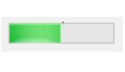
The WinForms Ribbon control supports a variety of tool strip items. Button items (like tool strip button, tool strip drop-down button, tool strip split button) can be included in different types of states. The Ribbon control can also support the following tool strip controls, making it comprehensive yet flexible: radio button, combo box, gallery, check box, text box, label, and progress bar. All these controls can be separated using the ribbon separator.
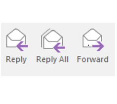
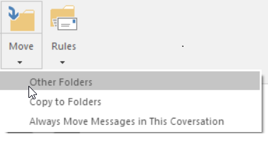



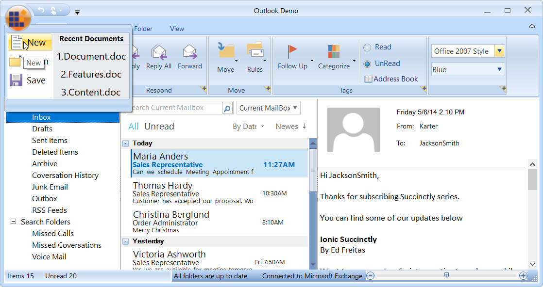
The quick access toolbar (QAT) is used to render a set of ribbon items that are commonly used in applications. It renders at the top-left corner of a window to make it more accessible. Users can choose to place it above or below the ribbon, remove certain commands from it, or add commands to it.

The Ribbon control supports any number of contextual tab groups, which can be hidden or shown in certain contexts.

The backstage is a separate view that contains tabs and buttons that can show an application’s information and basic settings. The backstage items can also be arranged at the top or bottom of the view.
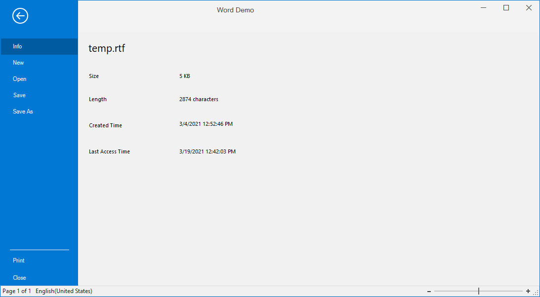
The application menu is equivalent to a file menu found in a traditional UI.
The Ribbon will resize its controls to fit within the space available in the ribbon window.

In a multiple document interface (MDI), parent and child forms can have their own ribbon menus and items specific to their requirement. Normally in the ribbon, the parent form holds general commands like File, Home, Help, etc., whereas the child form holds specific and exclusive functionalities like Insert, Review, View, etc. Users can either switch between forms to operate these functionalities or merge both parent and child MDI forms to combine the ribbon menus and items within the parent form, if needed.

Load any user control to the right side of the title bar in the ribbon form.

The Ribbon control lets users customize the QAT as well as the ribbon window, its appearance, and its tabs.
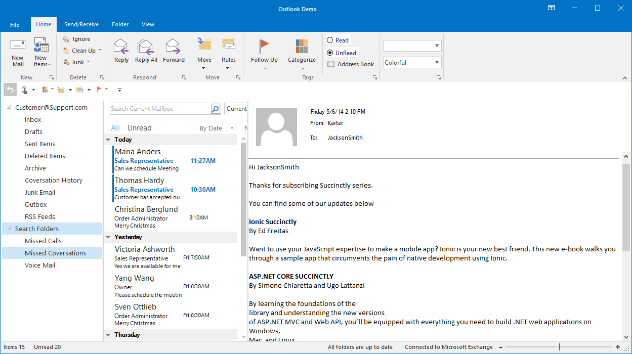
Place the quick access toolbar either above or below the ribbon.

Users can add frequently accessed commands to the QAT.
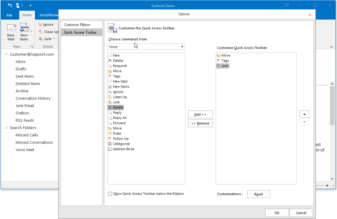
Customize the QAT in the customization window by adding, removing, or reordering items.
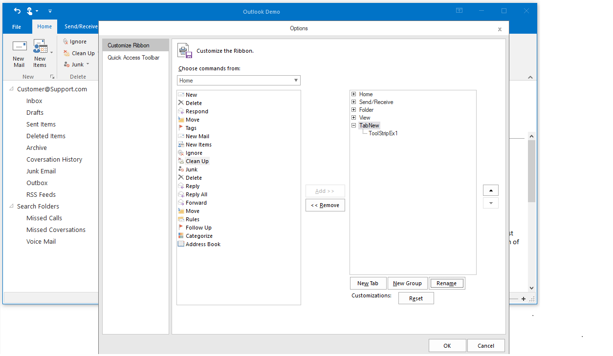
Users can create a new ribbon tab by adding commands in the WinForms Ribbon control.
Settings in the WinForms Ribbon control can be serialized to XML format. The XML files can be loaded back with built-in deserialization options. The Ribbon control also offers the option to serialize and deserialize QAT and tabs modules, separately.

The mini-toolbar control is a lightweight, floating toolbar that can be dynamically displayed and hidden for certain contexts. A good example is text editing. When users select text in the editor, you can display a mini-toolbar next to the text to quickly let users bold, italicize, or underline it.
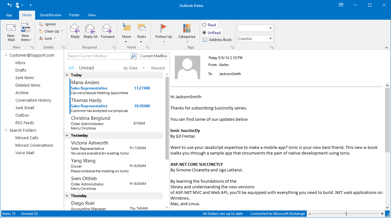
Display the current status of an application or document, similar to in Microsoft Office.
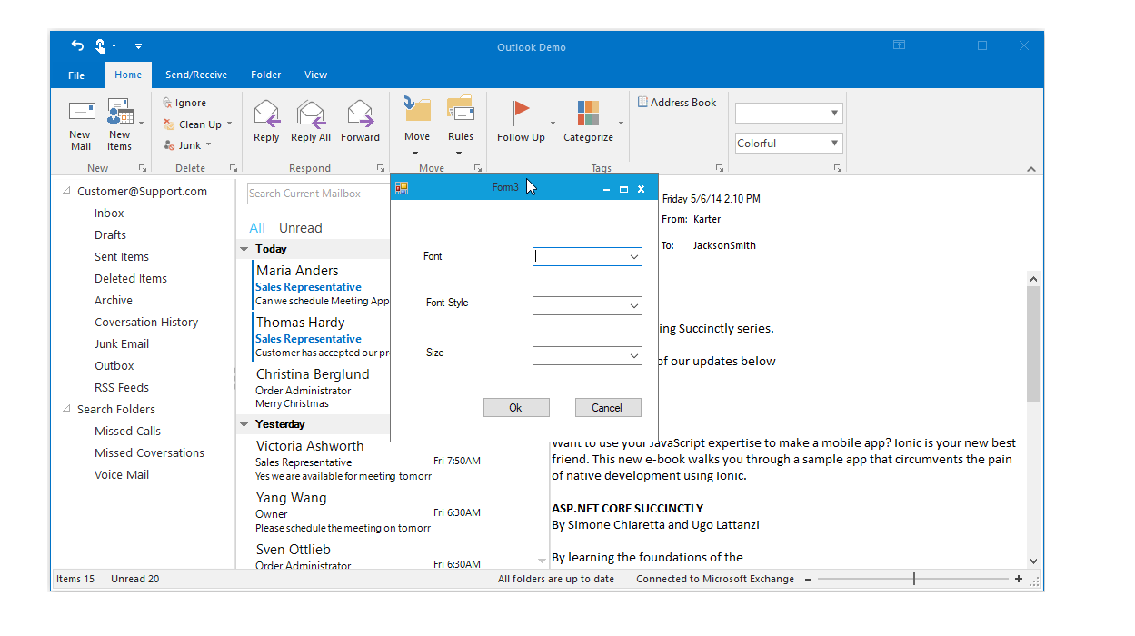
The launcher button allows users to execute an action they define.
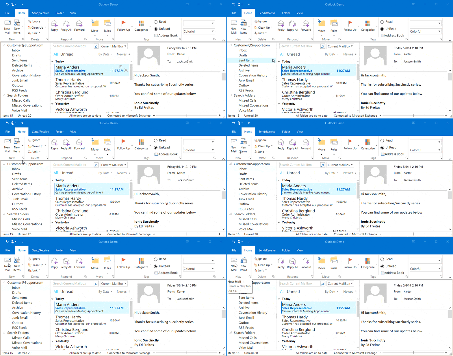
The Ribbon control supports key tips for ribbon items, letting users quickly access a command in a few keystrokes. When a user presses the Alt key, key tips for commands in the current tab are displayed. Pressing a key indicated in the key tip invokes the corresponding command.
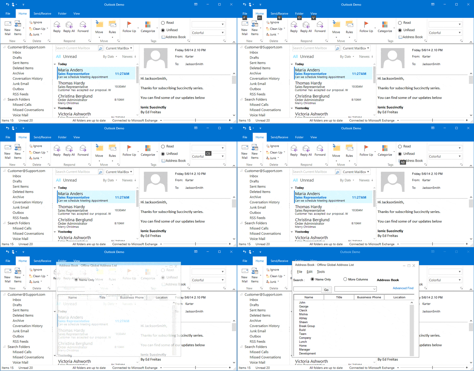
The Ribbon control supports a traditional look with Office 2007 and Office 2010 styles and a flat look with Office 2013 and Office 2016 styles.
The Ribbon control supports super tooltips, which are used to customize the default look and feel of all tooltips.
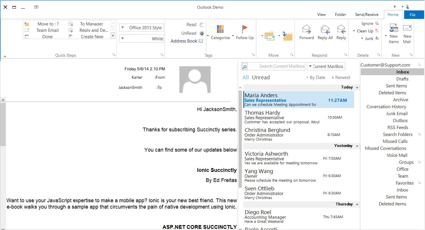
Right-to-left (RTL) orientation allows users to work in right-to-left languages like Hebrew, Arabic, or Persian.
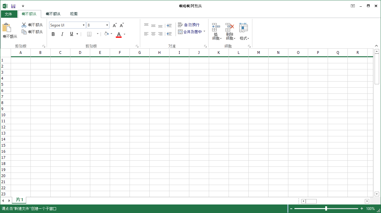
Content in the Ribbon control can be formatted according to culture.
Easily get started with the WinForms Ribbon using a few simple lines of C# code example as demonstrated below. Also explore our WinForms Ribbon Example that shows you how to render and configure the WinForms Ribbon.
- using Syncfusion.Windows.Forms.Tools;
- using System.Windows.Forms;
- namespace WindowsFormsApp1
- {
- public partial class Form1 : RibbonForm
- {
- private RibbonControlAdv ribbonControlAdv1;
- private ToolStripTabItem homeTabItem;
- private ToolStripTabItem sendTabItem;
- private ToolStripTabItem folderTabItem;
- private ToolStripButton newMailButton;
- private ToolStripButton IgnoreButton;
- private ToolStripButton replyButton;
- private ToolStripEx newToolStripEx;
- private ToolStripEx deleteToolStripEx;
- public Form1()
- {
- InitializeComponent();
- this.newToolStripEx = new ToolStripEx();
- this.deleteToolStripEx = new ToolStripEx();
- this.respondToolStripEx = new ToolStripEx();
- this.ribbonControlAdv1 = new RibbonControlAdv();
- this.Controls.Add(ribbonControlAdv1);
- this.homeTabItem = new ToolStripTabItem();
- this.sendTabItem = new ToolStripTabItem();
- this.folderTabItem = new ToolStripTabItem();
- this.homeTabItem.Text = "Home";
- this.sendTabItem.Text = "Send";
- this.folderTabItem.Text = "Folder";
- this.ribbonControlAdv1.Header.AddMainItem(this.homeTabItem);
- this.ribbonControlAdv1.Header.AddMainItem(this.sendTabItem);
- this.ribbonControlAdv1.Header.AddMainItem(this.folderTabItem);
- this.newMailButton = new ToolStripButton();
- this.IgnoreButton = new ToolStripButton();
- this.replyButton = new ToolStripButton();
- this.homeTabItem.Panel.Controls.AddRange(new Control[] { newToolStripEx, deleteToolStripEx, respondToolStripEx});
- this.newMailButton.Text = "New Mail";
- this.IgnoreButton.Text = "Ignore";
- this.replyButton.Text = "Reply";
- this.newToolStripEx.Items.AddRange(new ToolStripItem[] {this.newMailButton });
- this.deleteToolStripEx.Items.AddRange(new ToolStripItem[] {this.IgnoreButton });
- this.respondToolStripEx.Items.AddRange(new ToolStripItem[] {this.replyButton});
- }
- }
- }
The Syncfusion WinForms Ribbon controls offers the following features:
You can find our WinForms Ribbon demo on GitHub location.
No, this is a commercial product and requires a paid license. However, a free community license is also available for companies and individuals whose organizations have less than $1 million USD in annual gross revenue, 5 or fewer developers, and 10 or fewer total employees.
A good place to start would be our comprehensive getting started documentation.
 Documentation
Greatness—it’s one thing to say you have it, but it means more when others recognize it. Syncfusion® is proud to hold the following industry awards.