.NET MAUI DataGrid - A Data Table Control with Rich UI
- Instantly load large amounts of data.
- Deliver features such as row selection and sorting.
- Style every element in a data grid easily.

Trusted by the world’s leading companies

Overview
The .NET MAUI DataGrid control is used to display and manipulate data in a tabular view. Its rich feature set includes different column types, sorting, autofitting for columns and rows, and styling for all elements.
Why choose Syncfusion .NET MAUI Data Grid?
High Performance
Built with a highly optimized virtualization engine, the .NET MAUI DataGrid efficiently renders and scrolls through millions of records with minimal memory overhead and lightning-fast load times.
Seamless data binding
Bind data efficiently to both local and remote data sources such as JSON, OData, WCF, and RESTful services using the built-in data manager for real-time, high-performance data updates.
Adapts to any resolution
DataGrid has a highly responsive layout and an optimized design for desktops, touch screens, and smartphones. It works well on all mobile phones that use iOS, Android, or Windows OS.
Flexible editing
Easily perform create, read, update, and delete (CRUD) operations on local collections or remote data services using the built-in data manager, with full support for dynamic data models and real-time updates.
Attractive customizable themes
Offers built-in MaterialLight and MaterialDark themes with full support for light and dark modes. Easily customize appearance using resource dictionaries to match the application’s branding.
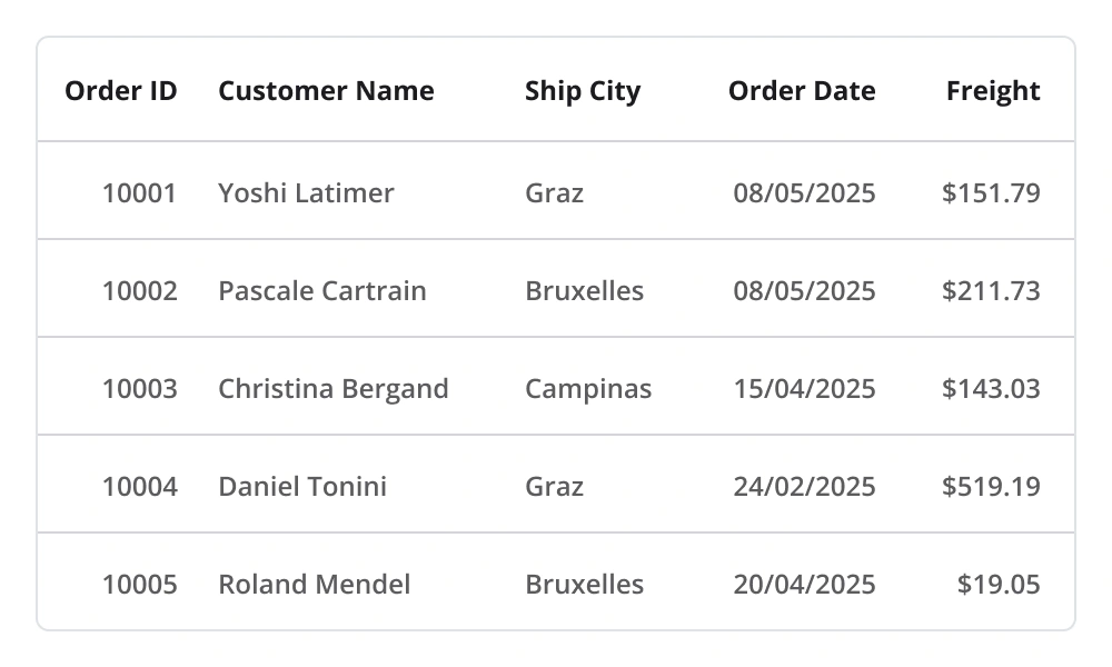
.NET MAUI DataGrid Code Example
Easily get started with the .NET MAUI DataGrid using a few simple lines of XAML code example as demonstrated below. Also, explore our .NET MAUI DataGrid Example that shows you how to render and configure the .NET MAUI DataGrid.
<?xml version="1.0" encoding="utf-8" ?>
<ContentPage xmlns="http://schemas.microsoft.com/dotnet/2021/maui"
             xmlns:x="http://schemas.microsoft.com/winfx/2009/xaml"
              xmlns:syncfusion="clr-namespace:Syncfusion.Maui.DataGrid;assembly=Syncfusion.Maui.DataGrid"
              xmlns:local="clr-namespace:GettingStarted"
             x:Class="GettingStarted.MainPage">
    <ContentPage.BindingContext>
        <local:OrderInfoRepository x:Name="viewModel" />
    </ContentPage.BindingContext>
    <ContentPage.Content>
        <syncfusion:SfDataGrid x:Name="dataGrid"
             ItemsSource="{Binding OrderInfoCollection}">
        </syncfusion:SfDataGrid>
    </ContentPage.Content>
</ContentPage>
Selection
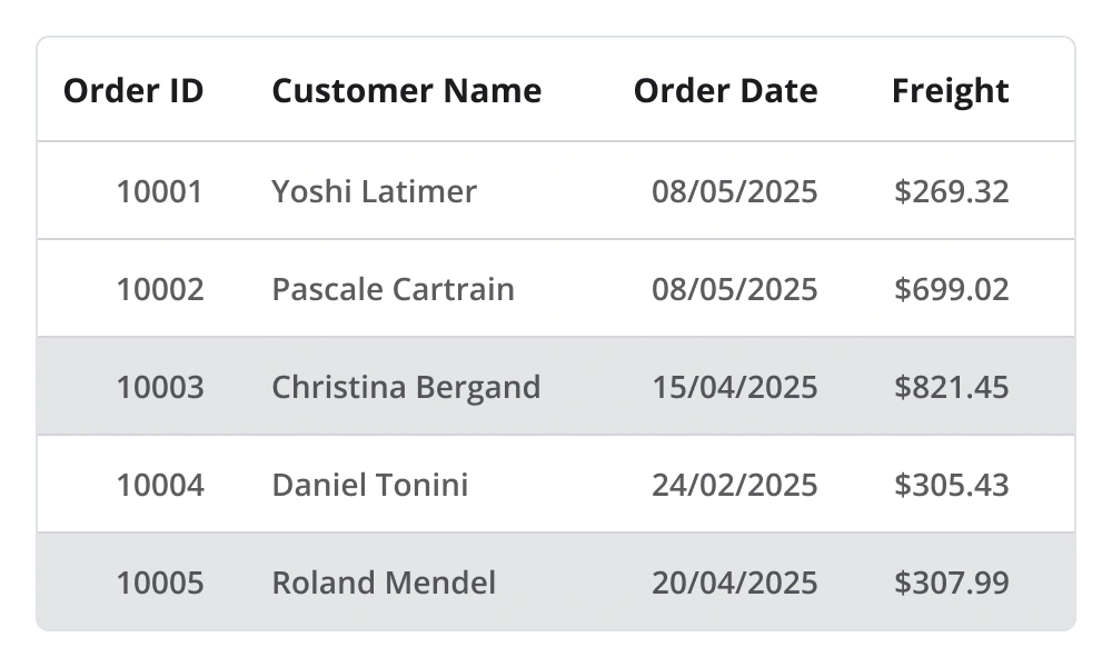
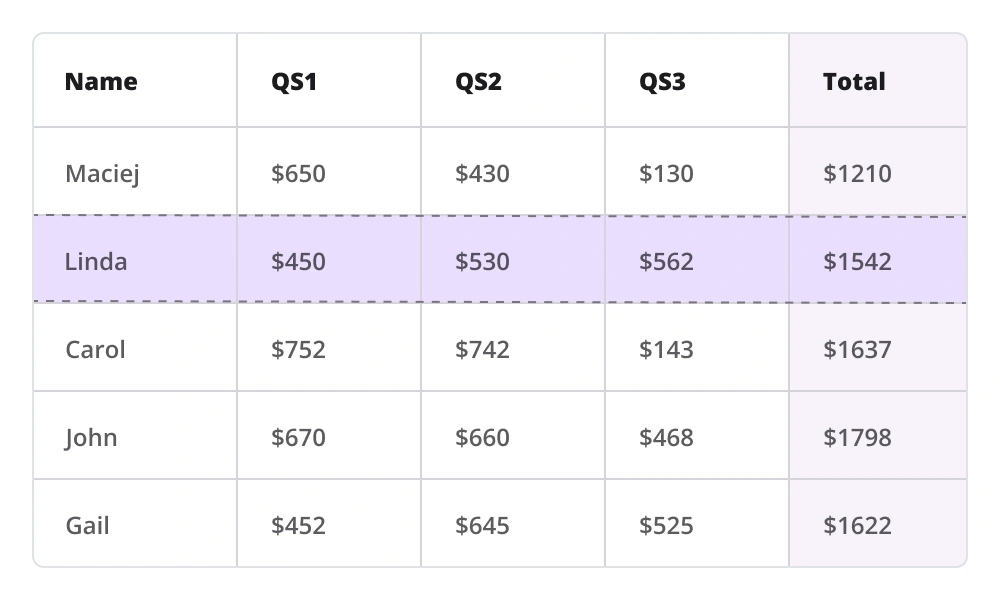
- Select one or more rows with built-in selection modes.
- Navigate among cells and rows with keyboard navigation in the Windows platform.
- Customize the background and text color for selected rows.
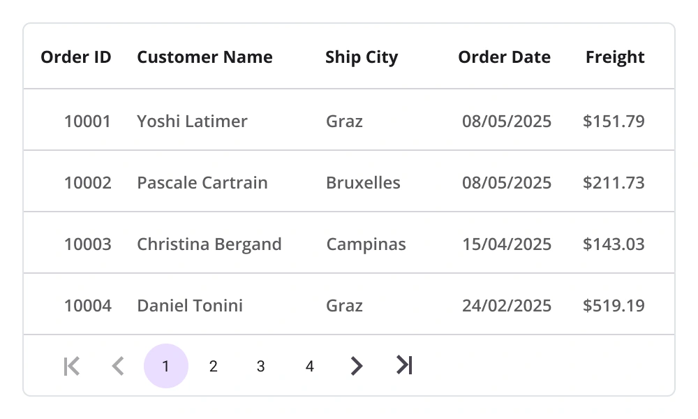
Paging
- Manipulate data using the DataPager control to view records on multiple pages.
- Customize visually appealing styles based on device and application requirements.
- Load data to new pages on demand with options to maintain and reset the cache.
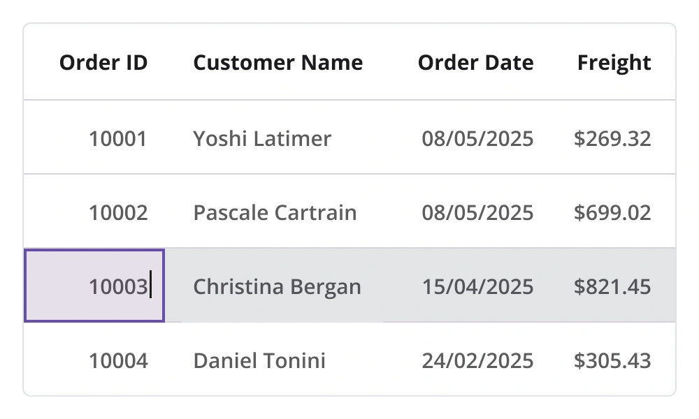
Editing
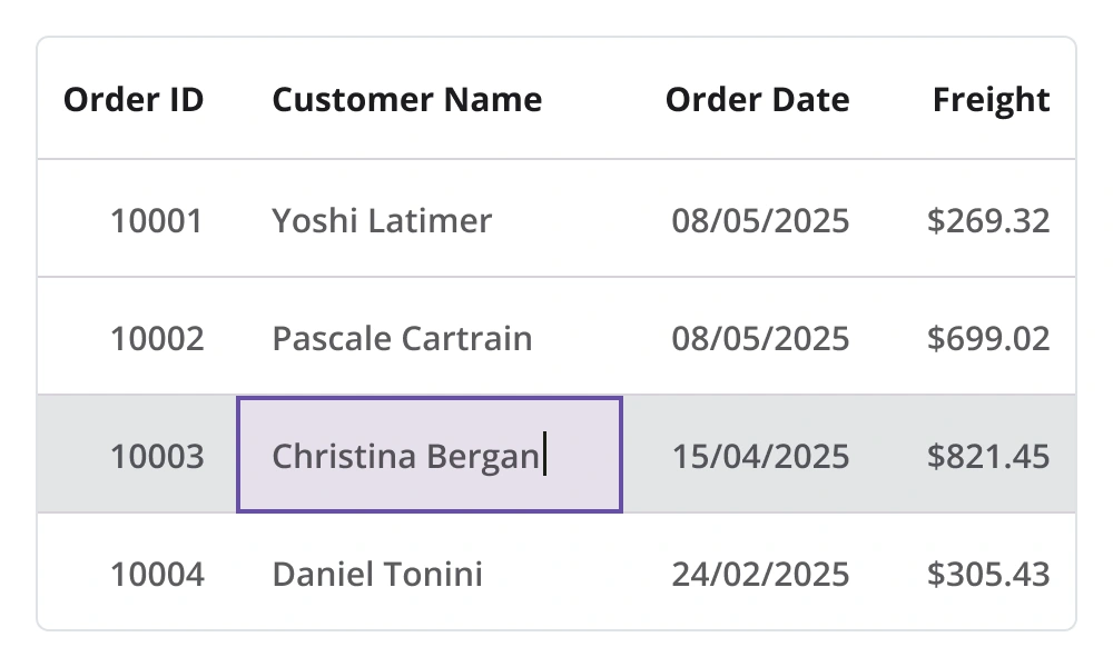
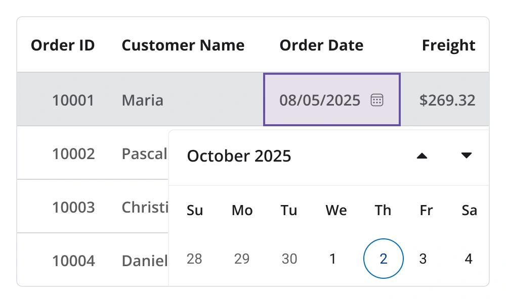
Experience easy editing with our in-place editing feature! With a seamless interface and a wide range of built-in column types, including text, numeric, combo box, and date-picker editors, users will enjoy unparalleled control over their data. Easily commit or roll back changes with just a few clicks, ensuring the smoothest editing experience possible.
Data shaping and manipulation
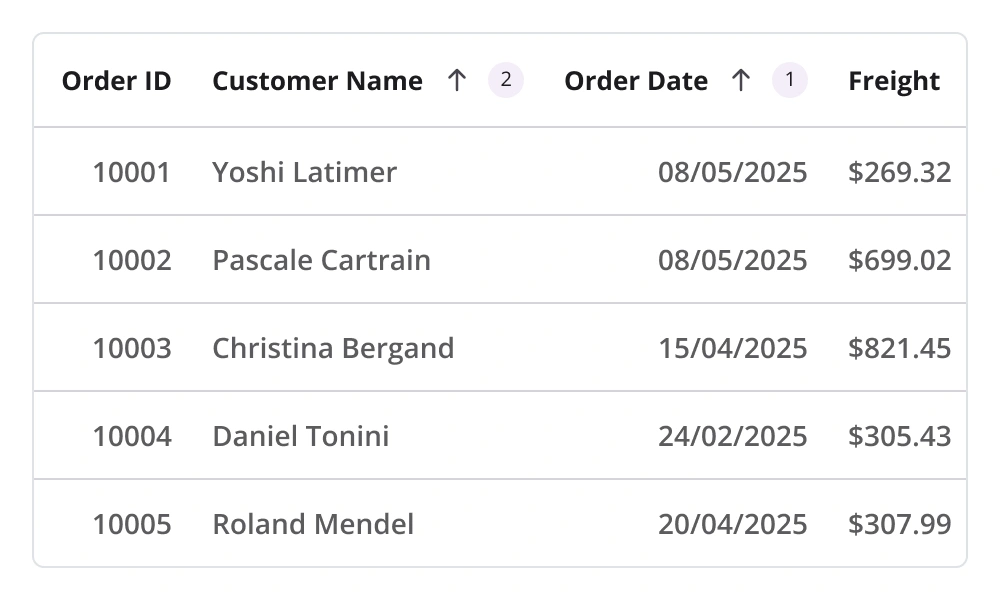
Sorting
Sort one or more columns in ascending or descending order. Perform tri-state sorting and display sort numbers to indicate the sort order.
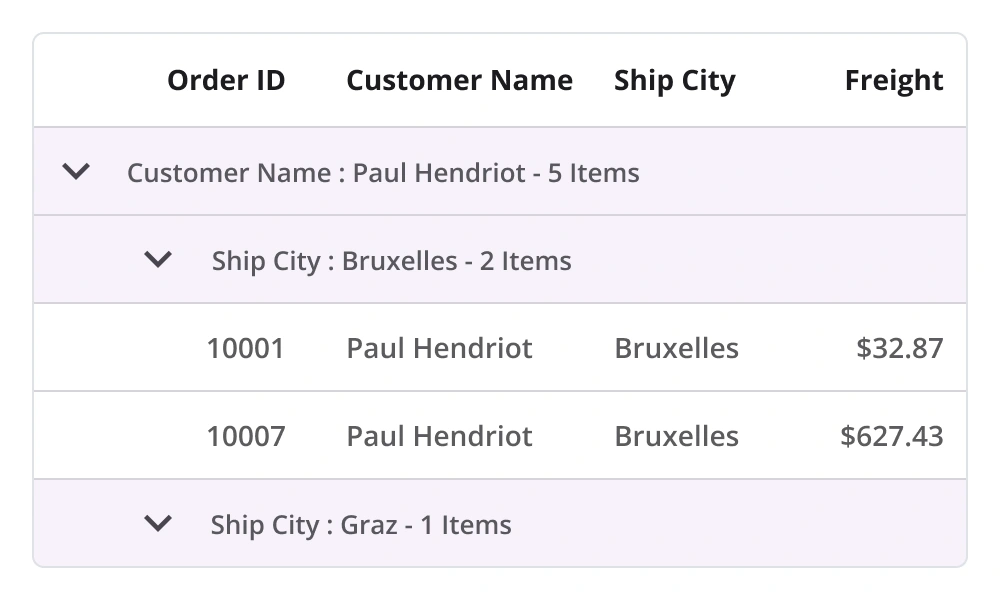
Grouping
Programmatically group data by one or more columns using flexible templates. The groups can be expanded or collapsed based on user preference. Additionally, the grouping logic can be customized to apply specific rules for data grouping.
Filtering
Programmatically filter the rows by setting a predicate to the view.
Real-time updates
In high-pressure situations, maintaining up-to-date information is critical. The DataGrid supports real-time updates to cells, enhancing efficiency and responsiveness.
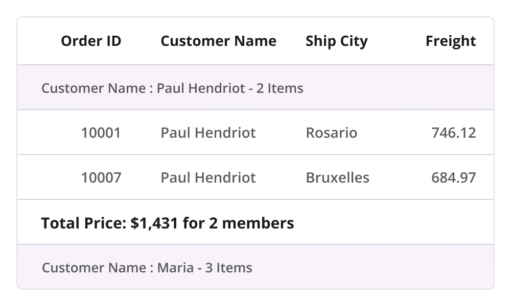
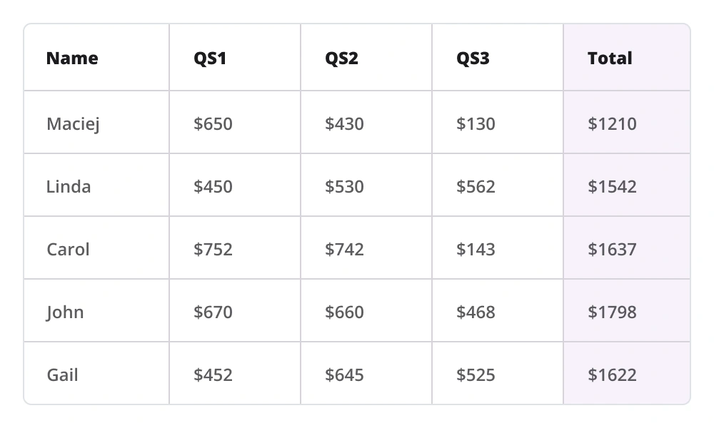
Summaries
Display a row containing summary data for the columns with aggregate types sum, minimum, maximum, average, and count. The following are the different categories of summary:
- Total or table
- Group
- Summary in group caption or group header
- Custom
Loading more items
- Load a subset of data into a bound collection at runtime.
- Customize the load-more-items option and set its position at the top or bottom of the MAUI DataGrid.
- Automatically load data in chunks when reaching the end of the list.
Pull to refresh
- Refresh the data source dynamically during a pull-to-refresh action.
- Enhance the user experience by customizing the pull-to-refresh view with sliding and pushing transition modes.
Row and column customization
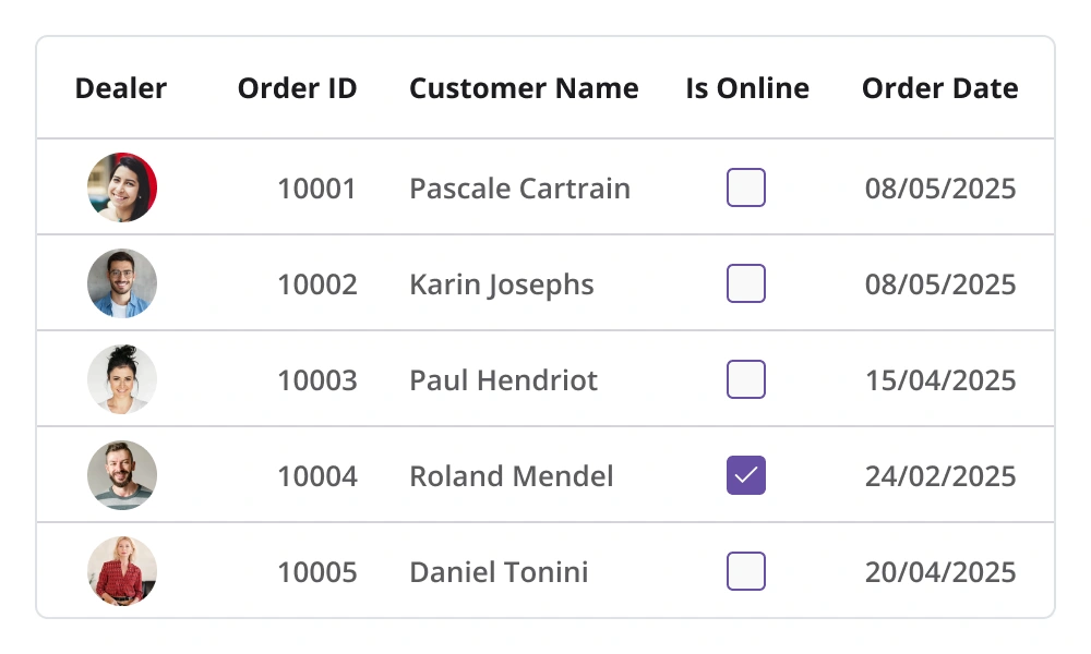
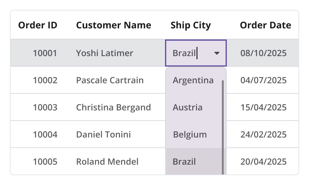
Column types
- Users can load different types of data using the built-in column types text, numeric, date, checkbox, and image for better data visualization.
- Load custom or multiple views in the cells to display using templated columns.
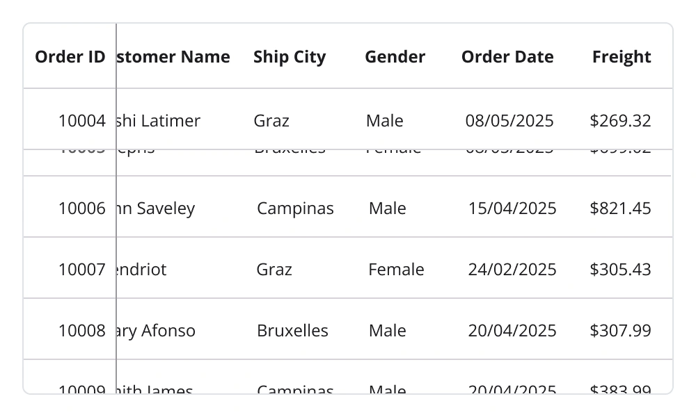
Freeze panes
Freeze rows and columns at the top and bottom of the view, similar to Excel. Horizontal and vertical scrolling can be performed, except on frozen columns and rows.
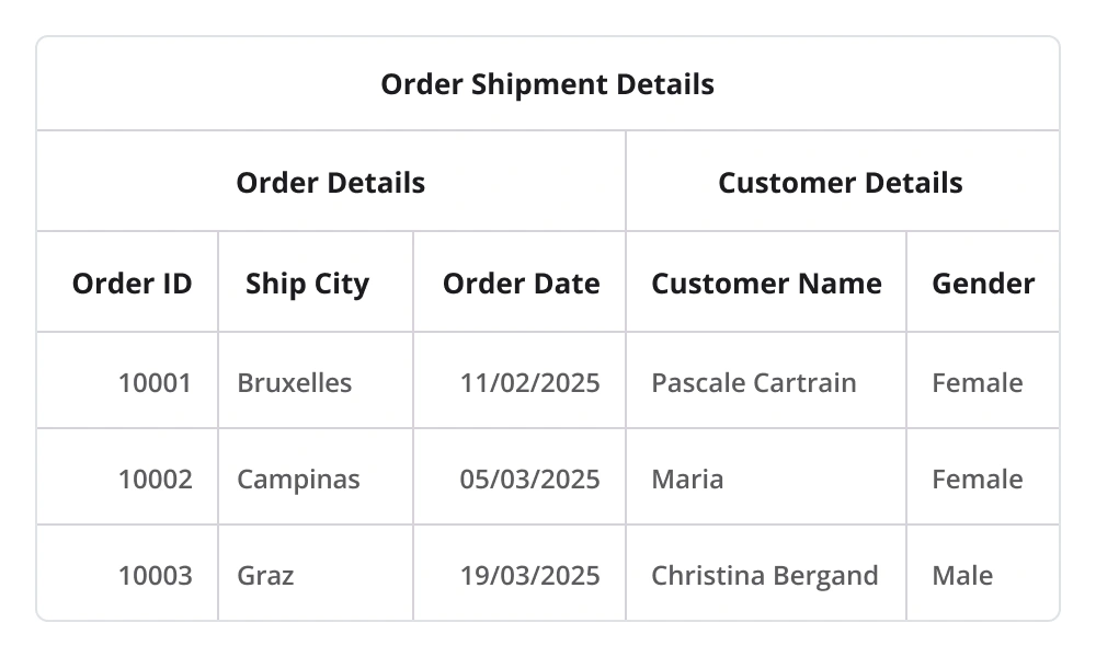
Stacked headers
Group the columns under a common header. Users can add multiple rows and define multicolumn headers in the stacked header rows.

Row height
Adjust (auto fit) the row height based on the content of any column or certain columns to enhance the readability of the content. It is also possible to set the row height conditionally.
Column sizing
- The column width can be adjusted to fit the contents of its cells.
- All the columns can be adjusted to fit within the viewport.
Unbound view
Unbound column
Display additional columns that are not bound to data objects from the underlying data source. The control supports applying arithmetic/logical expressions on cell values of bound columns to populate the cells of unbound columns.
Unbound row
Display rows at the top and bottom of the grid with data that is not bound to the data source.
Interactive features
Swiping
Associate swipe buttons with custom actions. Swipe buttons are displayed by swiping left or right over a data row. Create swipe templates and associate the views in them with custom actions.
Resizing
Resize a column on touch-up. Restrict a column with a minimum width to avoid hiding it and a maximum width to restrict resizing beyond the limit.
Drag and drop
Reorder rows and columns by simply dragging and dropping them into place.
Appearance
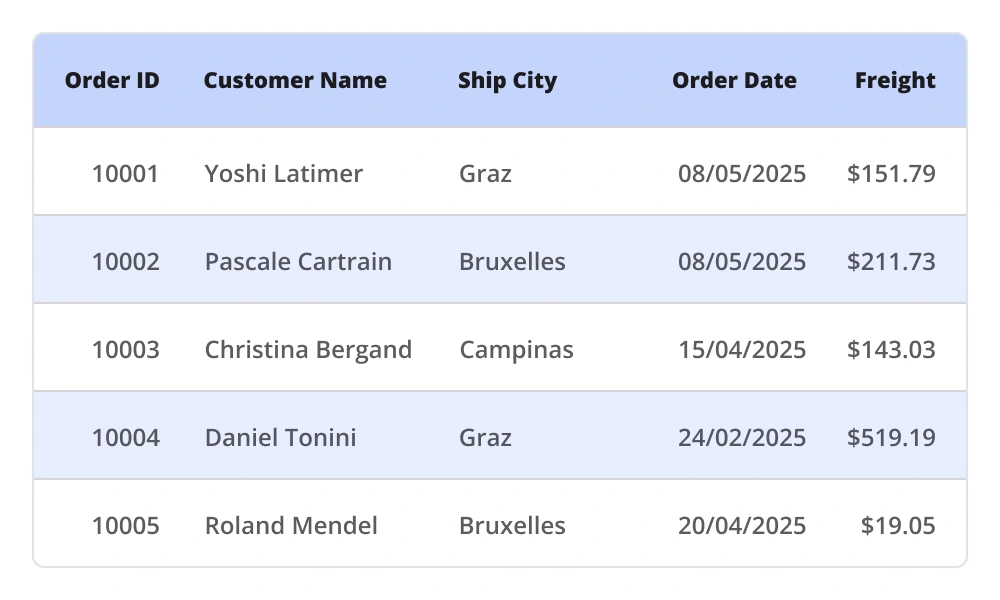
Styling
- Customize the style of each and every element in the MAUI DataGrid to display visually appealing data.
- Apply a background color to alternating rows for better readability.
- Customize the text styles of rows for an elegant look and feel.
- Customize vertical, horizontal, or both grid line borders. Customize the color and thickness of the grid lines, as well.
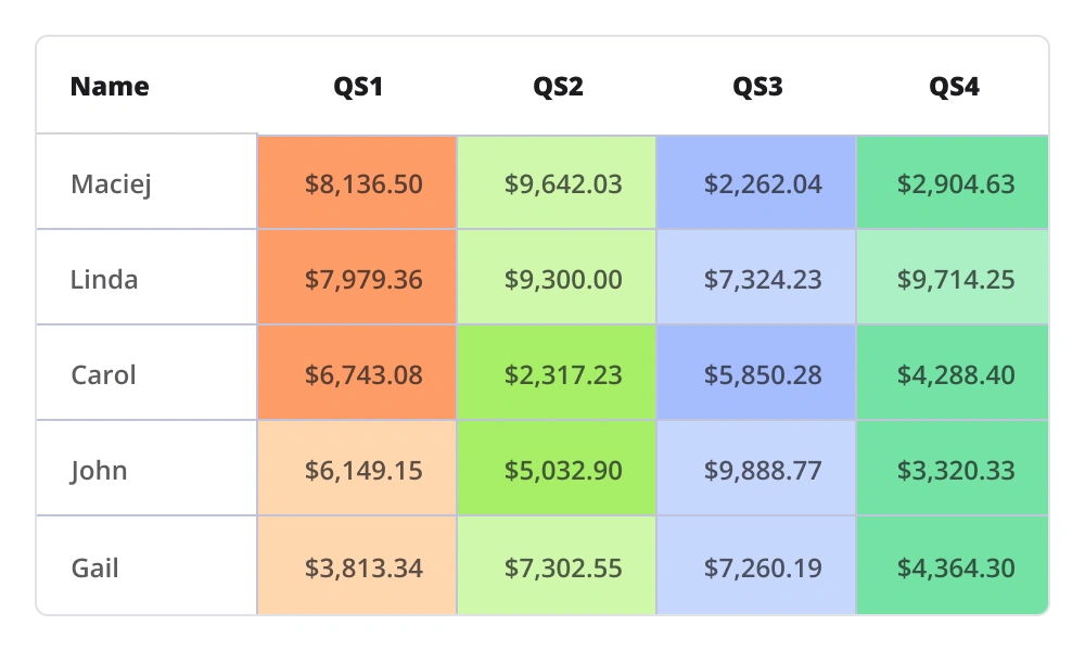
Conditional styling
- Customize cell and row appearances conditionally based on the data.
- Customize the styles and formatting of data in the rows.
Exporting

Excel export
- The .NET MAUI DataGrid allows exporting data to Excel file format.
- It offers a range of appearance customization options.
- Users can exclude specific columns and headers from the exported file, set custom row heights and column widths, and much more. To enhance customization capabilities, utilize the Syncfusion .NET MAUI Excel Library to further modify the exported Excel file.

PDF exporting
- The .NET MAUI DataGrid allows the export of data to PDF file format, providing a wide range of appearance customization options.
- Users can exclude specific columns and headers from the exported PDF, set custom row heights and column widths, and more.
- Users can show or hide column headers on each page of the exported PDF. Moreover, the DataGrid enables the display of additional content at the top (header) or bottom (footer) of the page during PDF export. To view the exported PDF document, users can utilize the Syncfusion .NET MAUI PDF Viewer.
 95+ UI controls
200+ interactive .NET MAUI demos
1.8M+ downloads
95+ UI controls
200+ interactive .NET MAUI demos
1.8M+ downloads
Not sure how to create your first .NET MAUI DataGrid? Our tutorial videos and documentation can help.
I’d love to watch it now I’d love to read it nowFrequently Asked Questions
Why should you choose the Syncfusion .NET MAUI DataGrid?
The Syncfusion .NET MAUI DataGrid control supports the following features:
- Instantly load large amounts of data.
Apply styles to every element in a data grid easily.
Select one or more rows with built-in selection modes.
Sort one or more columns in ascending or descending order.
- Update cells in real time, enhancing efficiency and responsiveness.
- Load and display custom or multiple views in cells using column templates.
Group data by one or more columns using flexible templates.
Appreciate high performance and handle large data sets efficiently.
Display a row containing summary data for the columns with aggregate types such as sum, minimum, maximum, average, and count.
Enjoy a simple configuration and APIs.
- Utilize a touch-friendly UI.
Take advantage of extensive demos, documentation, and videos to let you get started quickly with the .NET MAUI DataGrid.
Where can I find the Syncfusion .NET MAUI DataGrid demo?
You can find our .NET MAUI DataGrid demo, which demonstrates how to render and configure the DataGrid.
What is a .NET MAUI DataGrid?
Can I try Syncfusion .NET MAUI DataGrid for free?
Yes, Syncfusion offers a 30-day free trial. After the trial, licensing is required for continued use.
How do I implement paging in .NET MAUI DataGrid?
Use the SfDataPager control and bind it to the DataGrid’s ItemsSource. Customize the page size using the PageSize property.
Can I download and utilize the Syncfusion .NET MAUI DataGrid for free?
No, this is a commercial product and requires a paid license. However, a free community license is also available for companies and individuals whose organizations have less than $1 million USD in annual gross revenue, 5 or fewer developers, and 10 or fewer total employees.
How do I get started with Syncfusion .NET MAUI DataGrid?
A good place to start would be our comprehensive getting started documentation.
How can I bind data to the .NET MAUI DataGrid?
The .NET MAUI DataGrid Control is bound to an external data source to display data in a tabular format. It supports data sources such as List, IEnumerable and more. The SfDataGrid. ItemsSource property helps bind this control with a collection of objects.
xmlns="http://schemas.microsoft.com/dotnet/2021/maui" xmlns:x="http://schemas.microsoft.com/winfx/2009/xaml" xmlns:local="clr-namespace:GettingStarted" xmlns:syncfusion="clr-namespace:Syncfusion.Maui.DataGrid;assembly=Syncfusion.Maui.DataGrid" x:Class="GettingStarted.MainPage"> x:Name="sfDataGrid" ItemsSource="{Binding OrderInfoCollection}" /> How do you handle sorting in .NET MAUI DataGrid?
SfDataGrid has a built-in functionality to sort one or more columns using the SortingMode property. When sorting is enabled, the data grid automatically reorders the data based on the chosen sort criteria. You can sort data by tapping on the column header. After sorting, a sort icon appears in the respective column header to indicate the direction of the sort.
Is .NET MAUI DataGrid responsive?
Yes, the grid adjusts dynamically to different screen sizes and orientations for a seamless experience.
.NET MAUI DataViz & UI Controls
Our Customers Love Us


See Real Success Stories
Developers around the world trust Syncfusion’s Essential Studio to simplify complex projects and speed up delivery. With a vast library of UI controls, powerful SDKs, and reliable support, Essential Studio helps teams build enterprise-ready applications with confidence.
Explore Case StudiesIndustry
Software development
75% Cost reduction
50% Faster development
Industry
Utilities (oil and gas)
450+ hours saved
Streamlined processes and hours of development effort saved.
Advanced, flexible features
Empowered users through robust and versatile functionality.
Industry
Software and technology
1000+ of hours saved
Accelerated development with enterprise-ready UI components.
Efficient file management
Streamlined workflows with document libraries without building them from scratch.
Industry
Software and technology
2 Years of delay avoided
Two years of delays prevented with proactive planning.
On-time delivery
Projects delivered on schedule using trusted controls.
Industry
IT services and IT consulting
Improved performance
Large datasets handled with easy customization and quick debugging.
Highly customizable
Plug-and-play controls with quick template integration.
Industry
Professional services
Instant access
Quick availability of features and resources.
Reduced dependencies
Fewer dependencies for faster development.
Rated by users across the globe


 .NET MAUI UI Kit
Awards
Greatness—it’s one thing to say you have it, but it means more when others recognize it. Syncfusion® is proud to hold the following industry awards.

