.NET MAUI ListView - Highly Customizable Templated UI Control
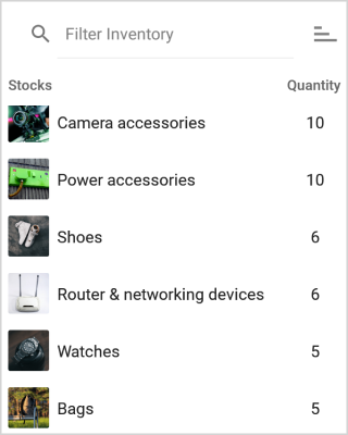
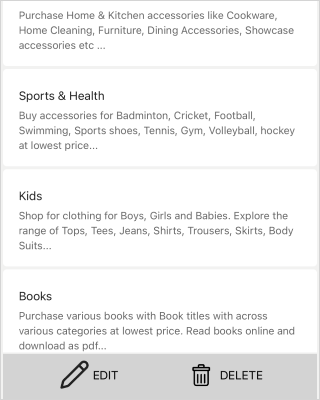
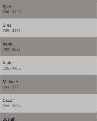
- Data can be elegantly visualized with the templates.
- Easily arrange items in a vertical or horizontal manner.
- Includes all the essential features, such as grouping, selection, load more, sorting, and much more.
Trusted by the world’s leading companies

Overview
The .NET MAUI ListView control is used to present lists of data in a vertical or horizontal orientation with different layouts virtually. It supports essential features such as selection, template selectors, horizontal and vertical orientation, load more, autofitting items, and more. The control also supports sorting, grouping, and filtering with optimization for working with large amounts of data.
.NET MAUI ListView Code Example
Easily get started with the .NET MAUI ListView using a few simple lines of XAML code as demonstrated below. Also explore our .NET MAUI ListView example that shows you how to render and configure .NET MAUI ListView.
<?xml version="1.0" encoding="utf-8" ?>
<ContentPage xmlns="http://schemas.microsoft.com/dotnet/2021/maui"
        xmlns:x="http://schemas.microsoft.com/winfx/2009/xaml"
        xmlns:syncfusion="clr-namespace:Syncfusion.Maui.ListView;assembly=Syncfusion.Maui.ListView"
        xmlns:local="clr-namespace:GettingStarted;assembly=GettingStarted"
        x:Class="GettingStarted.MainPage">
  <ContentPage.BindingContext>
    <local:BookInfoRepository />
  </ContentPage.BindingContext>
    <ContentPage.Content>
      <syncfusion:SfListView x:Name="listView"
        ItemsSource="{Binding BookInfo}" />
      </syncfusion:SfListView>
    </ContentPage.Content>
</ContentPage>
Data binding
The .NET MAUI ListView has data binding support to work out-of-the box with popular data sources such as List, ObservableCollection, and many more.

Different layouts
Data can be displayed in different layouts such as linear and grid. Both layouts are supported in the horizontal list view as well.

Linear layout
The linear layout arranges items linearly in a single column vertically or a single row horizontally.

Grid layout
The grid layout arranges items in a predefined number of columns and the number of columns can be changed.

Custom template
Display any view or control in ListView items using data templates. The control supports customizing each item by dynamic selection of the UI using a data template selector.
Horizontal ListView
Easily customize and load data items in a horizontal orientation based on your business needs.


Item swipe
The .NET MAUI ListView associates custom actions to swipe views. Swipe views are displayed by swiping an item from left to right or right to left.
Selection
Built-in support for single and multiple selection as well as tap, double-tap, and hold selection gestures.


Drag and drop
Reorder items by dragging them with a long press or from the drag indicator view. The control supports customizing the appearance of drag items while dragging.
Load more
The .NET MAUI ListView supports loading data at runtime automatically, manually, or when the user reaches the end of the list. Users can also load more data manually at the top of the list. The loading indicator and load more buttons are fully customizable.

Expandable ListView
Display the ListView items in an accordion view. Each item can be expanded or stretched to reveal the content associated with that item. No items, exactly one item, or more than one item can be expanded at a time depending on the configuration.
Sorting
Sort data in the ascending or descending order programmatically and by using XAML as well. Apply custom sorting logic to sort data when conventional techniques do not meet the requirement.


Grouping
Group items with easy-to-use APIs based on specific categories and custom grouping logic with customizable templates. Groups can be expanded or collapsed. Set sticky group headers at the top when scrolling the items.
Filtering
Easily filter or search the data items in ListView by setting a predicate to the data source.


AutoFit row height
Automatically adjust row heights based on their content to enhance readability and visibility, thereby creating a more user-friendly and aesthetically pleasing design.
Header and footer
The .NET MAUI ListView supports to display header and footer at the top and bottom of the control.

Header
Display the header at the top as well as create that header as sticky on scrolling.

Footer
Users can customize the appearance and size of the footer in ListView with sticky on scrolling at the bottom of the list.
ListView style
Customize the appearance of items in ListView with spacing, sizing, and styling options.

Spacing
Specify the required space between ListView items for an elegant look and feel.

Sizing
Customize the size of the header, footer, group header, and items in a ListView, and also autofit the items based on their content.

Alternative row style
Apply alternate row styles to items based on specific conditions for better data readability.

Conditional style
Apply styling for each item in the ListView based on different conditions. Users can apply styling to a particular view of an item or an entire item based on the property values of the business object.

Rounded corners on items
Users can customize ListView items with rounded corners to match the native user experience.

Shadow effects on items
Users can customize the appearance of ListView items to show drop shadow effects using frames.
Dynamic height
Fit the height of the items when the size of the content in the items changes at run time.


Right to left
The .NET MAUI ListView supports changing the flow direction of the text from right to left in both vertical and horizontal orientations.
Real-time updates
Automatically handles UI updates when adding new items and deleting items in the underlying collection. Updates sorting and grouping when changing business objects.

Localization
All static text within the ListView can be localized to a different language for specific cultures.
Not sure how to create your first .NET MAUI ListView? Our tutorial videos and documentation can help.
I’d love to watch it now I’d love to read it nowFrequently Asked Questions
Why should you choose the Syncfusion .NET MAUI ListView?
The Syncfusion .NET MAUI ListView supports the following features:
Easily arrange items in a vertically or horizontally manner.
Load data from data sources such as lists and Observable Collections with built-in support. Sorting, grouping, and filtering are supported out of the box.
- Group items with easy-to-use APIs. Custom grouping is also supported.
Enjoy all the essential features, such as swiping, load more, and item reordering through drag-and-drop.
- One of the best .NET MAUI ListView in the market, offering feature-rich UI to interact with the software.
Simple configuration and APIs.
- Mobile-touch friendly.
Extensive demos, documentation, and videos to let you get started quickly with the .NET MAUI ListView.
Where can I find the Syncfusion .NET MAUI ListView demo?
You can find our .NET MAUI ListView demo, which demonstrates how to render and configure the ListView.
What is the .NET MAUI ListView?
The .NET MAUI ListView is a highly customizable control for displaying a collection of data in a scrollable list format, vertically or horizontally. It supports features like grouping, sorting, filtering, and item selection.
How do I bind data to a .NET MAUI ListView?
Data can be bound to the ListView through the ItemsSource property, which is typically set to a collection like an ObservableCollection. You can then define the ItemTemplate to customize the layout for each item.
xmlns="http://schemas.microsoft.com/dotnet/2021/maui" xmlns:x="http://schemas.microsoft.com/winfx/2009/xaml" xmlns:syncfusion="clr-namespace:Syncfusion.Maui.ListView;assembly=Syncfusion.Maui.ListView" xmlns:local="clr-namespace:GettingStarted;assembly=GettingStarted" x:Class="GettingStarted.MainPage"> /> x:Name="listView" ItemsSource="{Binding BookInfo}" /> Can I implement filtering in .NET MAUI ListView?
Yes, filtering can be implemented by setting the DataSource.Filter predicate property of ListView. You have to invoke the DataSource.RefreshFilter method to refresh the view after filtering the items.
Can I download and utilize the Syncfusion .NET MAUI ListView for free?
No, this is a commercial product and requires a paid license. However, a free community license is also available for companies and individuals whose organizations have less than $1 million USD in annual gross revenue, 5 or fewer developers, and 10 or fewer total employees.
How do I get started with Syncfusion .NET MAUI ListView?
A good place to start would be our comprehensive getting started documentation.
What are the layout options for .NET MAUI ListView?
The .NET MAUI ListView supports linear and grid layouts. They can be set by using the ItemsLayout property. You can display the items in a predefined number of columns in a grid layout by setting the SpanCount value.
Can I enable multiple-selection in .NET MAUI ListView?
Yes, multiple-selection can be enabled by setting the SelectionMode property to Multiple. Users can then select multiple items by tapping them.
How can I sort the items in a .NET MAUI ListView?
You can sort the items either in ascending or descending order by defining the SortDescriptor object with the property name to be sorted and adding it to the DataSource.SortDescriptors collection.
xmlns:syncfusion="clr-namespace:Syncfusion.Maui.ListView;assembly=Syncfusion.Maui.ListView" xmlns:data="clr-namespace:Syncfusion.Maui.DataSource;assembly=Syncfusion.Maui.DataSource" > x:Name="listView"> PropertyName="ContactName" Direction="Ascending"/> .NET MAUI DataViz & UI Controls
Our Customers Love Us


 .NET MAUI UI Kit
Awards
Greatness—it’s one thing to say you have it, but it means more when others recognize it. Syncfusion® is proud to hold the following industry awards.


