The Syncfusion® Figma UI kits for web components are designed to significantly reduce design time. Each kit includes the actual UI of the web components, making it an ideal tool for seamless collaboration between developers and designers.
Explore Figma UI kits for over 85 high-performance, lightweight web UI components, including DataGrid, Scheduler, and Charts.
Leverage themes
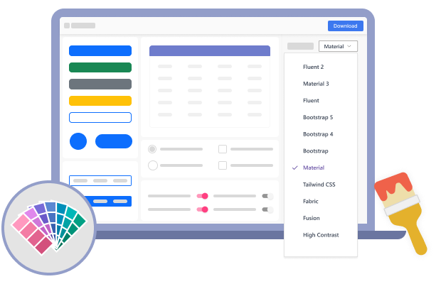
Accelerate your UI development by leveraging predesigned Figma UI kits that fit Tailwind, Bootstrap 5, Material 3, and Fluent themes provided by Syncfusion®.
Easy customization
Enjoy extensive customization options to align our UI kits with your designs.
Effortless implementation
Transform your design workflow with our UI kits. Seamlessly integrate them into your existing designs or use them to swiftly create innovative, unique designs.
Accessibility
All Syncfusion® web components are fully accessible and compliant with standards such as WCAG 2.2, Section 508, and WAI-ARIA.
Dedicated support
Receive unparalleled support as you embark on your design endeavors. Should you need assistance or wish to share feedback, our dedicated feedback portal is at your service.
Key features
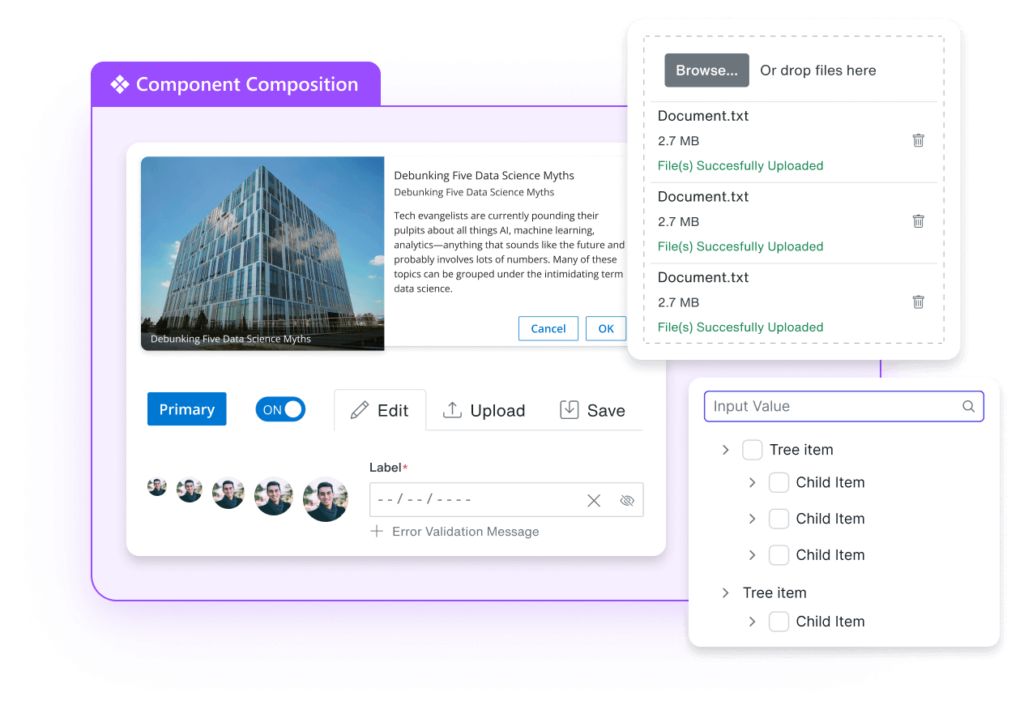
Streamlined Component Composition
Enhance your design and development efficiency with our approach to component composition. For instance, the Dropdown Tree component is constructed from the TreeView component, ensuring that any customizations to the TreeView are automatically reflected in the Dropdown Tree.
Flexible Customization
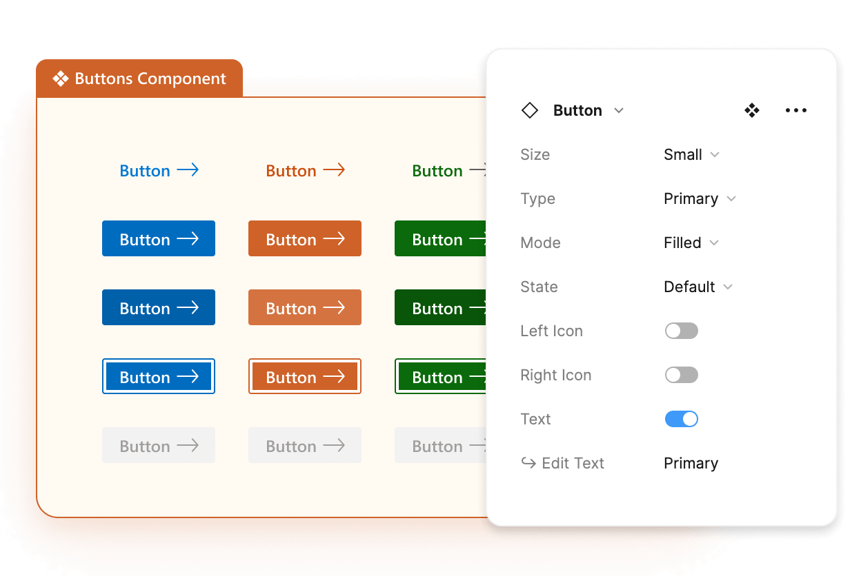
Craft unique and distinctive interfaces with ease. Our UI kits offer various built-in types for components. For example, the Button component includes primary, info, and other types. Simply adjust the type property to switch between them effortlessly.
Auto Layout
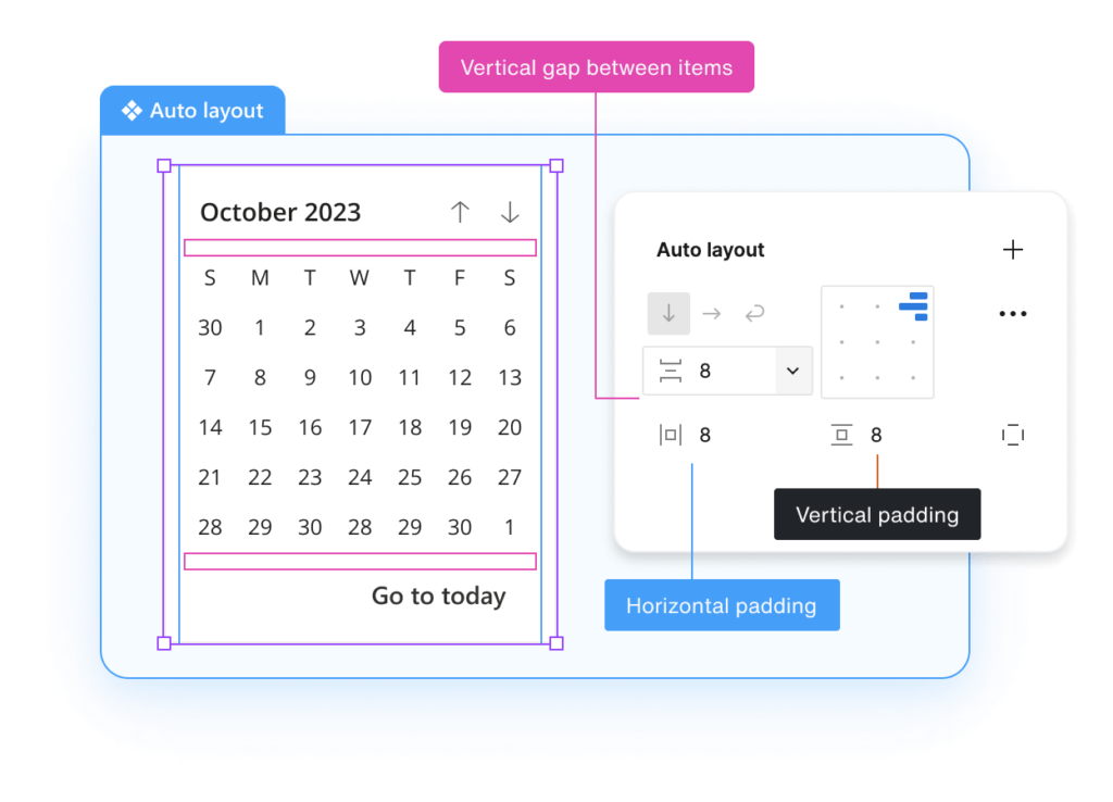
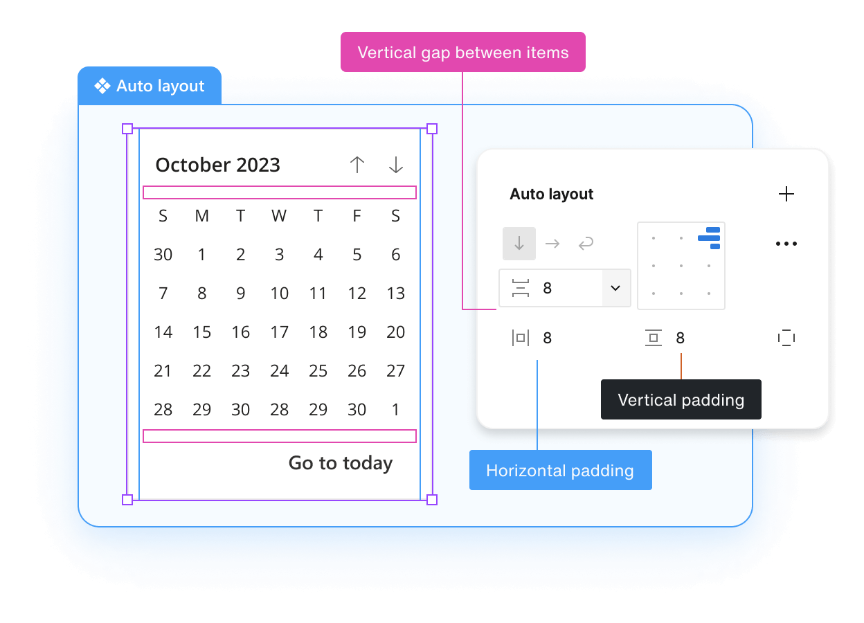
Empower your designs built with our UI kits to adapt dynamically to content changes with Figma’s auto layout options, ensuring a seamless and responsive user experience.
Design Tokens
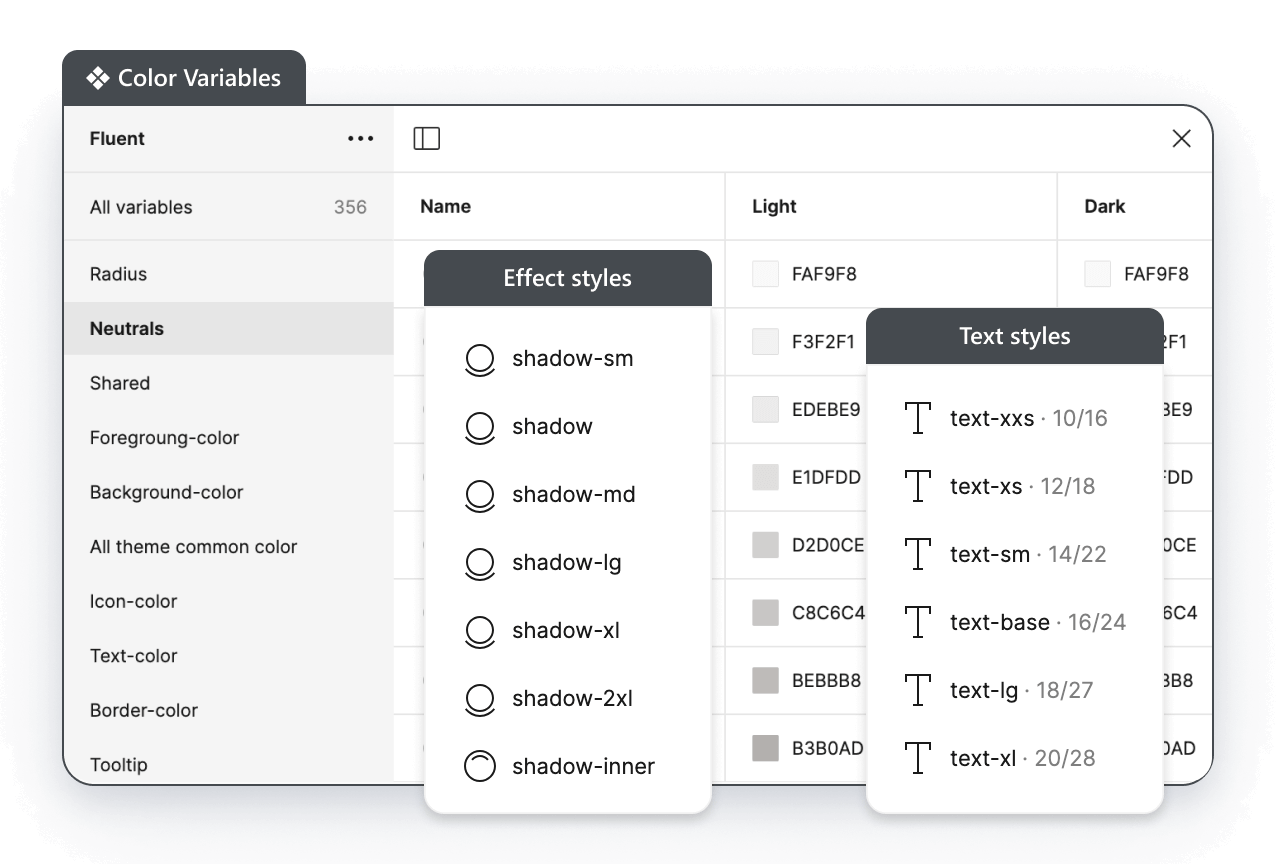
Customize your designs effortlessly by utilizing design tokens for color, typography, spacing, and more. Any change, like updating the background color, will be consistently applied across all components.
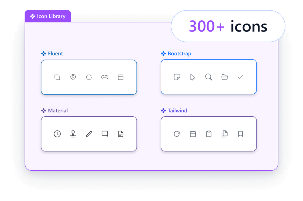
Icon Library
Enhance your designs with over 300 icons, adding visual appeal and clarity to your projects.
Theme Studio
Syncfusion® Theme Studio is a powerful tool for quickly and easily customizing and creating themes for Syncfusion® components. With Theme Studio, users can effortlessly craft visually stunning and consistent themes that align perfectly with their application’s branding and design requirements.


