Blazor application renders UI as HTML content in client-side (browser). So, you can determine whether it is a Desktop, or a Mobile device based on the viewport’s width.
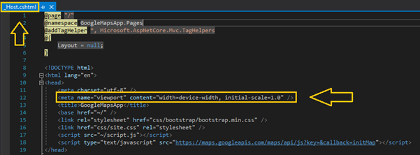
The meta tag named “viewport” is used to design the webpage responsiveness and this is included in all Blazor applications, _Host.cshtml file in Blazor server-side application and index.html file in Blazor Web Assembly application. CSS styling makes designs responsive in Blazor apps.
Another way, you can create a responsive design using media queries that adjusts to the size of the user’s screen based on desktop or mobile browser.
For example, you define breakpoints for small, medium, and large screen sizes.
<style>
    /* Default styles */
    @media (max-width: 576px) {
        /* Styles for small screens */
    }

    @media (min-width: 577px) and (max-width: 992px) {
        /* Styles for medium screens */
    }

    @media (min-width: 993px) {
        /* Styles for large screens */
    }
</style>
For more details, refer to this link.


Share with