If you are a hardcore XAML fan like me, you probably know what a Visual State Manager (VSM) is. Like me, you might have been heartbroken when you learned that Xamarin.Forms didn’t support VSM in its early versions. For those who don’t know what VSM is, let me explain. VSM makes it easier for the developer to specify the appearance of a control depending on its visual state.
In a classic approach to updating a property of a control based on its state, we may look for direct properties to set the value in different states, or we could watch for a change in the state of the control to update it in the code behind. In Xamarin.Forms, there was no direct way to set a property to the control based on its state. Well, I was glad when Xamarin.Forms 3.0 was released with support for a Visual State Manager.
The Visual State Manager (VSM) in Xamarin.Forms provides CommonStates, a visual state group with three visual states:
- Normal
- Disabled
- Focused
For all classes obtained from VisualElement, which is the base class for View and Page, this visual state group is endorsed.
The common states
The Visual State Manager allows you to include in your XAML file parts that can change the visual appearance of a view if the view is in normal, disabled, or focused states. These are called the common states.
For example, let’s consider an Entry control, and update the background color to red when it is disabled. The following XAML code will do this:
<Entry FontSize=”18”>
    <VisualStateManager.VisualStateGroups>
        <VisualStateGroup x:Name=”CommonStates”>
            <VisualState x:Name=”Disabled”>
                <VisualState.Setters>
                    <Setter Property=”BackgroundColor” Value=”Red” />
                </VisualState.Setters>
            </VisualState>
        </VisualStateGroup>
    </VisualStateManager.VisualStateGroups>
</Entry>
VSM works not just with the common states, but also with custom states. Let’s proceed with an example of customizing the text property of the Syncfusion Button control in various states.
Customizing Syncfusion Button with VSM
The Syncfusion Button has the following states:
- Normal
- Pressed
- Disabled
- Checked (toggle button)
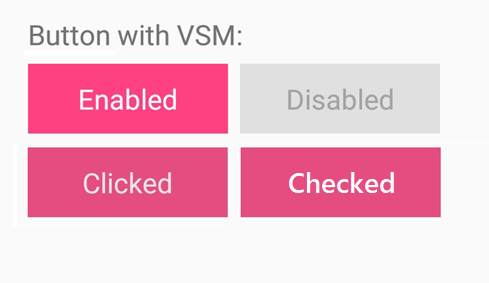
In this example, we will customize the Text property of the Button control with respect to these visual states. Please follow the below steps:
- Including the Button control.
- Declaring visual state groups.
- Adding visual state groups.
- Adding the visual states in the group.
- Customizing the Text property.
Step 1: Including the Button control
First, add a reference to the Syncfusion Button to the project. Then, add the XML namespace and Button control to the main page.
xmlns:button="clr-namespace:Syncfusion.XForms.Buttons;assembly=Syncfusion.Buttons.XForms"

<button:SfButton>
</ button:SfButton>
Step 2: Declaring visual state groups
VisualStateGroups is a bindable property of type VisualStateGroupList, which is a collection of objects of VisualStateGroup. VisualStateManager defines it.
Insert VisualStateGroups between the button tags.
<button:SfButton>
            <VisualStateManager.VisualStateGroups>

            </VisualStateManager.VisualStateGroups>
</ button:SfButton>
Step 3: Adding visual state groups
The VisualStateGroups property can hold more than the VisualStateGroup, but here we are going to add a single group to hold the common states of the Syncfusion Button control.
<button:SfButton>
            <VisualStateManager.VisualStateGroups>
                <VisualStateGroup x:Name="CommonStates">

                </VisualStateGroup>
                <VisualStateGroup x:Name="ButtonStates">

                </VisualStateGroup>
            </VisualStateManager.VisualStateGroups>
</ button:SfButton>
Step 4: Adding visual states in the groups
The VisualStateGroup defines a property named States, which is a collection of VisualState. Add a pair of tags for every state of the Syncfusion Button control.
<button:SfButton>
    <VisualStateManager.VisualStateGroups>
        <VisualStateGroup x:Name="CommonStates">
            <VisualState x:Name="Normal">

            </VisualState>
            <VisualState x:Name="Disabled">

            </VisualState>
        </VisualStateGroup>
        <VisualStateGroup x:Name="ButtonStates">
            <VisualState x:Name="Pressed">

            </VisualState>
            <VisualState x:Name="Checked">

            </VisualState>
        </VisualStateGroup>
    </VisualStateManager.VisualStateGroups>
</button:SfButton>
Step 5: Customizing the text property
VisualState has a collection of Setter objects, defined under a property named Setters. Define the setter object in Setters to change the Text property of the Button control based on its state.
<button:SfButton>
    <VisualStateManager.VisualStateGroups>
        <VisualStateGroup x:Name="CommonStates">
            <VisualState x:Name="Normal">
                <VisualState.Setters>
                    <Setter Property="Text" Value="Enabled" />
                </VisualState.Setters>
            </VisualState>
            <VisualState x:Name="Disabled">
                <VisualState.Setters>
                    <Setter Property="Text" Value="Disabled" />
                </VisualState.Setters>
            </VisualState>
        </VisualStateGroup>
        <VisualStateGroup x:Name="ButtonStates">
            <VisualState x:Name="Pressed">
                <VisualState.Setters>
                    <Setter Property="Text" Value="Clicked" />
                </VisualState.Setters>
            </VisualState>
            <VisualState x:Name="Checked">
                <VisualState.Setters>
                    <Setter Property="Text" Value="Checked" />
                </VisualState.Setters>
            </VisualState>
        </VisualStateGroup>
    </VisualStateManager.VisualStateGroups>
</button:SfButton>

Syncfusion Button with Customized Text Using VSM
Conclusion
Since the introduction of VSM in Xamarin.Forms 3.0, I have been playing around with VSM. One use-case I find interesting is using it in an adaptive layout to update the state with respect to the orientation, shifting between portrait and landscape. I hope you find it equally interesting and play around with it yourself. Let me know your thoughts as comments below.
In this blog, we have studied how to customize properties of Xamarin.Forms controls based on their states using the Visual State Manager. We have seen how to customize the properties based on both the common states and custom states of the control. The sample for customizing the Text property of the Syncfusion Button control based on its states using the Visual State Manager can be checked out from this GitHub location.
Reference: https://docs.microsoft.com/en-us/xamarin/xamarin-forms/user-interface/visual-state-manager


