

TL;DR: Learn to visualize each country’s global forest area percentage using the Syncfusion WPF Pie Chart. We’ll cover data preparation, chart configuration, and customization for a clear view of forest distribution!
Welcome to our Chart of the Week blog series!
Today, we’ll use the Syncfusion WPF Pie Chart to visualize each country’s percentage of global forest area in 2021.
The WPF Pie Chart is a circular graph that divides data into slices to show the proportion of each category. It’s perfect for illustrating percentages or parts of a whole, with each slice’s size corresponding to its value within the total dataset. You can customize the chart with different colors, labels, and interactions to enhance data visualization and user experience.
The following image shows the Pie Chart we’re going to create.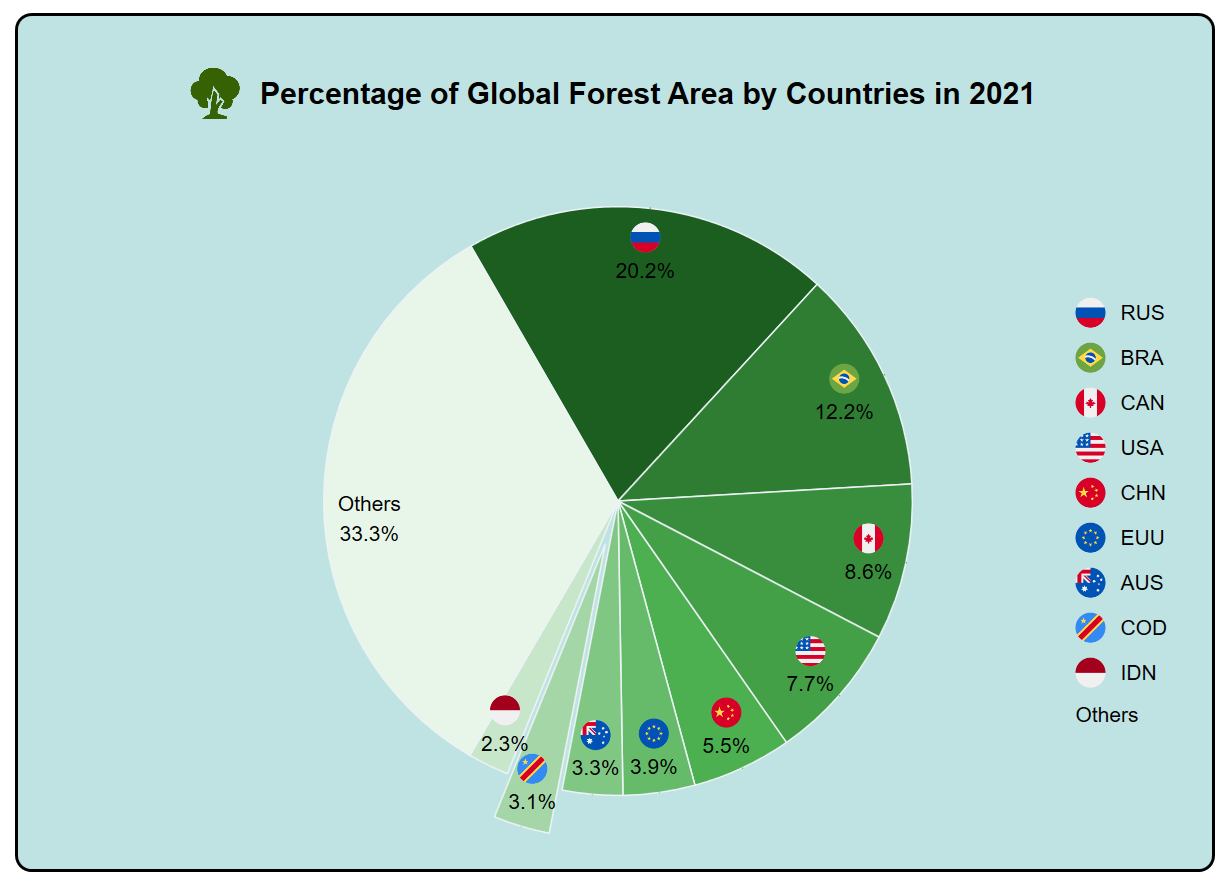
Let’s get started!
Step 1: Gathering the data
First, gather the data regarding the global forest area. You can also download this data in CSV format.
Step 2: Preparing the data for the chart
Next, the data will be organized by creating a ForestDataModel class to define the structure of the forest area data and a ForestDataViewModel class to handle data manipulation and communication between the model and the Pie Chart.
The model represents the data you want to visualize, including properties such as country name, corresponding forest area, and percentage of the global forest area.
Refer to the following code example.
public class ForestDataModel
{
     public string? Country { get; set; }

     public double Value { get; set; }

     public double Percentage { get; set; }
}
Then, create the ForestDataViewModel class. It mediates between data models and user interface elements (e.g., Pie Charts), preparing and formatting data for display and interaction.
Refer to the following code example.
public class ForestDataViewModel
{
    public List<ForestDataModel> ForestDatas { get; set; }

    public ForestDataViewModel()
    {
        ForestDatas = new List<ForestDataModel>();

        ReadCSV();

    }
}
Next, convert the CSV data into a dataset using the ReadCSV method. Refer to the following code example.
public void ReadCSV()
{
    Assembly executingAssembly = typeof(App).GetTypeInfo().Assembly;
    Stream inputStream = executingAssembly.GetManifestResourceStream("ForestSampleWPF.ForestData.csv");
    List<string> lines = new List<string>();
    if (inputStream != null)
    {
        string line;
        StreamReader reader = new StreamReader(inputStream);
        while ((line = reader.ReadLine()) != null)
        {
            lines.Add(line);
        }
        lines.RemoveAt(0);

        double otherValues = 0;
        double totalValue = 0;

        foreach (var dataPoint in lines)
        {
            string[] data = dataPoint.Split(',');

            var value = double.Parse(data[3]);
            if (value >= 915000)
            {
                ForestDatas.Add(new ForestDataModel() { Country = data[1], Value = value });
                totalValue =  totalValue + value;
            }
            else
            {
                otherValues = otherValues + value;
            }
        }

        totalValue = totalValue + otherValues;
        ForestDatas = ForestDatas.OrderByDescending(data => data.Value).ToList();

        ForestDatas.Add(new ForestDataModel() { Country = "Others", Value = otherValues });

        AddPercentage(totalValue);
    }
}

private void AddPercentage(double totalValue)
{
    foreach (var dataPoint in ForestDatas)
    {
        var percentage = (dataPoint.Value / totalValue * 100);
        dataPoint.Percentage = percentage;
    }
}
Step 3: Adding a border
Before we create the Pie Chart, let’s enhance it with a border. This addition will elevate its visual appeal and clarity.
Refer to the following code example.
<Window x:Class="ForestSampleWPF.MainWindow"
        xmlns:local="clr-namespace:ForestSampleWPF"
        Title="MainWindow" Height="650" Width="860" >

 <!--Set border for the Pie Chart -->

  <Border Background="#40008B8B"
          Width="800"
          Margin="20"
          BorderBrush="Black"
          BorderThickness="2">

   <!--Create the Pie Chart inside the border-->

  </Border>
</Window>
Step 4: Configure the Syncfusion WPF Pie Chart control
Now, configure the Syncfusion WPF Pie Chart control using this documentation.
Refer to the following code example.
<Window x:Class="ForestSampleWPF.MainWindow" xmlns:syncfusion="clr-namespace:Syncfusion.UI.Xaml.Charts;assembly=Syncfusion.SfChart.WPF">

 <syncfusion:SfChart x:Name="Chart">

  <syncfusion:PieSeries>
    . . .
  </syncfusion:PieSeries>

 </syncfusion:SfChart>

    . . .
</Window>
Step 5: Bind the data to the WPF Pie Chart
Let’s bind the ForestDatas collection to the Syncfusion WPF PieSeries. Each country’s pie slice will represent its corresponding forest area (in sq km). Refer to the following code example.
.   .    .
<syncfusion:SfChart x:Name="Chart">

 <syncfusion:PieSeries ItemsSource="{Binding ForestDatas}"
                       XBindingPath="Country"
                       YBindingPath="Value">
 </syncfusion:PieSeries>

</syncfusion:SfChart>
Step 6: Customize the WPF Pie Chart appearance
Now, let’s improve the readability of the Syncfusion WPF Pie Chart by customizing its appearance.
Customize the header
First, add a header to the chart using the following code example, ensuring clarity and context. Enhance the header with a border, grid layout, image, and label. Adjust image source, label content, font size, and padding as needed.
. . . .

<syncfusion:SfChart.Header  >

 <Border Margin="0,30,00,0">
  <Grid x:Name="header" >
   <Grid.ColumnDefinitions>
    <ColumnDefinition Width="*" />
    <ColumnDefinition Width="Auto" />
    <ColumnDefinition Width="*" />
   </Grid.ColumnDefinitions>

   <Image Source="tree.png" Height="40" Width="40" HorizontalAlignment="Left"/>
   <Label Content="Percentage of Global Forest Area by Countries in 2021"
          FontSize="20"
          FontWeight="SemiBold"
          Padding="10"
          FontFamily="Arial"
          Foreground="Black"
          HorizontalAlignment="Center"
          VerticalAlignment="Center"
          Grid.Column="1"/>
  </Grid>
 </Border>

</syncfusion:SfChart.Header>
Customize the chart series
Refer to the following code example to customize the Pie Chart series using the Palette, Stroke, StrokeThickness, and other properties.
<syncfusion:PieSeries ExplodeOnMouseClick="True"
                      ExplodeIndex="7"
                      StartAngle="-120"
                      EndAngle="240" "
                      Palette="GreenChrome"
                      StrokeThickness="0.5"
                      Stroke="White">

</syncfusion:PieSeries>
Customize the data labels
Let’s customize the data labels with the LabelTemplate property.
Refer to the following code example.
. . . . .

<syncfusion:SfChart x:Name="Chart">

 <syncfusion:PieSeries LabelPosition="Outside" >

  <syncfusion:PieSeries.AdornmentsInfo>
   <syncfusion:ChartAdornmentInfo  LabelPosition="Inner"
                                   ShowConnectorLine="True"
                                   HighlightOnSelection="True"
                                   SegmentLabelContent="LabelContentPath"
                                   LabelTemplate="{StaticResource adornmentTemplate}"
                                   ShowLabel="True">
   </syncfusion:ChartAdornmentInfo>
  </syncfusion:PieSeries.AdornmentsInfo>
 </syncfusion:PieSeries>
</syncfusion:SfChart>

.     .    .     .     .
Customize the chart legend
Now, customize the chart legend with the ItemTemplate and DockPosition properties.
Refer to the following code example.
. . . . .
<syncfusion:SfChart.Legend>
 <syncfusion:ChartLegend DockPosition="Right"
                         ItemTemplate="{StaticResource legendTemplate}"
                         LegendPosition="Inside"
                         FontFamily="Arial"
                         FontWeight="Normal" Width="100" />
</syncfusion:SfChart.Legend>
.    .    .    .     .
After executing these code examples, we will get the output that resembles the following image.
GitHub reference
For more details, refer to visualizing the percentage of global forest area using the WPF Pie Chart GitHub demo.
Conclusion
Thanks for reading! In this blog, we’ve seen how to use the Syncfusion WPF Pie Chart to visualize each country’s global forest area percentage in 2021. Please follow the steps outlined in this blog and share your thoughts in the comments below.
Existing customers can download the new version of Essential Studio® on the License and Downloads page. If you are not a Syncfusion customer, try our 30-day free trial to check out our incredible features.
You can also contact us through our support forums, support portal, or feedback portal. We are always happy to assist you!


 No spam, just valuable updates.