TL;DR: Let’s create a WPF Multi-Bar Chart to visualize and compare the U.S. and China’s superpower status across eight key measures of national strength, including trade, innovation, military, and economic output. The blog provides a detailed, step-by-step approach to setting up data models, binding them to the chart, and customizing the chart’s appearance to clearly present each country’s influence and global power.
Welcome to the Chart of the Week blog series!
Today, we’ll explore how to compare the U.S. and China’s superpower status using the Syncfusion WPF Multiple Bar Chart with annotation.
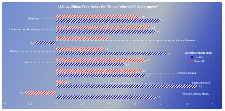
Today, the global balance of power is shaped by numerous factors, including economic strength, trade, and a country’s defense-industrial base. This chart will visualize a comparison between the U.S. and China across eight measures of power.
Annotations in SfChart are a powerful feature that allows you to highlight specific areas or points of interest within the chart. They can be used to draw attention to important data points, trends, or thresholds, making the chart more informative and easier to interpret. Annotations can include lines, text, shapes, and more, and they can be customized in terms of position, style, and appearance to suit your specific needs.
Methodology for evaluating nations’ strength
In this analysis, Ray Dalio delineates eight fundamental pillars that assess various dimensions of a nation’s strength. These categories include:
- Trade
- Innovation and technology
- Education
- Economic output
- Military
- Financial center
- Competitiveness
- Reserve currency status
The scores for these categories were calculated using Z-scores, which indicate how far a specific data point deviates from the dataset’s average, measured in terms of standard deviation. The interpretation of Z-scores is as follows:
- A Z-score of 0 indicates that the data point is at the average.
- A Z-score of 1 indicates that the data point is one standard deviation above the average.
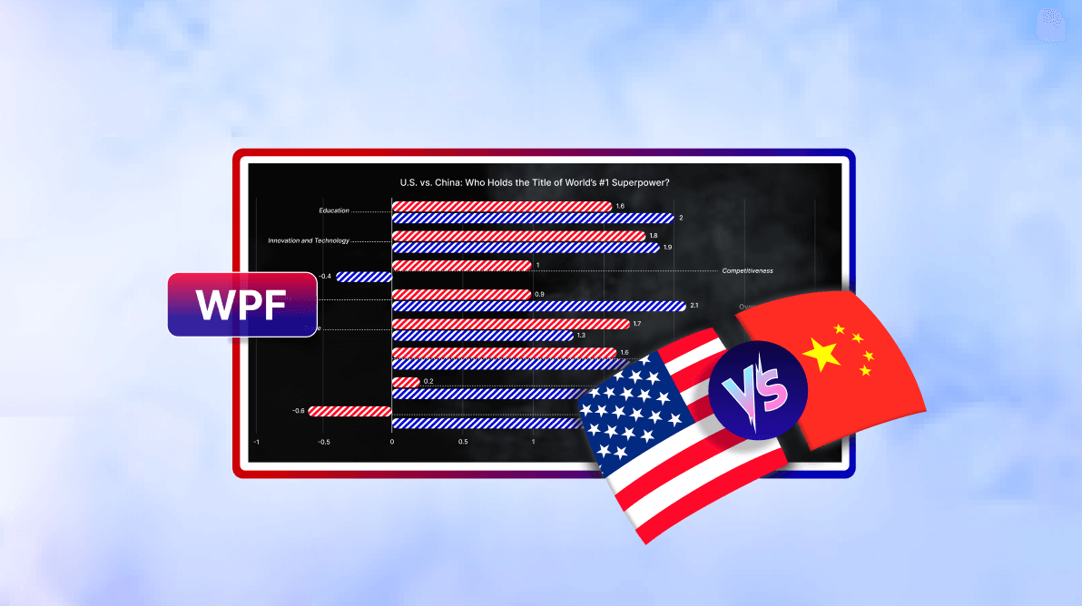
The following image demonstrates the chart that we intend to construct.
Let’s explore the steps involved in analyzing the details of the World’s #1 Superpower using the Syncfusion WPF Charts.
Step 1: Collecting data
To begin, we should gather the data for the chart. Here, we’ll refer to The Great Powers Index 2024, which provides comprehensive information on comparing the U.S. and China across eight measures of power. Specifically, we examined page 6.
Step 2: Preparing the data for the chart
Start by creating the MeasureModel and AnnotationModel classes to represent the methodologies for China and the United States and their measurements.
public class MeasureModel
{
    public string Measures { get; set; }
    public double US { get; set; }
    public double China { get; set; }
    public AnnotationModel AnnotationValue { get; set; }

    public MeasureModel(string measures, double us, double china, AnnotationModel annotationValue)
    {
        Measures = measures;
        US = us;
        China = china;
        AnnotationValue = annotationValue;
        AnnotationValue.Text = measures;
    }
}

public class AnnotationModel
{
    public double X1 { get; set; }
    public double X2 { get; set; }
    public double Y1 { get; set; }
    public double Y2 { get; set; }
    public string? Text { get; set; }
    public double TextX { get; set; }
    public double TextY { get; set; }
}
Next, create a data collection to represent the details of measured data using the MeasureData class with the Data property.
Refer to the following code example.
public class MeasureData
{
    public ObservableCollection<MeasureModel> Data { get; set; }

    public MeasureData()
    {
        Data = new ObservableCollection<MeasureModel>()
        {
            new MeasureModel("Reserve Currency Status", 1.9, -0.6, new AnnotationModel()
            {
                X1 = 0.1, Y1 = 0, X2 = 0.1, Y2 = 2.4, TextX = 0.3, TextY = 2.4
            }),
            new MeasureModel("Financial Center", 2.7, 0.2, new AnnotationModel()
            {
                X1 = 1.0, Y1 = 0, X2 = 1.1, Y2 = 2.6, TextX = 1.3, TextY = 2.6
            }),
            new MeasureModel("Economic Output", 1.7, 1.6, new AnnotationModel()
            {
                X1 = 2.0, Y1 = 0, X2 = 2.0, Y2 = 2.3, TextX = 2.2, TextY = 2.3
            }),
            new MeasureModel("Trade", 1.3, 1.7, new AnnotationModel()
            {
                X1 = 3.0, Y1 = 0, X2 = 3.0, Y2 = -0.5, TextX = 3.2, TextY = -0.63
            }),
            new MeasureModel("Military", 2.1, 0.9, new AnnotationModel()
            {
                X1 = 4.0, Y1 = 0, X2 = 4.0, Y2 = -0.7, TextX = 4.2, TextY = -0.89
            }),
            new MeasureModel("Competitiveness", -0.4, 1.0, new AnnotationModel()
            {
                X1 = 5.0, Y1 = 0, X2 = 5.0, Y2 = 2.3, TextX = 5.2, TextY = 2.3
            }),
            new MeasureModel("Innovation and Technology", 1.9, 1.8, new AnnotationModel()
            {
                X1 = 6.0, Y1 = 0, X2 = 6.0, Y2 = -0.3, TextX = 6.2, TextY = -0.9
            }),
            new MeasureModel("Education", 2.0, 1.6, new AnnotationModel()
            {
                X1 = 7.0, Y1 = 0, X2 = 7.0, Y2 = -0.3, TextX = 7.2, TextY = -0.54
            }),
        };
    }
}
Step 3: Configuring the Syncfusion WPF Charts control
Let’s configure the Syncfusion WPF Charts control using this getting started documentation.
Refer to the following code example.
<charts:SfChart>

 <charts:SfChart.PrimaryAxis>
  <charts:CategoryAxis/>
 </charts:SfChart.PrimaryAxis>

 <charts:SfChart.SecondaryAxis>
  <charts:NumericalAxis/>
 </chart:SfChart.SecondaryAxis>

</charts:SfChart>
Step 4: Binding data to the WPF Bar Chart
Now, we will create a multiple bar graph to compare the United States and China across eight measures of power. The following code example illustrates how to bind the collected data to the Bar Chart.
<charts:BarSeries ItemsSource="{Binding Data}" XBindingPath="Measures" YBindingPath="US">
</charts:BarSeries>

<charts:BarSeries ItemsSource="{Binding Data}" XBindingPath="Measures" YBindingPath="China" >
</charts:BarSeries>
Step 5: Customizing the WPF Bar Chart appearance
Let’s enhance the appearance of the WPF Bar Chart by customizing its elements, such as the title, axis, legend, series color, and data labels.
Customizing the chart title
Adding a title can help make the data presented in the chart more easily understood. Refer to the following code example to customize the chart title.
<charts:SfChart.Header>

 <TextBlock TextAlignment="Center" Text="U.S. vs. China: Who Holds the Title of World’s #1 Superpower?"  FontSize="20" Margin="0,0,0,20" Foreground="White" FontWeight="DemiBold"/>

</charts:SfChart.Header>
Customizing the axis
To customize the chart axis, we’ll use the following properties:
- ShowGridLines: To customize the visibility of the major grid lines.
- AxisLineStyle: To customize the style of the axis line.
- MajorGridLineStyle: To customize the style of the major grid lines.
- ShowAxisNextToOrigin: To position the axis line at the origin value specified in the Origin property based on the x or y axes.
Refer to the following code example.
<charts:SfChart.PrimaryAxis>
 <charts:CategoryAxis FontSize="0.1" Origin="0" ShowAxisNextToOrigin="True"
           TickLineSize="0" ShowGridLines="False">

  <charts:CategoryAxis.AxisLineStyle>
   <Style TargetType="Line">
    <Setter Property="StrokeThickness" Value="2"/>
    <Setter Property="Stroke" Value="White"/>
   </Style>
  </charts:CategoryAxis.AxisLineStyle>

 </charts:CategoryAxis>
</charts:SfChart.PrimaryAxis>

<charts:SfChart.SecondaryAxis>
 <charts:NumericalAxis FontSize="14" Interval="0.5" Minimum="-1" TickLineSize="0"
                Foreground="White" EdgeLabelsDrawingMode="Shift">

  <charts:NumericalAxis.AxisLineStyle>
   <Style TargetType="Line">
    <Setter Property="StrokeThickness" Value="0"/>
   </Style>
  </charts:NumericalAxis.AxisLineStyle>

  <charts:NumericalAxis.MajorGridLineStyle>
   <Style TargetType="Line">
    <Setter Property="StrokeThickness" Value="0.25"/>
    <Setter Property="Stroke" Value="White"/>
   </Style>
  </charts:NumericalAxis.MajorGridLineStyle>

 </charts:NumericalAxis>
</charts:SfChart.SecondaryAxis>
Customizing the series appearance
Let’s customize the series’ color, spacing, and shape using the Interior, SegmentSpacing, and CustomTemplate properties.
<charts:SfChart>

 <charts:SfChart.Resources>

  <DataTemplate x:Key="seriesTemplate">
   <Canvas>
    <Rectangle Canvas.Left="{Binding RectX}" Canvas.Top="{Binding RectY}"
                     Width="{Binding Width}" Height="{Binding Height}" RadiusX="10" RadiusY="10">
     <Rectangle.Fill>
      <VisualBrush TileMode="Tile" Viewport="0,0,10,10" ViewportUnits="Absolute"
                                Viewbox="0,0,10,10" ViewboxUnits="Absolute">

       <VisualBrush.Transform>
        <RotateTransform Angle="45"/>
       </VisualBrush.Transform>

       <VisualBrush.Visual>
        <Canvas>
         <Rectangle Fill="{Binding Interior}" Width="5" Height="20"/>
         <Rectangle Fill="White" Width="5" Height="20" Canvas.Left="5"/>
        </Canvas>
       </VisualBrush.Visual>
      </VisualBrush>
     </Rectangle.Fill>
    </Rectangle>
   </Canvas>
  </DataTemplate>

 </charts:SfChart.Resources>

 <charts:BarSeries Label="US : 0.89" ItemsSource="{Binding Data}" XBindingPath="Measures" YBindingPath="US" CustomTemplate="{StaticResource seriesTemplate}" SegmentSpacing="0.2" Interior="#0003CE">
 </charts:BarSeries>

 <charts:BarSeries Label="China : 0.8" ItemsSource="{Binding Data}" XBindingPath="Measures" YBindingPath="China" CustomTemplate="{StaticResource seriesTemplate}" SegmentSpacing="0.2" Interior="#EE3D43">
 </charts:BarSeries>

</charts:SfChart>
Adding chart legend
Refer to the following code to enable and customize the WPF Charts legend.
<charts:SfChart.Legend>
 <charts:ChartLegend DockPosition="Right" LegendPosition="Inside" Foreground="White"
                        FontSize="13" IconHeight="13" IconWidth="13">

  <charts:ChartLegend.Header>
   <TextBlock Text="Overall Strength Score" FontWeight="SemiBold" FontSize="15" Margin="-30,0,0,0"/>
  </charts:ChartLegend.Header>

 </charts:ChartLegend>
</charts:SfChart.Legend>

<charts:BarSeries Label="US : 0.89">
</charts:BarSeries>

<charts:BarSeries Label="China : 0.8">
</charts:BarSeries>
Customizing the data label appearance
We can enable and customize the chart data label elements, such as the label position, text color, and background, as follows.
<charts:BarSeries.AdornmentsInfo>
 <charts:ChartAdornmentInfo ShowLabel="True" LabelPosition="Outer" FontSize="14" UseSeriesPalette="False" Foreground="White"/>
</charts:BarSeries.AdornmentsInfo>
Incorporating annotations
The SfChart supports annotations, allowing you to mark specific areas of interest in the chart. You can add shapes, text, and images using these annotations.
In this section, we will incorporate line and text annotations to compare the United States and China’s superpower status.
To incorporate annotations, we can set the annotation collection in the view model as follows to minimize the code.
C#
public class MeasureData
{
    public AnnotationCollection Annotation { get; set; }

    public MeasureData()
    {
        Annotation = new AnnotationCollection();

        foreach (var measure in Data)
        {
            Annotation.Add(new LineAnnotation()
            {
                X1 = measure.AnnotationValue.X1,
                Y1 = measure.AnnotationValue.Y1,
                X2 = measure.AnnotationValue.X2,
                Y2 = measure.AnnotationValue.Y2,
                StrokeThickness = 1.5,
                Stroke = new SolidColorBrush(Colors.White),
                StrokeDashArray = new DoubleCollection() { 2, 3 },
            });

            Annotation.Add(new TextAnnotation()
            {
                Text = measure.AnnotationValue.Text,
                X1 = measure.AnnotationValue.TextX,
                Y1 = measure.AnnotationValue.TextY,
                Foreground = new SolidColorBrush(Colors.White),
                FontStyle = FontStyles.Italic,
                FontSize = 14.5
            });
        }
    }
}
XAML
<charts:SfChart Annotations="{Binding Annotation}">

</charts:SfChart>
After executing the previous code examples, the output will look like the following image.
GitHub reference
For more details, refer to the project on GitHub.
Conclusion
Thank you for reading! In this blog, we’ve explored how to compare and visualize the U.S. and China’s superpower status using the Syncfusion WPF Multi-Bar Chart. We strongly encourage you to follow the steps outlined in this blog and share your feedback in the comments section below.
Existing customers can download the new version of Essential Studio® on the License and Downloads page. If you are not a Syncfusion customer, try our 30-day free trial to check out our incredible features.
If you require any assistance, please don’t hesitate to contact us via our support forum, support portal, or feedback portal. We are always eager to help you!