TL;DR: Let’s demonstrate how to visualize the 2024 European Parliament composition with the Syncfusion WPF Doughnut Chart. Steps include gathering election data, configuring data models, binding this data to the chart, and detailed customization of the chart’s appearance for clarity and visual appeal.
Welcome to the Chart of the Week blog series!
Today, we will explore how to visualize the composition of the new European Parliament in 2024 using the Syncfusion WPF Doughnut Chart. We’ll also customize this chart’s series, angle, center view, and data label appearance to achieve the radial angle chart appearance.
The center view of the chart is a circular graphic ideal for displaying relevant information regarding the data being plotted. Here, we will show the image of the European flag. The WPF Doughnut Chart supports animation and interactive features such as tooltips and selection.
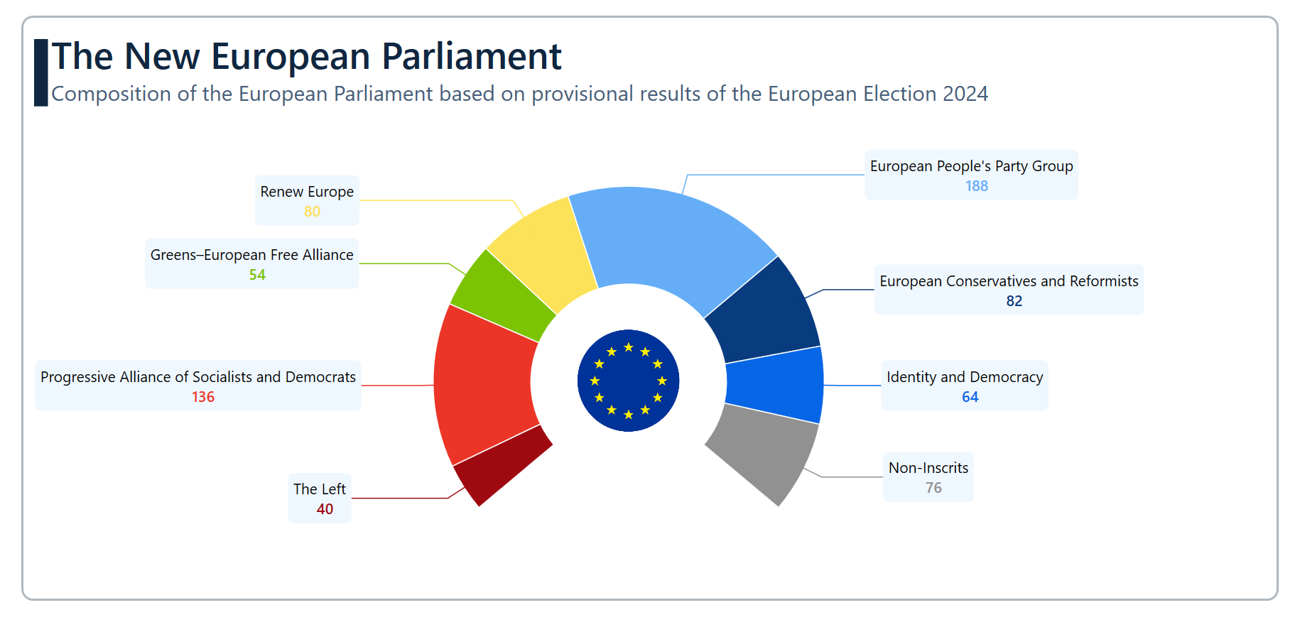
The following chart visually presents the data on the composition of the European Parliament based on provisional results of the European Election 2024.
Let’s explore the steps involved in showcasing these details!
Step 1: Gathering the data
Before creating the chart, we must gather data on the European Parliament election results for 2024 from Wikipedia. Here, we have considered the data for June 9, 2024.
Step 2: Populating the data for the chart
Define the ParliamentModel class with the PollingAggregations and PollingCount properties to store the new parliament composition data for 2024 in the chart.
public class ParliamentModel
{
    public string PollingAggregations { get; set; }
    public double PollingCount { get; set; }

    public ParliamentModel(string pollingAggregations, double pollingCount)
    {
        PollingAggregations = pollingAggregations;
        PollingCount = pollingCount;
    }
}
Generate the data collection that illustrates the seats occupied by the parties in the 2024 European Parliament election using the ParliamentData class with the Data property.
public class ParliamentData
{
  public ObservableCollection<ParliamentModel> Data {  get; set; }
    public ParliamentData()
    {
        Data = new ObservableCollection<ParliamentModel>()
        {
            new ParliamentModel("The Left",40),
            new ParliamentModel("Progressive Alliance of Socialists and Democrats", 136),
            new ParliamentModel("Greens–European Free Alliance",54),
            new ParliamentModel("Renew Europe",80),
            new ParliamentModel("European People's Party Group",188),
            new ParliamentModel("European Conservatives and Reformists",82),
            new ParliamentModel("Identity and Democracy",64),
            new ParliamentModel("Non-Inscrits",76),
        };
    }
}
Step 3: Configure the Syncfusion WPF Charts control
Let’s configure the Syncfusion WPF Charts control using this documentation.
Refer to the following code example.
<chart:SfChart>
</chart:SfChart>
Step 4: Binding data to the WPF Doughnut Chart
To visualize the new European Parliament’s composition data, we will use the Syncfusion DoughnutSeries.
Refer to the following code example. In this example, we have bound the ItemSource, XBindingPath, and YBindingPath properties with the Data, PollingAggregations, and PollingCount properties, respectively.
<chart:DoughnutSeries ItemsSource="{Binding Data}" XBindingPath="PollingAggregations" YBindingPath="PollingCount">
</chart:DoughnutSeries>
Step 5: Customize the chart appearance
Let’s enhance the appearance of the WPF Doughnut Chart by customizing its elements, such as the title, series color, doughnut size, and data labels.
Customizing the chart title
Adding a title can help make the data presented in the chart more easily understood. Refer to the following code example to customize the chart title.
<chart:SfChart HorizontalHeaderAlignment="Left">

    <chart:SfChart.Header>
        <Grid Margin="0,0,0,70">
            <Grid.ColumnDefinitions>
                <ColumnDefinition Width="13"/>
                <ColumnDefinition Width="*"/>
            </Grid.ColumnDefinitions>
            <StackPanel Orientation="Vertical" Margin="0,10,0,0" Background="#0F2741"/>
            <StackPanel Grid.Column="1" Margin="3,0,0,0">
                <TextBlock Text="The New European Parliament" FontSize="35" FontWeight="SemiBold" Foreground="#0F2741"/>
                <TextBlock Text="Composition of the European Parliament based on provisional results of the European Election 2024" FontSize="20" Foreground="#455E7A"/>
            </StackPanel>
        </Grid>
    </chart:SfChart.Header>

</chart:SfChart>
Customizing the chart color, angle, and size
Let’s customize the chart’s size, angle, and color using the DoughnutCoefficient, DoughnutSize, StartAngle, EndAngle, and Palette properties.
<chart:DoughnutSeries DoughnutSize="1" Palette="Custom" DoughnutCoefficient="1"
      Stroke="White" StrokeThickness="1" StartAngle="140" EndAngle="400">

    <chart:DoughnutSeries.ColorModel>
        <chart:ChartColorModel>
            <chart:ChartColorModel.CustomBrushes>
                <SolidColorBrush Color="#9F0A10"/>
                <SolidColorBrush Color="#EB3526"/>
                <SolidColorBrush Color="#7CC304"/>
                <SolidColorBrush Color="#FCE258"/>
                <SolidColorBrush Color="#65AEF7"/>
                <SolidColorBrush Color="#093B7F"/>
                <SolidColorBrush Color="#0766E6"/>
                <SolidColorBrush Color="#919191"/>
            </chart:ChartColorModel.CustomBrushes>
        </chart:ChartColorModel>
    </chart:DoughnutSeries.ColorModel>

</chart:DoughnutSeries>
Customize the data label appearance
To improve the readability further, we can activate and customize the chart data labels using the AdornmentsInfo property.
<chart:DoughnutSeries ConnectorType="Line" LabelPosition="OutsideExtended">

    <chart:DoughnutSeries.AdornmentsInfo>
        <chart:ChartAdornmentInfo ShowLabel="True" ShowConnectorLine="True" SegmentLabelContent="LabelContentPath">

            <chart:ChartAdornmentInfo.LabelTemplate>
                <DataTemplate>
                    <Border Padding="5" CornerRadius="5" Background="#eff7ff" HorizontalAlignment="Center">
                        <StackPanel>
                            <TextBlock Text="{Binding Item.PollingAggregations}" FontSize="14" Foreground="Black" TextWrapping="Wrap"
                                       HorizontalAlignment="Center"/>
                            <TextBlock Text="{Binding Item.PollingCount}" FontSize="14" FontWeight="SemiBold" HorizontalAlignment="Center"
                                   Foreground="{Binding Interior}" TextWrapping="Wrap" Margin="10,0,0,0"/>
                        </StackPanel>
                    </Border>
                </DataTemplate>
            </chart:ChartAdornmentInfo.LabelTemplate>
        </chart:ChartAdornmentInfo>
    </chart:DoughnutSeries.AdornmentsInfo>

</chart:DoughnutSeries>
Incorporate the center view
The CenterView property of the DoughnutSeries allows us to add any view to the center of the chart. It helps us to understand the information about the provided data better.
<chart:DoughnutSeries.CenterView >
    <ContentControl>
        <Image Source="Images/flag.png" Height="100" Width="100"/>
    </ContentControl>
</chart:DoughnutSeries.CenterView>
After executing the previous code examples, the output will look like the following image.

GitHub reference
For more details, refer to the project on GitHub.
Conclusion
Thanks for reading! In this blog, we have seen how to visualize the data on the European Parliament using the Syncfusion WPF Doughnut Chart. We strongly encourage you to follow the steps outlined in this blog and share your feedback in the comments section below.
If you require assistance, please don’t hesitate to contact us via our support forum, support portal, or feedback portal. We are always eager to help you!


