

TL;DR: Explore the latest updates in our Blazor suite, now compatible with .NET 10 Preview 1 as we bid farewell to .NET 6 and 7. This release introduces the new SpeechToText component (preview) and brings major enhancements to the DataGrid, Charts, Diagram, and PDF Viewer. Enjoy a smarter, faster, and more feature-rich experience in the 2025 Volume 1 release.
We are thrilled to announce the availability of the Syncfusion® Essential Studio® 2025 Volume 1 release! This release introduces many exciting new features and enhancements in our Blazor suite to enhance user experience and streamline modern web development.
Let’s explore them!
.NET 10 Preview 1 compatibility
Our Blazor components are now fully compatible with .NET 10 Preview 1, ensuring seamless integration with its latest features and enhancements. This update allows developers to leverage the cutting-edge .NET 10 functionalities with ease.
Discontinued support for .NET 6 and .NET 7
In alignment with Microsoft’s .NET support policy, our Blazor components library will no longer support .NET 6 and .NET 7 starting with this release.
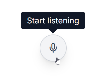
New SpeechToText (Preview) component
The new Blazor SpeechToText component supports efficient voice-to-text transcription capabilities for web apps. Its key features include:
- Real-time transcription: Converts spoken input to text efficiently, enabling smooth speech recognition.
- Interim results: Provides dynamic, partial transcriptions during speech for an enhanced real-time experience.
- Multilingual recognition: Supports various languages, allowing users to transcribe in their preferred language.
- Tooltips: Informative tooltips guide users through start and stop actions in the speech recognition process.
- Customizable appearance: Offers pre-defined styles with options to customize content and icons to suit app design needs.
Refer to the following image.
Note: For more details, refer to the Blazor SpeechToText component documentation and demos.
Production-ready components
The following Blazor components have been refined to meet industry standards and are now marked as production-ready:
What’s new in existing Blazor components?
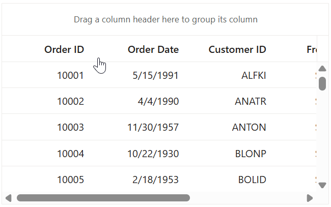
DataGrid
The Blazor DataGrid supports the following new features in this 2025 Volume 1 release:
Fixed columns
The Fixed Columns feature helps us to lock specific columns on the left side of the DataGrid, ensuring they remain visible during horizontal scrolling. These columns maintain their position for consistent data reference and cannot be reordered or included in grouping operations. We can use the FixedColumn property to implement this functionality.
Refer to the following image.
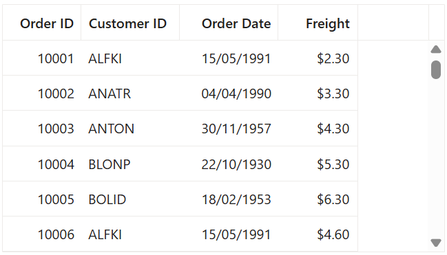
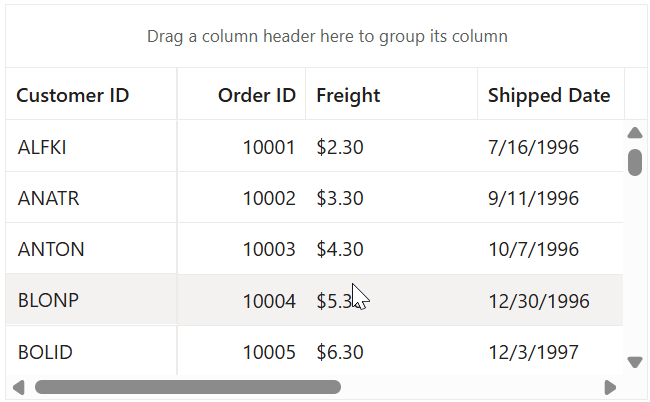
Specified column widths
The Blazor DataGrid component now lets users render grids with specific column widths instead of having them occupy the entire grid table width automatically.
Refer to the following image.
Hidden column rendering prevention
The new ShouldRenderHiddenColumns property optimizes the DOM by preventing hidden columns from rendering. When set to false, hidden columns are completely removed from rendering, significantly improving performance and reducing memory usage, especially in grids with numerous hidden columns. This optimization particularly benefits apps with complex DataGrids.
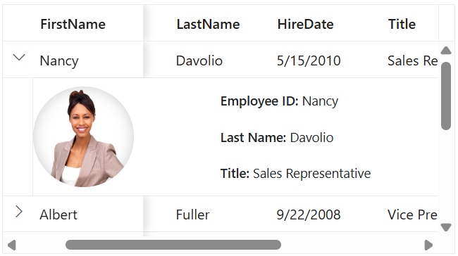
Freezing rows and columns with a detail template
Enhanced the DataGrid to support concurrent usage of Frozen Columns and Detail Template features. This integration required complex synchronization between the fixed and scrollable sections of the grid. This ensures the detail template expansion maintains visual consistency while preserving the frozen column positions during horizontal scrolling.
Refer to the following image.
Resizing with grouping and frozen features
Column resizing now works seamlessly with Grouping and Frozen columns, ensuring proper column width proportions and consistent layout recalculations.
Refer to the following image.
Performance optimization
The sorting algorithm for ForeignKey Columns has been optimized, reducing memory usage and processing time and improving responsiveness.
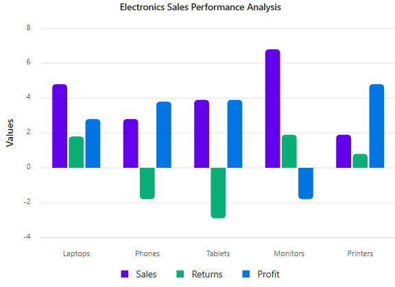
Charts
The Blazor Charts component is rolled out with the following vivid features:
Tooltip highlight
Hovering over a data point now highlights its corresponding series, enhancing visual correlation between data points and their series.
Refer to the following image.
Displaying a tooltip based on the closest point
Tooltips now display information for the data point closest to the cursor rather than requiring precise hovering. This improves user experience by making data exploration more intuitive.
Refer to the following image.

Highlighting data range with crosshair
Enhanced crosshair functionality to highlight the entire range of data points in a specific category. When the crosshair is displayed, the entire data range for that category is emphasized, providing better context and visibility.
Custom corner radius for individual data points
Developers can now customize the corner radius for individual data points in a rectangle-shaped series via the OnPointRender event. This event is triggered during point rendering, allowing for more detailed visual styling of charts.
Customizing the exported Excel document
The Exporting event now allows users to customize the chart before saving it to Excel format. This will give you control over the final document’s appearance and structure.
Customizing the title position
Chart titles can now be positioned at the top, bottom, left, or right, enhancing layout flexibility.
Diagram
The Blazor Diagram Library supports the following user-friendly features:
Container support
The Container feature allows users to group multiple nodes and connectors into a structured layout, making managing complex diagrams easier. Containers support dragging, resizing, and customization, including headers and text styling. They help maintain an organized layout without permanently merging elements, making them ideal for workflows, BPMN diagrams, and system designs. With containers, you can efficiently manage grouped elements while ensuring clarity and flexibility in your diagrams.
Note: For more details, refer to the containers in Blazor Diagram Library demos and documentation.
Toggle selection for diagram elements
The CanToggleSelection feature allows users to toggle the selection state of diagram elements, including nodes, connectors, groups, and swimlanes, by clicking on them at runtime. If an element is already selected, clicking it again will deselect it, enhancing interaction flexibility.
Control annotation rotation
By default, annotations rotate along with the node while using the rotator thumb. The RotationReference feature provides an option to keep annotations fixed to the page or rotate them with the node, offering greater flexibility in diagram customization.
Highlight multiple selection
This feature enhances the visibility of selected diagram elements by rendering a highlighted border around them during multiple selections. The first selected element is distinguished with a border twice as thick as the others, making it easier to identify and manage selections effectively.
Performance improvements
We’ve implemented significant rendering optimizations for diagrams containing nodes with annotations and connectors. These enhancements provide substantial performance gains during initial loading, especially for complex diagrams with numerous elements.
The following benchmark data highlights the performance improvements across different environments and diagram complexities:
Environment | Scenario | Performance improvement |
Server | 1,000 Nodes, 1,000 Connectors, 1,000 Annotations | 60% Faster |
| 5,000 Nodes, 5,000 Connectors, 5,000 Annotations | 75% Faster |
| 10,000 Nodes, 10,000 Connectors, 10,000 Annotations | 86.6% Faster |
WebAssembly (WASM) | 1,000 Nodes, 1,000 Connectors, 1,000 Annotations | 31.2% Faster |
| 5,000 Nodes, 5,000 Connectors, 5,000 Annotations | 85.3% Faster |
| 10,000 Nodes, 10,000 Connectors, 10,000 Annotations | 74.1% Faster |
These optimizations are particularly beneficial for enterprise apps that visualize complex systems, organizational structures, or network diagrams.
PDF Viewer
Form designer support
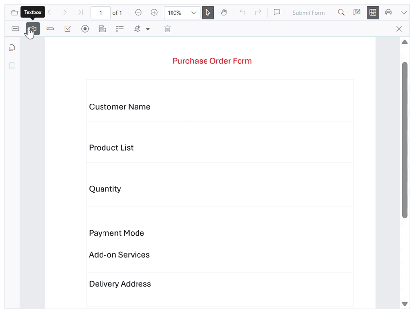
The Blazor PDF Viewer now offers comprehensive form designer capabilities, allowing us to create and modify interactive form fields directly within PDF documents. This integration eliminates the need for external tools by providing a complete form design experience.
The supported form field types are:
- Button: Create customizable action buttons that trigger events or scripts.
- TextBox: Enable user text input with customizable validation.
- Password field: Implement secure data entry with masked input.
- CheckBox: Allow users to toggle selections with configurable states.
- Radio button: Create option groups with mutually exclusive selections.
- DropDown: Provide organized selection lists with optional editable fields.
- List box: Display multiple selectable items with single or multi-select capabilities.
- Signature field: Enable digital signature placement with validation support.
This feature streamlines document workflow, transforming static PDFs into interactive forms without requiring users to switch between apps.
Refer to the following image.
Ribbon
The Blazor Ribbon component has the following new features:
Contextual tabs
We can dynamically use the contextual tabs to display additional tab groups based on interactions. This feature enhances UI flexibility by showing relevant commands only when needed, keeping the interface organized.
Refer to the following image.
Key tips
The Blazor Ribbon now includes key tips, allowing users to navigate and activate ribbon items using keyboard shortcuts. This accessibility feature makes it easy to access ribbon items without relying on a mouse.
Refer to the following image.
Scheduler
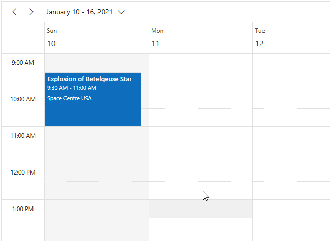
Clipboard functionality for appointments
Introduced the clipboard functionality for appointments with the new AllowClipboard property. When enabled, users can cut, copy, and paste appointments using standard keyboard shortcuts, making it easier to duplicate or move appointments within the same scheduler or across different scheduler instances.
Keyboard shortcuts:
Keys | Description |
Ctrl + X | Cut the selected appointment. |
Ctrl + C | Copy the selected appointment. |
Ctrl + V | Paste the cut/copied appointment. |
Additionally, the new CutAsync(), CopyAsync(), and PasteAsync() methods provide programmatic access to these clipboard operations.
This enhancement is especially beneficial for users who frequently reschedule or duplicate appointments, improving efficiency and workflow.
Refer to the following image.
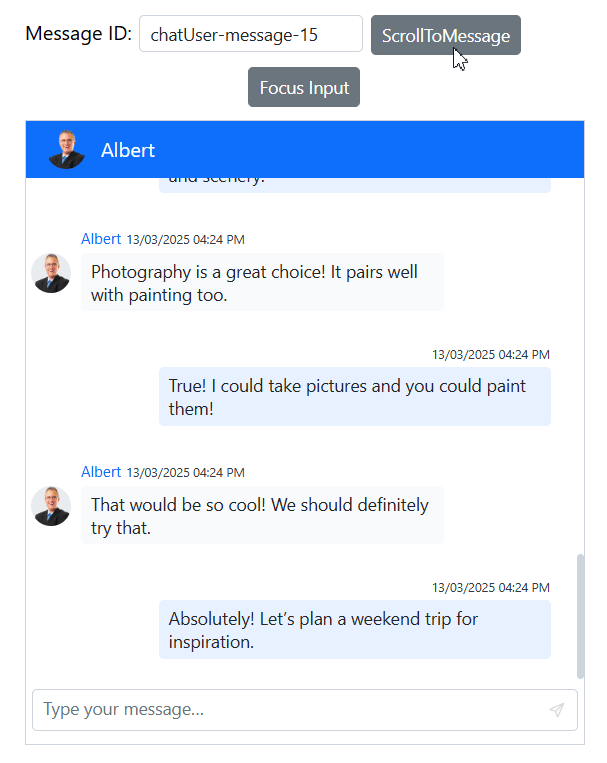
Chat UI
Improved message navigation and focus management
We’ve introduced two powerful methods to enhance user interaction with the Blazor Chat UI component:
- ScrollToMessageAsync(string messageId): Navigate directly to specific messages using its unique ID, allowing quick access to important conversations without manual scrolling.
- FocusAsync(): Automatically set focus to the input textarea, enabling users to start typing immediately without clicking the input field first.
These enhancements significantly improve usability by streamlining navigation and reducing unnecessary interactions, making them especially beneficial for conversation-heavy apps.
Refer to the following image.
TreeGrid
Performance optimization
We’ve significantly improved the Blazor TreeGrid performance by optimizing the DOM structure. The component now generates cleaner HTML with fewer unnecessary attributes and inline styles, leading to faster rendering and smoother scrolling, especially with large datasets.
The key improvements include:
- Reduced DOM size by removing redundant attributes.
- Optimized inline styles for better rendering performance.
- Improved memory management for large hierarchical datasets.
These optimizations are particularly beneficial when working with complex hierarchical data structures and deeply nested levels.
Mention
Flexible mention triggering
The Blazor Mention component now supports configurable mention activation through the RequireLeadingSpace property. When set to false, the suggestion popup appears immediately as users type the mention character, without requiring a preceding space.
The key benefits include:
- More natural typing flow for users familiar with the mention patterns.
- Improved efficiency when adding multiple mentions in sequence.
- Greater flexibility to accommodate different user interaction preferences.
By default, the suggestion popup still requires a leading space before the mention character to ensure backward compatibility.
Refer to the following code example.
<SfMention TValue="EmployeeData" RequireLeadingSpace="false">
    <MentionData>
        @EmployeesList
    </MentionData>
</SfMention>
Refer to the following image.
Rich Text Editor
Inline code formatting
The Blazor Rich Text Editor now allows us to format code snippets within the text by wrapping them in the <code> element, which displays them in a monospace font. This feature can be combined with other formatting options, such as bold and italics, to enhance readability and maintain a clear visual hierarchy in technical documentation.
Refer to the following code example.
<SfRichTextEditor>
    <RichTextEditorToolbarSettings Items="@Tools" />
</SfRichTextEditor>

@code {
    private List<ToolbarItemModel> Tools = new List<ToolbarItemModel>() {
        new ToolbarItemModel() { Command = ToolbarCommand.InlineCode }
    };
}
Gantt Chart
The Blazor Gantt Chart now supports text labels in PDF exports through new properties in the PdfLabelSettings class, allowing greater customization of exported gantt charts.
Dashboard layout
State persistence
The Blazor Dashboard Layout now offers comprehensive state management capabilities through the following three new methods:
- GetPersistDataAsync(): Retrieves the current layout configuration, including panel positions, sizes, and visibility states.
- SetPersistDataAsync(string persistData): Applies a previously saved layout configuration, enabling users to restore their preferred dashboard arrangement.
- ResetPersistDataAsync(): Resets all dashboard panels to their initial configuration as defined in the component setup.

Conclusion
Thanks for reading this blog! We’ve explored the new components and features added to the Syncfusion® Blazor suite for the 2025 Volume 1 release. To discover more about the features available in this release, please visit our Release Notes and What’s New pages. Try them out and leave your feedback in the comments section below!
Existing Syncfusion® users can access the most recent version of Essential Studio® on the License and Downloads page. If you’re new to Syncfusion®, we offer a 30-day free trial to test these exciting new features.
You can also contact us through our support forum, support portal, or feedback portal. We are always happy to help you!