The Syncfusion Flutter DataGrid is used to display and manipulate data in a tabular view. Its rich feature set includes row selection, sorting, column sizing, row height customization, swiping, and more. It has also been optimized to handle high-frequency, real-time updates. Additionally, we have included the following features for the Flutter DataGrid in our 2021 Volume 2 release:
Let’s see these new features from a bird’s eye view!
Editing
From the 2021 Volume 2 release onward, our Flutter DataGrid provides a feature to edit cell values through different kinds of editors. An important part of this editing feature is that users can load any kind of widget, based on columns or any requirement, when a cell enters into edit mode.
Note: Refer to “Editing in Flutter DataGrid” to learn about enabling the editing feature in a DataGrid.

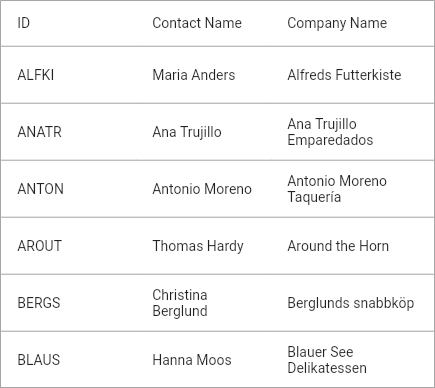
Autofit columns and rows
To improve the readability of content in a grid, you have to fit row heights and column widths based on content size. You can easily achieve this in our Flutter DataGrid. The grid allows you to fit rows and columns using the DataGridCell.value property. Also, you can fit the column widths based on the column header name using the GridColumn.columnName property.
Note: Refer to “Column sizing in Flutter DataGrid” to learn how to fit rows and columns in the grid.

Footer
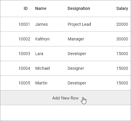
Now, users can show an additional row at the bottom (footer) of the DataGrid (i.e. below the last row). This footer row is commonly used to write custom actions such as adding new rows and showing additional information.
Note: Refer to “Footer in Flutter DataGrid” to learn how to show a footer in the grid.

Row highlighting on hovering
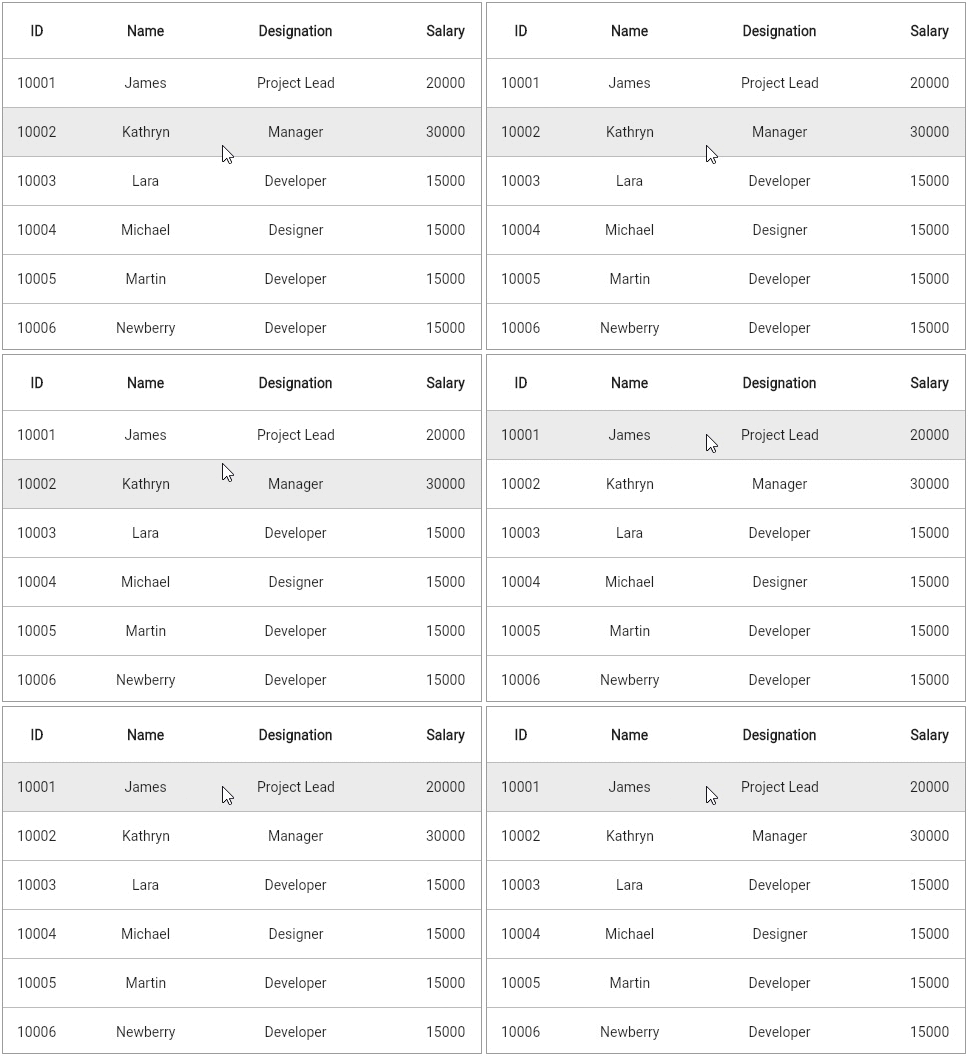
This feature is an intuitive way to represent interactions on rows. It highlights the current row when hovering on it. This is specifically applicable to web and desktop platforms. By default, this feature is now enabled in our Flutter DataGrid.
Note: Refer to “Styling in Flutter DataGrid” to learn how to customize row highlighting in the grid.

Conclusion
I hope that you enjoyed this blog and learned about the new features in our Flutter DataGrid in the 2021 Volume 2 release. Descriptions of these features are also available in our Release Notes and What’s New pages. Try out the new features and leave your feedback in the comments section of this post!
Browse our Flutter documentation to learn more about our other Flutter widgets. You can also see our Flutter app with many examples in our GitHub repository. Don’t miss our demo app in Google Play, the App Store, the Microsoft Store, Snapcraft, the Microsoft App Center, and on our website.
If you aren’t a customer yet, you can try our 30-day free trial to check out these features.
You can also contact us through our support forum, feedback portal, or Direct-Trac support system. We are always happy to assist you!


