
 Rajendran R
TL;DR: Showcasing the new features and components introduced in the Syncfusion Blazor platform for the 2024 Volume 2 release with vivid, picturesque illustrations.
We are happy to announce the release of 2024 Volume 2. The release brings many exciting new components, features, themes, and accessibility improvements to our Syncfusion Blazor components.
This blog will share the most highlighted updates in the Syncfusion Blazor suite for the 2024 Volume 2 release.
Common updates
.NET 9 previews compatibility
Syncfusion Blazor components offer full compatibility with .NET 9, including the latest preview versions.
Introducing Fluent 2.0: A modern theme for your Blazor apps
Introducing a new Fluent 2.0 theme for Syncfusion Blazor components! This theme elevates your apps’ visual appeal with a clean look and feel.
- Light and dark variants: Choose a light theme for a bright and airy feel or a dark theme for a sophisticated look.
- Customization: With the intuitive Syncfusion Blazor Theme Studio, we can easily customize the theme’s appearance. You can also easily adjust colors, fonts, and other visual elements.
Note: Refer to the Fluent 2.0 theme in the Blazor components demo for more details.
New Blazor components
In this release, the following most awaited new Blazor components arrived in preview mode:
Blazor 3D Charts (Preview)
The Blazor 3D Charts component visually represents data in three dimensions, showcasing relationships and trends among variables. Unlike traditional 2D charts, 3D charts add depth to the visualization, allowing for a better understanding of data patterns.
The component’s key features include:
- Data binding: Bind the 3D Charts component to a collection of objects or a DataManager. In addition to chart series, data labels and tooltips can also be bound to your data.
- Data labels: Annotate data points with labels to improve the readability of data.
- Axis types: Plot different data types such as numbers, datetime, logarithmic, and string.
- Axis features: It supports multiple axes, inverted axes, multiple panes, opposed positions, and smart labels.
- Legend: Provide additional information about a series with customization options.
- Animation – Animates the Chart series when the chart is rendered and refreshed.
- User interaction: Supports interactive features such as tooltips and data point selection.
- Export: Print the Chart directly from the browser and export it in JPEG and PNG formats.
- RTL – Provides a full-fledged right-to-left mode that aligns the axis, tooltip, legend, and data in the 3D Charts component from right to left direction.
- Appearance: The built-in theme picks the colors for the 3D Charts, but each element can be customized with simple configuration options.
- Accessibility—The 3D Charts component is designed to be accessible to users with disabilities. Its features, such as WAI-ARIA standard compliance and keyboard navigation, ensure that it can be effectively used with assistive technologies such as screen readers.
The Blazor 3D Charts component offers six versatile chart types; all are easily configurable and have built-in support for visually stunning effects.
- Column: Represents data with vertical bars for easy value comparison.
- Bar: Utilizes horizontal bars to display data and facilitate value comparison.
- Stacked Column: Plots data points on top of each other using vertical bars for comprehensive visualization.
- Stacked Bar: Achieves the same effect as the Stacked Column but with horizontal bars.
- 100% Stacked Column: This column illustrates the percentage distribution of multiple datasets within a total, with each column adding up to 100%.
- 100% Stacked Bar: This bar resembles the Stacked Column but uses horizontal bars to showcase the percentage distribution of datasets within a total.
Refer to the following image.

Note: For more details, refer to the Blazor 3D Charts documentation and demos.
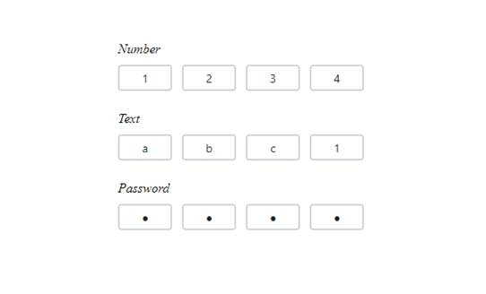
Blazor OTP Input (Preview)
The Blazor OTP Input is a form component used to input one-time passwords (OTP) during multi-factor authentication. It provides extensive customization options, allowing users to change input types, placeholders, separators, and more to suit their needs.
Its key features include:
- Input types: Allowed input types are text, number, or password.
- Styling modes: Offer built-in styling options such as underline, outline, or fill.
- Placeholders: Set a hint character for each input field, indicating the expected value.
- Separators: Specify a character between the input fields.
- Customization: Customize the default appearance, including input field styling, input length, and more.
Refer to the following image.
Note: For more details, refer to the Blazor OTP Input component documentation and demos.
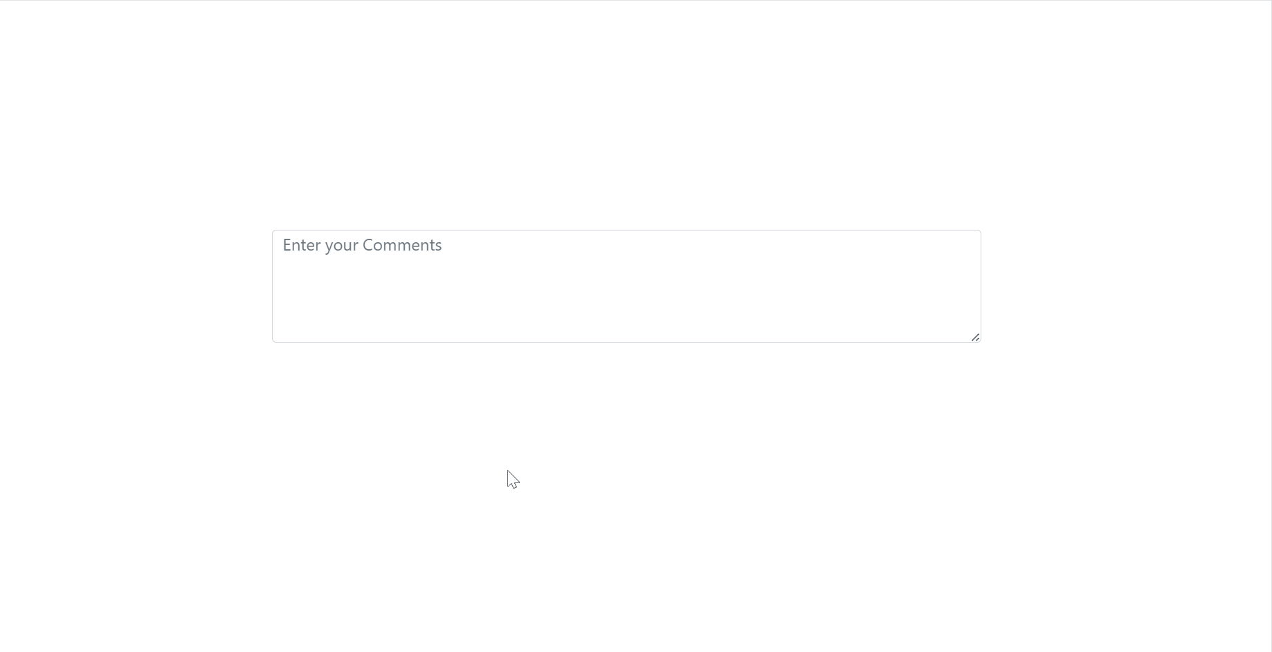
Blazor TextArea (Preview)
The Blazor TextArea allows users to input multiple lines of text within a specific area, such as comments, messages, composing detailed notes, or other content.
Its key features include:
- Resizable: The Blazor TextArea component can be resized vertically, horizontally, or in both directions by selecting the corresponding ResizeMode option.
- Row-column configurations: You can configure the size and appearance of the TextArea element in terms of RowCount and ColumnCount to suit specific design and functionality requirements.
- Floating label: The Blazor TextArea intelligently floats the placeholder text based on the specified FloatLabelType option, providing users with clear guidance and enhancing usability.
Refer to the following image.
Note: For more details, refer to the Blazor TextArea documentation and demos.
Preview to production-ready component
The Blazor Timeline component, introduced in the 2024 Volume 1 release, is now production-ready and meets the industry standards for stability and performance.
Refer to the following image.
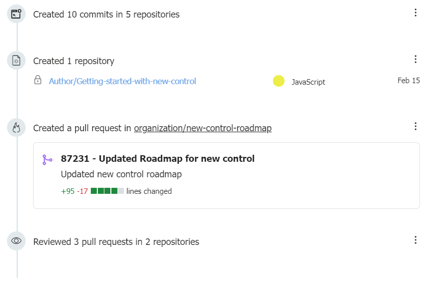
Note: For more details, refer to the Blazor Timeline component demo.
What’s new in our existing Blazor components?
Blazor Diagram
The new features added to the Blazor Diagram component are as follows:
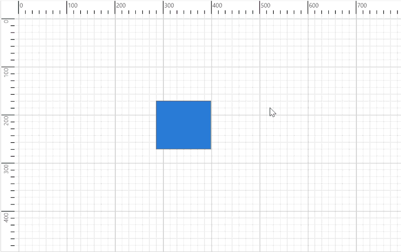
Rulers
Streamline your diagram creation process using rulers in the Blazor Diagram component! This powerful new feature empowers you to:
- Ensure accuracy: Achieve precise placement, sizing, and alignment of shapes and objects within your diagrams.
- Horizontal and vertical measurements: Utilize horizontal and vertical rulers for comprehensive measurement capabilities.
The RulerSettings property is used to customize ruler behavior and appearance.
Refer to the following image.
Note: For more details, refer to the rulers in the Blazor Diagram component demos.
Handle complex diagrams with chunking support
We have added support for rendering large diagrams with annotations, paths, text, images, and SVG shapes without exceeding the maximum size limit for a single incoming hub message (MaximumReceiveMessageSize of 32KB). You can achieve it by setting the EnableChunkMessages property to true.
Advanced routing
We have enhanced the dynamic updating of connector routes based on the placement or movement of nearby shapes. You can enable this feature by setting the RoutingType property to Advanced. It provides an optimized path with fewer bends and the shortest possible connector length.
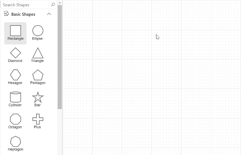
Search symbols in the symbol palette
This feature allows users to search for symbols in the symbol palette by entering a symbol’s ID or search keywords into a text box and clicking Search. The search results are retrieved by matching the ID or SearchTags property with the string entered in the Search text box. The ShowSearchTextBox property of the symbol palette is used to show or hide the search text box in the symbol palette.
Refer to the following image.
PDF Viewer
The Blazor PDF Viewer delivers the following new features:
Improved PDF Viewer performance
The PDF Viewer now loads large-sized documents quickly, boosting the loading speed and efficiency of large PDF files.
Experience faster document viewing with the optimized PDF Viewer, designed to handle large files quickly.
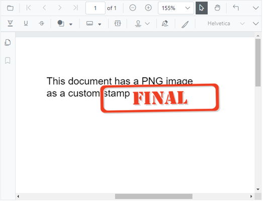
Enhanced custom stamp
The Blazor PDF Viewer now supports adding PNG images as custom stamps. Also, it displays any graphical object as a custom stamp in an existing PDF document. You can rotate custom stamps to better fit your documents.
Refer to the following image.
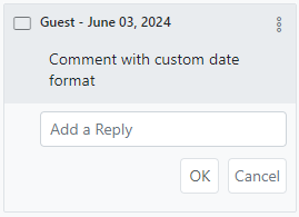
Customizable date and time format
In the comment panel, you can customize the date and time format. The display can also be tailored to suit your preferred style and regional settings.
Multiline comments
Multiline comments can now be added to the annotations. This allows better organization and clarity in the PDF documents.
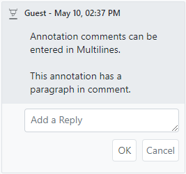
Image Editor
The Blazor Image Editor is rolled out with the following advanced features:
Continuous drawing mode for seamless image editing
Users can now draw multiple annotations simultaneously in the Image Editor, enhancing creative flexibility. Furthermore, every action, including customizations, will be tracked in the undo/redo collection, ensuring a seamless user experience and making it easier to experiment with different designs. This feature can be achieved through the UI and built-in public methods, namely EnableActiveAnnotationAsync and DisableActiveAnnotationAsync.
Note: For more details, refer to the Blazor Image Editor demo.
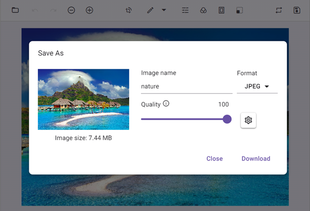
Save support enhancement
Users can save an image with a specified file name, type, and image with quality. This enhancement provides more control over the output, ensuring users can save their work exactly as needed.
The feature can be achieved through UI and ExportAsync public method.
Refer to the following image.
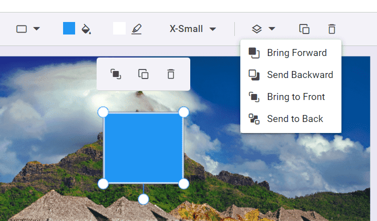
Z-order support for layered editing
This feature allows users to adjust the positioning of annotations. It is handy for designing personalized templates like greeting cards or posters, where managing the layering of multiple annotations is crucial for a polished final product. This feature can be implemented through UI and the public methods BringForwardAsync, BringToFrontAsync, SendBackwardAsync, and SendToBackAsync.
Types of z-order adjustments include:
- Sent Backward: Switch the selected annotation with the annotation one layer behind it.
- Send to Back: Move the selected annotation to behind all other annotations.
- Bring to Front: Move the selected annotation ahead of all others.
- Bring forward: Switch the selected annotation with the annotation one layer ahead of it.
Gantt Chart
The Blazor Gantt Chart delivers the following new user-friendly updates:
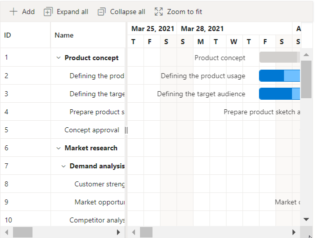
Revamped resource binding for more efficient project management
The resource allocation feature in the Blazor Gantt Chart has been enhanced with simplified data binding support and improved resource assignment management.
Row hover support for interactive viewing
We’ve introduced the new row hover selection support in the Gantt Chart. The EnableRowHover property enhances the visual experience and makes it easier to identify the row currently under the cursor.
Refer to the following image.
Note: For more details, refer to the row hovering in the Blazor Gantt Chart demo.
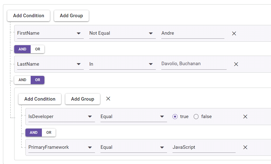
Query Builder
The Blazor Query Builder supports the following new features in this 2024 volume 2 release:
Drag and drop support for intuitive query building
Users can reposition rules or groups within the component effortlessly. This enhancement provides a more intuitive and flexible way to construct and modify queries.
Note: For more details, refer to the example of drag and drop in Blazor Query Builder.
Separate connectors for clear visualization
Users can integrate standalone connectors between rules or groups within the same group. This feature allows for greater flexibility, as users can connect rules or groups using different connectors, enhancing the complexity and precision of query construction.
Note: For more details, refer to the example of separate connectors in Blazor Query Builder.
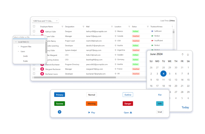
DataGrid
Add new row option for easier data entry
The Blazor DataGrid now includes an add new row feature during inline editing. This feature ensures that a blank row is constantly visible within the grid content, facilitating the easy insertion of new records.
Refer to the following image.
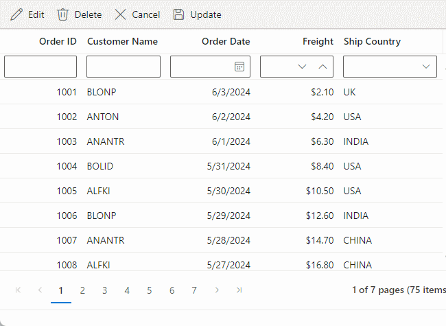
Note: For more details, refer to the example of inline editing in Blazor DataGrid.
Dropdown components
Disable specific items
The dropdown components (AutoComplete, ComboBox, Dropdown List, and MultiSelect Dropdown) can now enable or disable individual items for specific scenarios. Once an item is disabled, it cannot be selected as a value for the component. This is particularly useful for disabling options such as out-of-stock products or inactive account types. To configure the disabled item columns, use the DropDownListFieldSettings.Disabled property.
MultiSelect Dropdown
Virtual scrolling
The Blazor MultiSelect Dropdown component’s virtualization support allows users to navigate large lists of options efficiently by loading the items on demand. Virtualization can be used with filtering, grouping, custom values, and checkbox mode features. This feature can be enabled by setting the EnableVirtualization property to true.
Note: For more details, refer to the example of virtualization in the Blazor MultiSelect Dropdown component.
Tree Grid
Performance improvements in expand and collapse features
We are excited to announce significant performance improvements for Blazor TreeGrid with single root node data configurations. This enhancement targets scenarios with only one root parent row and thousands of child rows.
Following are the performance metrics comparing the old release with the current 2024 volume 2 release for 10,000 records:
Actions | Old release | 2024 Volume 2 release |
Initial rendering | 1.7 seconds | 1.1 seconds |
Expand row | 31 seconds | 1.4 seconds |
Collapse row | 560 milliseconds | 150 milliseconds |
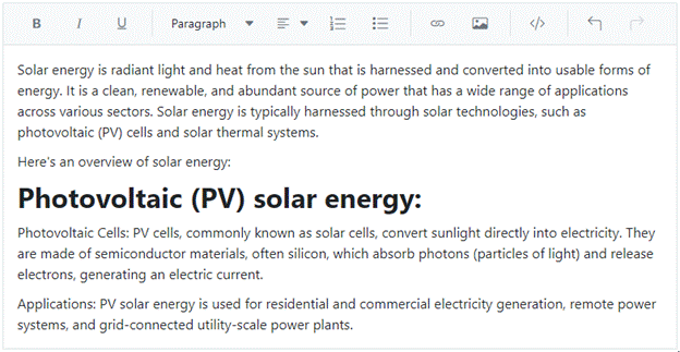
Rich Text Editor
Quick format toolbar for easy text formatting
The Blazor Rich Text Editor features a quick toolbar that appears upon text selection, offering convenient access to text formatting options. This floating toolbar allows users to easily apply bold, italic, underline, strikethrough, and other formats directly from the quick toolbar near the selected text.
Note: For more details, refer to the example of quick format toolbar in Blazor Rich Text Editor.
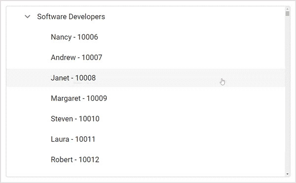
TreeView
Virtualization for smoother performance
The Blazor TreeView component now supports virtualization to optimize performance while handling a huge volume of data. This will render only nodes based on the TreeView height and swap the nodes when the user scrolls, avoiding rendering off-screen items. To enable this feature, set the required Height property for TreeView and the value of EnableVirtualization to true.
Refer to the following image.

Conclusion
Thanks for reading! In this blog, we have explored the new components and features added to the Syncfusion Blazor suite for the 2024 Volume 2 release. To discover more about the features available in this release, please visit our Release Notes and What’s New pages. Try them out and leave your feedback in the comments section below!
For current Syncfusion users, you can access the most recent version of Essential Studio® on the License and Downloads page. If you’re new to Syncfusion, we offer a 30-day free trial to test these exciting new features.
Try out these features and share your feedback as comments on this blog. You can also reach us through our support forums, support portal, or feedback portal.
Related blogs
- Syncfusion Essential Studio® 2024 Volume 2 Is Here!
- Introducing the New Blazor 3D Charts Component
- How to Maintain State in the Blazor ListBox Using Fluxor?
- What’s New in C# 13 for Developers?


 No spam, just valuable updates.