The WPF TreeView has all the features that an essential tree view control should have. In this blog, we are going to look at the top 5 features available to improve your application:
- Expand and collapse actions
- Recursive checking
- Load on demand with built-in busy animation
- Auto fit node heights
- Drag and drop within and between controls
Let’s get started!
Expand and collapse actions
The expanding and collapsing of nodes are the usual operations performed in a TreeView control. But our Syncfusion WPF TreeView provides an intuitive way to expand and collapse the nodes. You can perform the expanding and collapsing actions by interacting with either the expander icon or the whole content view in the node. You can control this behavior with the ExpandActionTrigger property.
<syncfusion:SfTreeView x:Name="sfTreeView" ExpandActionTrigger="Node" />You can also change the position of the expander view. You can display the expander at either the start or end of the node by setting values to the ExpanderPosition property.
<Syncfusion:SfTreeView x:Name="sfTreeView" ExpanderPosition="End">Recursive checking
Load a check box in each node to allow users to check and uncheck them. You can load check boxes in the WPF TreeView control when you load TreeView in bound or unbound modes. You can also modify the parent node’s checked state when you check or uncheck the child nodes by setting the CheckBoxMode property to Recursive.
If you are binding the ItemsSource and need to bind the CheckBox value, then you should set the ItemTemplateDataContextType to Node to bind the TreeViewNode.IsChecked property to CheckBox in ItemTemplate.
Refer to the following code example.
<syncfusion:SfTreeView
    x:Name="sfTreeView"
    CheckBoxMode ="Recursive"
    CheckedItems="{Binding CheckedStates}"
    ChildPropertyName="Models"
    ItemTemplateDataContextType="Node"
    ItemsSource="{Binding Items}">
<syncfusion:SfTreeView.ItemTemplate>
   <DataTemplate>
     <Grid>
        <CheckBox x:Name="CheckBox" FocusVisualStyle="{x:Null}"
              IsChecked="{Binding IsChecked, Mode=TwoWay}"/>
         <TextBlock FontSize="12" VerticalAlignment="Center" Text="{Binding Content.State}" Margin="25,0,0,0"/>
      </Grid>
   </DataTemplate>
 </syncfusion:SfTreeView.ItemTemplate>
</syncfusion:SfTreeView>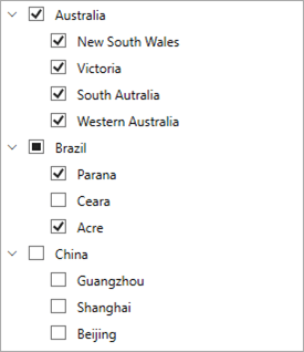
GitHub reference: You can view the example in this GitHub location.
Load on-demand with built-in busy animation (lazy loading)
TreeView allows you to load child nodes on request using the load-on-demand (lazy loading) feature. It helps you load the child nodes from services when the end-user expands the node. You can use the LoadOnDemandCommand property to load the child nodes on demand while expanding the nodes.
An important feature is that you can also display a busy indicator in the node by using the TreeViewNode.ShowExpanderAnimation property until the data is fetched in the command.
The following code example shows the procedure to bind the LoadOnDemandCommand property with the ViewModel’s property in XAML.
<syncfusion:SfTreeView
 x:Name="sfTreeView"
 LoadOnDemandCommand="{Binding TreeViewOnDemandCommand}"
 ItemsSource="{Binding Menu}" >
 <syncfusion:SfTreeView.ItemTemplate>
   <DataTemplate>
     <Label
        VerticalContentAlignment="Center"
        Content="{Binding ItemName}"
        FocusVisualStyle="{x:Null}"
        FontSize="12" />
    </DataTemplate>
 </syncfusion:SfTreeView.ItemTemplate>
</syncfusion:SfTreeView>
The following code shows how to load child nodes on demand when the OnDemandCommand is triggered.
public class MusicInfoRepository
 {
…………….
     private ICommand treeViewOnDemandCommand;
     public ICommand TreeViewOnDemandCommand
     {
         get{ return treeViewOnDemandCommand; }
         set{ treeViewOnDemandCommand = value; }
     }

     public MusicInfoRepository()
     {
         ………………..
         TreeViewOnDemandCommand = new OnDemandCommand(ExecuteOnDemandLoading, CanExecuteOnDemandLoading);
     }

    private bool CanExecuteOnDemandLoading(object sender)
        {
            var hasChildNodes = ((sender as TreeViewNode).Content as MusicInfo).HasChildNodes;
            if (hasChildNodes)
                return true;
            else
                return false;
        }

             private void ExecuteOnDemandLoading(object obj)
        {
            var node = obj as TreeViewNode;

            // Skip the repeated population of child items every time the node expands.
            if (node.ChildNodes.Count > 0)
            {
                node.IsExpanded = true;
                return;
            }
            //Animation starts for expander to show progress of load on demand.
            node.ShowExpanderAnimation = true;
            treeViewNodes.Add(node);

            Application.Current.MainWindow.Dispatcher.BeginInvoke(DispatcherPriority.Background,
               new Action(async () =>
               {
                   await Task.Delay(1000);
                   foreach (var item in treeViewNodes)
                   {
                       if (!item.ShowExpanderAnimation)
                           continue;
                       currentNode = item;
                       break;
                   }

                   MusicInfo musicInfo = currentNode.Content as MusicInfo;

                   //Fetching child items to add.
                   var items = GetSubMenu(musicInfo.ID);

                   // Populating child items for the node in on-demand.
                   currentNode.PopulateChildNodes(items);
                   if (items.Count() > 0)
                       //Expand the node after child items are added.
                       currentNode.IsExpanded = true;

                   //Stop the animation after load on demand is executed If animation is not stopped, it remains after execution of load on demand.
                   currentNode.ShowExpanderAnimation = false;
                   treeViewNodes.Remove(currentNode);

               }));
        }
………………
}
GitHub reference: You can check out the example project in this GitHub location.
Auto fit node height
TreeView allows you to set the height of the node:
- By default using the ItemHeight property.
- Conditionally using the QueryNodeSize event.
You can adjust (autofit) the height of the node based on the content’s measured size to improve readability. You can do this through the QueryNodeSize event and the QueryNodeSizeEventArgs.GetAutoFitNodeHeight method.
Refer to the following code example.
sfTreeView.QueryNodeSize += SfTreeView_QueryNodeSize;

private void SfTreeView_QueryNodeSize(object sender, Syncfusion.UI.Xaml.TreeView.QueryNodeSizeEventArgs e)
{
    if (e.Node.Level == 0)
    {
        //Returns specified item height for items.
        e.Height = 30;
        e.Handled = true;
    }
    else
    {
        // Returns item height based on the content loaded.
        e.Height = e.GetAutoFitNodeHeight();
        e.Handled = true;
    }
}
GitHub reference: You can view the example project in this GitHub location.
Drag and drop within TreeView and between controls
TreeView allows you to drag and drop items within the TreeView control by setting the AllowDragging property to true. You can also drag and drop the items between TreeViews or to any other control, such as ListView and DataGrid.
While dropping, you can add the dragged nodes above or below the target item or as a child to a specific node based on the drag indicator position.
Refer to the following code example.
<treeview:SfTreeView
    Name="sfTreeView"
    AllowDragging="True"
    ChildPropertyName="Childs"
    ItemsSource="{Binding Nodes1}" />
WPF TreeView has the following events to perform custom operations when dragging items between nodes. Also, you can utilize these events to perform the drag-and-drop actions between TreeView and other controls:
Github examples
The examples for dragging and dropping items between TreeView and other controls are:
Conclusion
Thanks for reading! In this blog, we have learned the top five features available in our Syncfusion WPF TreeView control. It also provides other features, such as editing, selection, a context menu, and tree lines. You can refer to this UG documentation for a complete guide to all the available features in the WPF TreeView control. Try our TreeView demos in this link. Browse through our documentation to learn more about our other WPF controls.
If you aren’t a customer yet, you can try our 30-day free trial to check out these features.
If you wish to send us feedback or would like to submit any questions, please feel free to post them in the comments section of this blog post. You can also contact us through our support forum, feedback portal, or Direct-Trac support system. We are always happy to assist you!

