Overview
In this blog, I have created the Story Estimator application as an example of Single Page Application you can make with a combination of Syncfusion ASP.NET Core controls. Here, I will first explain how this application works, and then how I used Syncfusion ASP.NET Core controls to build it.
The Story Estimator
The Story Estimator is an effective Agile-based tool for estimating story points for stories using Planning Poker techniques. Planning Poker is an Agile estimating and planning technique that is consensus-based.
Agile teams around the world use this kind of tool to estimate how long a certain amount of work will take to complete. The purpose of this tool is to make sure that each person on the development team is actively participating in the estimation process and contributing their opinion.
The Room Creation
As a first step, organizer creates a room (session) and imports all the stories to be estimated. Normally, the product owner or team lead who organizes the session will be the organizer, and their team members are players or estimators. So, the organizer will invite their team members for this session.
The Story Estimation
After starting the session, the organizer reads the description of the user story for which the estimation is to be made. If the estimators raise any questions, then the organizer will answer them.
Each estimator has a separate play screen with cards that hold values like 0, 1, 2, 3, 5, 8, 13, 20, 40, and 100. The values represent the number of story points, ideal days, or other units the team follows.
The estimators discuss the story or feature by asking the organizer questions, if needed. When the story or feature has been fully discussed, each estimator privately selects one card to represent his or her estimate. After all the estimators select their estimates, the organizer will reveal everyone’s selection.
If everyone has selected the same value, it becomes the estimate. If not, all the estimators will discuss their estimates. The high and low estimators will share their reasoning. According to the discussion, the organizer will finalize the estimate of the selected story. If required, repeat the process until the estimate is finalized.
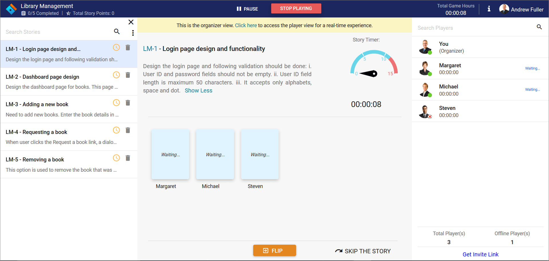 Story estimator – Admin play area
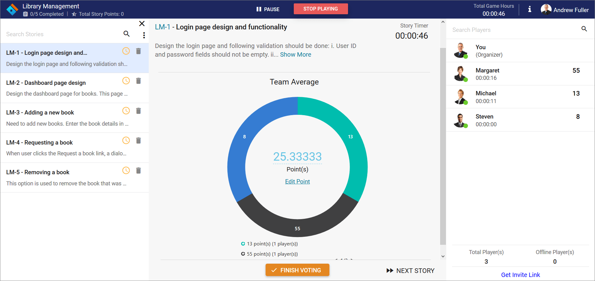 Average story point estimated
Demo: https://aspdotnetcore.syncfusion.com/showcase/aspnetcore/story-estimator/
This Story Estimator was developed using Syncfusion components. Let’s see how Syncfusion components are part of Story Estimator and where they are used.
- Accumulation Chart
- Button
- Checkbox
- Circular Gauge
- Dialog
- Data Grid
- Input Mask
- Radio Button
- Sidebar
- Split Button
- Uploader
Accumulation Chart
The Accumulation chart control is a circular graphic, that can be divided into multiple segments to illustrate numerical proportions. All the elements are rendered as Scalable Vector Graphics (SVG).
We use this chart to represent the team average for votes. It will display after flipping all the cards. This chart groups similar data and the legend shows the values.
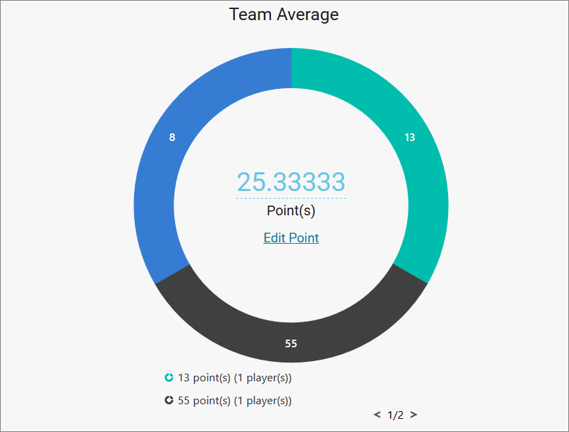 Chart to represent average story points
This chart has some key features, that supports:
- Local binding and remote data sources.
- Arranging the labels smartly without overlapping.
- Interactive features such as tooltip, explode, and selection.
- Club points to group the values of category.
Button
The Button control is a graphical user interface element that triggers an event when clicked. It can contain text, an image, or both. We used Syncfusion buttons in many places in this application.
Syncfusion Button key features:
- Different button types.
- Predefined button styles.
- Easy button customization.
- Buttons can use texts and icons.
Checkbox
The Checkbox control is a graphical user interface element that allows you to select one or more options from a group of choices. It contains checked, unchecked, and indeterminate states.
We used check boxes in this application to remove multiple stories at a time from the discussion phase.
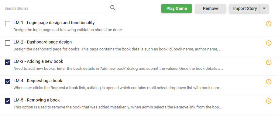 Checkbox to select the stories
Circular Gauge
The Circular Gauge control is ideal to visualize numeric values over a circular scale. Scalable Vector Graphics (SVG) is used to render all element of circular gauge.
We used the Circular Gauge control to represent the story timer. The story timer reminds the organizer to estimate a story within a specified time range. The optimal time range is set as 15 minutes, and you can change it during room creation.
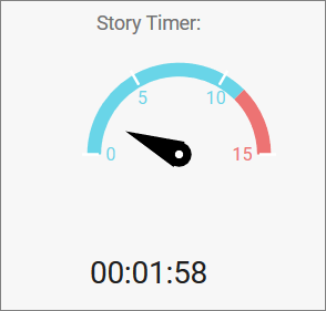 Circular Gauge as timer
Syncfusion Circular Gauge key features:
- Add custom elements to the gauge using annotations.
- Use interactive features like tooltip and pointer drag and drop.
- Add multiple pointers to the gauge.
- Add multiple axes and ranges.
- Use animation for pointers.
Dialog
The Dialog control is a window that displays information to a user, requests and accepts user input.
We used dialog for several purposes; creating the room, confirmation, warning messages, and some alerts.
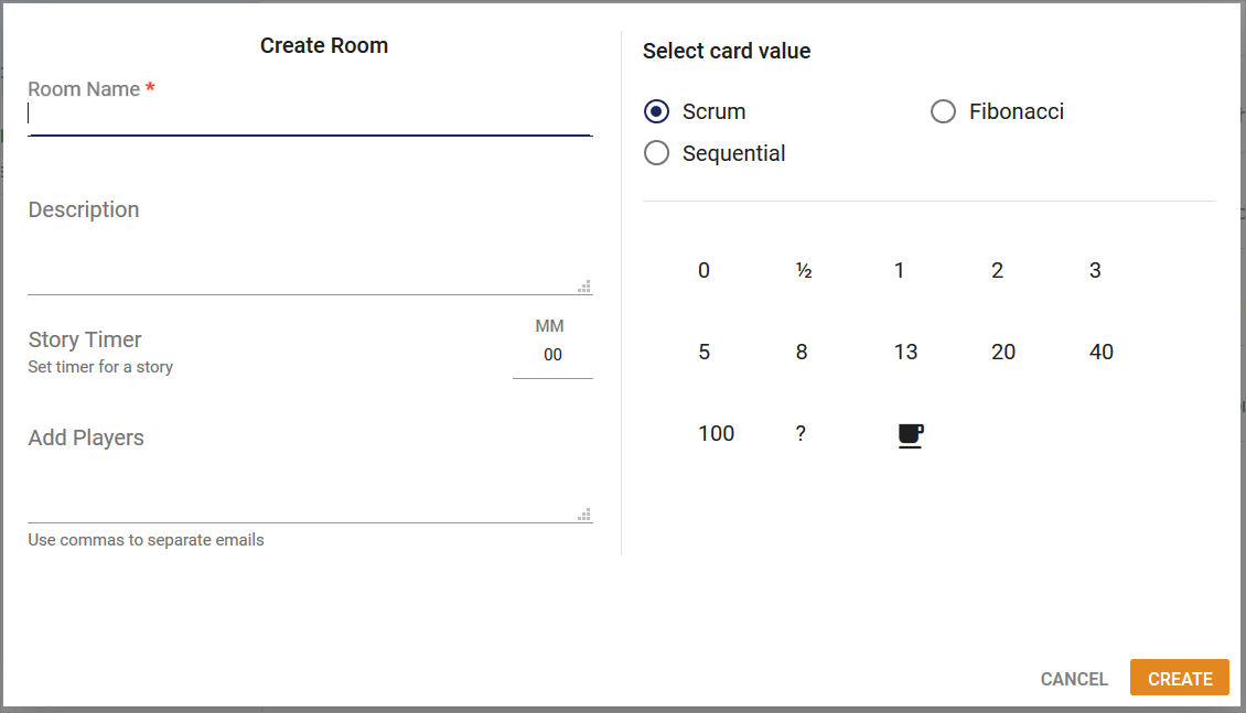 Dialog used as form
Syncfusion Dialog key features:
- Model and modeless dialogs.
- Button: Render buttons in the Dialog footer.
- Templates: Customize Dialog header and footer through a template.
- Draggable: Drag the Dialog within the page or container.
- Animation: Use customized animation support when opening and closing a dialog.
- Localization: Localize the default close icon title text to different cultures.
DataGrid
The DataGrid control is used to display and manipulate tabular data with configuration options to control the way the data is presented. It can pull data from data sources such as an array of JavaScript objects, OData web services, or the DataManager and bind data fields to columns. It also displays the column header to identify the field with support for grouped records.
We used the DataGrid to represent user stories and the players list. We have done some simple customization and changed the grid view to a more elegant look. The DataGrid is very lightweight, so it does not increase the process time of the application.
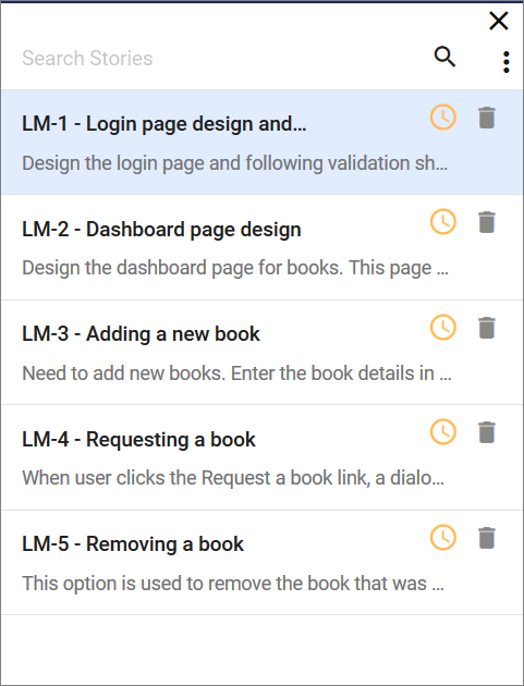 DataGrid used to list the stories
Syncfusion DataGrid key features:
- Data sources: Binds the DataGrid component with an array of JavaScript objects or DataManager.
- Sorting and grouping: Supports n level of sorting and grouping.
- Filtering: Offers filter bar in each column to filter data.
- Paging: Allows easy switching between pages using the pager bar.
- Reordering: Allows the drag and drop of any column anywhere in a grid’s column header row, thus allowing repositioning of columns.
- RTL support: Provides right-to-left mode that aligns the grid content from right to left.
- Localization: Provides inherent support to localize the UI.
Input Mask
The Input Mask control allows users to enter valid input based on the provided mask.
We used the Input Mask to set the story timer value when creating the room. 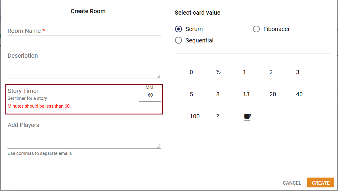
Input mask used to create rooms
Syncfusion Input Mask key features:
- Custom characters: Use your own characters as the mask elements.
- Regular expression: Use as a mask element for each character of the Input Mask.
- Accessibility: Access all the Input Mask component features through the keyboard, on-screen readers, or other assistive technology devices.
Radio Button
The Radio Button control is a graphical user interface element that allows you to select only one option from a set of choices. It contains checked and unchecked states.
We used the Radio Button to select card value when creating the room.
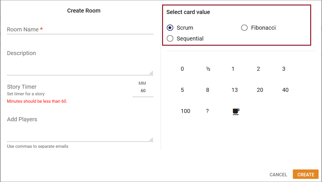 Radio button used to select card values
Sidebar
The Sidebar control is an expandable and collapsible component that typically acts as a side container to place primary or secondary content alongside the main content.
We used Sidebar to represent user stories in the play area. It has mobile-friendly support, so when opening the site in mobile, the user stories area will be closed automatically.
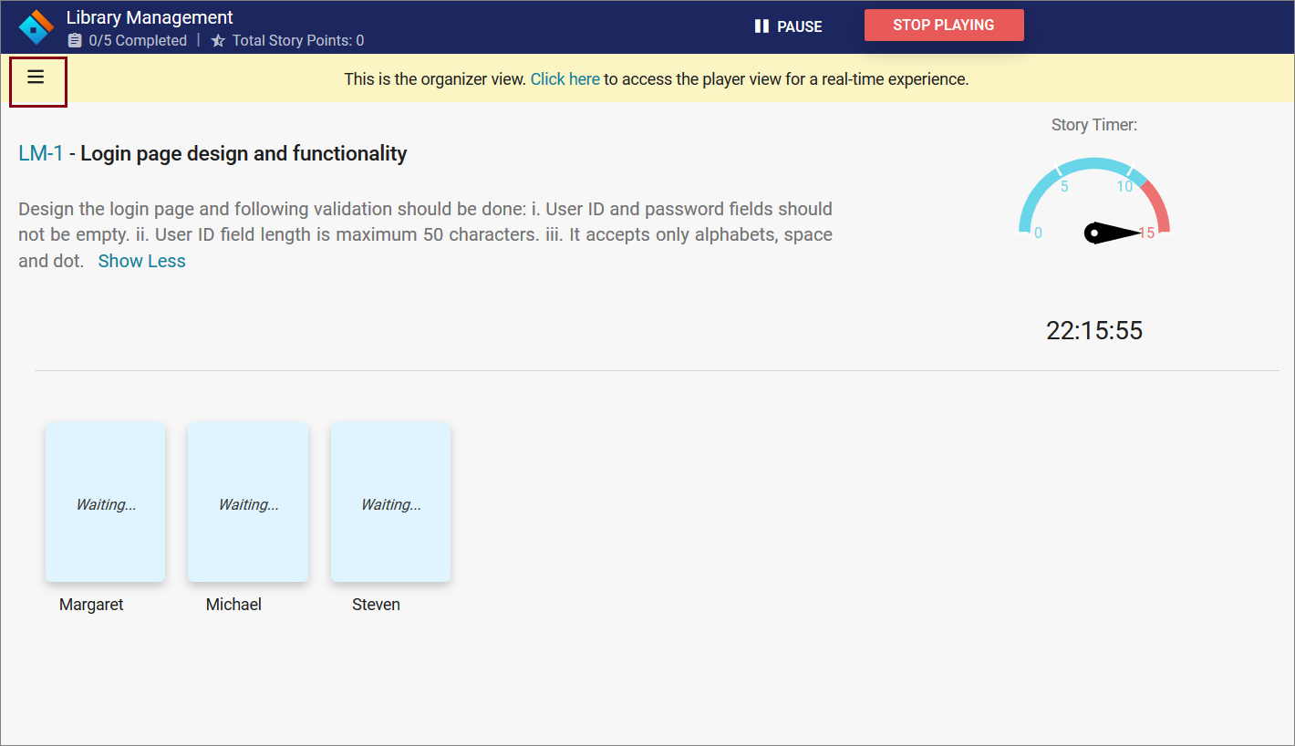 Sidebar collapsed view
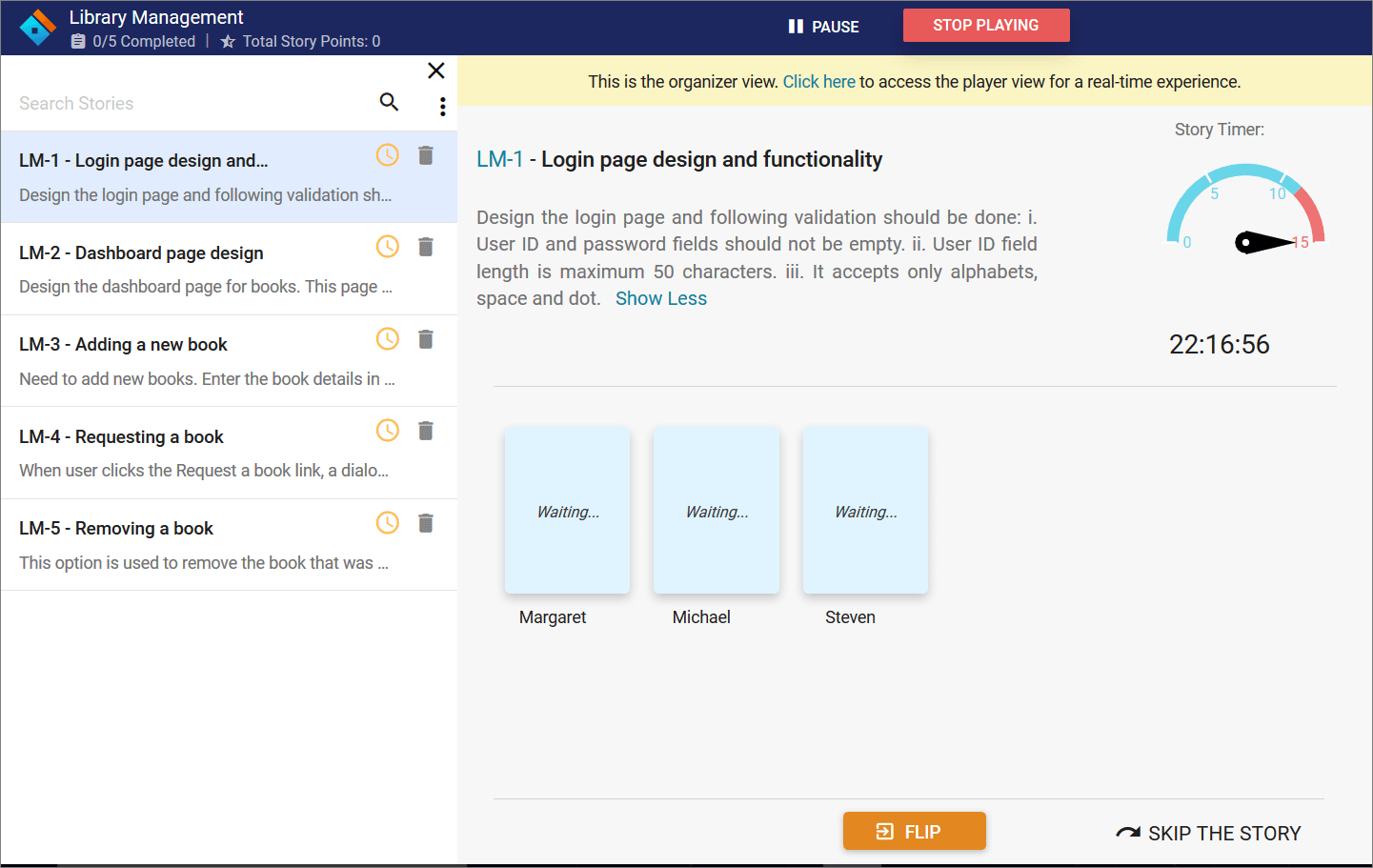 Sidebar expanded view
Syncfusion Sidebar key features:
- Context: Initialize Sidebar in any HTML element except the body element.
- Several types and positions.
- Auto close: The Sidebar can be in an expanded or collapsed state only in certain resolutions.
- Dock: By default, it supports the display of short notifications about the content in docked mode.
Split Button
The Split Button control triggers a default action when its primary button is clicked, and toggles contextual overlays to display a list of action items when its drop-down button is clicked. The control can contain both text and images.
We used Split Button in the Import Story options. We have multiple import story options simply represented in a split button.
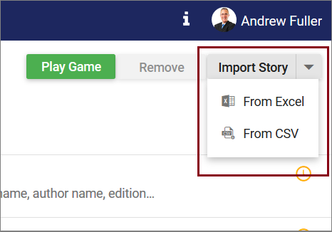 Split button to import stories
Syncfusion Split Button key features:
- Icons
- Pop-up items
- Accessibility
Uploader
The Uploader control is useful to upload images, documents, and other files to a server. This component is an extended version of HTML5 upload. It has multiple-file selection, auto upload, drag and drop, progress bar, preloading files, and validation.
We used the Uploader in the Import Stories option in Excel and CSV file formats. Also, you can drag and drop the files to upload.
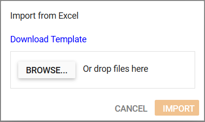 Uploaded to upload files containing story details
Syncfusion Uploader key features:
- Asynchronous upload: The Uploader component allows you to upload files in an asynchronous way.
- Drag and drop: The files can be dragged from the file explorer into the drop area. By default, the Uploader control itself acts as a drop-area element.
- Form supports: The selected or dropped files are received as a collection in a when the form is submitted.
- Template: You can customize the default appearance of the Uploader using a template property along with a button property.
Conclusion
Syncfusion has powerful controls you can use to develop any kind of application on various platforms. They are designed to make developers’ lives easier. If you’re already a Syncfusion user, you can download the product setup here, or, you can download a free, 30-day trial here to evaluate our products.
Want to learn more about creating real time application using Syncfusion Essential JS 2? Don’t forget to check out the Showcase Applications here. You can find this project in this Github repository. If you have any questions on these features, please let us know in the comments below. You can also contact us through our support forum or Direct-Trac or Feedback portal. We are more than happy to assist you!
If you like this blog post, we think you’ll also like the following links
[Blog] Single Page Application Examples using Essential JS 2 Components
[Ebook] JavaScript Succinctly
[Ebook] AngularJS Succinctly
[Ebook] ASP.NET Core Succinctly

