
 Gowrimathi S
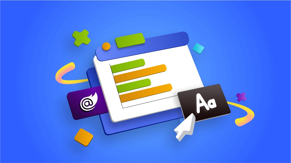
TL;DR: Let’s see how fonts enhance readability and clarity in the Blazor Charts. Well-chosen fonts improve data accessibility, guiding users’ focus on key insights. This guide covers customizing titles, axis labels, legends, tooltips, and more using the APIs. Optimize your charts with effective typography for a professional and engaging visualization.
Welcome to our latest post in the Weekly Data Visualization series!
Fonts go beyond aesthetics—they play a crucial role in enhancing data clarity, accessibility, and visual appeal. In the Syncfusion Blazor Charts, thoughtfully selected fonts enhance readability, emphasize crucial insights, and provide a polished, professional appearance to your visualizations. Well-chosen fonts direct the viewer’s attention, creating a seamless flow where titles, labels, and legends enhance your data’s story with clarity and impact.
This guide delves into practical strategies for using fonts in our Blazor Charts, covering everything from selecting appropriate font sizes and weights to styling individual chart elements. With our customizable APIs, you can tailor fonts to meet the specific needs of each chart, ensuring that titles stand out, data labels are legible, and legends are easy to interpret. By using careful font, you can transform your charts into user-friendly, informative visuals, enabling viewers to grasp complex information quickly and leave a lasting impression.
The role of fonts in data visualization
Refer to the following image. Here, we visualize global electric vehicle (EV) sales by manufacturers for 2023, showcasing market share data in a clear and organized format. Styled with the default Material theme, the chart offers a modern and consistent aesthetic that enhances readability. The text elements are styled with default Material theme sizes and settings, ensuring the information remains readable and visually consistent throughout the visualization.

Here, the data labels are positioned near individual data points, clearly displaying the exact values of each category. This careful placement, aligned with the Material theme’s emphasis on clarity and simplicity, allows viewers to quickly interpret specific figures without having to estimate from the chart itself. This approach enhances both data clarity and accessibility, supporting users in making informed observations at a glance.
The axis labels are strategically placed along the horizontal and vertical axes to indicate what each axis represents. They provide crucial context by identifying categories, such as manufacturers in the case of electric vehicle sales, and numerical values, such as market share percentages. The clear differentiation in font size and weight between axis labels and the chart title ensures that viewers can easily understand the presented data while maintaining a clean and organized visual appearance.
Title and subtitle
In the Blazor Charts, the title and subtitles are essential for guiding viewers’ understanding of the presented data. A well-crafted title succinctly encapsulates the essence of the chart, providing immediate insights into what the viewer can expect. Customizing the title’s font size, weight, and style using our API can make it bold and prominent, effectively drawing attention and enabling viewers to grasp the main subject of the visualization quickly.
The subtitle offers crucial context that complements the title, incorporating details such as the time frame of the data, the source, or an explanation of the chart’s purpose. By utilizing a slightly lighter font weight or smaller size for the subtitle, viewers can easily distinguish it from the title while still benefiting from the additional information it conveys.
For example, using our API, the title could be formatted with a font size of 16px, weight 700, and the Segoe UI font family, while the subtitle could be set to 13px, weight 400, also in Segoe UI. This typographic approach enhances the chart’s readability and effectively conveys the visualized data.
Refer to the following code example.
// Title style
<ChartTitleStyle Size="16px"
                 FontWeight="700"
                 FontFamily="Segoe UI">
</ChartTitleStyle>

// SubTitle style
<ChartSubTitleStyle Size="13px"
                    FontWeight="400"
                    FontFamily="Segoe UI">
</ChartSubTitleStyle>
Axis label and axis title
Axis labels are vital text elements along a chart’s axes that indicate what each axis measures. They provide essential context for interpreting the data and reflect specific points relevant to the analysis.
In the Blazor Charts, axis titles further enhance this clarity by offering a broader context. For example, the X-axis title, Operating System, specifies the categories being compared, while the Y-axis title, Market Share (%), defines the measured metric. This clear labeling enables viewers to understand what each axis represents quickly.
To ensure visibility, axis titles are formatted with a font size of 15px and a font-weight of 600, using the Segoe UI font family, while the axis labels are slightly lighter and smaller. This approach improves readability and enhances the overall professionalism of the chart, as the axis titles are designed to be more prominent than the axis labels for easy distinction.
Refer to the following code example.
// Axis label style
<ChartAxisLabelStyle Size="11px"
                     FontWeight="400"
                     FontFamily="Segoe UI">
</ChartAxisLabelStyle>

// Axis title style
<ChartAxisTitleStyle Size="15px"
                     FontWeight="600"
                     FontFamily="Segoe UI">
</ChartAxisTitleStyle>
Legend and legend text
In our demo, the chart series Name will be displayed as the legend text by default. The legend is an essential component that assists viewers in identifying the various data series or categories represented in the chart. It establishes a clear association between the colors or patterns used in the chart and the corresponding data categories, enhancing the overall interpretability of the visualization.
The legend text specifies the specific categories being represented. In this example, the legend text is styled with a font size of 15px and a font-weight of 500, utilizing the Segoe UI font family. This consistent styling ensures that the legend is easily readable and visually harmonizes with other textual elements in the chart, contributing to a cohesive design. By maintaining clarity in the legend, viewers can quickly grasp the significance of each color or pattern in relation to the data presented, facilitating easier insights and analysis.
Refer to the following code example.
// Legend text style
<ChartLegendTextStyle Size="15px"
                       FontWeight="500"
                       FontFamily="Segoe UI">
</ChartLegendTextStyle>
Data labels
Data labels are essential for conveying specific information about individual data points within a series. They enhance the chart’s interpretability by presenting key values directly alongside the corresponding data points. Data labels should be appropriately sized to ensure clarity and reduce the risk of overlap with other chart elements.
Refer to the following code example. Here, the data labels are formatted with a font size of 13px and a font-weight of 500, utilizing the Segoe UI font family. This choice of styling strikes a balance between visibility and readability, ensuring that viewers can easily identify essential values without distraction. By incorporating well-designed data labels, the chart effectively communicates vital information, allowing for a clearer understanding of the trends and insights represented in the visualization.
Refer to the following code example.
// Datalabel text style
<ChartDataLabel Visible="true">
    <ChartDataLabelFont Size="13px"
                         FontWeight="500"
                         FontFamily="Segoe UI">
    </ChartDataLabelFont>
</ChartDataLabel>
Tooltip text
Tooltips in the Blazor Charts serve as an interactive element, providing additional information about data points when users hover over them. Enabling tooltips enhances data exploration and understanding by offering detailed insights without cluttering the chart. To activate tooltips, set the Enable property to true.
In terms of styling, tooltips can be customized to adjust font size, weight, and family, ensuring that they are informative and visually aligned with the overall chart design. In this setup, the tooltip text is customized to a font size of 14px with a font-weight of 400, using the Segoe UI font family. This choice ensures that tooltip content is legible and unobtrusive, balancing information density and readability.
Refer to the following code example.
// Tooltip text style
<ChartTooltipSettings Enable="true">
    <ChartTooltipTextStyle Size="14px"
                           FontFamily="Segoe UI"
                           FontWeight="400">
    </ChartTooltipTextStyle>
</ChartTooltipSettings>
Crosshair text
Crosshairs in the Blazor Charts enhance data visualization by allowing users to inspect or target specific data points through mouse movement or touch interaction. When enabled, crosshairs display thin horizontal and vertical lines that intersect at the selected data point, providing precise alignment with the data. This feature is particularly useful for analyzing the exact values of data points, as it highlights information through an interactive tooltip.
To enable crosshairs, set the Enable property to true. This allows the crosshair feature to function seamlessly, providing real-time feedback on data point locations. In terms of styling, crosshair tooltips can be customized to ensure clarity and consistency with the overall chart design. The text style for crosshair tooltips can be specified as follows:
// Crosshair text style
<ChartAxisCrosshairTooltip Enable="true">
    <ChartCrosshairTextStyle Size="14px"
                              FontFamily="Segoe UI"
                              FontWeight="400">
    </ChartCrosshairTextStyle>
</ChartAxisCrosshairTooltip>
This customization sets the crosshair tooltip text to a font size of 14px with a font-weight of 400, using the Segoe UI font family. These styling choices ensure that the information displayed in the crosshair tooltips is easily readable and integrates smoothly with the chart’s aesthetic, thus enhancing the user’s ability to interpret data accurately.
Stripline text
Striplines in the Blazor Charts are visual elements that can be used to highlight specific ranges of values along an axis, enhancing the readability of the chart by emphasizing areas of interest. Adding a stripline to the vertical axis can create a horizontal stripline while adding it to the horizontal axis forms a vertical stripline. These striplines are drawn over a specified start-to-end range, and it is possible for an axis to contain multiple striplines.
In this example, the stripline text is set to a font size of 16px with a font-weight of 500, using the Segoe UI font family. These styling choices ensure that the text within the stripline is both prominent and easily readable, aligning well with the overall design of the chart. The use of the Segoe UI font family adds a modern and cohesive look, enhancing the visual coherence of the data presentation. Additionally, the chosen font size and weight maintain balance, providing clarity without overwhelming other chart elements.
<ChartStriplines>
    <ChartStripline Start="33" End="35" Text="High" Color="#6200EE" HorizontalAlignment="Anchor.Middle" Visible="true">
        <ChartStriplineTextStyle Size="16px" Color="#ffffff" FontWeight="500"></ChartStriplineTextStyle>
        <ChartStriplineBorder Width="0"></ChartStriplineBorder>
    </ChartStripline>
</ChartStriplines>
In the Blazor Chart illustrating global electric vehicle (EV) sales by manufacturer for 2023, we examined the various fonts used to enhance readability. Each text element, including the title, subtitle, axis labels, legends, and data labels, serves a distinct purpose. We created aesthetically appealing and informative visualizations by customizing fonts through our APIs.
The following image demonstrates how different font sizes, weights, and styles contribute to the chart’s overall clarity and professionalism.

Reference
For more details, refer to the Font customization in the Blazor Charts demo.

Conclusion
Thanks for reading! In this blog, we’ve delved into the importance of selecting the right fonts for the text elements in the Syncfusion Blazor Charts for better data visualization. Try them out and leave your feedback in the comments section below!
Explore our Blazor Charts examples to learn more about the supported chart types and how easy it is to configure them for stunning visual effects.
The latest version of the Blazor Charts component is available for current customers from the License and Downloads page. If you are not a Syncfusion customer, try our 30-day free trial to check it out.
You can also contact us through our support forums, support portal, or feedback portal. We are always happy to assist you!


 No spam, just valuable updates.