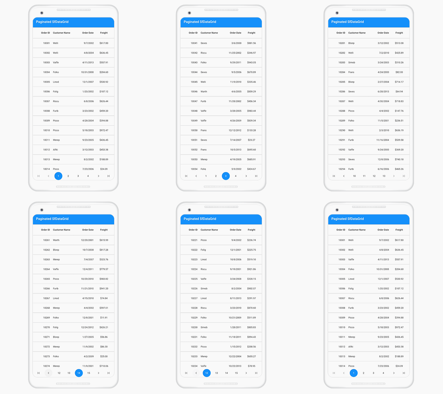
Paging is an important feature for loading large amounts of data and displaying it instantly in the DataGrid widget. It also provides easy navigation through the data. We at Syncfusion have developed the Syncfusion Flutter Data Pager widget to achieve pagination in the Flutter DataGrid widget. You can get this Data Pager in our 2020 Volume 3 release.
Let’s discuss in this blog how to integrate the SfDataPager with SfDataGrid and the customization options available in the Data Pager widget.
Integrating SfDataPager into SfDataGrid
Step 1: Include the Syncfusion Flutter DataGrid package dependency in the pubspec.yaml file of your project with the following code.
syncfusion_flutter_datagrid: ^18.3.35-betaStep 2: Import the DataGrid package in the main.dart file using the following code example.
import 'package:syncfusion_flutter_datagrid/datagrid.dart';Step 3: Create a common delegate for both the SfDataPager and SfDataGrid and do the following. Please note that, by default, DataGridSource is extended with the DataPagerDelegate.
- Set the SfDataGrid.DataGridSource to the SfDataPager.delegate property.
- Set the number of items that should be displayed in view by setting the SfDataPager.visibleItemsCount property.
- Override the SfDataPager.delegate.rowCount property and SfDataPager.delegate.handlePageChanges method in the SfDataGrid.DataGridSource.
- You can also load data for a specific page using the handlePageChanges method. This method is called for every page navigation in the Data Pager.
Refer to the following code example.
class OrderInfoDataSource extends DataGridSource<OrderInfo> {
  @override
  List<OrderInfo> get dataSource => paginatedDataSource;

  @override
  Object getValue(OrderInfo orderInfos, String columnName) {
    switch (columnName) {
      case 'orderID':
        return orderInfos.orderID;
        break;
      case 'customerID':
        return orderInfos.customerID;
        break;
      case 'freight':
        return orderInfos.freight;
        break;
      case 'orderDate':
        return orderInfos.orderData;
        break;
      default:
        return '';
        break;
    }
  }

  @override
  int get rowCount => orders.length;

  @override
  Future<bool> handlePageChange(int oldPageIndex, int newPageIndex,
      int startRowIndex, int rowsPerPage) async {
    int endIndex = startRowIndex + rowsPerPage;
    if (endIndex > orders.length) {
      endIndex = orders.length - 1;
    }

    paginatedDataSource = List.from(
        orders.getRange(startRowIndex, endIndex).toList(growable: false));
    notifyListeners();
    return true;
  }
}
Step 4: Create an instance of OrderInfoDataSource and assign it to DataGrid’s source and Data Pager’s delegate properties.
Refer to the following code example.
List<OrderInfo> orders = [];
List<OrderInfo> paginatedDataSource = [];

static const double dataPagerHeight = 60;

final _OrderInfoRepository _repository = _OrderInfoRepository();
final OrderInfoDataSource _orderInfoDataSource = OrderInfoDataSource();

@override
void initState() {
  super.initState();
  orders = _repository.getOrderDetails(300);
}

@override
Widget build(BuildContext context) {
  return MaterialApp(
      title: 'Paginated SfDataGrid',
      home: Scaffold(
        appBar: AppBar(
          title: Text('Paginated SfDataGrid'),
        ),
        body: LayoutBuilder(builder: (context, constraint) {
          return Column(
            children: [
              SizedBox(
                  height: constraint.maxHeight - dataPagerHeight,
                  width: constraint.maxWidth,
                  child: SfDataGrid(
                      source: _orderInfoDataSource,
                      columnWidthMode: ColumnWidthMode.fill,
                      columns: <GridColumn>[
                        GridNumericColumn(
                            mappingName: 'orderID', headerText: 'Order ID'),
                        GridTextColumn(
                            mappingName: 'customerID',
                            headerText: 'Customer Name'),
                        GridDateTimeColumn(
                            mappingName: 'orderDate',
                            headerText: 'Order Date'),
                        GridNumericColumn(
                            mappingName: 'freight', headerText: 'Freight'),
                      ])),
              Container(
                height: dataPagerHeight,
                color: Colors.white,
                child: SfDataPager(
                  delegate: _orderInfoDataSource,
                  rowsPerPage: 20,
                  direction: Axis.horizontal,
                ),
              )
            ],
          );
        }),
      ));
}
After executing this code example, we will get output like in the following GIF image.

Appearance customization of Data Pager
Data Pager allows you to customize the appearance of its elements using SfDataPagerThemeData in the SfDataPagerTheme property. To do this, the SfDataPager should be wrapped inside the SfDataPagerTheme.
Follow these steps to customize the Data Pager:
Step 1: Import the theme package in the main.dart file using the following code.
import 'package:syncfusion_flutter_core/theme.dart';Step 2: Add the SfDataPager widget inside the SfDataGridTheme like in the following code example.
@override
Widget build(BuildContext context) {
  return Scaffold(
    body: SfDataPagerTheme(
    data: SfDataPagerThemeData(
      itemColor: Colors.white,
      selectedItemColor: Colors.lightGreen,
      itemBorderRadius: BorderRadius.circular(5),
      backgroundColor: Colors.teal,
    ),
    child: SfDataPager(
      delegate: _orderInfoDataSource,
      rowsPerPage: 20,
      direction: Axis.horizontal,
    ),
  ));
}
After executing this code example, we will get output like in the following screenshot.

Conclusion
In this blog, we have seen the steps to integrate the Syncfusion Flutter DataGrid with the new Data Pager. This feature helps you to easily navigate to required data. You can get the complete source code for the example used in this blog in this GitHub repository.
So, try it out and leave your feedback in the comments section below!
Syncfusion Flutter widgets offer fast, fluid, and flexible widgets for creating high-quality apps for iOS, Android, and the web. Use them to enhance your productivity!
For existing customers, the new version is available for download from the License and Downloads page. If you are not yet a Syncfusion customer, you can try our 30-day free trial to check out our available features. Also, try our samples from this GitHub location.
You can also reach us through our support forums, Direct-Trac, or feedback portal. We are always happy to assist you!


