TL;DR: The Syncfusion React MultiColumn ComboBox introduces advanced multi-column dropdown functionality, complete with customizable layouts, sorting, virtualization, and additional features. Let’s delve into its exceptional capabilities and the steps to get started.
We’re delighted to introduce the new Syncfusion React MultiColumn ComboBox component in the Essential Studio® 2024 Volume 2 release.
The React MultiColumn ComboBox is a dropdown component that displays items in a detailed table-like format with multiple columns, offering more information than standard dropdown lists. It uses the Syncfusion Data Grid component, which allows for displaying and managing complex data structures in an organized and efficient manner. This makes it ideal for apps that require handling extensive datasets with ease.
Let’s explore this new component in detail!
Key features
The key features of the React MultiColumn ComboBox are as follows:
- Customized column layouts
- Organizing data with grouping
- Filtering
- Sorting
- Data virtualization
- Customizable templates
Customized column layouts
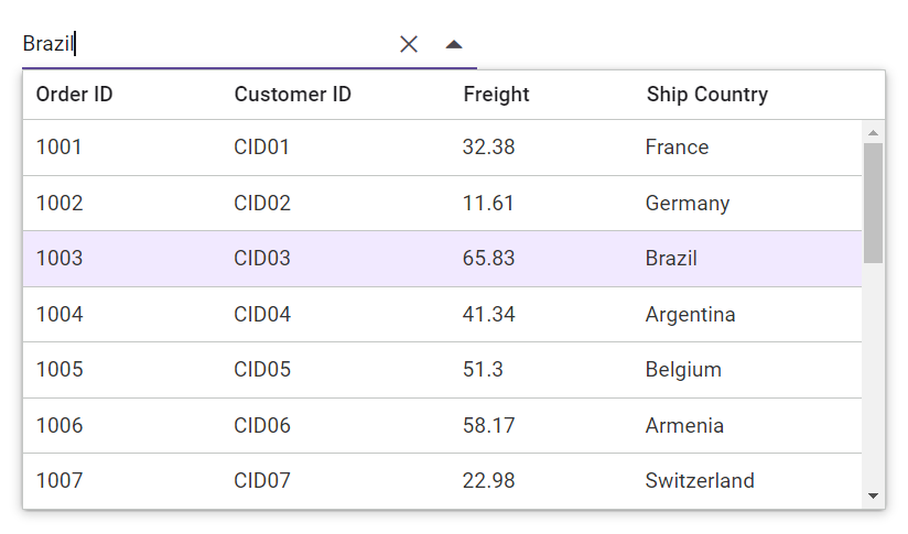
The React MultiColumn ComboBox allows us to customize the column layouts based on our specific needs. This feature enables data to be displayed across multiple columns, enhancing the user experience by presenting complex datasets in an organized manner and making it easier for users to navigate and select the required information.
Organizing data with grouping
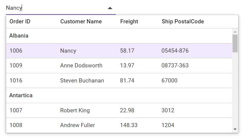
By organizing the data into groups, we can categorize related items and make navigation easier and quicker. This is particularly useful when dealing with large datasets, as grouping related items can save time when scrolling through longer lists.
Filtering
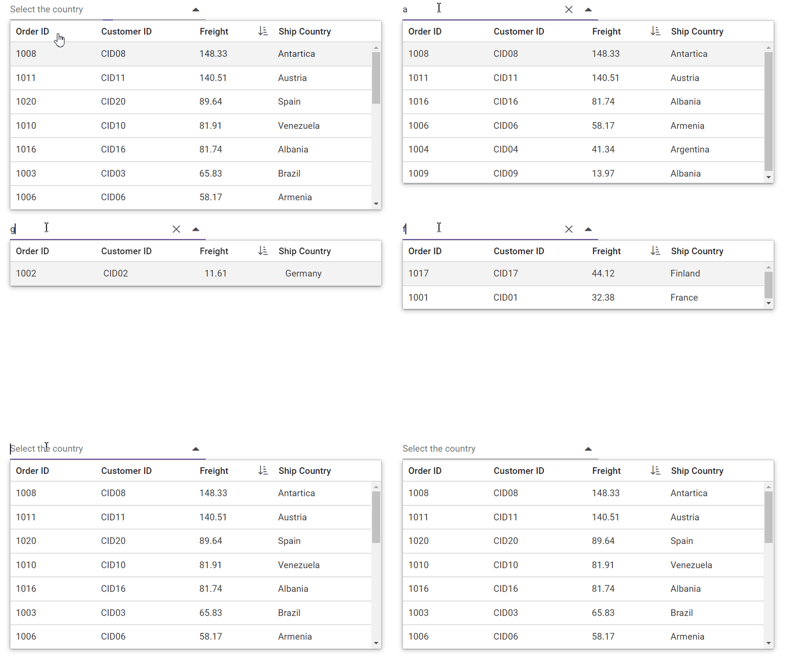
Filtering allows us to search for specific items within the MultiColumn ComboBox based on the text input. As users type into the input field, the component dynamically filters the data to display only those items that match the entered text. This helps users locate the desired information without scrolling through extensive lists.
Refer to the following image.
Sorting
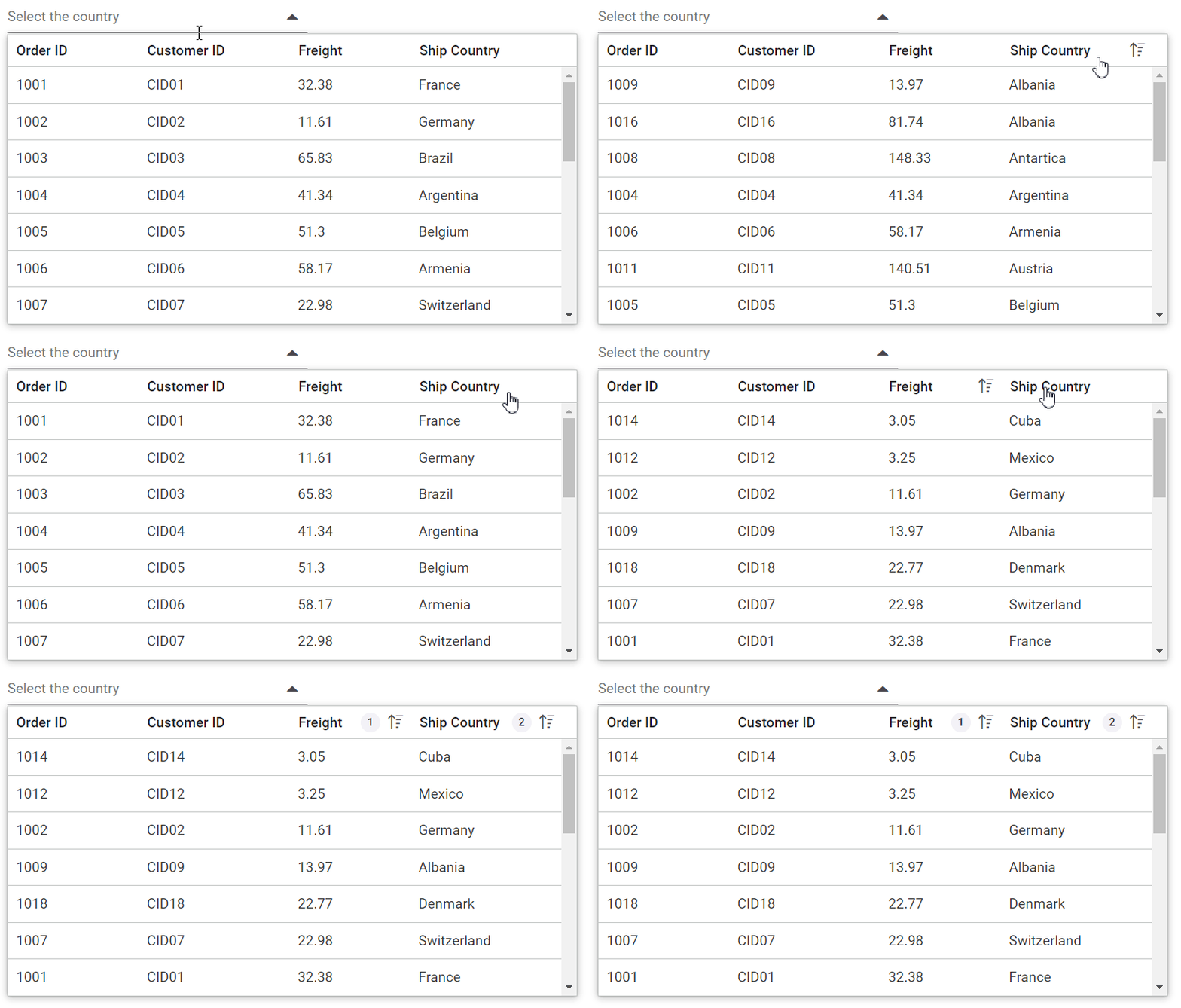
Sorting arranges data in a specific order (ascending or descending) based on column values. In the React MultiColumn ComboBox, sorting allows users to organize data alphabetically, numerically, or by any other relevant criteria defined for the columns. Clicking the column header for the first time sorts the column in ascending order, clicking it again sorts it in descending order, and a third click clears the sorting. The available sort types are:
- Single column sorting
- Multiple column sorting
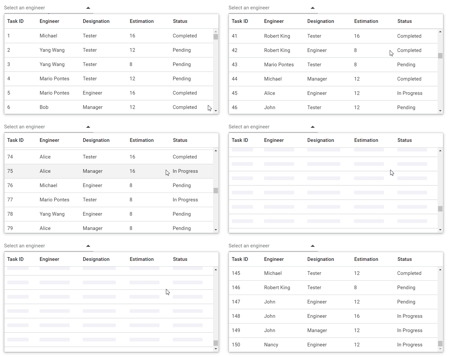
Data virtualization
This feature dynamically loads and displays data as the user scrolls or interacts with the component rather than loading the entire dataset at once. This significantly reduces the initial load time, making the component more responsive. It improves performance by efficiently managing memory and processing power, especially with large datasets.
Customizable templates
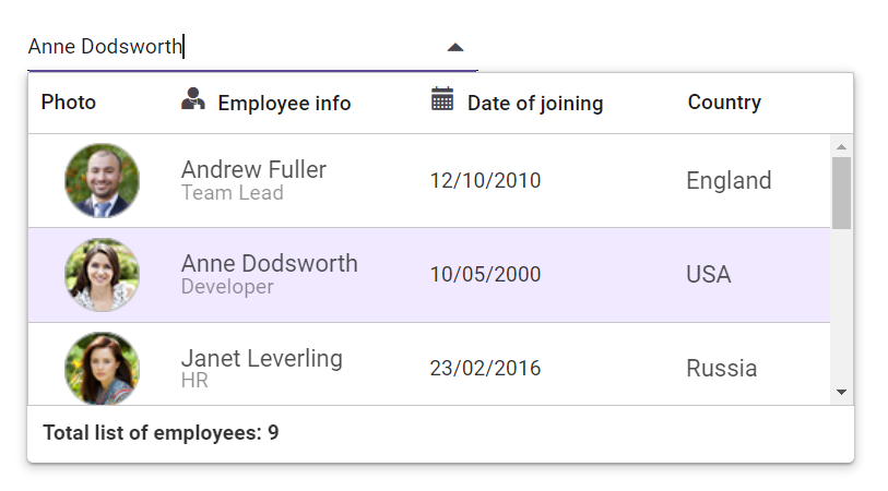
Customizable templates enable you to define how data should be displayed within the MultiColumn ComboBox. You can create templates for individual items, headers, and footers to provide a more customized and informative user interface. This ensures that the information is shown in a way that best suits your app’s needs.
Refer to the following image.
Supported platforms
We have introduced the new MultiColumn ComboBox component in the following platforms as part of the 2024 volume 2 release.
Platform | Demo | Documentation |
Getting started with the React MultiColumn ComboBox
We’ve seen the marvelous features of the React MultiColumn ComboBox component. Let’s see how to integrate it into our application.
Step #1: Create a new React app
First, create a new React app by installing the create-react-app NPM package in the desired location using the following command.
npx create-react-app my-appStep #2: Add the Syncfusion packages
The NPM public registry contains all the Syncfusion Essential JS 2 packages currently available. Use the following command to install the React MultiColumn ComboBox component.
npm install @syncfusion/ej2-react-multicolumn-combobox --saveStep #3: Add the CSS references for the Syncfusion React components
After installing the NPM package, the CSS files for the Syncfusion React components will be available in the ../node modules/@syncfusion package folder. Import the React MultiColumn ComboBox component’s required CSS references as follows in the src/App.css file.
@import "../node_modules/@syncfusion/ej2-base/styles/material3.css";
@import "../node_modules/@syncfusion/ej2-inputs/styles/material3.css";
@import "../node_modules/@syncfusion/ej2-popups/styles/material3.css";
@import "../node_modules/@syncfusion/ej2-grids/styles/material3.css";
@import "../node_modules/@syncfusion/ej2-react-multicolumn-combobox/styles/material3.css";
Step #4: Adding React MultiColumn ComboBox to the app
Now, import the MultiColumnComboBoxComponent from ej2- react-multicolumn-combobox package in the App.tsx file. Define each column using the ColumnDirective tag inside the ColumnsDirective tag, as shown in the following example.
import { MultiColumnComboBoxComponent, ColumnsDirective, ColumnDirective } from '@syncfusion/ej2- react-multicolumn-combobox';
import * as React from "react";
import * as ReactDOM from "react-dom";

function App() {
// Define the array of object data.
  const employeeData: Object[] = [
    { "EmpID": 1001, "Name": "Andrew Fuller", "Designation": "Team Lead", "Country": "England" },
    { "EmpID": 1002, "Name": "Robert", "Designation": "Developer", "Country": "USA" },
    { "EmpID": 1003, "Name": "John", "Designation": "Tester", "Country": "Germany" },
    { "EmpID": 1004, "Name": "Robert King", "Designation": "Product Manager", "Country": "India" },
    { "EmpID": 1005, "Name": "Steven Buchanan", "Designation": "Developer", "Country": "Italy" },
    { "EmpID": 1006, "Name": "Jane Smith", "Designation": "Developer", "Country": "Europe" },
    { "EmpID": 1007, "Name": "James Brown", "Designation": "Developer", "Country": "Australia" },
    { "EmpID": 1008, "Name": "Laura Callahan", "Designation": "Developer", "Country": "Africa" },
    { "EmpID": 1009, "Name": "Mario Pontes", "Designation": "Developer", "Country": "Russia" }
  ];
  // Maps the appropriate column to fields property.
  const fields: Object = { text: 'Name', value: 'EmpID' };
  return (
    <div id='timeline' style={{ height: "350px" }}>
      <MultiColumnComboBoxComponent dataSource={this.employeeData} fields={this.fields}>
           <ColumnsDirective>
              <ColumnDirective field='EmpID' header='Employee ID' width={120}></ColumnDirective>
 	      <ColumnDirective field='Name' header='Name' width={120}></ColumnDirective>
	      <ColumnDirective field='Designation' header='Designation' width={120}></ColumnDirective>
 	      <ColumnDirective field='Country' header='Country' width={100}></ColumnDirective>
          </ColumnsDirective>
      </MultiColumnComboBoxComponent>
    </div>
  );
}

const root = ReactDOM.createRoot(document.getElementById("element"));
root.render(<App />);
Step #5: Run the application
Finally, run the application in the browser using the following command.
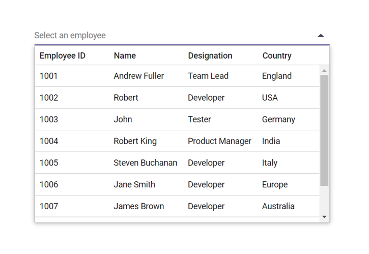
npm startRefer to the following image.

Explore the endless possibilities with Syncfusion’s outstanding React UI components.
Conclusion
Thanks for reading! We hope you enjoyed learning about the new Syncfusion React MultiColumn ComboBox and its features. This component is now available in our 2024 Volume 2 release. Check out our Release Notes and What’s New pages to discover all the new updates in this release. Try them out and share your thoughts in the comments section below!
The newest version of Essential Studio® is available on the license and downloads page for existing Syncfusion customers. If you are not a customer, try our 30-day free trial to test these new features.
You can also contact us through our support forums, support portal, or feedback portal. We are always happy to assist you!
Related blogs
- What’s New in React Gantt Chart: 2024 Volume 2
- Enhancing Your Application with GraphQL-Based CRUD Operations in React Grid
- Performance Optimization in React Pivot Table with Data Compression
- Visualize Customer Survey Reports Using React 3D Circular Charts [Webinar Show Notes]




Comments (1)
Any idea when Blazor support will be added ?