
 Saravanan G
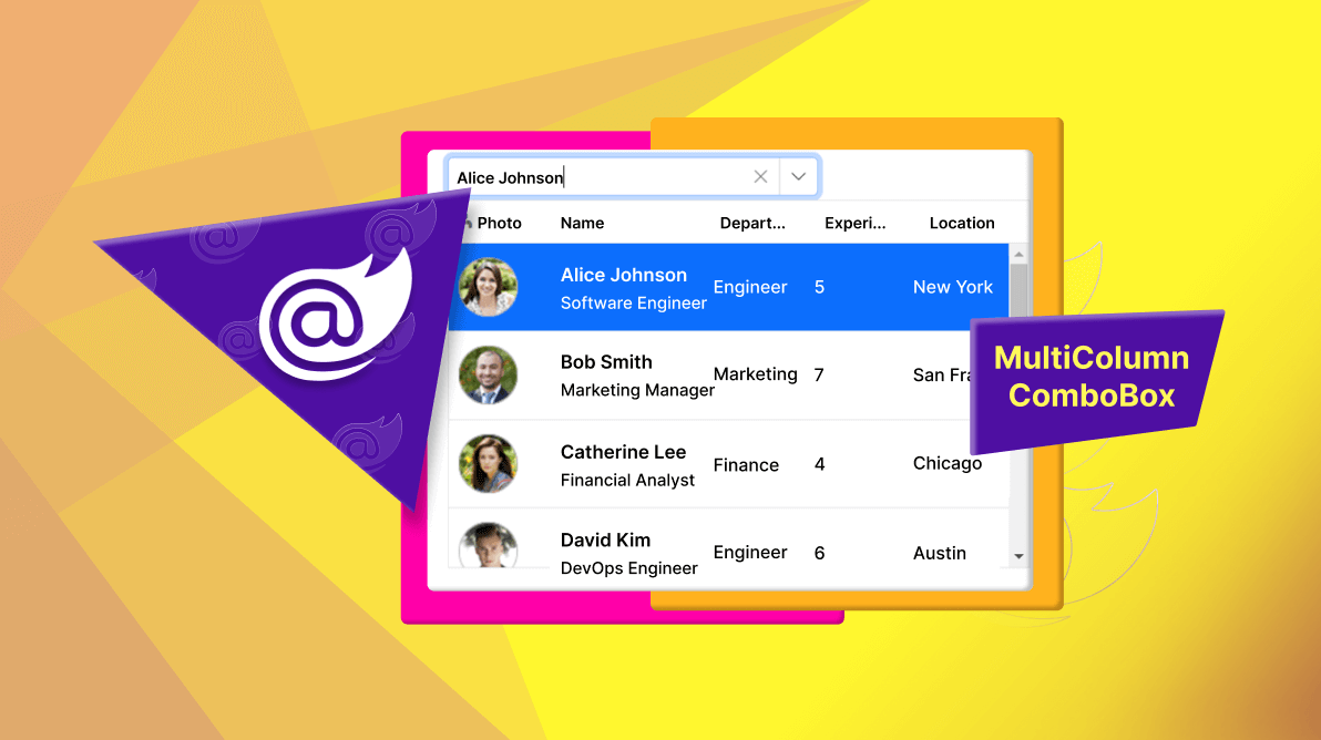
TL;DR: The Blazor MultiColumn ComboBox enhances dropdowns by displaying extra details, helping users make quicker, better choices. With smooth data binding, filtering, sorting, and customization, it simplifies data management and boosts user experience in your Blazor apps. Explore our guide to see how it can elevate your applications!
We are excited to introduce the Syncfusion Blazor MultiColumn ComboBox component, part of 2024 Volume 3 release. This component addresses the need for complex item selection with multi-column display, allowing users to view more contextual data within a single dropdown.
In this blog, we’ll explore the key features, use cases, and how it can enhance your Blazor applications. Let’s get started!
What is the MultiColumn ComboBox?
The MultiColumn ComboBox is an advanced dropdown list component that allows users to search and select items from a data-bound list. Unlike a traditional ComboBox, this component displays multiple columns in the dropdown, giving users more context about each item in the list. It is especially helpful when selecting an item requires additional information.
Example use case: Imagine a scenario where a user wants to select a product based on unit price and units in stock. A standard dropdown might not provide sufficient information at a glance. However, with the MultiColumn ComboBox, the user can see all relevant product details within the same list. You can even extend this view to include additional fields, such as units on order and discounts, ensuring users can make well-informed decisions.
Ease of use
The Blazor MultiColumn ComboBox is user-friendly. It offers quick data binding, auto-generated columns, and built-in features like filtering and sorting, all with minimal setup. It supports template customization and ensures smooth performance when handling large datasets through virtualization.
Note: For more detailed guidance, refer to our Getting Started with Blazor MultiColumn ComboBox documentation.
Key features
The Blazor MultiColumn ComboBox component boasts several key features.
- Data Binding
- Auto-Generated columns
- Column configurations
- Filtering
- Sorting
- Paging
- Grouping
- Virtualization
- Remote binding with Virtualization
- Template customization
- Form validation
Data Binding
The Blazor MultiColumn ComboBox allows you to bind data from various local and remote data sources, such as IEnumerable/List, RESTful services, OData services, and WCF services, using the DataSource API. It utilizes a data manager to handle data and allows for customization of data requests and processing.
You can bind a list of employee or customer details to the MultiColumn ComboBox using remote RESTful service calls, making it easier for users to select the right item without navigating through large datasets or complex lists.
Refer to the following code example.
@using Syncfusion.Blazor.MultiColumnComboBox
@using Syncfusion.Blazor.Data
<div class="col-lg-12 control-section">
<div class="control-wrapper">
<label class="example-label">Select an employee</label>
<SfMultiColumnComboBox TItem="EmployeeData" TValue="string" @bind-Value="@EmployeeValue"
ValueField="EmployeeID" TextField="FirstName"
PopupWidth="600px" Placeholder="e.g. Andrew">
<SfDataManager Url="https://blazor.syncfusion.com/services/production/api/Employees"
Offline="true"
CrossDomain="true"
Adaptor="Syncfusion.Blazor.Adaptors.WebApiAdaptor">
</SfDataManager>
</SfMultiColumnComboBox>
</div>
</div>
@code {
public string EmployeeValue { get; set; } = "Andrew";
public Query RemoteQuery = new Query();
public class EmployeeData
{
public int EmployeeID { get; set; }
public string FirstName { get; set; }
public string LastName { get; set; }
public string Country { get; set; }
}
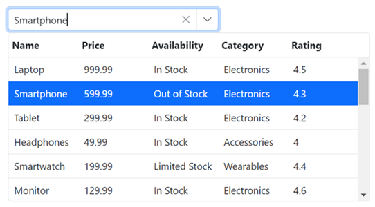
}Auto-Generated Columns
Customize the appearance of each column with a variety of options. The MultiColumn ComboBox supports auto-generating columns, which simplifies the process by automatically creating columns based on the data source. Additionally, you can modify the column header text to reflect specific data, adjust the column width for clear display, and set the column alignment (left, center, or right) to enhance readability and visual balance according to your application’s needs.
Refer to the following code example.
@using Syncfusion.Blazor.MultiColumnComboBox
<SfMultiColumnComboBox @bind-Value="@Value"
                       DataSource="@Products"
                       PopupWidth="600px"
                       ValueField="Name"
                       TextField="Name" Placeholder="Select any product"></SfMultiColumnComboBox>
@code {
    public class Product
    {
        public string Name { get; set; }
        public decimal Price { get; set; }
        public string Availability { get; set; }
        public string Category { get; set; }
        public double Rating { get; set; }
    }
    private List<Product> Products = new List<Product>();
    private string Value { get; set; } = "Smartphone";
    protected override Task OnInitializedAsync()
    {
        Products = new List<Product>
        {
            new Product { Name = "Laptop", Price = 999.99m, Availability = "In Stock", Category = "Electronics", Rating = 4.5 },
            new Product { Name = "Smartphone", Price = 599.99m, Availability = "Out of Stock", Category = "Electronics", Rating = 4.3 },
            new Product { Name = "Tablet", Price = 299.99m, Availability = "In Stock", Category = "Electronics", Rating = 4.2 }
        };
        return base.OnInitializedAsync();
    }
}
Refer to the following image.
Column configurations
The Blazor MultiColumn ComboBox allows you to customize how data is displayed based on your use case. You can define custom configurations for each column, enabling you to adjust the column width, text alignment, and header text and other options to meet your design requirements.
Column configurations offer the flexibility to achieve precise control over the UI layout, such as adjusting column widths to align with branding or UX guidelines.
Refer to the following code example.
<SfMultiColumnComboBox @bind-Value="@Value"
DataSource="@Products"
PopupWidth="600px"
ValueField="Name"
TextField="Name"
Placeholder="Select any product">
<MultiColumnComboboxColumns>
<MultiColumnComboboxColumn Field="Name"
Width="200px"
TextAlign="Syncfusion.Blazor.Grids.TextAlign.Center">
</MultiColumnComboboxColumn>
<MultiColumnComboboxColumn Field="Price"
Width="100px"
TextAlign="Syncfusion.Blazor.Grids.TextAlign.Center">
</MultiColumnComboboxColumn>
<MultiColumnComboboxColumn Field="Availability"
Width="100px"
TextAlign="Syncfusion.Blazor.Grids.TextAlign.Center">
</MultiColumnComboboxColumn>
</MultiColumnComboboxColumns>
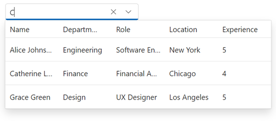
</SfMultiColumnComboBox>Filtering
Filtering allows users to narrow down the options in the MultiColumn ComboBox by typing a keyword into the input field. This feature significantly improves the user experience, especially when dealing with large datasets. It ensures that users can quickly find the desired item by applying search criteria with the support of the AllowFiltering API.
Refer to the following code example.
<SfMultiColumnComboBox DataSource="@Products"
                       AllowFiltering=true
                       ValueField="Name"
                       TextField="Name"
                       Placeholder="Select any product">
</SfMultiColumnComboBox>
Refer to the following image.
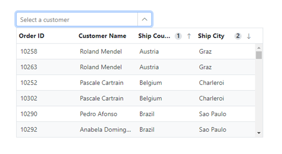
Sorting
The Blazor MultiColumn ComboBox allows users to sort rows in either ascending or descending order by simply clicking the header of a column. Users can sort data in multiple columns by holding the Ctrl key while clicking the header. This feature enables users to organize complex datasets more effectively, with the support of the AllowSorting and AllowMultiSorting properties.
Refer to the following code example.
<SfMultiColumnComboBox TValue="string"
                       TItem="OrderDetails"
                       DataSource="@Orders"
                       ValueField="Name"
                       TextField="OrderId"
                       AllowSorting=true
                       AllowMultiSorting="true">
</SfMultiColumnComboBox>
Refer to the following image.
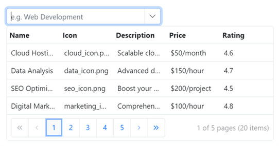
Paging
The component offers built-in support for managing large datasets through its paging feature. It can handle large data collections by breaking them into manageable pages, thereby enhancing performance and improving the user experience. In addition, by enabling the AllowPaging property, we can customize the page size and page count.
Refer to the following code example.
<SfMultiColumnComboBox TItem="Service"
                       TValue="string"
                       Placeholder="e.g. Web Development"
                       AllowPaging=true
                       PageSize=5
                       PageCount=10
                       ValueField="Name"
                       TextField="Name">
</SfMultiColumnComboBox>
Refer to the following image.
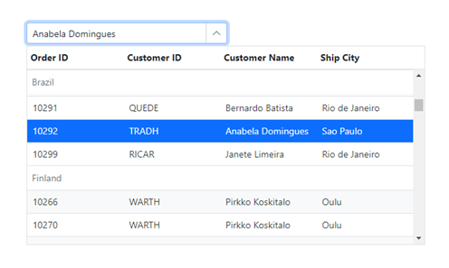
Grouping
Organize items into categories within the MultiColumn ComboBox while configuring the GroupByField property. Grouping related items together allows users to filter and select items more efficiently.
Refer to the following code example.
<SfMultiColumnComboBox TValue="string"
                       TItem="OrderDetails"
                       DataSource="@Orders"
                       ValueField="Name"
                       TextField="OrderId"
                       GroupByField="Country">
</SfMultiColumnComboBox>
Refer to the following image.
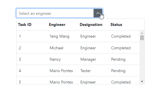
Virtualization
Virtualization enhances performance by rendering only the items visible in the viewport. For large datasets, this ensures that the UI remains responsive, even when thousands of items are managed through the EnableVirtualization property.
Refer to the following code example.
<SfMultiColumnComboBox TValue="string"
                       TItem="Employee"
                       DataSource="@EmployeeDetails"
                       ValueField="TaskId"
                       TextField="Name"
                       EnableVirtualization=true>
</SfMultiColumnComboBox>
Refer to the following image.
Remote binding with Virtualization
The Blazor MultiColumn ComboBox supports remote data binding, which allows developers to fetch data from external APIs or remote servers. This capability is beneficial for handling large datasets. When combined with virtualization, this feature ensures optimal performance by loading only the items visible in the viewport, reducing the load on both the server and the browser. This approach provides end users with a smooth and responsive experience, even when dealing with vast amounts of data.
Refer to the following code example.
<SfMultiColumnComboBox TItem="OrderDetails"
                       TValue="string"
                       EnableVirtualization=true
                       ValueField="CustomerID"
                       TextField="CustomerID"
                       Width="500px">
    <SfDataManager Url="https://blazor.syncfusion.com/services/production/api/Orders"
                   CrossDomain="true"
                   Adaptor="Syncfusion.Blazor.Adaptors.WebApiAdaptor" />
</SfMultiColumnComboBox>

@code {
    public class OrderDetails
    {
        public int? OrderID { get; set; }
        public string CustomerID { get; set; }
        public int? EmployeeID { get; set; }
        public double? Freight { get; set; }
        public string ShipCity { get; set; }
    }
}
Template Customization
The Blazor MultiColumn ComboBox provides template customization options, enabling users to modify the appearance of the popup list for a unique and personalized interface. You can customize key elements such as column headers, columns, footer, and the no-record template, allowing for a more flexible design.
Refer to the following code example.
<SfMultiColumnComboBox TItem="Employee"
                       TValue="string"
                       DataSource="@Employees"
                       ValueField="Id"
                       TextField="Name"
                       Placeholder="Select an employee">
    <MultiColumnComboboxColumns>
        <MultiColumnComboboxColumn Field="EmployeeID" Width="80px">
            <HeaderTemplate>
                <div>
                    <span class="e-icon-userlogin e-icons employee"></span> Photo
                </div>
            </HeaderTemplate>
            <Template>
                @{
                    var EmployeeInfo = (context as Employee);
                    <div class="image">
                        <img src="@(SampleService.WebAssetsPath)images/multicolumn-combobox/employees/@(EmployeeInfo.EmployeeID).png" alt="@EmployeeInfo.EmployeeID" />
                    </div>
                }
            </Template>
        </MultiColumnComboboxColumn>
        <MultiColumnComboboxColumn Field="Name" Width="120px">
            <Template>
                @{
                    var EmployeeInfo = (context as Employee);
                    <div class="ename"> @EmployeeInfo.Name </div>
                    <div class="job"> @EmployeeInfo.Role </div>
                }
            </Template>
        </MultiColumnComboboxColumn>
        <MultiColumnComboboxColumn Field="Department" Width="80px" />
        <MultiColumnComboboxColumn Field="Experience" Width="80px" />
        <MultiColumnComboboxColumn Field="Location" Width="80px" />
    </MultiColumnComboboxColumns>
</SfMultiColumnComboBox>
Refer to the following image.

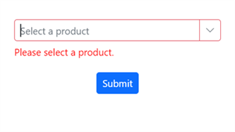
Form Validation
Data Binding
Form validation ensures that the data entered by the user is valid before submission. The Blazor MultiColumn ComboBox integrates seamlessly with Blazor’s EditForm validation mechanisms, helping maintain data integrity and providing useful feedback to users.
Refer to the following code example.
<EditForm Model="@ProductModel"
          OnValidSubmit="@OnValidSubmit"
          OnInvalidSubmit="@OnInvalidSubmit">
    <DataAnnotationsValidator />
    <SfMultiColumnComboBox @bind-Value="@ProductModel.Name"
                           DataSource="@Products"
                           ValueField="Name"
                           TextField="Name"
                           Placeholder="Select any product"
                           PopupWidth="600px">
    </SfMultiColumnComboBox>
    <ValidationMessage For="()=>ProductModel.Name" />
    <div class="submit-btn">
        <SfButton type="submit" IsPrimary="true">Submit</SfButton>
    </div>
</EditForm>
Refer to the following image.
References
For more details, refer to the Blazor MultiColumn ComboBox Component demos and documentation.

Conclusion
Thank you for exploring the new MultiColumn ComboBox component introduced in the 2024 Volume 3 release. Dive into this powerful control and share your valuable feedback in the comments section. Visit our Release Notes and What’s New pages for a comprehensive view of all updates in this release.
Existing Syncfusion users can access the most recent version of Essential Studio® on the License and Downloads page. If you’re new to Syncfusion, we offer a 30-day free trial to test these exciting new features.
For further assistance, don’t hesitate to reach out through our support forum, support portal, or feedback portal. We are always happy to assist you!
Related blogs
- Introducing the AI-Powered Smart Blazor Components and Features
- What’s New in Blazor: 2024 Volume 3
- Syncfusion Essential Studio 2024 Volume 3 Is Here!
- Effortlessly Visualize and Manage Data with Blazor TreeView


 No spam, just valuable updates.