TL;DR: Discover how to visualize Gen Z’s favorite social media platforms using Syncfusion .NET MAUI Column Chart with Neumorphism. Learn to gather data, configure the chart, and apply Neumorphic styling to create a modern, tactile UI for your app!
Welcome to this week’s edition of the Chart of the Week series!
In today’s blog, we’ll dive into an exciting project where we combine the aesthetic appeal of Neumorphism with the power of data visualization. We’ll build a Neumorphic Column Chart to showcase Gen Z’s favorite social media platforms using the Syncfusion .NET MAUI Column Chart.
This guide will walk you through creating a visually appealing and responsive column chart with a modern Neumorphic design. This chart is perfect for apps that aim to provide an engaging user experience. By the end of this tutorial, you can integrate this beautiful chart into your own .NET MAUI apps, bringing data to life in a stylish and interactive way.
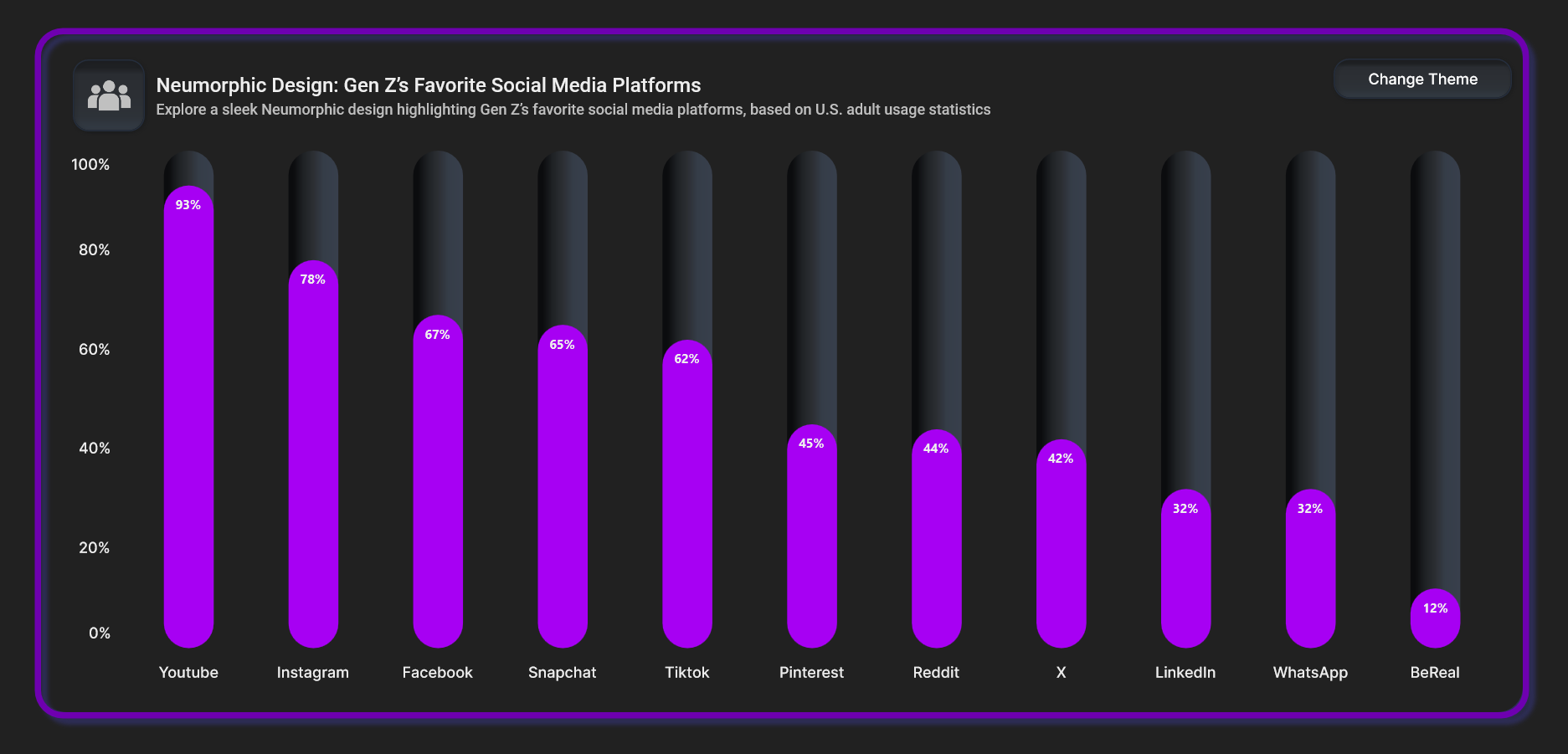
Refer to the following image.
Why Neumorphism?
Neumorphism is a modern design trend that blends minimalism with soft, subtle shadows to create a tactile, almost physical appearance for UI elements. It focuses on using soft edges and gentle highlights to add depth to flat interfaces. This design style brings a sense of realism while maintaining a clean and minimalist aesthetic. Neumorphism helps create a smooth, modern user experience while keeping the design simple and intuitive.
Let’s dive in!
Step 1: Gathering the data
To start, we need reliable data on Gen Z’s favorite social media platforms.
Step 2: Preparing the data for the chart
The next step is to structure the data so that the chart can use it. This involves creating a Model class to represent each data point (the platform and its popularity) and a ViewModel class to handle the collection of these data points.
Create the SocialMediaPlatform class with the Name and Popularity properties to represent each social media platform and their popularity percentage. Refer to the following code example.
public class SocialMediaPlatform
{
    public string Name { get; set; }
    public double Popularity { get; set; }
}
Next, configure the SocialMediaAppInfo class to create a collection of the app’s data along with its popularity, and store it in an observable collection using the ApplicationData property. Refer to the following code example.
public class SocialMediaAppInfo
{
    public ObservableCollection<SocialMediaPlatform> ApplicationData { get; set; }

    public SocialMediaAppInfo()
    {
        ApplicationData = new ObservableCollection<SocialMediaPlatform>()
        {
            new SocialMediaPlatform() {Name = "Youtube", Popularity = 93},
            new SocialMediaPlatform() {Name = "Instagram", Popularity = 78},
            new SocialMediaPlatform() {Name = "Facebook", Popularity = 67},
            new SocialMediaPlatform() {Name = "Snapchat", Popularity = 65},
            new SocialMediaPlatform() {Name = "Tiktok", Popularity = 62},
            new SocialMediaPlatform() {Name = "Pinterest", Popularity = 45},
            new SocialMediaPlatform() {Name = "Reddit", Popularity = 44},
            new SocialMediaPlatform() {Name = "X", Popularity = 42},
            new SocialMediaPlatform() {Name = "LinkedIn", Popularity = 32},
            new SocialMediaPlatform() {Name = "WhatsApp", Popularity = 32},
            new SocialMediaPlatform() {Name = "BeReal", Popularity = 12},
        };
    }
}
Step 3: Configuring the Syncfusion .NET MAUI Column Chart
Now that the data is ready in the ViewModel, the next step is to configure the Syncfusion .NET MAUI Column Chart to display it.
First, configure the Syncfusion .NET MAUI Cartesian Charts control using this documentation.
Then, on your XAML page, define the ColumnSeries and bind it to the data from the ViewModel. Refer to the following code example.
<ContentPage xmlns:local="clr-namespace:GenZFavouriteSocialMedia"
             xmlns:chart="clr-namespace:Syncfusion.Maui.Toolkit.Charts;assembly=Syncfusion.Maui.Toolkit">

    <ContentPage.BindingContext>
        <local:SocialMediaAppInfo/>
    </ContentPage.BindingContext>

    <chart:SfCartesianChart>

        <chart:SfCartesianChart.Title>
            <HorizontalStackLayout>
                <VerticalStackLayout VerticalOptions="Center">
                    <Label Text="Neumorphic Design: Gen Z’s Favorite Social Media Platforms"/>
                    <Label "Explore a sleek Neumorphic design highlighting Gen Z’s favorite social media platforms, based on U.S. adult usage statistics"/>
                </VerticalStackLayout>
            </HorizontalStackLayout>
        </chart:SfCartesianChart.Title>

        <chart:SfCartesianChart.XAxes>
            <chart:CategoryAxis LabelPlacement="BetweenTicks"/>
        </chart:SfCartesianChart.XAxes>

        <chart:SfCartesianChart.YAxes>
            <chart:NumericalAxis Maximum="100" Minimum="0" Interval="20">
                <chart:NumericalAxis.LabelStyle>
                    <chart:ChartAxisLabelStyle LabelFormat="0'%"/>
                </chart:NumericalAxis.LabelStyle>
            </chart:NumericalAxis>
        </chart:SfCartesianChart.YAxes>

        <chart:ColumnSeries x:Name="columnSeries" ItemsSource="{Binding ApplicationData}" XBindingPath="Name" EnableAnimation="True" YBindingPath="Popularity" ShowDataLabels="True">
        </chart:ColumnSeries>
    </chart:SfCartesianChart>
</ContentPage>
In the above code example:
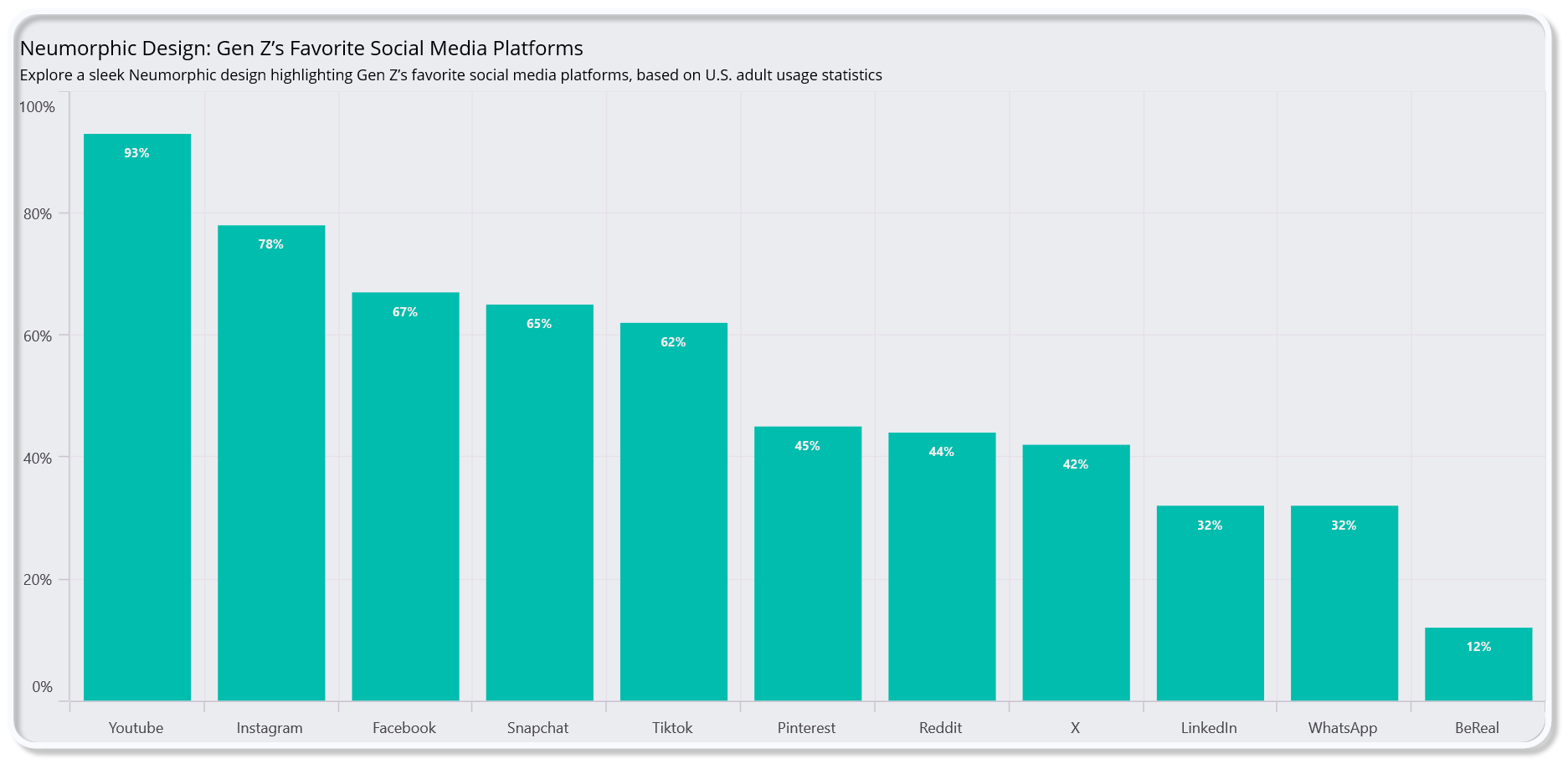
- We’ve bound the chart’s series ItemsSource property to the ApplicationData collection from the SocialMediaAppInfo.
- The XBindingPath is bound to the Name property of each platform, and the YBindingPath is bound to the Popularity property, which determines the height of the columns.
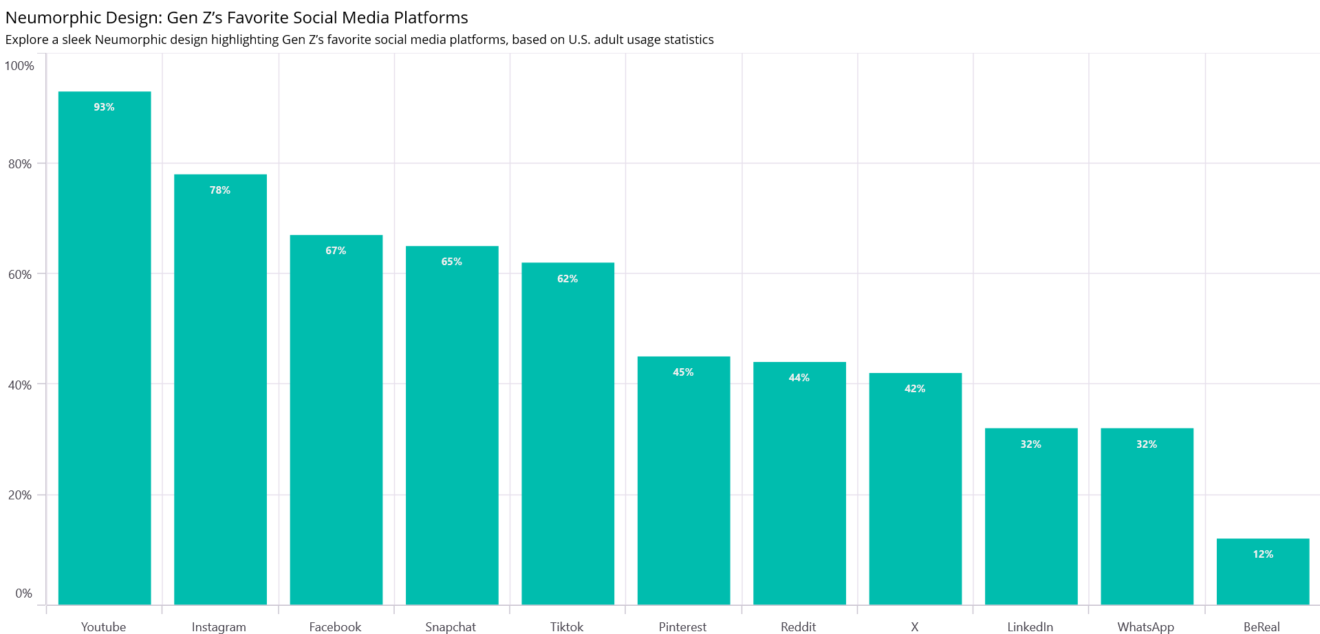
- The title was provided with a description using the view, and the view was then applied to the Chart’s Title. Refer to the following image.
Step 4: Creating the Neumorphic view for the .NET MAUI Column Chart
To enhance the visual appearance of your chart with a neumorphic design, we’ll use the SfNeumorphismDrawer class. It inherits from an Element and implements the IDrawable interface. This allows it to define custom drawing logic for the Neumorphism effect, including shadows, rounded corners, and stroke styling.
The class includes various BindableProperties, which makes it highly customizable from the XAML or C# code. These properties are used to define the appearance of the Neumorphic effect, such as shadow color, padding, stroke width, and more.
Refer to the following code example.
public class SfNeumorphismDrawer : Element, IDrawable
{
    public static readonly BindableProperty BackgroundProperty = BindableProperty.Create(nameof(Background), typeof(Brush), typeof(SfNeumorphismDrawer), defaultValue: new SolidColorBrush(Colors.Transparent));

    public Brush Background
    {
        get { return (Brush)GetValue(BackgroundProperty); }
        set { SetValue(BackgroundProperty, value); }
    }

    //Implemented remaining styling properties

    public void Draw(ICanvas canvas, RectF dirtyRect)
    {
       //To create the Background and Shadow effect
       canvas.SetShadow(ShadowOffset, ShadowBlur, ShadowColor.WithAlpha(0.5f));
       canvas.SetFillPaint(Background, paddingRect);
       canvas.FillRoundedRectangle(paddingRect, cornerRadius);

       //To create the stroke effect for the content view
       var strokeRect = new RectF() { Left = paddingRect.Left - StrokeWidth / 2, Top = paddingRect.Top - StrokeWidth / 2, Right = paddingRect.Right + StrokeWidth / 2, Bottom = paddingRect.Bottom + StrokeWidth / 2 };
       canvas.StrokeColor = Stroke.Color;
       canvas.StrokeSize = StrokeWidth;
       canvas.DrawRoundedRectangle(strokeRect, cornerRadius);
    }
}
In the above code example, we’ve used the following properties:
- Background: The color or gradient applied to the background of the neumorphic view.
- Stroke: The color of the border surrounding the view.
- ShadowColor: The color of the shadow that creates the raised or inset effect.
- ShadowOffset: The position of the shadow relative to the view.
- ShadowBlur: The degree of blur applied to the shadow for a softer appearance.
- CornerRadius: The roundness of the corners.
- Padding: The space inside the neumorphic container around the chart.
By adjusting these properties, you can customize the neumorphic look to fit your design, creating a polished user experience for the chart.
This neumorphic view will be placed around the chart to give it a sleek, stylish appearance as we proceed to the next phase of implementation.
Step 5: Creating and customizing the neumorphic content view for the .NET MAUI Column Chart
Encapsulate the chart within a Neumorphic-styled container to elevate its visual appeal further. The SfNeumorphicContentView class provides a modern design aesthetic with soft shadows, rounded corners, and depth, achieved through custom drawing. It acts as a container to apply a neumorphic style to any content placed inside it, enhancing UI design.
Key features
- Drawable property: Binds to an instance of SfNeumorphismDrawer to render the neumorphic effect.
- Content property: Holds the child element (e.g., a chart) placed inside the container.
- GraphicsView integration: Handles the rendering of neumorphic effects for smooth visuals.
Embedding the .NET MAUI Column Chart in NeumorphicContentView
To create a seamless integration of the .NET MAUI Column Chart within the neumorphic container, refer to the following code example.
<ContentPage.Resources>
    <local:SfNeumorphismDrawer x:Name="outer" Background="#EBECF0" Stroke="#F8FAFD" StrokeWidth="5" ShadowColor="Gray" CornerRadius="20" x:Key="outerView"/>
</ContentPage.Resources>

<local:SfNeumorphicContentView Drawable="{StaticResource outerView}">
    <Grid Margin="{Binding Padding, Source={x:Reference outer}}">
        <chart:SfCartesianChart>
                 . . . .
                 . . . .
        </chart:SfCartesianChart>
    </Grid>
</local:SfNeumorphicContentView>
Refer to the following image.
Step 6: Creating neumorphic column segments
To fully customize the look of the column segments in your chart with a neumorphic style, we need to extend the default ColumnSeries and ColumnSegment classes. This step involves creating the SfNeumorphismColumnSeries and SfNeumorphismColumnSegment classes to draw the columns with neumorphic effects.
Explanation of the custom classes
- SfNeumorphismColumnSeries class:
- Inherits from the ColumnSeries.
- Adds a Drawable property of type SfNeumorphismDrawer to apply styling to each segment.
- Overrides the CreateSegment method to return SfNeumorphismColumnSegment, which customizes how each segment is drawn.
- SfNeumorphismColumnSegment class:
- Inherits from the ColumnSegment.
- Uses the SfNeumorphismDrawer to draw the background for each column.
- Overrides the Draw method to customize the drawing of the column, applying the neumorphic effect defined in the Drawable.
Refer to the following code example.
public class SfNeumorphismColumnSeries : ColumnSeries
{
     public SfNeumorphismDrawer Drawable
     {
         get { return (SfNeumorphismDrawer)GetValue(DrawableProperty); }
         set { SetValue(DrawableProperty, value); }
     }

     protected override ChartSegment CreateSegment()
     {
         return new SfNeumorphismColumnSegment(Drawable);
     }
}

public class SfNeumorphismColumnSegment : ColumnSegment
{
     private SfNeumorphismDrawer Drawable;

     public SfNeumorphismColumnSegment(SfNeumorphismDrawer drawable)
     {
         Drawable = drawable;
     }
}
Integration with the .NET MAUI Column Chart
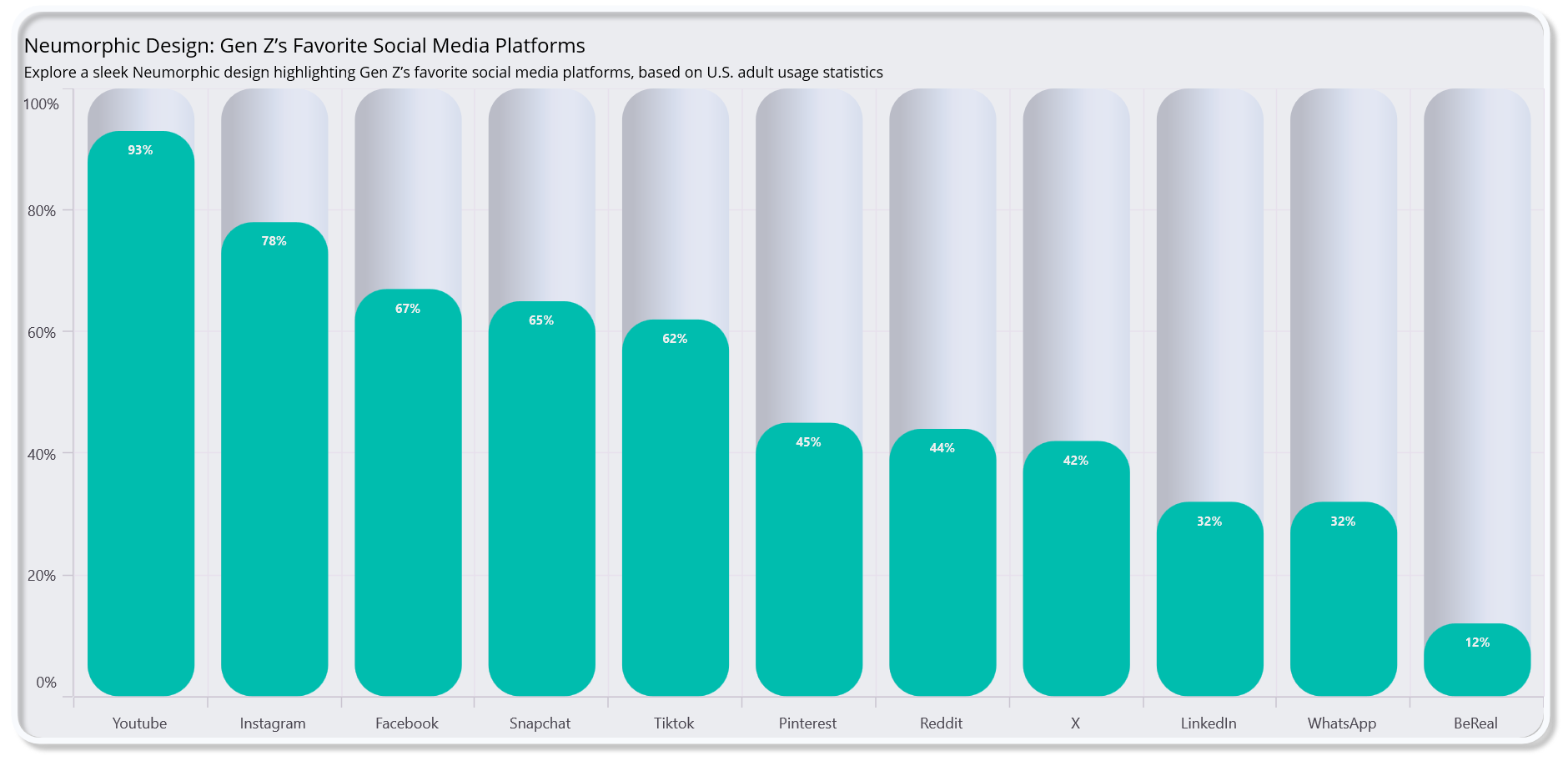
To use this custom series in our chart, replace the regular ColumnSeries with the SfNeumorphismColumnSeries and set the Drawable property to match your neumorphic styling.
<ContentPage.Resources>
  <local:SfNeumorphismDrawer x:Name="column" Background="{StaticResource LightSeriesBackground}" CornerRadius="25" x:Key="columndrawer"/>
</ContentPage.Resources>

<local:SfNeumorphicContentView Drawable="{StaticResource outerView}">
  <Grid Margin="{Binding Padding, Source={x:Reference outer}}">
    <chart:SfCartesianChart>
       . . . .
       . . . .
       <local:SfNeumorphismColumnSeries Drawable="{StaticResource columndrawer}" x:Name="columnSeries" ItemsSource="{Binding ApplicationData}" XBindingPath="Name" EnableAnimation="True" CornerRadius="{Binding CornerRadius,Source={x:Reference column}}"  YBindingPath="Popularity" ShowDataLabels="True"/>
    </chart:SfCartesianChart>
  </Grid>
</local:SfNeumorphicContentView>
Refer to the following image.
Step 7: Customizing the title with a neumorphic view
To complete the neumorphic theme, we’ll add an icon with a neumorphic design to the chart’s title using the NeumorphicContentView. This will give the title a soft look with the icon’s rounded effect and shadows and a subtle light/dark contrast, fitting seamlessly with the chart design.
Refer to the following code example.
<ContentPage.Resources>
  <local:SfNeumorphismDrawer x:Name="title" Background="{StaticResource LightTitleBackground}" ShadowColor="Gray" x:Key="titleView"/>
</ContentPage.Resources>

<local:SfNeumorphicContentView>
  <Grid>
    <chart:SfCartesianChart>
       <chart:SfCartesianChart.Title>
          <HorizontalStackLayout>
             <local:SfNeumorphicContentView Drawable="{StaticResource titleView}"
                <Path Data="{Binding Path}"/>
             </local:SfNeumorphicContentView>
             <VerticalStackLayout VerticalOptions="Center">
                <Label Text="Neumorphic Design: Gen Z’s Favorite Social Media Platforms"/>
                <Label Text="Explore a sleek Neumorphic design highlighting Gen Z’s favorite social media platforms, based on U.S. adult usage statistics"/>
              </VerticalStackLayout>
           </HorizontalStackLayout>
        </chart:SfCartesianChart.Title>
       . . . .
       . . . .
   </Grid>
 </local:SfNeumorphicContentView>
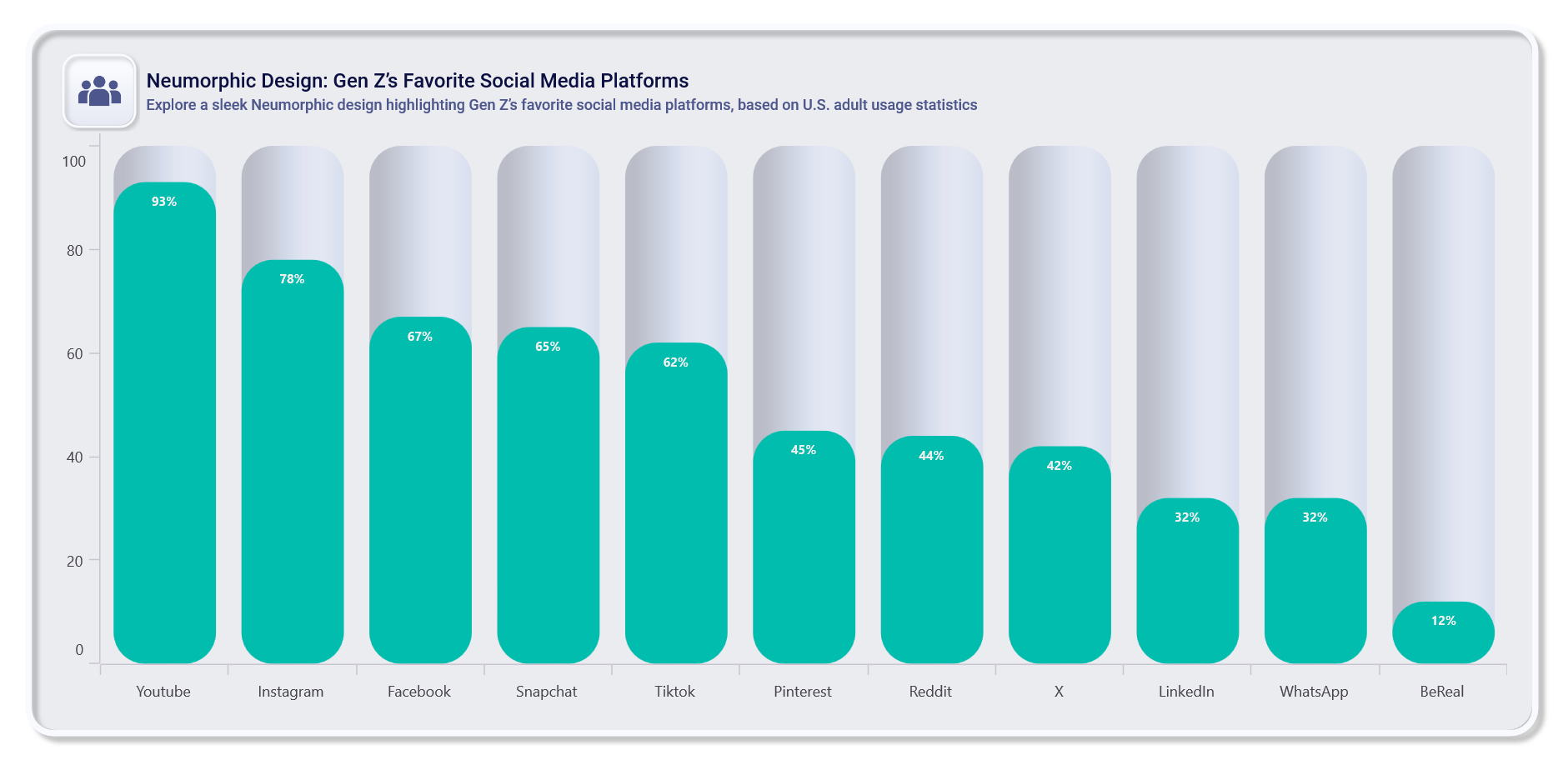
Refer to the following image.
Step 8: Customizing the chart elements
Now we’ve set up the neumorphic chart, and the next step is to refine the chart’s appearance by customizing additional elements such as Series properties, axis styles, and other chart elements. This ensures the entire chart aligns with the theme for a cohesive design.
<chart:SfCartesianChart.XAxes>
  <chart:CategoryAxis ShowMajorGridLines="False">
    <chart:CategoryAxis.AxisLineStyle>
       <chart:ChartLineStyle StrokeWidth="0"/>
    </chart:CategoryAxis.AxisLineStyle>
    <chart:CategoryAxis.MajorTickStyle>
       <chart:ChartAxisTickStyle StrokeWidth="0"/>
    </chart:CategoryAxis.MajorTickStyle>
    <chart:CategoryAxis.LabelStyle>
       <chart:ChartAxisLabelStyle TextColor="#0B0F41" FontSize="{OnPlatform Android=11}" FontFamily="InterMedium"/>
    </chart:CategoryAxis.LabelStyle>
  </chart:CategoryAxis>
</chart:SfCartesianChart.XAxes>

 . . . .
 . . . .
 . . . .
<local:SfNeumorphismColumnSeries CornerRadius="{Binding CornerRadius, Source={x:Reference column}}" Width="0.6" Spacing="0.2">
</local:SfNeumorphismColumnSeries>
Refer to the following image.
Step 9: Implementing theme changes
Finally, to make the chart adaptable to both light and dark themes, we’ll use the AppThemeBinding property. This allows the chart and its elements to adjust dynamically based on the current theme of the app, providing a consistent and seamless user experience. The neumorphic design adapts by changing background colors, shadow colors, and other properties to suit the light or dark mode.
By using AppThemeBinding, we have ensured that key properties such as the background color, shadow color, and stroke are responsive to theme changes.
Refer to the following code example.
<local:SfNeumorphismDrawer Background="{AppThemeBinding Light='#EBECF0',Dark='#212121'}"
                           Stroke="{AppThemeBinding Light='#F8FAFD', Dark='#6E00B0'}"
                           ShadowColor="{AppThemeBinding Light=Gray,Dark='#3A3A3A90'}"
                           ShadowOffset="{AppThemeBinding Light='5,5', Dark='5,5'}"/>
Adding a neumorphic button for theme toggling
To switch between light and dark themes, we’ll add the SfButton control styled with a neumorphic effect. When clicked, this button changes the current theme of the app.
<local:SfNeumorphicContentView Drawable="{StaticResource titleView}">
    <button:SfButton Text="Change Theme" TextColor="{AppThemeBinding Dark='#FFFFFF',Light='#0B0F41'}" Clicked="SfButton_Clicked"/>
</local:SfNeumorphicContentView>
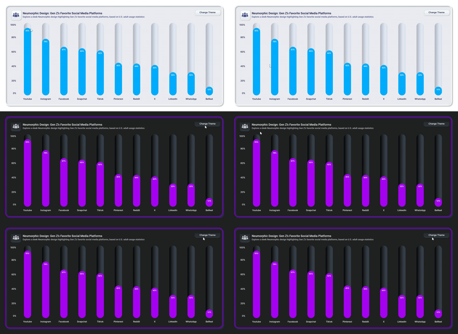
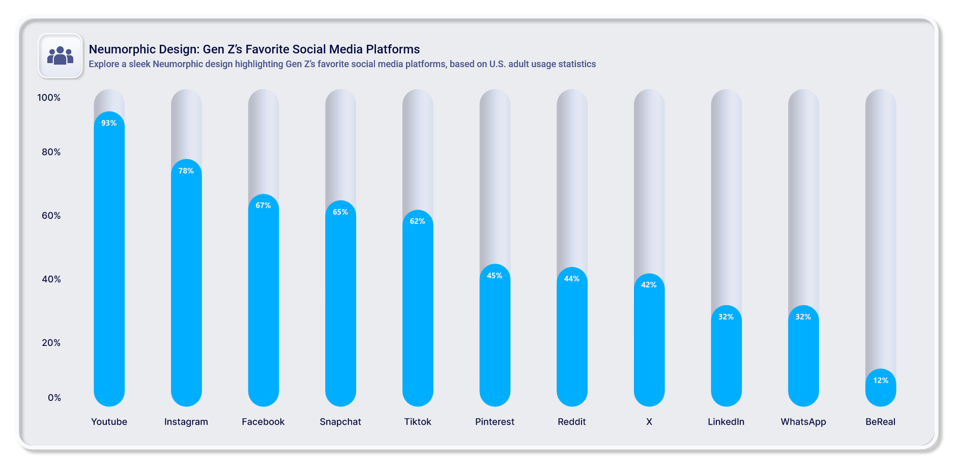
With these implementations, the chart and button maintain a consistent neumorphic design while seamlessly switching between light and dark themes.
Refer to the following output image.
GitHub reference
For more details, refer to the project on GitHub.

Supercharge your cross-platform apps with Syncfusion's robust .NET MAUI controls.
Conclusion
Thanks for reading! In this blog post, we’ve explored how to build a neumorphic column chart to visualize Gen Z’s favorite social media platforms using the Syncfusion .NET MAUI Column Chart. We strongly encourage you to follow the steps discussed in this blog and share your thoughts in the comments below.
If you require any assistance, you can contact us through our support forums, support portal, or feedback portal. We are always happy to help!



Comments (1)
Fantastic post! Thank you for sharing as well as using real-world data analytics