Introduction
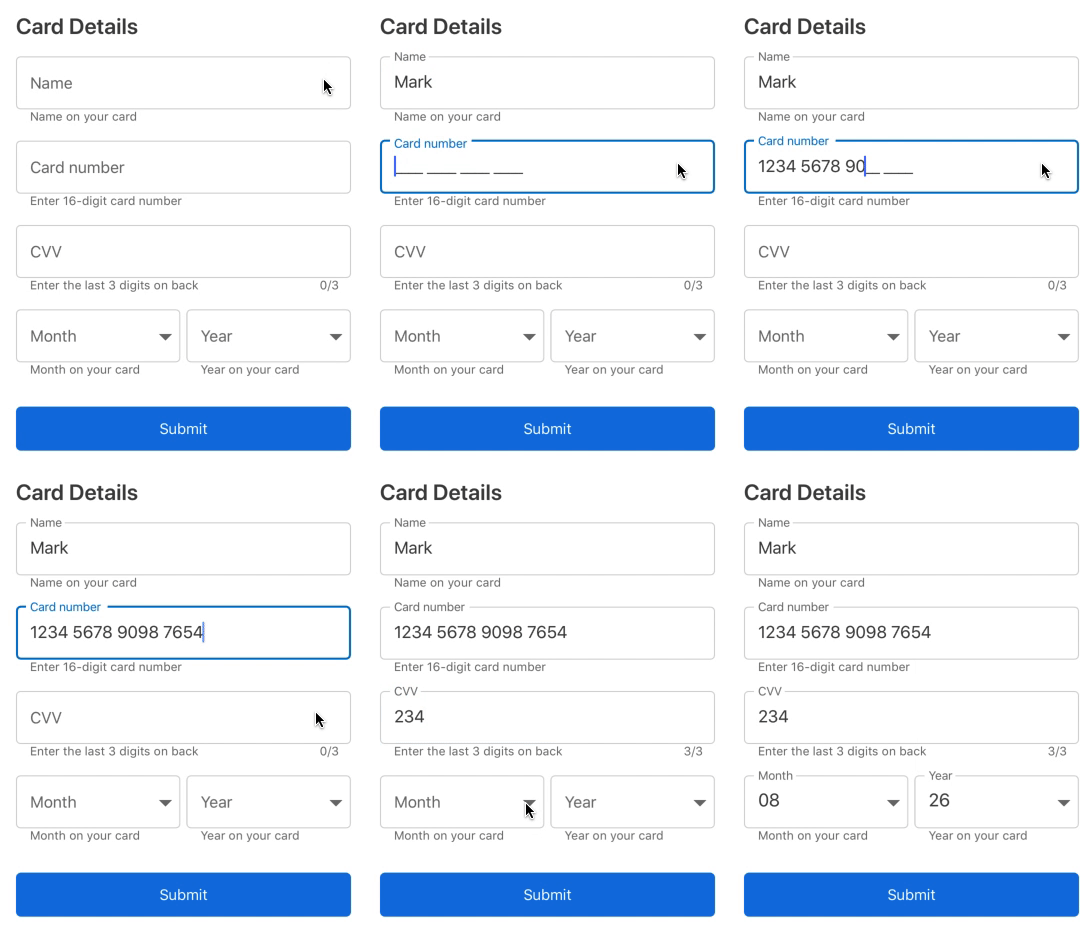
Input views with floating labels are now everywhere in mobile applications. They are little wizards that provide hints based on expected input. Once focused, the beautifully animated hints make way for actual input. This not only modernizes the look of a mobile application, it also enhances the user experience of form-filling by showing hints and error messages in an intuitive way.
In native Android applications, this is something that can be achieved using Text Input Layout, which is available in the Android design support library, but there are no such components or APIs available in Xamarin.Forms. You can write a custom renderer to achieve this in Xamarin.Forms.Android using text input layout, but this is not possible in other major platforms such as iOS and UWP.
Considering the importance of this UI in modern mobile applications, we created a unique component known as Text Input Layout for Xamarin.Forms. It’s a layout control that accepts various input views as content. It provides all the functionalities of a native text input layout and, of course, much more!

Text Input Layout
Features
Important features of the text input layout are:
- Different container types.
- Helper text, error text, and a character counter.
- Password toggling.
- Leading and trailing views.
- Availability in iOS, Android, and UWP.
| Note: Refer to our “Adding SfTextInputLayout reference” section to learn more about the initial configurations needed to use the text input layout. |
Container types
There are 3 container types such as filled, outlined and none to match the appearance of your application.
Filled
<inputLayout:SfTextInputLayout
    Hint="Name"
    ContainerType="Filled">
    <Entry Text="John" />
</inputLayout:SfTextInputLayout>

Filled
Outlined
<inputLayout:SfTextInputLayout
    Hint="Name"
    ContainerType="Outlined">
    <Entry Text="John" />
</inputLayout:SfTextInputLayout>

Outlined
None
<inputLayout:SfTextInputLayout
    Hint="Name"
    ContainerType="None">
    <Entry Text="John" />
</inputLayout:SfTextInputLayout>
None
Refer to the Container type section to learn more about different container types.
Helper text, error text and character counter
Helper and error text are essential to all types of form-filling. It is important to communicate to users what type of input is expected, and it’s important to show error messages when input is not in the expected format.
In the text input layout, you can provide helper and error messages using the HelperText and ErrorText properties. Initially, the helper message will be shown below the line.
<inputLayout:SfTextInputLayout
    Hint="Email"
    HelperText="Enter your name"
    ErrorText="Name required*"
    HasError="false">
    <Entry />
</inputLayout:SfTextInputLayout>

Helper text
When HasError is changed to true, the helper message will be replaced by an error message.
Error text
Additionally, you may use ShowCharCount and CharMaxLength to show the current character count and to specify the maximum characters you expect. When a user inputs more than the maximum characters, an error state will be intimated through a color change.
<inputLayout:SfTextInputLayout
    Hint="Password"
    HelperText="Enter 5 to 8 characters"
    ShowCharCount="true"
    CharMaxLength="8">
    <Entry />
</inputLayout:SfTextInputLayout>

Maximum character count
Refer to the Adding assistive labels section to learn more about the assistive labels.
Password toggling
The Entry control in Xamarin.Forms can be used to enter passwords by using the IsPassword property. However, in modern-day applications, having an interactive button that toggles the password visibility is essential. To achieve this, you can use the EnablePasswordVisibilityToggle property of the text input layout. This will enable a toggle button that can be used to show or hide password characters. The value of the IsPassword property is internally handled based on the current state of the toggle button.
<inputLayout:SfTextInputLayout
    Hint="Password"
    HelperText="Enter 5 to 8 characters"
    ShowCharCount="true"
    CharMaxLength="8"
    EnablePasswordVisibilityToggle="true">
    <Entry />
</inputLayout:SfTextInputLayout>

Password toggling
Refer to the Enabling password visibility toggle section to learn more about this.
Leading and trailing views
It is possible to add a leading icon to indicate input types, such as birth date, phone number, or password. And you can use a trailing icon to add a clear button, error icon, voice input icon, drop-down icon, etc.
<inputLayout:SfTextInputLayout
    Hint="Birth date"
    HelperText="Enter your date of birth"
    LeadingViewPosition="Outside"
    TrailingViewPosition="Inside"
    ContainerType="Outlined">
    <Entry />
    <inputLayout:SfTextInputLayout.LeadingView>
       <Label
           <!--Font icon-->
           Text="FontIcon">
       </Label>
    </inputLayout:SfTextInputLayout.LeadingView>
    <inputLayout:SfTextInputLayout.TrailingView>
      <Label
         <!--Font icon-->
         Text="FontIcon">
      </Label>
    </inputLayout:SfTextInputLayout.TrailingView>
 </inputLayout:SfTextInputLayout>
Leading and trailing views
Refer this section to know more details about this.
Advanced for more controls
Until the release of Essential Studio® 2019, Volume 1, the text input layout supported the following controls alone, and the syntax for all of them was similar to the Entry control, as shown in the previous code listings. You can refer to the “Supported input views” section to learn more about using these other controls.

Supported controls
From Volume 2, 2019, we have extended this support for the below-mentioned controls.
Autocomplete and ComboBox
The Autocomplete and ComboBox controls are essential items for form-filling UIs. They are highly optimized to quickly load and populate suggestions from a large volume of data depending on users’ input.
Due to the number of requests from our customers, we have provided text input layout support for these controls.
| Note: To access List, add the namespace xmlns:ListCollection=”clr namespace:System.Collections.Generic;assembly=netstandard”. Also, refer to the SfComboBox “Getting Started” section to learn about the initial configurations needed to use the combobox control. |
         <inputLayout:SfTextInputLayout ContainerType="Outlined" Hint="Categories">
             <combobox:SfComboBox IsEditableMode="true">
                 <combobox:SfComboBox.ComboBoxSource>
                     <ListCollection:List x:TypeArguments="x:String">
                         <x:String>Electronics</x:String>
                         <x:String>Fashion</x:String>
                         <x:String>Grocery</x:String>
                         <x:String>TVs and Appliances</x:String>
                         <x:String>Home and Furnitures</x:String>
                     </ListCollection:List>
                 </combobox:SfComboBox.ComboBoxSource>
             </combobox:SfComboBox>
         </inputLayout:SfTextInputLayout>
Text input layout with combobox
Refer to the SfComboBox user guide to learn more about the available features in the combobox control.
Similar to the combobox, you can also use the autocomplete control as an input view.
         <inputLayout:SfTextInputLayout ContainerType="Outlined" Hint="Categories">
             <autocomplete:SfAutoComplete>
                 <autocomplete:SfAutoComplete.AutoCompleteSource>
                     <ListCollection:List x:TypeArguments="x:String">
                         <x:String>Electronics</x:String>
                         <x:String>Fashion</x:String>
                         <x:String>Grocery</x:String>
                         <x:String>TVs and Appliances</x:String>
                         <x:String>Home and Furnitures</x:String>
                     </ListCollection:List>
                 </autocomplete:SfAutoComplete.AutoCompleteSource>
             </autocomplete:SfAutoComplete>
         </inputLayout:SfTextInputLayout>
Text input layout with autocomplete
Refer to the SfAutoComplete user guide to learn more about the available features in the autocomplete control.
DataForm
The Xamarin DataForm control is a data-oriented component used to display and edit the properties of any data object using a wide range of built-in editors for different data types. It simplifies the development of various forms, such as login, reservation, and data entry.
We have extended support for the text input layout to the DataForm control in our latest release. The rich features of the DataForm, along with the modern UI of the text input layout, make the user experience of form-filling hassle-free.
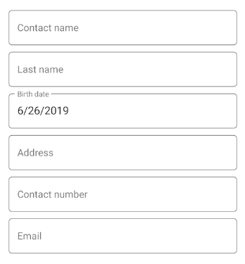
The default value of LayoutOptions is Default, which will render the DataForm items in an old style. To change the DataForm items to a text input layout style, set LayoutOptions to TextInputLayout.
| Note: Refer to the “SfDataForm” section to learn about the initial configurations needed to use the DataForm control. |
View:
<dataForm:SfDataForm LayoutOptions="TextInputLayout"
                     DataObject="{Binding ContactInfo}" />
Model:
    public class ContactInfo : INotifyPropertyChanged
    {
        private string contactName;

        private string lastName;

        private DateTime birthDate = DateTime.Now;

        private string address;

        private string contactNo;

        private string email;

        public event PropertyChangedEventHandler PropertyChanged;

        [Display(ShortName = "Contact name")]
        public string ContactName
        {
            get
            {
                return this.contactName;
            }

            set
            {
                this.contactName = value;
                this.RaisePropertyChanged("ContactName");
            }
        }

        [Display(ShortName = "Last name")]
        public string LastName
        {
            get
            {
                return this.lastName;
            }

            set
            {
                this.lastName = value;
                this.RaisePropertyChanged("LastName");
            }
        }

        [Display(ShortName = "Birth date")]
        public DateTime BirthDate
        {
            get
            {
                return this.birthDate;
            }

            set
            {
                this.birthDate = value;
                this.RaisePropertyChanged("BirthDate");
            }
        }

        public string Address
        {
            get
            {
                return this.address;
            }

            set
            {
                this.address = value;
                this.RaisePropertyChanged("Address");
            }
        }

        [Display(ShortName = "Contact number")]
        public string ContactNumber
        {
            get
            {
                return this.contactNo;
            }

            set
            {
                this.contactNo = value;
                this.RaisePropertyChanged("ContactNumber");
            }
        }

        public string Email
        {
            get
            {
                return this.email;
            }

            set
            {
                this.email = value;
                this.RaisePropertyChanged("Email");
            }
        }

        private void RaisePropertyChanged(string name)
        {
            if (this.PropertyChanged != null)
            {
                this.PropertyChanged(this, new PropertyChangedEventArgs(name));
            }
        }
    }
View model:
    public class ViewModel
    {
        private ContactInfo contactInfo;
        public ContactInfo ContactInfo
        {
            get { return this.contactInfo; }
            set { this.contactInfo = value; }
        }
        public ViewModel()
        {
            this.contactInfo = new ContactInfo();
        }
    }

Dataform with text input layout
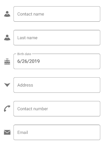
If you are an existing user of the DataForm control, then you already known about AutoGeneratingDataFormItem, which is used to customize DataFormItem. Similarly, you can use this event for customizing the appearance of the text input layout using TextInputLayoutSettings and direct properties of DataFormItem.
        private void OnAutoGeneratingDataFormItem(object sender, AutoGeneratingDataFormItemEventArgs e)
        {
            if (e.DataFormItem.Name.Equals("Email"))
            {
                e.DataFormItem.TextInputLayoutSettings = new TextInputLayoutSettings()
                {
                    .......
                    LeadingView = new Label()
                    {
                        Text = "A",
                        FontFamily = "ContactsIcons.ttf#ContactsIcons"
                    .......
                };
            }
        }

Dataform with customized text input layout
Conclusion
In this post, we walked through working with the Text Input Layout and its supported input components, which include the Autocomplete, ComboBox, and DataForm controls. We invite you to check out our other Xamarin.Forms components. You’ll find complete documentation online for all features.
You can always download our free evaluation to see all these components in action. Also, explore samples in our GitHub repository. Ready-to-evaluate samples are available on Google Play and Microsoft Store.
If you have any questions or require clarification, please let us know in the comments section. You can also contact us through our support forum, Direct-Trac, or our Feedback Portal. As always, we are happy to assist you!


Comments (4)
[…] Modernize Xamarin.Forms DataForm, Autocomplete and ComboBox using Text Input Layout (Mohamed Samsudeen) […]
Android platform does not require any additional configuration to render the text input layout control.
Yes. For Android platform, you need not to configure any additional steps like UWP and iOS.
https://help.syncfusion.com/xamarin/text-input-layout/getting-started#ios
Are you facing any issues related to this?
This section explains the steps required to configure the text input layout control with floating label. Syncfusion also provides Xamarin Toolbox. Using this toolbox, you can drag the SfTextInputLayout control to the XAML page. It will automatically install the required NuGet packages and add the namespace to the page. To install Syncfusion Xamarin Toolbox, refer to Toolbox .