
TL;DR: Let’s see how to build an interactive 3D Column Chart using the .NET MAUI Toolkit to visualize America’s top 10 most popular sports. We’ll structure data, configure the charts control, and enhance visuals with custom labels and tooltips. The 3D effect adds depth, making data more engaging and insightful. Elevate your app’s data visualization with the .NET MAUI Toolkit!
Welcome to the Chart of the Week blog series!
In this blog, we’ll visualize America’s top 10 most popular sports using the Syncfusion .NET MAUI Toolkit 3D Column Chart!
Syncfusion .NET MAUI Toolkit is a comprehensive, open-source library available for free. Its open-source flexibility ensures both adaptability and cost-efficiency, making it an attractive option for those looking to integrate sophisticated UI components. Explore the Syncfusion .NET MAUI Toolkit controls to transform your app development process and deliver exceptional user experiences.
Syncfusion .NET MAUI Toolkit Charts: From data to insightful visuals
Syncfusion .NET MAUI Toolkit Charts control offers a wide range of chart types, including column, bar, line charts and more. Designed for efficiency, these controls handle large datasets seamlessly while providing interactive, customizable visualizations. With features such as data binding, tooltips, and live updates, developers can create engaging charts that are easy to understand and use.
Visualizing America’s favorite sports using .NET MAUI Toolkit 3D Column Chart
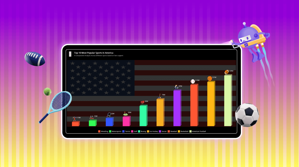
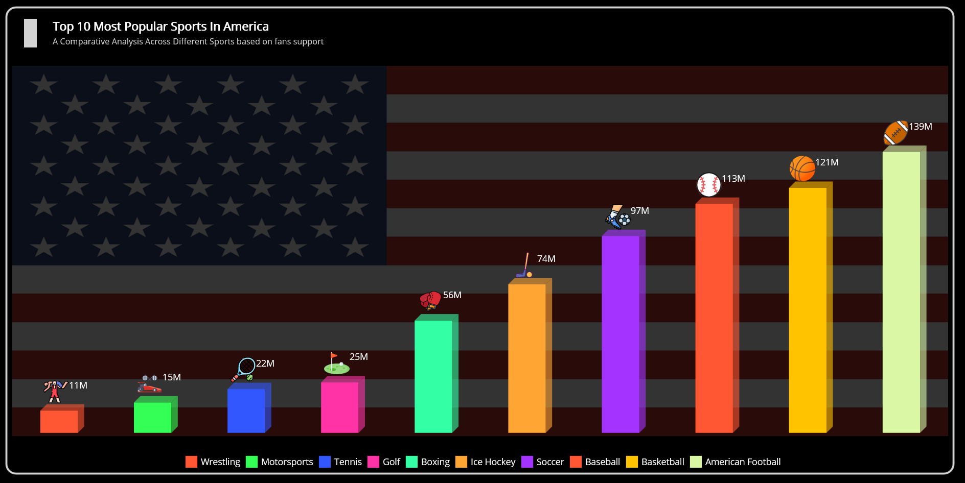
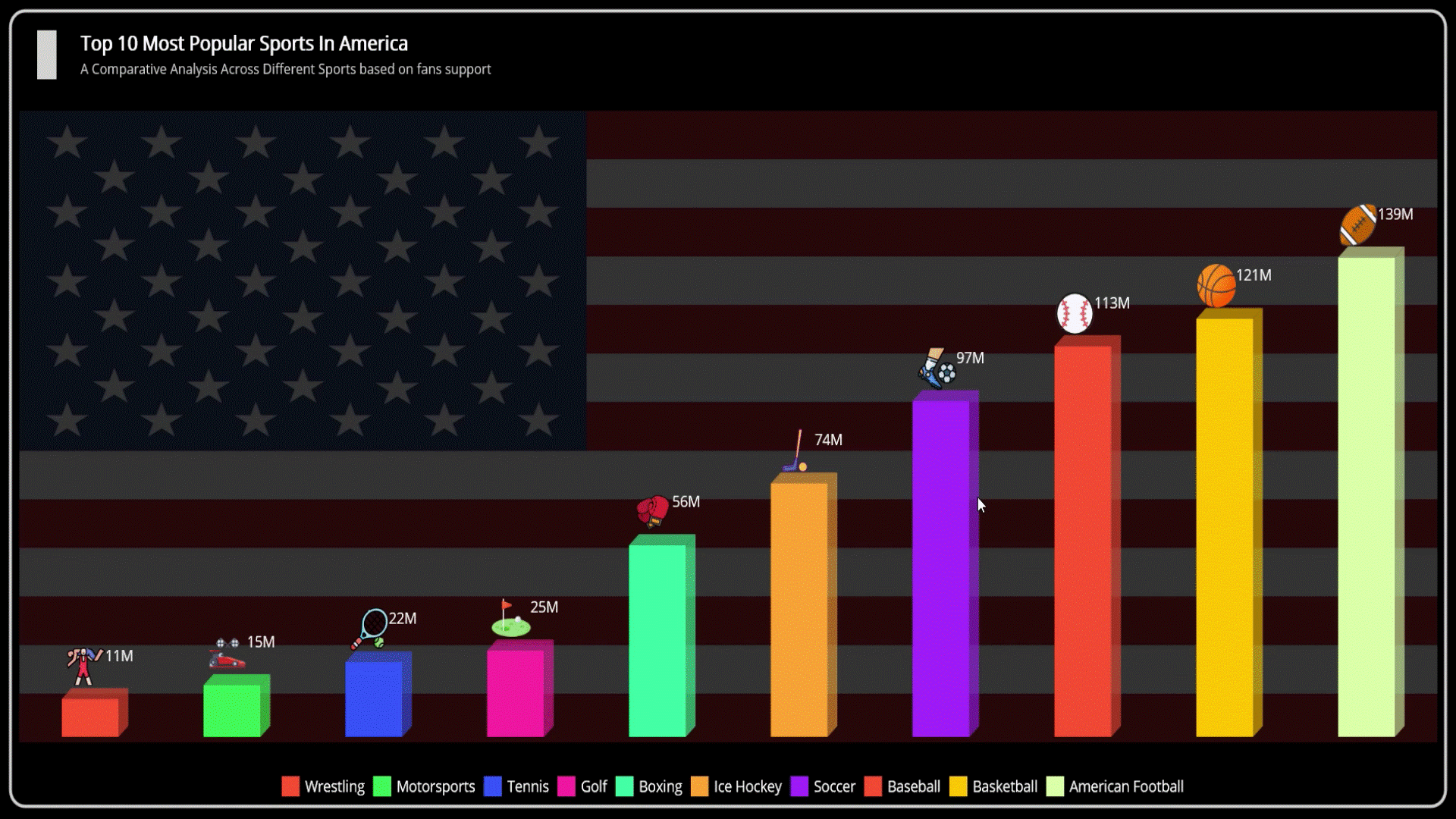
3D charts elevate data visualization by adding depth and perspective, making them ideal for representing complex information. The 3D column chart, in particular, offers dynamic interactions and attractive presentations.
In this blog, we’ll use this chart to visualize America’s popular sports by categorizing sports based on fan support counts. Enhancements such as customized data labels and tooltips further improve clarity and engagement.
Refer to the following image.
Let’s get started!
Step 1: Collecting data
First, we will gather data on fan support distribution across America’s top sports, focusing on popularity and engagement metrics.
Step 2: Preparing the data for the chart
Before creating the 3D Column Chart, it’s essential to structure the data properly. This involves defining the AmericaSportsModel class with the required properties to hold the details.
public class AmericaSportsModel
{
    public string Name { get; set; }
    public double Value { get; set; }
    public Color Color1 { get; set; }
    public string ImageName { get; set; }

    public AmericaSportsModel(string name, double value, string imageName, Color color)
    {
        Name = name;
        Value = value;
        Color1 = color;
        ImageName = imageName;
    }
}
Then, define the AmericaSportsViewModel class to manage data manipulation and communication between the model and the .NET MAUI 3D Column Chart.
public class AmericaSportsViewModel
{
    public List<AmericaSportsModel> SportsData { get; set; }
    public ObservableCollection<Brush> PaletteBrushes { get; set; }

    public AmericaSportsViewModel()
    {
        PaletteBrushes = new ObservableCollection<Brush>()
        {
            new SolidColorBrush(Color.FromArgb("#FF5733")), // Vibrant Red
            new SolidColorBrush(Color.FromArgb("#33FF57")), // Bright Green
            new SolidColorBrush(Color.FromArgb("#3357FF")), // Bright Blue
            new SolidColorBrush(Color.FromArgb("#FF33A6")), // Hot Pink
            new SolidColorBrush(Color.FromArgb("#33FFA5")), // Aquamarine
            new SolidColorBrush(Color.FromArgb("#FFA533")), // Golden Orange
            new SolidColorBrush(Color.FromArgb("#A533FF")), // Vivid Purple
            new SolidColorBrush(Color.FromArgb("#FF5733")), // Vibrant Red
            new SolidColorBrush(Color.FromArgb("#FFC300")), // Bright Yellow
            new SolidColorBrush(Color.FromArgb("#DAF7A6"))  // Light Green
        };

        SportsData = new List<AmericaSportsModel>()
        {
            new AmericaSportsModel("Wrestling", 11, "lifting.png", Color.FromArgb("#FF5733")),
            new AmericaSportsModel("Motorsports", 15, "racingcar.png", Color.FromArgb("#33FF57")),
            new AmericaSportsModel("Tennis", 21.64, "tennis.png", Color.FromArgb("#3357FF")),
            new AmericaSportsModel("Golf", 25, "golf.png", Color.FromArgb("#FF33A6")),
            new AmericaSportsModel("Boxing", 55.6, "boxinggloves.png", Color.FromArgb("#33FFA5")),
            new AmericaSportsModel("Ice Hockey", 73.5, "hockeystick.png", Color.FromArgb("#FFA533")),
            new AmericaSportsModel("Soccer", 97.4, "soccerplayer.png", Color.FromArgb("#A533FF")),
            new AmericaSportsModel("Baseball", 113.3, "baseball.png", Color.FromArgb("#FF5733")),
            new AmericaSportsModel("Basketball", 121.2, "basketball.png", Color.FromArgb("#FFC300")),
            new AmericaSportsModel("American Football", 139, "americanfootball.png", Color.FromArgb("#DAF7A6"))
        };
    }
}
Step 3: Configure the Syncfusion .NET MAUI Toolkit Charts
Let’s configure the Syncfusion .NET MAUI Toolkit Charts control by using this documentation. Set the XAxis as CategoryAxis and the YAxis as NumericalAxis.
<chart:SfCartesianChart>
  <chart:SfCartesianChart.XAxes>
     <chart:CategoryAxis/>
  </chart:SfCartesianChart.XAxes>
  <chart:SfCartesianChart.YAxes>
     <chart:NumericalAxis/>
  </chart:SfCartesianChart.YAxes>
</chart:SfCartesianChart>
Step 4: Binding data to the .NET MAUI Toolkit 3D Column Chart
The Syncfusion .NET MAUI Column Chart offers advanced customization options, enabling developers to create visually compelling data representations. By using the Column3D class, the chart delivers a 3D perspective, adding depth and realism to the columns and enhancing interactivity and visual appeal.
To implement this customization:
- Create the Column3D class that inherits from ColumnSeries.
- Create the ColumnSegment3D class that inherits from ColumnSegment.
- Override the Draw method in the ColumnSegment3D class to add dimension.
Refer to the following code example.
public class Column3D : ColumnSeries
{
    protected override ChartSegment CreateSegment()
    {
        return new ColumnSegment3D();
    }
}
public class ColumnSegment3D : ColumnSegment
{
    public float Depth { get; set; } = 10f;

    protected override void Draw(ICanvas canvas)
    {
        base.Draw(canvas);
        if (Series is not CartesianSeries series || series.ActualXAxis == null)
        {
            return;
        }

        if (!float.IsNaN(Left) && !float.IsNaN(Top) &&
            !float.IsNaN(Right) && !float.IsNaN(Bottom))
        {
            var depthOffset = Depth;

            Color mainColor = Colors.Red;
            if (Fill is SolidColorBrush solidBrush)
            {
                mainColor = solidBrush.Color;
            }

            var sidePath = new PathF();
            sidePath.MoveTo(Right, Top);
            sidePath.LineTo(Right + depthOffset, Top - depthOffset);
            sidePath.LineTo(Right + depthOffset, Bottom - depthOffset);
            sidePath.LineTo(Right, Bottom);
            sidePath.Close();

            var sideColor = mainColor.WithAlpha(0.6f);
            canvas.SetFillPaint(
                new SolidColorBrush(sideColor),
                new Rect() { Left = Right, Top = Top, Right = Right + depthOffset, Bottom = Bottom }
            );
            canvas.FillPath(sidePath);

            var topTriangle = new PathF();
            topTriangle.MoveTo(Left + depthOffset, Top - depthOffset);
            topTriangle.LineTo(Right + depthOffset, Top - depthOffset);
            topTriangle.LineTo(Right, Top);
            topTriangle.LineTo(Left, Top);
            topTriangle.Close();

            canvas.SetFillPaint(
                new SolidColorBrush(sideColor),
                new Rect() { Left = Left, Top = Top, Right = Right + depthOffset, Bottom = Top }
            );
            canvas.FillPath(topTriangle);
        }
    }
}
To design the Column Chart, we’ll use the Column3D instance. Ensure te ViewModel class is properly configured to bind its properties to the chart’s BindingContext.
The following code example demonstrates how to update the ColumnSeries with the ItemsSource, XBindingPath, and YBindingPath properties.
<ContentPage xmlns="http://schemas.microsoft.com/dotnet/2021/maui"
             xmlns:x="http://schemas.microsoft.com/winfx/2009/xaml"
             xmlns:chart="clr-namespace:Syncfusion.Maui.Toolkit.Charts;assembly=Syncfusion.Maui.Toolkit"
             xmlns:model="clr-namespace:AmericaSports"
             x:Class="AmericaSports.MainPage">
    <chart:SfCartesianChart>
        <chart:SfCartesianChart.BindingContext>
            <model:AmericaSportsViewModel />
        </chart:SfCartesianChart.BindingContext>
        <model:Column3D XBindingPath="Name"
                        YBindingPath="Value"
                        ItemsSource="{Binding SportsData}">
        </model:Column3D>
    </chart:SfCartesianChart>
</ContentPage>
Step 5: Customizing the chart appearance
Let’s enhance the appearance of the .NET MAUI 3D Column Chart by customizing its various elements, such as the title, tooltip, data label, and more.
Adding chart title
The Title property plays a vital role in enhancing the chart’s clarity and context. It allows you to set a descriptive title that effectively communicates the purpose or theme of the visualization, helping users easily grasp the displayed data.
<chart:SfCartesianChart HorizontalOptions="Fill" VerticalOptions="FillAndExpand">
    <chart:SfCartesianChart.Title>
        <Grid>
            <Grid.RowDefinitions>
                <RowDefinition Height="{OnPlatform Android=68,Default=80,iOS=68}"/>
            </Grid.RowDefinitions>
            <Grid.ColumnDefinitions>
                <ColumnDefinition Width="55"/>
                <ColumnDefinition Width="Auto"/>
            </Grid.ColumnDefinitions>
            <BoxView Grid.Column="0" Grid.RowSpan="2" BackgroundColor="LightGray" Margin="0,-20,0,0" HeightRequest="45" WidthRequest="20" />
            <StackLayout Grid.Column="1" Grid.Row="0" Margin="7,7,0,0">
                <Label Text="Top 10 Most Popular Sports In America" FontSize="{OnPlatform Android=12,Default=18,iOS=12}" FontAttributes="Bold" TextColor="White"/>
                <Label Text="A Comparative Analysis Across Different Sports based on fans support" FontSize="{OnPlatform Android=10,Default=13,iOS=10}" TextColor="LightGray" Margin="0,2,0,0"/>
            </StackLayout>
        </Grid>
    </chart:SfCartesianChart.Title>
</chart:SfCartesianChart>
Customizing the chart axis
The .NET MAUI Toolkit Charts offer extensive customization options for both XAxes and YAxes. You can define ranges, titles, and label styles for improved clarity and context. The IsVisible property in the axis determines whether the axis line should be displayed or not.
<chart:SfCartesianChart.XAxes>
    <chart:CategoryAxis IsVisible="False">
    </chart:CategoryAxis>
</chart:SfCartesianChart.XAxes>
<chart:SfCartesianChart.YAxes>
    <chart:NumericalAxis IsVisible="False" Maximum="{OnPlatform Android=240, Default=180, iOS=240}" Minimum="0">
    </chart:NumericalAxis>
</chart:SfCartesianChart.YAxes>
Customizing the column
You can control column sizes for improved visual clarity and data representation. For example, by defining the Spacing parameter, you can adjust the gaps between columns and their individual widths.
<chart:SfCartesianChart>
    <model:Column3D
        XBindingPath="Name"
        Spacing="0.4"
        YBindingPath="Value"
        EnableTooltip="True"
        ShowDataLabels="True"
        ItemsSource="{Binding SportsData}">
    </model:Column3D>
</chart:SfCartesianChart>
Adding tooltips
Tooltips can display detailed insights for each data point, clarifying the underlying information. In the following code example, the tooltip is customized to showcase specific metrics related to fan support for America’s top 10 most popular sports.
<chart:ColumnSeries.TooltipTemplate>
    <DataTemplate>
        <Grid>
            <Grid.RowDefinitions>
                <RowDefinition Height="Auto"/>
                <RowDefinition Height="Auto"/>
                <RowDefinition Height="Auto"/>
            </Grid.RowDefinitions>
            <Grid.ColumnDefinitions>
                <ColumnDefinition Width="Auto"/>
            </Grid.ColumnDefinitions>
            <Label Grid.Row="0" Grid.Column="0" LineBreakMode="WordWrap" MaximumWidthRequest="100" Text="{Binding Item.Name,StringFormat='{0}'}" HorizontalTextAlignment="Center" HorizontalOptions="Center" VerticalTextAlignment="Center" FontAttributes="Bold" Margin="0,3,0,3" FontSize="13.5" TextColor="White"/>
            <BoxView Grid.Row="1" Grid.Column="0" VerticalOptions="Center" Color="White" HeightRequest="1" />
            <StackLayout Grid.Row="2" Grid.Column="0" Orientation="Vertical" VerticalOptions="Fill" Spacing="0" Padding="3" Margin="0">
                <Label Text="{Binding Item.Value,StringFormat=' {0} Million Fans '}" VerticalTextAlignment="Center" HorizontalOptions="Start" Margin="0,0,3,0" FontSize="13.5" TextColor="White"/>
            </StackLayout>
        </Grid>
    </DataTemplate>
</chart:ColumnSeries.TooltipTemplate>
Adding data labels
We can customize data labels to enhance chart readability and presentation by displaying rich content, such as images alongside the formatted text, adding context to each data point.
<chart:ColumnSeries.LabelTemplate>
    <DataTemplate>
        <HorizontalStackLayout Margin="20,0,0,7">
            <Image Source="{Binding Item.ImageName}" HeightRequest="{OnPlatform Android=25,Default=40,iOS=20}" WidthRequest="{OnPlatform Android=22,Default=40,iOS=20}"/>
            <Label Text="{Binding Item.Value, StringFormat= '{0:0}M '}" TextColor="White" FontSize="{OnPlatform iOS=11}"/>
        </HorizontalStackLayout>
    </DataTemplate>
</chart:ColumnSeries.LabelTemplate>
CollectionView customization
The CollectionView provides a flexible way to display a horizontal list of items with custom layouts for enhanced visualization. In the following code example, we’ll use CollectionView to showcase a list of sports with color-coded indicators and names, offering an intuitive data representation.
<CollectionView ItemsSource="{Binding SportsData}">
    <CollectionView.ItemTemplate>
        <DataTemplate>
            <Grid>
                <Grid.ColumnDefinitions>
                    <ColumnDefinition Width="Auto"/>
                    <ColumnDefinition Width="*"/>
                </Grid.ColumnDefinitions>
                <RoundRectangle Grid.Column="0" WidthRequest="{OnPlatform Android=10,Default=20,iOS=10}" HeightRequest="{OnPlatform Android=10,Default=20,iOS=10}" BackgroundColor="{Binding Color1}" Margin="8,0,5,0"/>
                <Label Grid.Column="1" Text="{Binding Name}" FontSize="{OnPlatform Android=12,Default=14,iOS=10}" VerticalOptions="Center" TextColor="White"/>
            </Grid>
        </DataTemplate>
    </CollectionView.ItemTemplate>
    <CollectionView.ItemsLayout>
        <LinearItemsLayout Orientation="Horizontal"/>
    </CollectionView.ItemsLayout>
</CollectionView>
After executing the previous code examples, the output will look like the following image.
Common challenges in using 3D Charts for data visualization
- Complexity in data representation: 3D column charts can introduce visual complexity, making it challenging to maintain clarity and avoid visual clutter when displaying large datasets.
- Performance optimization: Rendering 3D graphics may demand additional system resources, so optimization is often necessary to ensure smooth interactivity.
Benefits of .NET MAUI Toolkit 3D Column Chart
- Advanced customization options: Extensive customization capabilities allow developers to tailor the appearance of charts, including colors, styles, and axes options, to match their application’s themes.
- Intuitive interactivity: Features like zooming, tooltips, and trackballs improve the readability of complex datasets.
- Cross-platform compatibility: Delivers consistent performance and a seamless experience across multiple devices and platforms, including Android, iOS, Windows, and macOS.
GitHub reference
Also, refer to the .NET MAUI Toolkit 3D Column Chart to visualize America’s top sports GitHub demo.
Conclusion
Thank you for reading! In this blog, we’ve explored how to use the Syncfusion .NET MAUI Toolkit to create a 3D Column Chart that showcases America’s top sports data. We strongly encourage you to follow the steps outlined and share your feedback in the comments section below.
If you require assistance, please reach out through our support forum, support portal, or feedback portal. We value your input and are always here to help!


 No spam, just valuable updates.