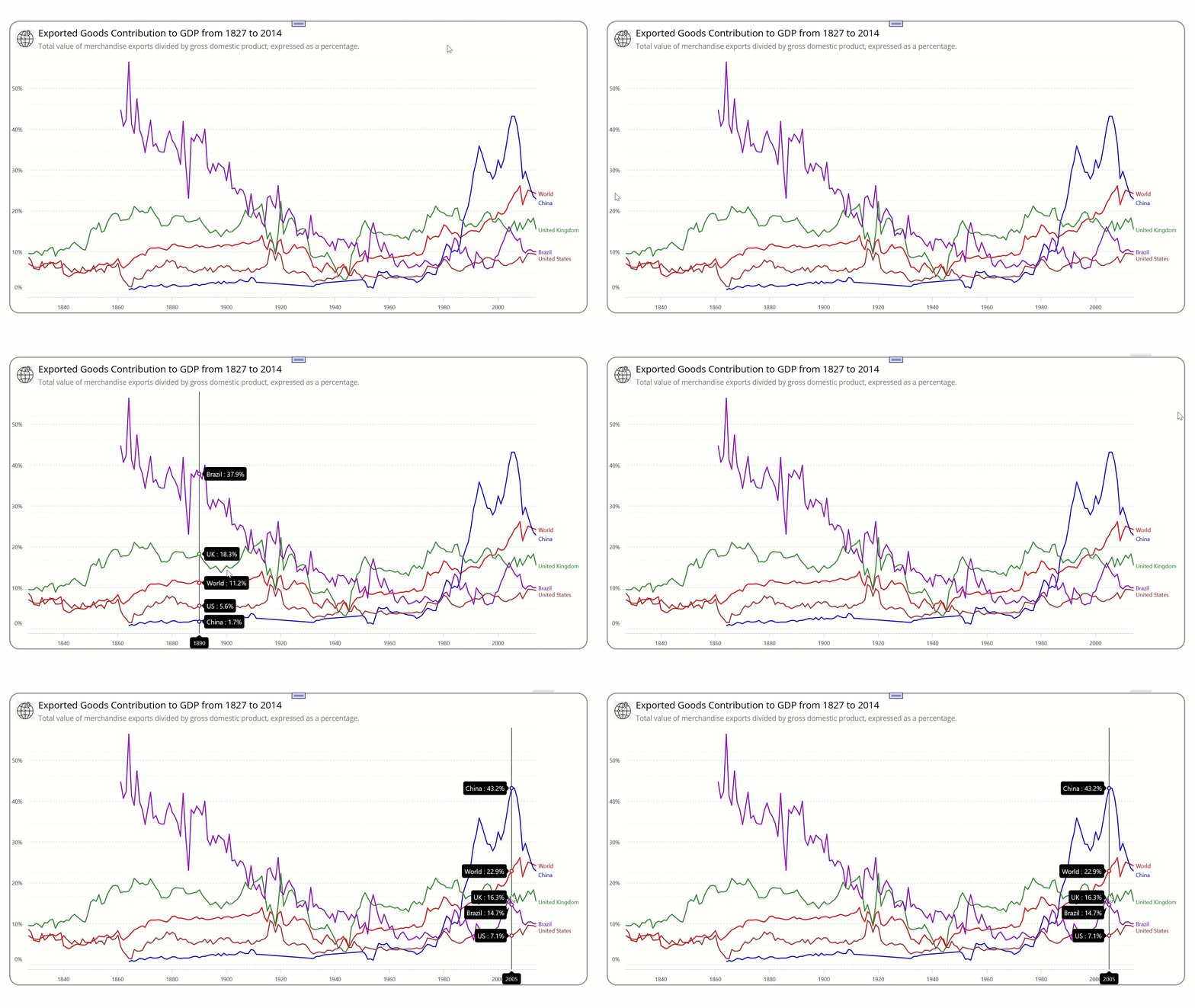
Welcome to our Chart of the Week blog series! Today, we’re diving into an analysis of the value of merchandise exports as a percentage of the GDP of various countries and world regions. We’ll be harnessing the power of the Syncfusion .NET MAUI Cartesian Charts control to bring this data to life.
The total value of global exports in 1870 made up less than 10% of the world’s output. Fast forward to today, and that figure has soared nearly 25%. This significant increase reflects a growth in global trade that has outpaced the overall economic growth over the past century and a half. To visualize this trend, we’re employing the .NET MAUI Fast Line Chart.
The fast line chart, a high-performance variant of the traditional line chart, can handle large datasets swiftly and efficiently. Its real-time data visualization capabilities make it popular across various fields, from financial analytics to dynamic trend monitoring.
Join us as we examine the sustained economic growth driven by exported goods from 1827 to 2014. The chart we’re about to construct will visually represent this fascinating economic change, as shown in the following image.

Step 1: Gathering the yearly data on exported goods
First, let’s gather the annual exported goods data for multiple countries and regions from Our World in Data for 1827 to 2014.
Step 2: Preparing the data for the chart
Create a Model class that includes properties for storing the year, GDP percentage value, and country details.
public class Model
{
    public double Year { get; set; }
    public double Value { get; set; }
    public string Country { get; set; }

    public Model(double year, double value, string country)
    {
        Year = year;
        Value = value;
        Country = country;
    }
}
Next, generate the exported goods data as a collection of the share of GDP ratios using the ViewModel class.
The CSV data assigned to the AllCountriesData property holds information for the countries, including the year and its corresponding GDP percentage value, utilizing the ReadCSV method. Meanwhile, the BrazilData, ChinaData, UKData, USData, and WorldData properties individually store export goods data for those countries and the world.
Refer to the following code example.
public class ViewModel
{
    public List<Model>? AllCountriesData { get; set; }
    public List<Model>? BrazilData { get; set; }
    public List<Model>? ChinaData { get; set; }
    public List<Model>? UKData { get; set; }
    public List<Model>? USData { get; set; }
    public List<Model>? WorldData { get; set; }
    public List<Model>? LastIndexData { get; set; }

    public float Spacing => 5;

    public ViewModel()
    {
        AllCountriesData = new List<Model>(ReadCSV());
        BrazilData = AllCountriesData.Where(d => d.Country == "Brazil").ToList();
        ChinaData = AllCountriesData.Where(d => d.Country == "China").ToList();
        UKData = AllCountriesData.Where(d => d.Country == "United Kingdom").ToList();
        USData = AllCountriesData.Where(d => d.Country == "United States").ToList();
        WorldData = AllCountriesData.Where(d => d.Country == "World").ToList();
    }

    public static IEnumerable<Model> ReadCSV()
    {
        Assembly executingAssembly = typeof(App).GetTypeInfo().Assembly;
        Stream inputStream = executingAssembly.GetManifestResourceStream("IndustrialRobotAnalysis.Resources.Raw.exportdata.csv");

        string line;
        List<string> lines = new();

        using StreamReader reader = new(inputStream);
        while ((line = reader.ReadLine()) != null)
        {
            lines.Add(line);
        }

        return lines.Select(line =>
        {
            string[] data = line.Split(',');

            return new Model(Convert.ToDouble(data[0]), Math.Round(Convert.ToDouble(data[1]), 1), data[2]);
        });
    }
}
Step 3: Configuring Syncfusion .NET MAUI Cartesian Charts
Now, configure the Syncfusion .NET MAUI Cartesian Charts control using this documentation.
Refer to the following code example.
<?xml version="1.0" encoding="utf-8" ?>
<ContentPage
….
 xmlns:chart="clr-namespace:Syncfusion.Maui.Charts;assembly=Syncfusion.Maui.Charts"
 xmlns:local="clr-namespace:ExportAnalysis">

<chart:SfCartesianChart>

    <!--Initialize the x-axis for chart-->
    <chart:SfCartesianChart.XAxes>
        <chart:NumericalAxis/>
    </chart:SfCartesianChart.XAxes>

    <!--Initialize the y-axis for chart-->
    <chart:SfCartesianChart.YAxes>
        <chart:NumericalAxis/>

         <!—Additional custom y-axis-->
        <local:NumericalAxisExt/>
    </chart:SfCartesianChart.YAxes>

</chart:SfCartesianChart>
Step 4: Set up the BindingContext for the Fast Line Chart
Next, configure the ViewModel class of your XAML page to bind its properties to the BindingContext of the SfCartesianChart.
Refer to the following code example.
<chart:SfCartesianChart.BindingContext>
   <local:ViewModel/>
</chart:SfCartesianChart.BindingContext>
Step 5: Bind the annual exported goods data to the Fast Line Chart
In this step, bind the data representing the value of exported goods as a share of the GDP ratios to the Syncfusion Fast Line Chart. This will allow us to visualize the data effectively.
<chart:FastLineSeries ItemsSource="{Binding BrazilData}"
                      XBindingPath="Year"
                      YBindingPath="Value"/>

<chart:FastLineSeries ItemsSource="{Binding ChinaData}"
                      XBindingPath="Year"
                      YBindingPath="Value"/>

<chart:FastLineSeries ItemsSource="{Binding UKData}"
                      XBindingPath="Year"
                      YBindingPath="Value"/>

<chart:FastLineSeries ItemsSource="{Binding USData}"
                      XBindingPath="Year"
                      YBindingPath="Value"/>

<chart:FastLineSeries ItemsSource="{Binding WorldData}"
                      XBindingPath="Year"
                      YBindingPath="Value"/>
In the previous code example, we utilized multiple FastLine series to analyze the shares of GDPs attributable to exports. This involved maintaining separate series for each country and the entire world. We bound the ItemSource to the ViewModel class properties: BrazilData, ChinaData, UKData, USData, and WorldData. Additionally, we set the XBindingPath with the Year property and the YBindingPath with the GDP ratio Value property.
Step 6: Integrating multiple axes
As previously mentioned, this demonstration will utilize multiple fast-line series to analyze the share of GDPs attributable to exports. We will employ a shared x-axis and two y-axes to analyze GDP growth percentage values by customizing the chart.
The .NET MAUI Cartesian Charts supports the arrangement of multiple series within the same chart area with specified x- and y-axes. These axes can be arranged in a stacking order or a side-by-side pattern. In this demonstration, an additional y-axis is added at the last index value of the x-axis using the CrossesAt property of the ChartAxis.
Refer to the following code example.
<chart:SfCartesianChart.YAxes>

  <chart:NumericalAxis>
  </chart:NumericalAxis>

  <local:NumericalAxisExt CrossesAt="{Static x:Double.MaxValue}">
  </local:NumericalAxisExt>

</chart:SfCartesianChart.YAxes>
Step 7: Customizing the chart appearance
We can enhance the appearance of the .NET MAUI multiple Fast Line Chart series by customizing its elements.
Customize the chart background
Refer to the following example to add and customize a border inside the chart.
<Border StrokeShape="RoundRectangle 20"
             StrokeThickness="2"
             Stroke="Gray"
             Margin="{OnPlatform WinUI='20, 0, 20, 20', Android='10', iOS='10', MacCatalyst='30'}">

    <chart:SfCartesianChart>
     ….
    </chart:SfCartesianChart>

</Border>
Customize the chart titles
Refer to the following code example to customize the chart title using the Title property.
<chart:SfCartesianChart.Title>

    <Grid Margin="0, 10, 0, 10">
        <Grid.ColumnDefinitions>
            <ColumnDefinition Width="2*"/>
            <ColumnDefinition Width="{OnPlatform Android=49*,WinUI=59*,MacCatalyst=59*,iOS=49*}"/>
        </Grid.ColumnDefinitions>
        <Image Source="export.png" WidthRequest="{OnPlatform Default='40', MacCatalyst='50'}"
               Margin="25, 0, 0, 0" HeightRequest="{OnPlatform Default='40', MacCatalyst='50'}"
               Grid.Column="0" Grid.RowSpan="2"/>
        <VerticalStackLayout Grid.Column="1" Margin="20, 0, 0, 0">
            <Label Text="Exported Goods Contribution to GDP from 1827 to 2014"
                   FontSize="{OnPlatform Default='20', Android='18', iOS='18'}"
                   Padding="{OnPlatform Default='0,0,5,5', Android='0,0,5,0', iOS='0,0,5,0'}"
                   HorizontalTextAlignment="Start"/>
            <Label Text="Total value of merchandise exports divided by gross domestic product, expressed as a percentage."
                   HorizontalTextAlignment="Start" FontSize="{OnPlatform Android=13,WinUI=15,MacCatalyst=16,iOS=13}"
                   TextColor="Grey" />
        </VerticalStackLayout>
    </Grid>

</chart:SfCartesianChart.Title>
Customize the chart axes
Then, customize the chart axis using the LabelStyle, AxisLineStyle, MajorTickStyle, and MajorGridLineStyle properties.
<chart:SfCartesianChart>

    <chart:SfCartesianChart.Resources>
        <DoubleCollection x:Key="gridLine">
            <x:Double>3</x:Double>
            <x:Double>3</x:Double>
        </DoubleCollection>

    </chart:SfCartesianChart.Resources>

    <!-- X-axis customization-->
    <chart:SfCartesianChart.XAxes>
       <chart:NumericalAxis ShowMajorGridLines="False"/>
    </chart:SfCartesianChart.XAxes>

    <chart:SfCartesianChart.YAxes>

    <!—Y-axis customization-->
    <chart:NumericalAxis Interval="10" Maximum="58">
        <chart:NumericalAxis.LabelStyle>
          <chart:ChartAxisLabelStyle LabelFormat="0'%"/>
        </chart:NumericalAxis.LabelStyle>
        <chart:NumericalAxis.AxisLineStyle>
          <chart:ChartLineStyle StrokeWidth="0"/>
        </chart:NumericalAxis.AxisLineStyle>
        <chart:NumericalAxis.MajorTickStyle>
          <chart:ChartAxisTickStyle StrokeWidth="0"/>
        </chart:NumericalAxis.MajorTickStyle>
        <chart:NumericalAxis.MajorGridLineStyle>
          <chart:ChartLineStyle StrokeDashArray="{StaticResource gridLine}"/>
        </chart:NumericalAxis.MajorGridLineStyle>
    </chart:NumericalAxis>

    <!—Additional custom y-axis-->
    <local:NumericalAxisExt CrossesAt="{Static x:Double.MaxValue}"
                 LabelExtent="{OnPlatform Default='100', MacCatalyst='110'}">
    </local:NumericalAxisExt>
</chart:SfCartesianChart.YAxes>
Customize axis rendering
The default rendering of the chart axis can be tailored to fit specific needs by extending the required axis and overriding the DrawAxis methods. These methods allow us to incorporate our unique requirements. In this demonstration, we have positioned the series labels as needed.
Refer to the following code example.
C#
public class NumericalAxisExt : NumericalAxis
{
    protected override void DrawAxis(ICanvas canvas, Rect arrangeRect)
    {
        var axis = this as ChartAxis;

        if (axis.Parent is SfCartesianChart chart && BindingContext is ViewModel viewModel)
        {
            var x = arrangeRect.X + viewModel.Spacing;

            foreach (CartesianSeries series in chart.Series)
            {
                var style = new ChartAxisLabelStyle() { FontSize = 12,TextColor = (series.Fill as SolidColorBrush).Color,  Parent = this.Parent};
                OnDrawLabels(canvas, series, style, (float)x);
            }
        }
    }
}
XAML
<chart:FastLineSeries StrokeWidth="2" Fill="Red" Label="World"/>

<chart:FastLineSeries StrokeWidth="2" Fill="Blue" Label="China"/>

<chart:FastLineSeries StrokeWidth="2" Fill="ForestGreen" Label="United Kingdom"/>

<chart:FastLineSeries StrokeWidth="2" Fill="DarkViolet" Label="Brazil"/>

<chart:FastLineSeries StrokeWidth="2" Fill="Firebrick" Label="United States"/>
Adding interactivity to the chart
Now, incorporate and tailor the trackball via the TrackballCreated callback event, thereby augmenting the readability of the chart with additional data.
XAML
<chart:SfCartesianChart TrackballCreated="SfCartesianChart_TrackballCreated">

     <chart:SfCartesianChart.XAxes>
       <chart:NumericalAxis ShowTrackballLabel="True"/>
     </chart:SfCartesianChart.XAxes>

     <chart:SfCartesianChart.TrackballBehavior>
       <chart:ChartTrackballBehavior/>
     </chart:SfCartesianChart.TrackballBehavior>

</chart:SfCartesianChart>
C#
private void SfCartesianChart_TrackballCreated(object sender, TrackballEventArgs e)
{
    var trackballInfoList = e.TrackballPointsInfo;

    foreach (var trackballInfo in trackballInfoList)
    {
        string prefix = trackballInfo.Series.Label == "United Kingdom" ? "UK" :
        trackballInfo.Series.Label == "United States" ? "US" :
        trackballInfo.Series.Label;
        trackballInfo.Label = $"{prefix} : {trackballInfo.Label}%";

        ChartMarkerSettings chartMarkerSettings = new ChartMarkerSettings();
        chartMarkerSettings.Stroke = trackballInfo.Series.Fill;
        chartMarkerSettings.StrokeWidth = 2;
        chartMarkerSettings.Fill = Colors.White;

        trackballInfo.MarkerSettings = chartMarkerSettings;
    }
}
After executing the previous code examples, the output will look like the following image.

GitHub reference
For more details, refer to the complete project on the GitHub repository.
Conclusion
Thanks for reading! In this blog, we’ve seen how to visualize and analyze the impact of exported goods on GDP using the Syncfusion .NET MAUI Fast Line Charts. We strongly encourage you to follow the steps outlined in this blog and share your thoughts in the comments below.
You can also contact us through our support forum, support portal, or feedback portal. We are always happy to assist you!
Related blogs
- Chart of the Week: Creating a .NET MAUI Stacked Column Chart for Global Smartphone Shipments
- Chart of the Week: Creating a .NET MAUI Scatter Chart to Visualize CO2 Emissions vs. Fossil Fuel Consumption
- Introducing the New .NET MAUI Pull to Refresh Control
- Chart of the Week: Create a .NET MAUI Stacked Area Chart to Visualize U.S. School Revenue as a Share of GDP by Funding Sources


