
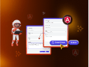
 Hari Venkatesh E
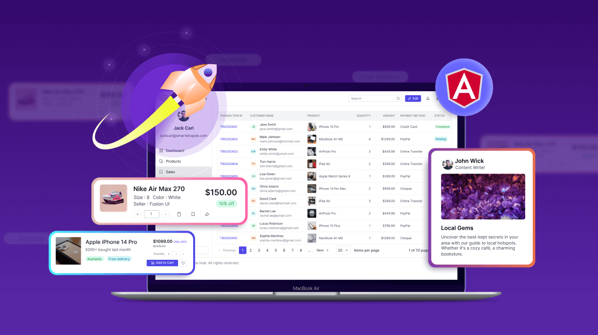
Building a polished, responsive UI in Angular can be time-consuming. Developers often spend countless hours crafting custom components—authentication forms, data grids, layouts, and more—only to deal with redundant code, inconsistent design, and unexpected issues. Tight deadlines make it even harder to maintain UI consistency and responsiveness.
But what if you could skip repetitive UI work and focus on building business logic instead?
To overcome these challenges and streamline UI development, Syncfusion introduces the Essential® UI Kit for Angular—a powerful collection of UI blocks designed to accelerate development.
The Angular UI Kit is packed with pre-built, reusable, customizable, and responsive blocks. It streamlines the creation of sleek, functional, and consistent user interfaces. By reducing the need to manually create a user interface from scratch, developers can focus on building features and enhancing functionalities.
Whether you’re working on a startup project or an enterprise-grade app, this kit eliminates UI bottlenecks, enhances productivity, and ensures a consistent, modern design across devices.
In this post, we’ll demonstrate how the pre-built UI designs of our Essential UI kit for Angular can help you code faster, smarter, and more efficiently.
Key features of Angular blocks
1. Comprehensive blocks library
The UI Kit includes over 120 pre-built blocks, such as authentication forms, headers, sidebars, footers, grids, list views, tile views, email templates, chat modules, and more. These versatile blocks cover a wide range of use cases, providing a solid foundation for building dynamic, feature-rich web apps.
2. Seamless integration with Tailwind CSS and Bootstrap 5.3
The UI Kit supports popular CSS frameworks like Tailwind CSS and Bootstrap 5.3, providing flexibility in styling and layout design. This ensures developers can quickly integrate and customize the blocks to fit their app’s needs without extensive rework, enhancing both design consistency and development speed
3. Easy Angular integration
Each block in the UI Kit is carefully designed to align with Angular’s architecture and best practices, ensuring smooth integration into both new and existing projects. With access to the public Gallery and GitHub repository, users have free access to the codebase, enabling easy integration and reducing the learning curve for developers.
4. Customizability
One of the standout features is the ability to fully customize the blocks, including elements like the company name and logo, content, dimensions, layouts, and other styles. This flexibility enables developers to align the blocks seamlessly with their app’s branding and design guidelines.
5. Responsive and cross-platform support
All blocks are optimized for responsiveness, ensuring a seamless user experience across desktops, tablets, and mobile devices. No matter the screen size, the UI Kit ensures your app looks and functions flawlessly on any platform.
Benefits of using Angular blocks
1. Accelerated development
Pre-built blocks eliminate the need to create user interfaces from scratch, drastically reducing development time. This enables teams to launch apps faster, accelerating time-to-market.
2. Enhanced productivity
By leveraging ready-to-use blocks, developers can dedicate more time to crafting app logic and delivering unique functionalities. This leads to increased efficiency and innovation within development teams.
3. Modularity and reusability
The modular structure of Angular Blocks ensures that blocks can be reused across multiple apps or different sections of the same app. This not only streamlines development but also improves maintainability.
4. Customization without complexity
Despite being pre-designed, the blocks are highly customizable, offering developers complete control over their app’s look and feel.
5. Scalability and maintainability
With consistent and reusable blocks, the UI Kit allows developers to scale apps easily and ensures that long-term maintenance is straightforward, even as apps grow in size and complexity.
Use cases for Angular blocks
1. Enterprise apps
Develop scalable enterprise solutions with blocks that ensure consistent UI design across different modules and workflows.
2. Business dashboards
Rapidly assemble dashboards with blocks, ensuring decision-makers have quick access to real-time, critical information.
3. E-commerce platforms
Use the UI Kit’s customizable blocks to design visually appealing product displays, shopping carts, and checkout processes.
4. Landing pages and marketing websites:
Create responsive and engaging landing pages quickly with pre-designed blocks. These blocks are fully customizable, enabling you to tailor them to your brand without starting from scratch.
5. Social networking or messaging apps:
Whether you’re creating a messaging app or adding real-time chat functionality to an existing app, our Angular UI blocks for communication (like chat conversation and e-mail composition) allow you to easily integrate these features, optimizing user experience.
Real-world example: Building a dashboard module
Imagine you’re tasked with creating a sales dashboard module. With the Essential® UI Kit for Angular, you can quickly assemble components like the header, sidebar, data grid, pager, and footer. Instead of building these elements from scratch, simply select and integrate pre-built blocks to save time. The result is a responsive, professional sales dashboard module that is ready to go.
Let’s walk you through the step-by-step process.
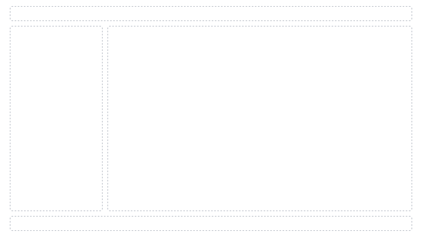
Step 1: Divide the layout into the header at the top, the footer at the bottom, the sidebar on the right, and the main data grid and pager in the center using basic HTML DOM elements.
Refer to the following image.
Step 2: Once the layout is in place, you can copy and paste the header, footer, sidebar, data grid, and pager code directly from the demo in our gallery or download the free source code from the GitHub repository. You’ll now see a basic outline.
The following image shows an example.
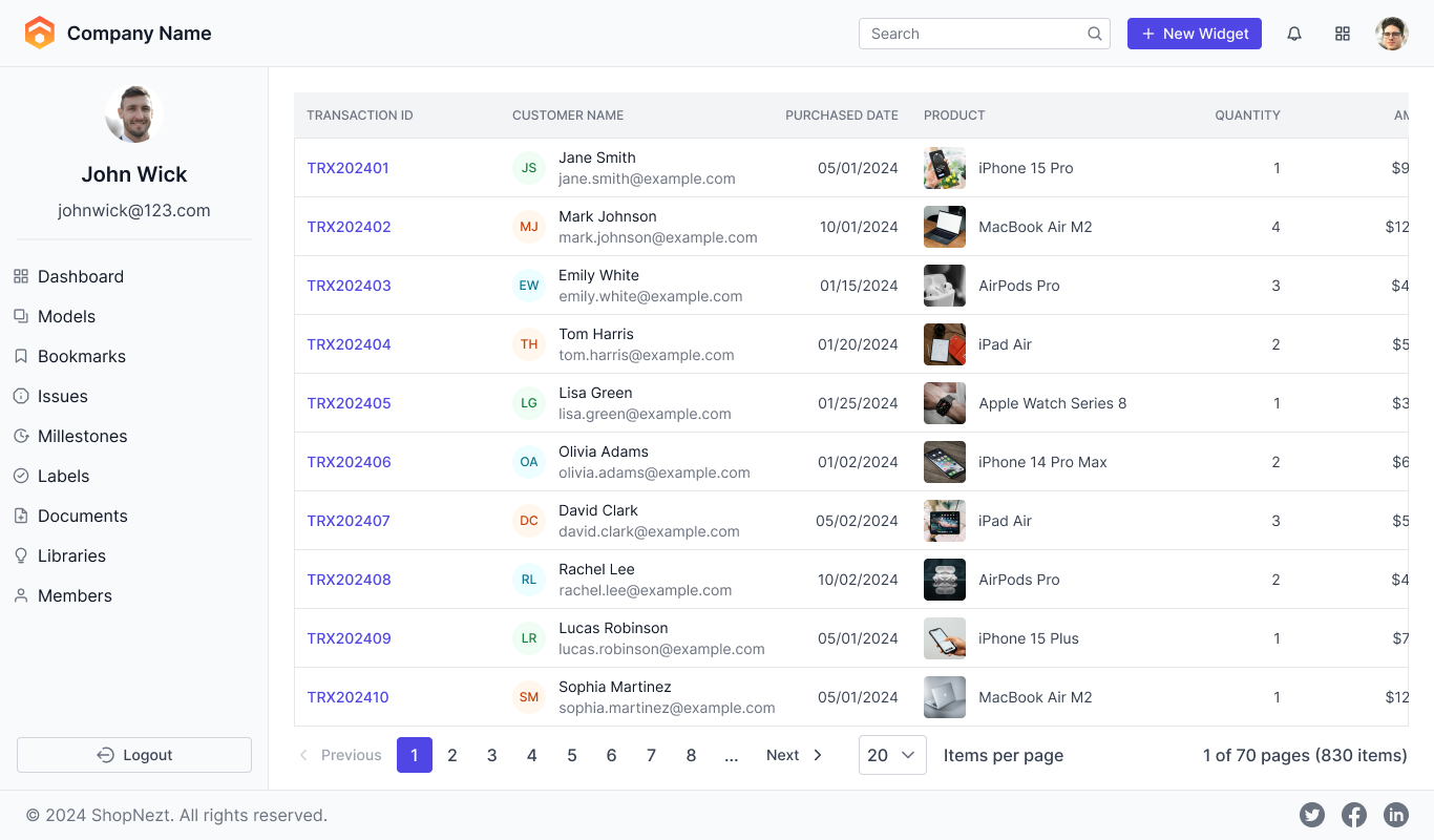
Note: For more details, refer to this documentation.
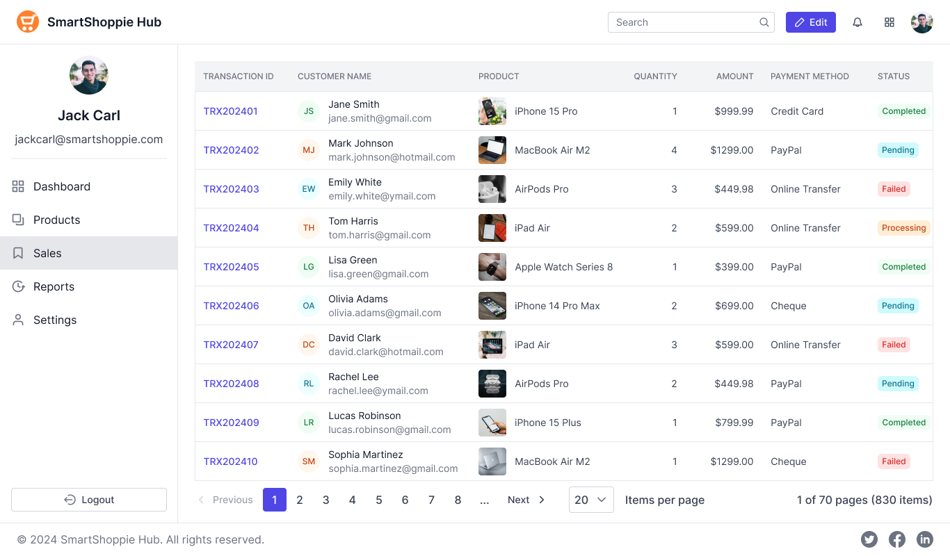
Step 3: The copied code is just a template. Now, make the following minor customizations to tailor it to your needs:
- Change the company name, logo, edit button, and profile image in the header.
- In the footer, update the company name.
- Modify the user profile name, email address, and image in the sidebar. You can also update the navigation options to fit the dashboard’s requirements.
- Reduce the number of columns in the grid for a more compact view. If needed, modify the data source or columns.
- We are not going to change the pager.
With these simple and quick changes, your sales dashboard module is ready to go! Refer to the following image.

Conclusion
Thank you for reading this blog! Syncfusion’s Essential® UI Kit for Angular is a game-changer for Angular developers. By providing a library of pre-built, reusable, customizable, and responsive blocks, it simplifies UI development, reduces time to market, and enhances productivity. From authentication forms to e-commerce pages, the UI kit provides pre-built blocks that are not only easy to implement but also designed for scalability, accessibility, and optimal performance.
And remember, this isn’t the final version—we continuously expand the Angular UI Kit with more industry-specific UI blocks in every release, ensuring that developers always have access to the latest solutions for their apps.
So, why not save yourself time, effort, and complexity? Explore Syncfusion’s Angular UI Kit today and accelerate your development process!
If you’re an existing customer, you can download the latest version of Essential Studio® from the License and Downloads page. For those new to Syncfusion, try our 30-day free trial to explore all our features.
If you have questions, contact us through our support forum, support portal, or feedback portal. As always, we are happy to assist you!


 No spam, just valuable updates.