TL;DR: Discover the new WinUI Kanban Board in the 2024 Volume 4 release! Features include WIP limits, drag-and-drop, swimlanes, and customizable templates. Streamline workflows and boost productivity effortlessly.
We are delighted to introduce another data visualization control in the Syncfusion .NET WinUI suite for the 2024 Volume 4 release, the all-new WinUI Kanban Board control.
The WinUI Kanban Board is a task management tool with a user-friendly interface, customizable templates, drag-and-drop functionality, and built-in error bars. It improves project visualization, task tracking, and productivity, making it suitable for agile project management and workflow organization.
In this blog, we’ll delve into the key features of the .NET WinUI Kanban Board and outline the steps to get started!
Key features
The WinUI Kanban Board control provides support for the following key features:
- Work in Progress (WIP) limits
- Cards
- Columns
- Swim lanes
- Seamless drag and drop
- Expand and collapse columns
- Appearance customization
Let’s take a closer look at these features!
Work in Progress (WIP) limits
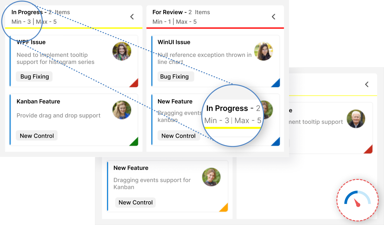
The WinUI Kanban Board allows users to set limits on the number of cards to be displayed at each stage of the workflow, helping to prevent overloading and multitasking. When these limits are exceeded, the error bar visually changes its appearance to indicate validation failure.
Cards
The Kanban cards visually represent tasks and their progress through different stages. Users can set values in the KanbanModel, which will be reflected in the Card UI, including the title, description, tags, and more.
Users can also set the task priority, displayed as a color indicator on the card.

Columns
The WinUI Kanban Board divides its layout into columns to visualize the different stages of work, such as to-do, validate, in-progress, testing, and completed.

Swim lanes
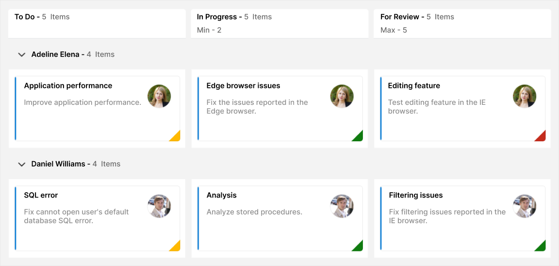
The WinUI Kanban control enables users to split the board horizontally into swimlanes, categorizing cards by key attributes such as assignee, project, or type. Users can customize swimlane headers with templates, control row visibility, and display item counts within each swimlane, enhancing task organization and management.
Seamless drag and drop
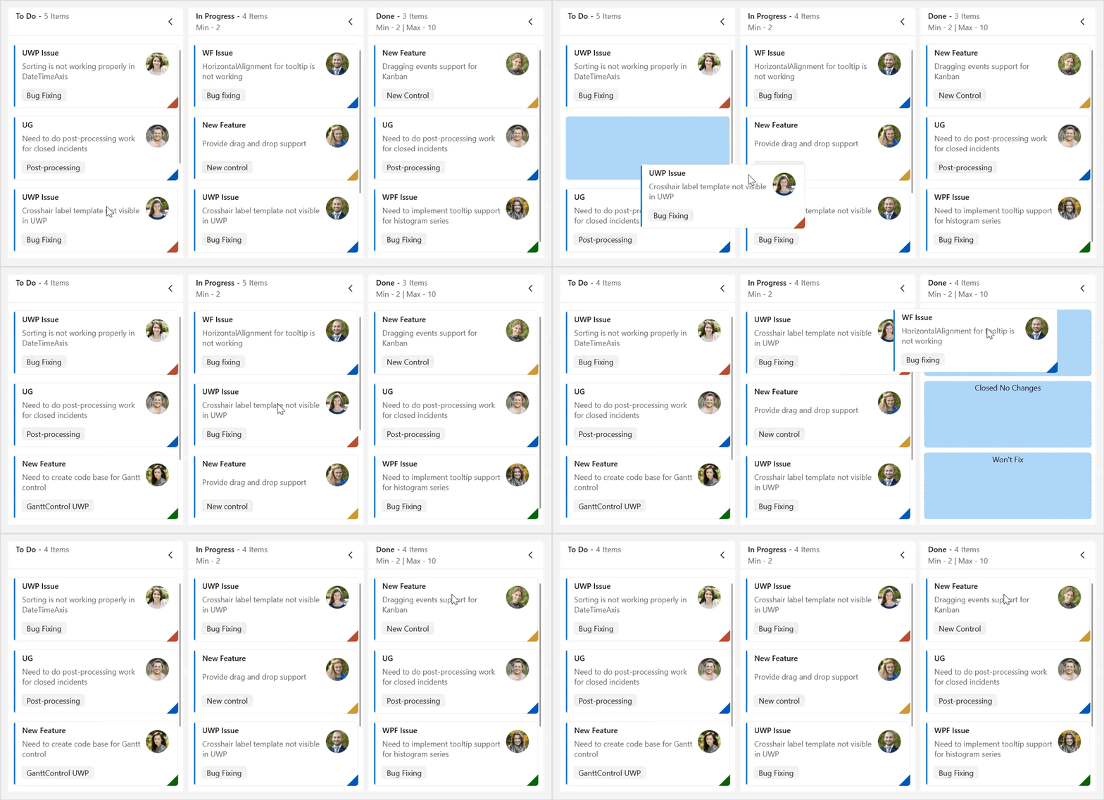
Users can easily drag and drop cards across columns, within columns, and between swimlane rows, enabling quick and intuitive status updates for improved workflow management.
Expand and collapse columns
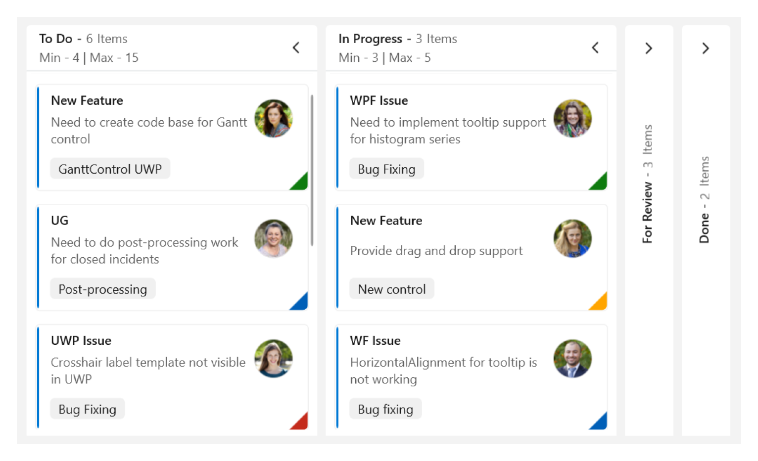
The WinUI Kanban allows users to expand and collapse columns, providing an organized view of tasks for improved workflow management.
Appearance customization
The Kanban supports UI customization for each element using templates, such as column headers, cards, swimlane headers, and more.
Note: For more details, refer to the WinUI Kanban Board documentation.
Getting started with the WinUI Kanban Board control
We have explored the key features of the WinUI Kanban Board control. Let’s see how to integrate the control in your WinUI app.
Step 1: Create a new .NET WinUI app
First, open Visual Studio and create a new WinUI 3 desktop app.
Step 2: Add the required NuGet package
Syncfusion WinUI components are available in the NuGet Gallery. To add the SfKanban to your project, open the NuGet package manager in Visual Studio, search for Syncfusion.Kanban.WinUI, and install it.
Step 3: Import and initialize the WinUI Kanban Board
Now, add the Syncfusion.UI.Xaml.Kanban namespace to your XAML page, and initialize the SfKanban control.
Refer to the following code example.
xmlns:kanban="using:Syncfusion.UI.Xaml.Kanban"
<kanban:SfKanban/>
Step 4: Populate the Kanban item source
Let’s create a view model using the actual data. Refer to the following code example.
public class KanbanViewModel
{
    public KanbanViewModel()
    {
        string path = @"ms-appx:///";
        this.TaskDetails = new ObservableCollection<KanbanModel>()
        {
            new KanbanModel()
            {
                Title = "UWP Issue",
                Id = "6593",
                Description = "Sorting is not working properly in DateTimeAxis",
                Category = "Postponed",
                IndicatorColorKey = "High",
                Tags = new List<string>() { "Bug Fixing" },
                Image=new Image { Source = new BitmapImage(new Uri(path + "Assets/People_Circle1.png")) }
            },

            new KanbanModel()
            {
                Title = "New Feature",
                Id = "6593",
                Description = "Need to create code base for Gantt control",
                Category = "Postponed",
                IndicatorColorKey = "Low",
                Tags = new List<string>() { "GanttControl UWP" },
                Image = new Image { Source = new BitmapImage(new Uri(path + "Assets/People_Circle2.png")) }
            },

            new KanbanModel()
            {
                Title = "UG",
                Id = "6516",
                Description = "Need to do post-processing work for closed incidents",
                Category = "Postponed",
                IndicatorColorKey = "Normal",
                Tags = new List<string>() { "Post-processing" },
                Image = new Image { Source = new BitmapImage(new Uri(path + "Assets/People_Circle3.png")) },
            },

            new KanbanModel()
            {
                Title = "UWP Issue",
                Id = "651",
                Description = "Crosshair label template not visible in UWP",
                Category = "Open",
                IndicatorColorKey = "High",
                Tags = new List<string>() { "Bug Fixing" },
                Image = new Image { Source = new BitmapImage(new Uri(path + "Assets/People_Circle4.png")) }
            },

            new KanbanModel()
            {
                Title = "WinUI Issue",
                Id = "646",
                Description = "AxisLabel cropped when rotating the axis label",
                Category = "Open",
                IndicatorColorKey = "Low",
                Tags = new List<string>() { "Bug Fixing" },
                Image = new Image { Source = new BitmapImage(new Uri(path + "Assets/People_Circle5.png")) }
            },
        };
    }

    public ObservableCollection<KanbanModel> TaskDetails { get; set; }
}
Then, bind the ItemsSource of Kanban to the XAML page. Refer to the following code example.
<kanban:SfKanban x:Name="kanban"
                                  AutoGenerateColumns="False"
                                  ItemsSource="{Binding TaskDetails}">
    <kanban:SfKanban.DataContext>
            <local:KanbanViewModel/>
     </kanban:SfKanban.DataContext>
    <kanban:SfKanban.IndicatorColorPalette>
        <kanban:KanbanColorMapping Key="Low" Color="#0F7B0F"/>
        <kanban:KanbanColorMapping Key="Normal" Color="#FFB900"/>
        <kanban:KanbanColorMapping Key="High" Color="#C42B1C"/>
    </kanban:SfKanban.IndicatorColorPalette>
    <kanban:KanbanColumn HeaderText="To Do" Categories="Open,Postponed" />
    <kanban:KanbanColumn HeaderText="In Progress"
                         Categories="In Progress"
                         MinimumCount="2">
        <kanban:KanbanColumn.ErrorBarSettings>
            <kanban:KanbanErrorBarSettings MaximumValidationColor="Red"
                                              MinimumValidationColor="Yellow" />
        </kanban:KanbanColumn.ErrorBarSettings>
    </kanban:KanbanColumn>

    <kanban:KanbanColumn HeaderText="For Review"
                         Categories="Review"
                         MaximumCount="5">
        <kanban:KanbanColumn.ErrorBarSettings>
            <kanban:KanbanErrorBarSettings MaximumValidationColor="Red"
                                              MinimumValidationColor="Yellow" />
        </kanban:KanbanColumn.ErrorBarSettings>
    </kanban:KanbanColumn>

    <kanban:KanbanColumn HeaderText="Done"
                         Categories="Closed,Closed No Changes,Won't Fix"
                         MinimumCount="2"
                         MaximumCount="10">
        <kanban:KanbanColumn.ErrorBarSettings>
            <kanban:KanbanErrorBarSettings MaximumValidationColor="Red"
                                              MinimumValidationColor="Yellow" />
        </kanban:KanbanColumn.ErrorBarSettings>
    </kanban:KanbanColumn>
</kanban:SfKanban>
Now, you can run the app and visualize the specified data in the WinUI Kanban Board control.
GitHub reference
For more details, refer to the WinUI Kanban Board control demo on GitHub.
Conclusion
Thanks for reading! In this blog, we’ve explored the features of the new WinUI Kanban Board control introduced in the 2024 Volume 4 release. Check out our Release Notes and What’s New pages to see the other updates in this release, and leave your feedback in the comments section below.
For existing Syncfusion customers, the newest version of Essential Studio® is available on the license and downloads page. If you are not a customer, try our 30-day free trial to check out these new features.
You can contact us through our support forums, feedback portal, or support portal. We are always happy to assist you!
Related blogs
- Easily Export WinUI DataGrid to Excel
- Syncfusion Essential Studio® 2024 Volume 4 Is Here!
- Easily Bind SQLite Data to WinUI DataGrid and Perform CRUD Actions
- Build an AI-Powered Chat Experience with WinUI AI AssistView and OpenAI


