TL;DR: Let’s explore the Flutter AI AssistView widget from the 2024 Volume 4 release. This widget offers a conversational UI with features like placeholders, action buttons, and customizable composers. Learn to integrate it, connect to AI, and effortlessly enhance user experiences.
We are excited to introduce the new Syncfusion® Flutter AI AssistView widget in the 2024 Volume 4 release!
The Flutter AI AssistView offers a modern conversational UI to facilitate user requests and AI response messages.
Let’s explore its impressive features and the steps to get started with it.
Key features
The key features of the Flutter AI AssitView widget are as follows:
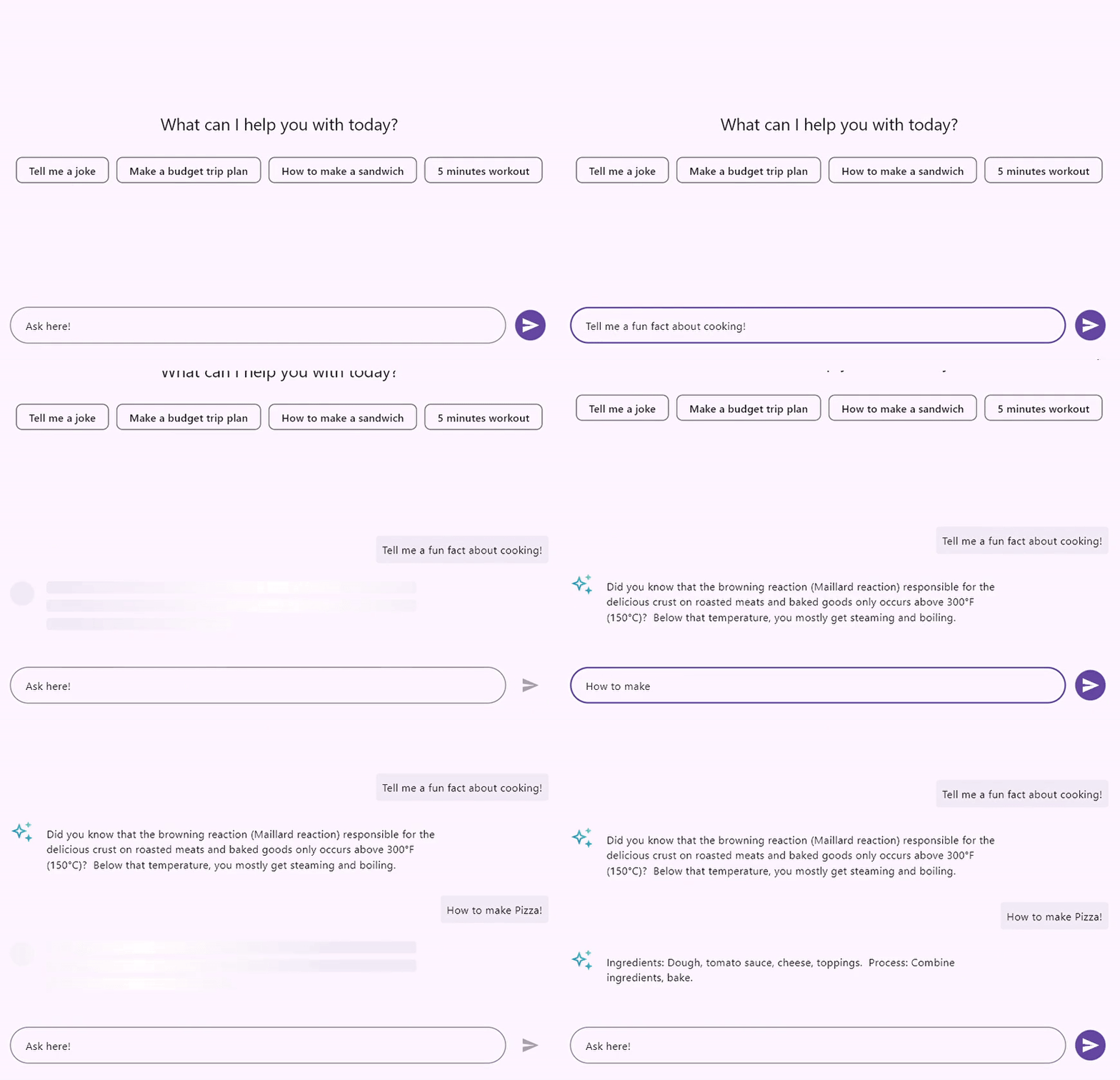
Placeholder
You can add any widget as a placeholder, which behaves as follows:
- It appears when there are no messages in the conversation area and disappears once messages begin to be added.
- Alternatively, it can be fixed as a header for all messages, remaining visible even as new messages are added, and scrolling up as the conversation grows.
Composer
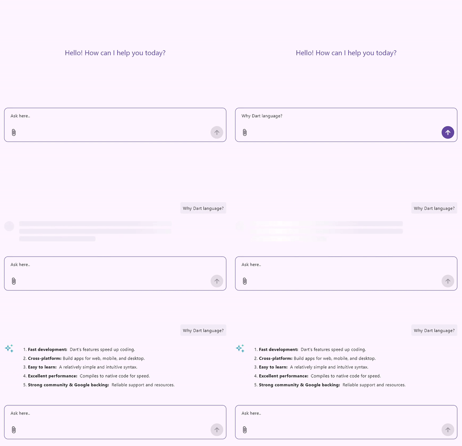
The default text editor is a versatile tool for creating and composing messages easily. It offers extensive customization options, enabling users to modify its appearance with hint text and decorative borders. Users can also add prefix and suffix icons to clarify the message’s purpose.
A key feature of this editor is the ability to replace the primary composer widget. This will support advanced functionalities, such as integrating leading and trailing icons for quick actions. This adaptability also supports multi-level widgets, enriching the user experience with a more dynamic messaging interface.
Action button
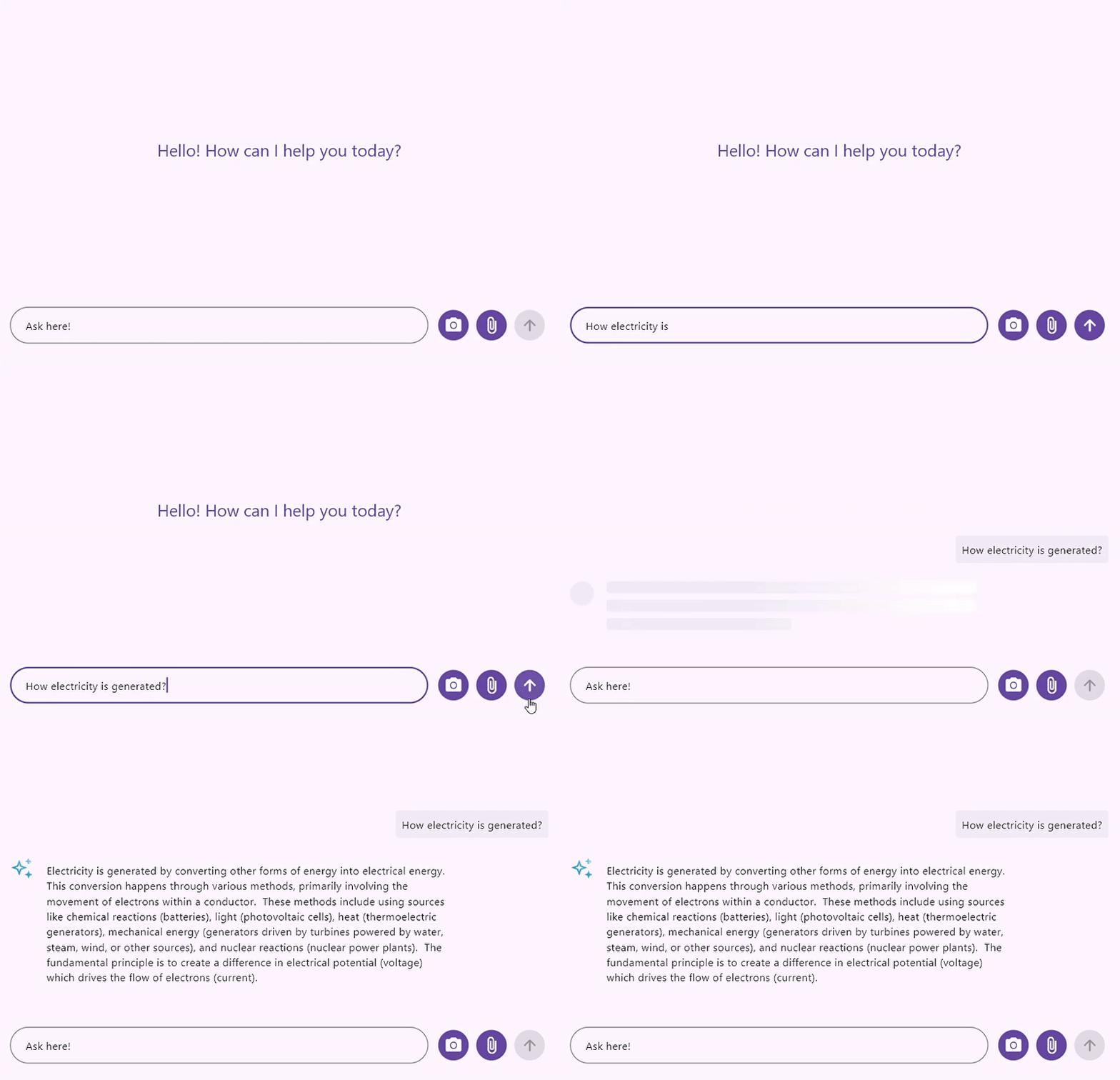
The action button, often called the send button, initiates a callback whenever a user clicks it. This will allow users to connect with their preferred AI tool to receive a response to their composed request message.
In addition to the standard send button, you can add a custom widget with one or more interactive elements. These interactive elements function as action buttons within the chat widget and can include a microphone icon for voice input, options for attaching files, and various other widgets designed to enhance user engagement.
Messages
The Flutter AI AssistView widget displays a list of request and response messages in the conversation area. Each message contains information about its creation time and author details.
Alignment
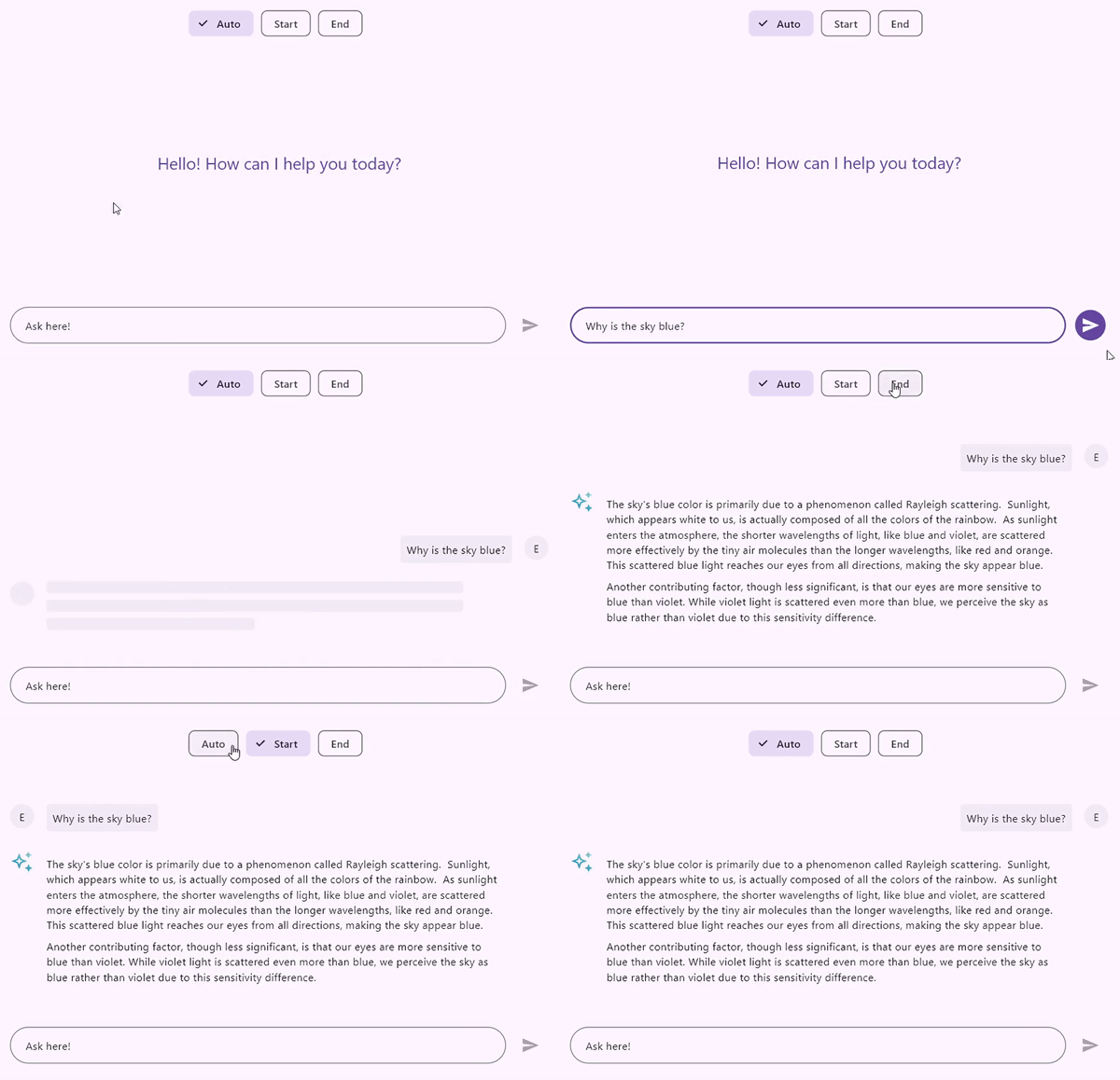
By default, when directionality is set to LeftToRight, request messages are displayed on the right side and response messages on the left. This is reversed for RightToLeft directionality. The alignment feature allows you to position both request and response messages on either the left or right side:
- Auto: The default alignment displays request messages on the right and response messages on the left for LeftToRight, reversed for RightToLeft.
- Start: Both request and response messages are aligned to the left for LeftToRight and to the right for RightToLeft.
- End: Both request and response messages are aligned to the left for RightToLeft and to the right for LeftToRight.
Loading indicator
The request and response messages are distinguished using the AssistMessage.request() and AssistMessage.response() constructors. When a request message is added to the AssistView, a loading indicator appears in the space designated for the response message, indicating that the response is currently loading. The default loading indicator features a shimmer effect, but you can replace it with any widget of your choice.
This loading indicator will remain visible until the response message is added. Once the response message is received, the indicator will automatically disappear. If a response message fails to generate due to server or internet connection issues, it is advisable to provide the necessary details for the response. This will prevent the loading indicator from being displayed indefinitely when an expected response has not been added to AssistView.
Header
This shows the message sender’s username along with the timestamp. Users can also design a custom widget to include additional details about chat messages.
Footer
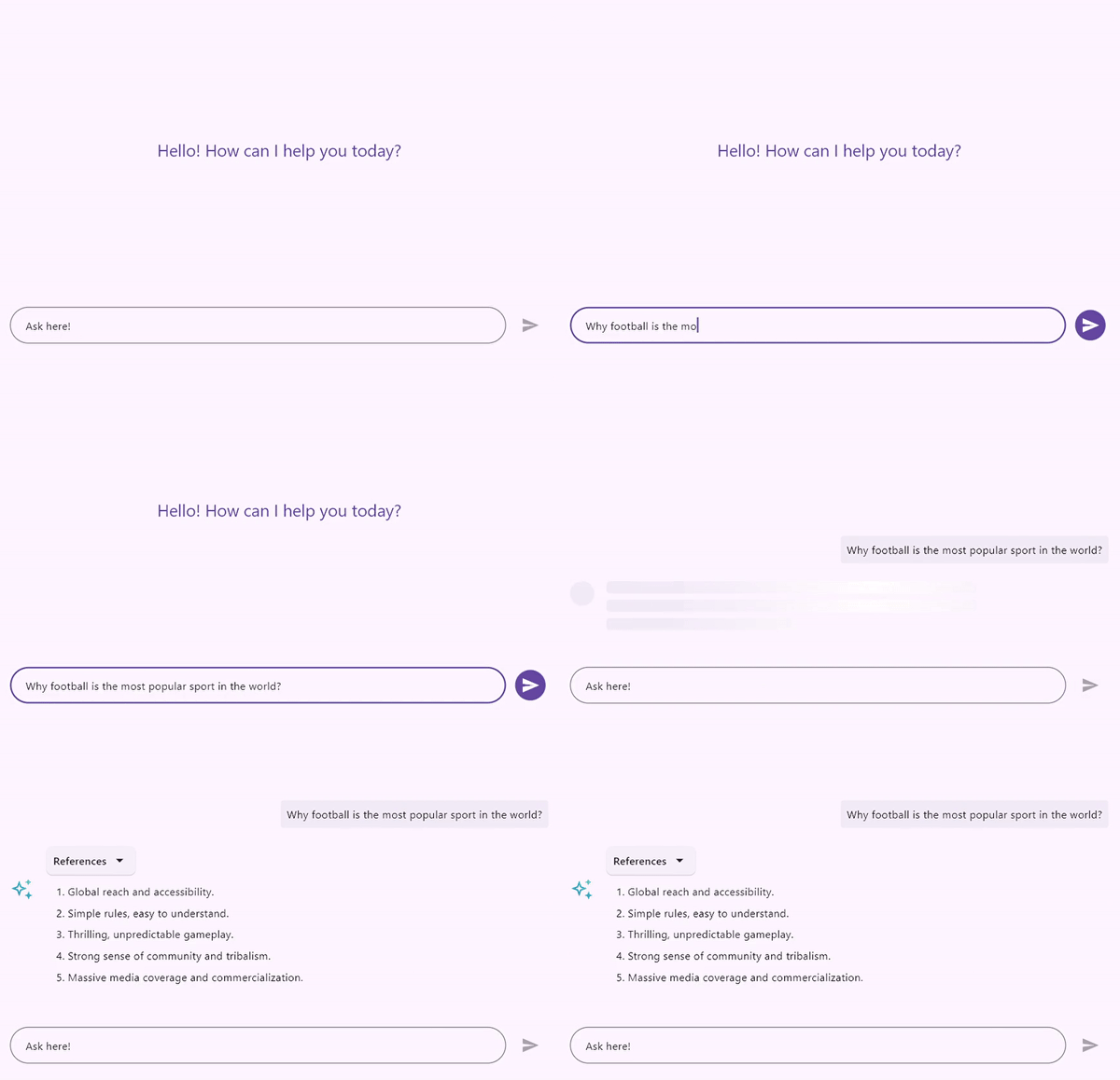
The AI AssistView widget does not have a footer by default, but users can create a custom widget to add extra details to messages, like the AI model name and feedback builder.

Avatar
The author’s avatar can be displayed as either an image or their initials. The author’s image can be loaded along with the author’s details. If no image is provided, the user’s initials will be shown by default. Additionally, users have the option to create a custom widget with more details about the author.
Content
Displays the message content. The AssistView widget does not have built-in markdown support, but lets you utilize your preferred markdown packages or custom markdown widgets for content. It also offers the ability to customize the background color, shape, and other elements based on the message sender or specific conditions.
Suggestions
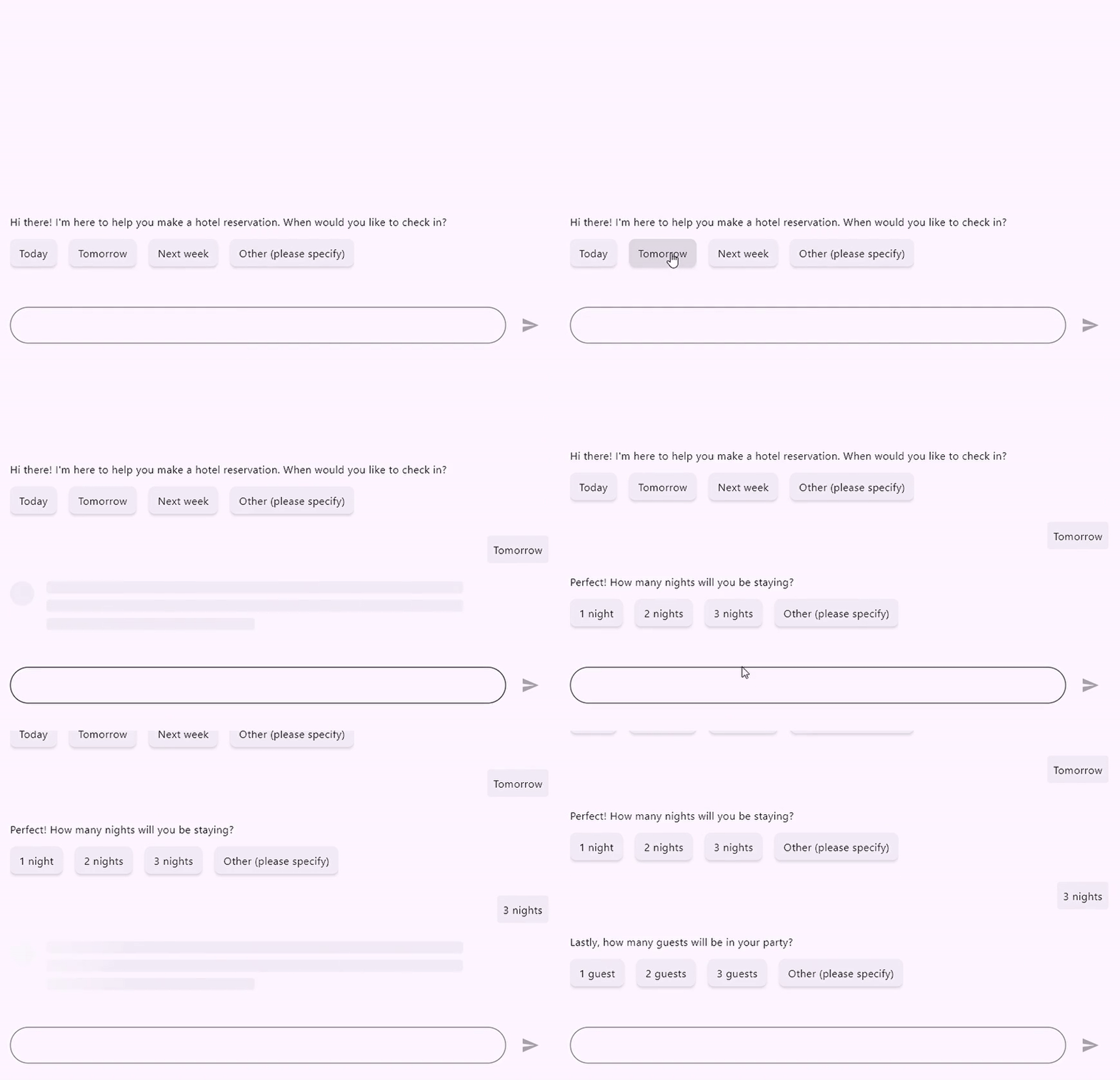
This feature is designed for response messages, which can be displayed in either horizontal or vertical orientations. For instance, in a doctor appointment booking scenario, when a user requests an appointment with their preferred doctor, the AI checks available time slots and prompts the user for their preferred appointment time. In this case, the response can present suggested time slots and dates as selectable options, making it easier for the user to book an appointment.
The AI AssistView widget offers two selection modes:
- Single: The chosen item is highlighted in a selected color, while the other options appear disabled.
- Multiple: Users can select one or more suggestions, but no selection color is applied to the chosen options.
It’s important to note that the AI AssistView widget does not maintain the selection state internally. When a suggestion is selected, a callback is triggered, allowing the user to replace it by copying its details with the selected property set to true and then rebuilding the AssistView to refresh the display.
Toolbar items
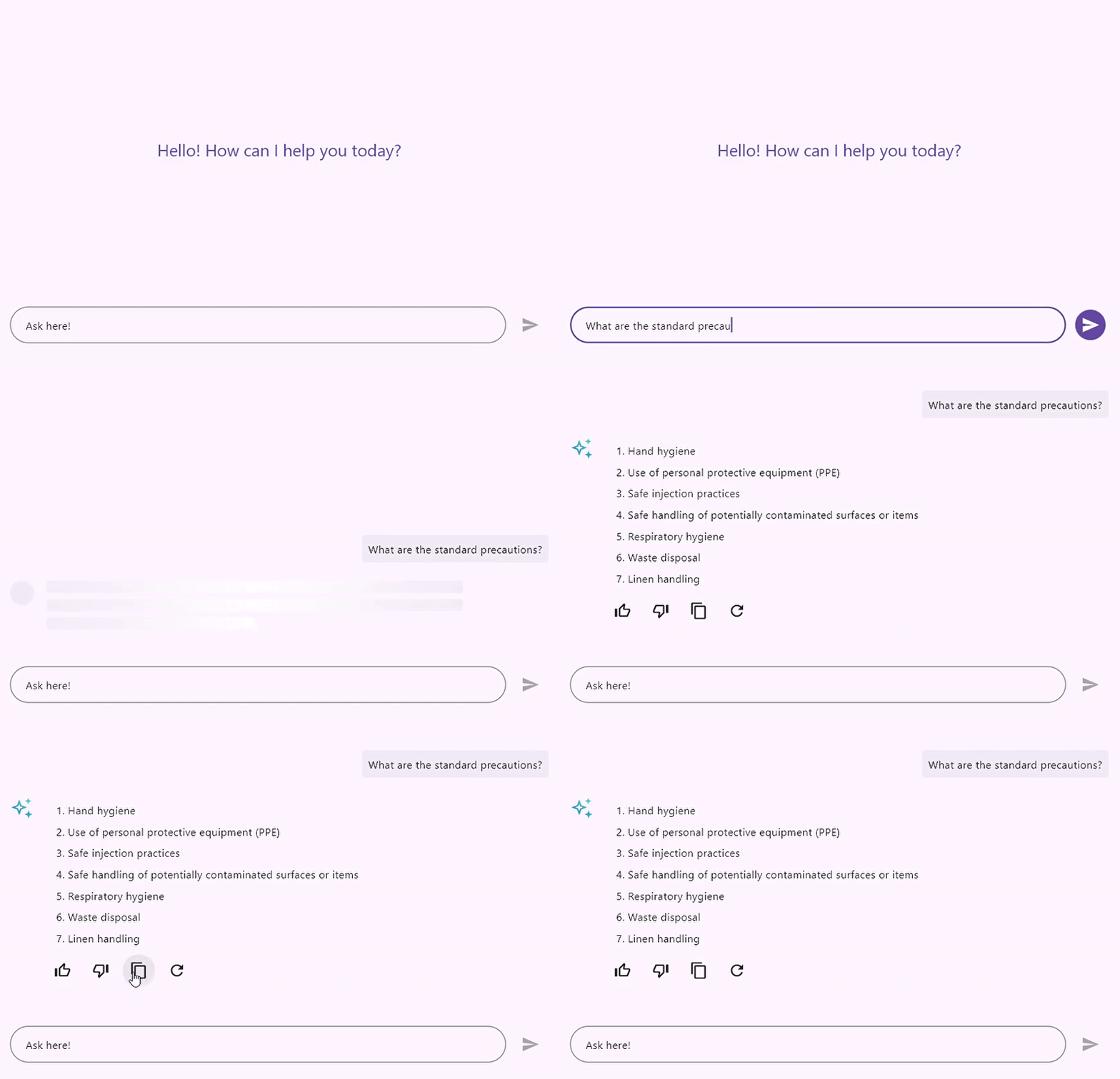
These items may include a variety of interactive icons, such as a thumbs-up icon, a thumbs-down icon, a share icon, and a refresh icon. These toolbar items will be prominently displayed beneath the message content and positioned above the footer builder.
A callback function is triggered when a user selects one of the toolbar items. This callback enables the user to replace the selected toolbar item with a visual representation of its active state, like the functionality provided by a suggestion feature, because the AI AssistView widget does not maintain the selection state internally.
Getting started with the Flutter AI AssistView widget
We’ve explored the Flutter AI AssistView widget’s user-friendly features. Now, let’s see how to integrate it into your Flutter app.
Step 1: Add the dependency
First, add the Syncfusion® Flutter Chat dependency to your pubspec.yaml file.
dependencies:
  syncfusion_flutter_chat: *.*.* // Use the latest available version in pub.dev.
Step 2: Get the packages
Then, run the following command to get the required packages.
flutter pub getStep 3: Import the AssistView library
Now, import the library using the following code.
import 'package:syncfusion_flutter_chat/assist_view.dart';Step 4: Add the Flutter AI AssistView widget
Next, add the SfAIAssistView widget. Refer to the following code example.
late List<AssistMessage> _messages;

@override
Widget build(BuildContext context) {
  return SfAIAssistView(
    messages: _messages,
    composer: const AssistComposer(
      decoration: InputDecoration(
        hintText: 'Type a message',
      ),
    ),
    actionButton: AssistActionButton(
      onPressed: (String data) {
       // Handle the action button click action.
      },
    ),
  );
}
Step 5: Handle the action button click the action
By default, the AI AssistView widget does not rebuild itself when the action button is pressed. Therefore, it is necessary to create a new message object using the newly composed request message passed in the parameter of the onPressed callback and then rebuild the widget using the setState function.
actionButton: AssistActionButton(
  onPressed: (String data) {
    setState(() {
      _messages.add(AssistMessage(data: data));
    });
  },
)
Step 6: Connect with AI
Currently, the Flutter AI AssistView does not have built-in AI support. Therefore, you need to connect to your preferred AI while clicking the action button to get a response for your composed request message. Once you receive the response, add it to the AssistView message collection and rebuild the widget to refresh the user interface.
GitHub reference
For more details, refer to the Flutter AI AssistView widget GitHub demo.

Unlock the power of Syncfusion’s highly customizable Flutter widgets.
Conclusion
Thanks for reading! In this blog, we’ve explored the new Flutter AI AssistView widget, which was rolled out in the 2024 Volume 4 release. For more information, refer to its documentation.
For existing Syncfusion® customers, the newest version of Essential Studio® is available from the license and downloads page. If you are not a customer, try our 30-day free trial to check out these new features.
If you need a new widget for the Flutter framework or new features in our existing widgets, you can contact us through our support forum, support portal, or feedback portal. As always, we are happy to assist you!

