This blog post is going to demonstrate building a few pieces of a dashboard for an online food ordering portal, step-by-step. To watch the video of the full demonstration, please visit our YouTube page.
We want to show important information at the top of the dashboard using card widgets. We’ll see how to do a couple of these. Then we’ll see how to add a chart widget.
Adding a data source
Let’s start by adding a data source. First, this is our dashboard home screen:
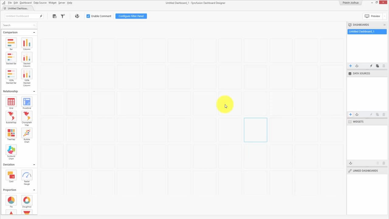
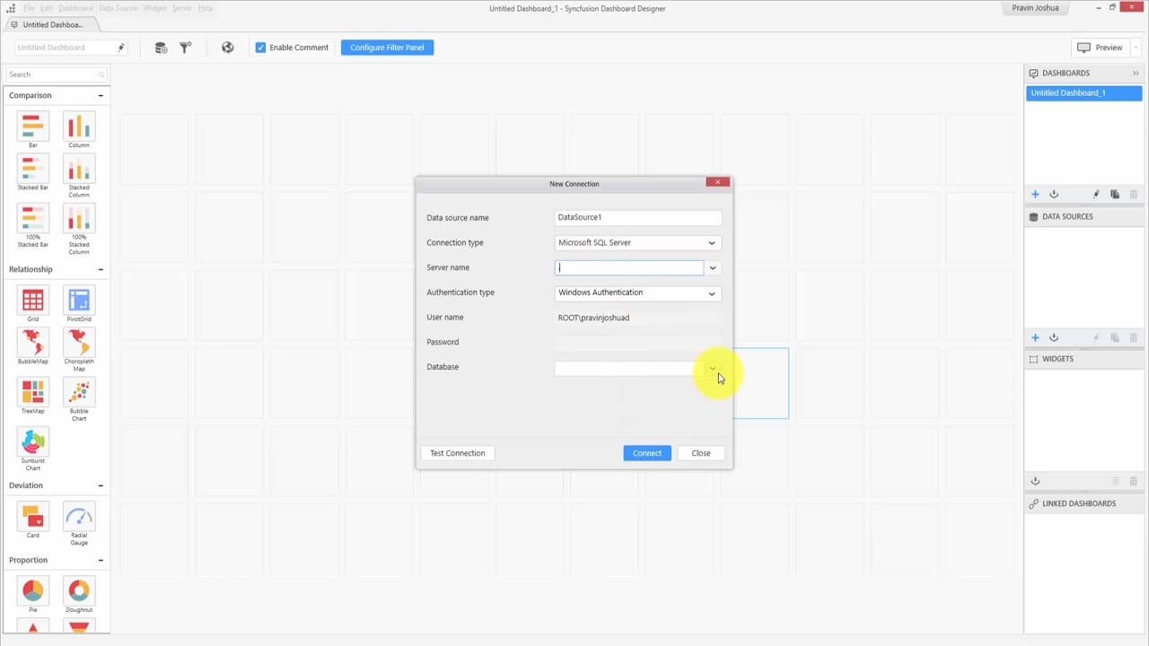
On the right side of the screen is a box for data sources. When I click +, a pop-up appears called New Connection. The database is in the local SQL server, so we’ll choose that from the drop-down list for Connection type, then choose the database from the drop-down list for Database and click Connect.
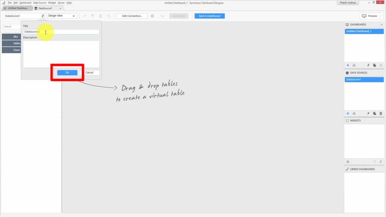
We need to give the data source a name in the window that pops up. We’ll go with “orderDetails.” We don’t need to put a description.
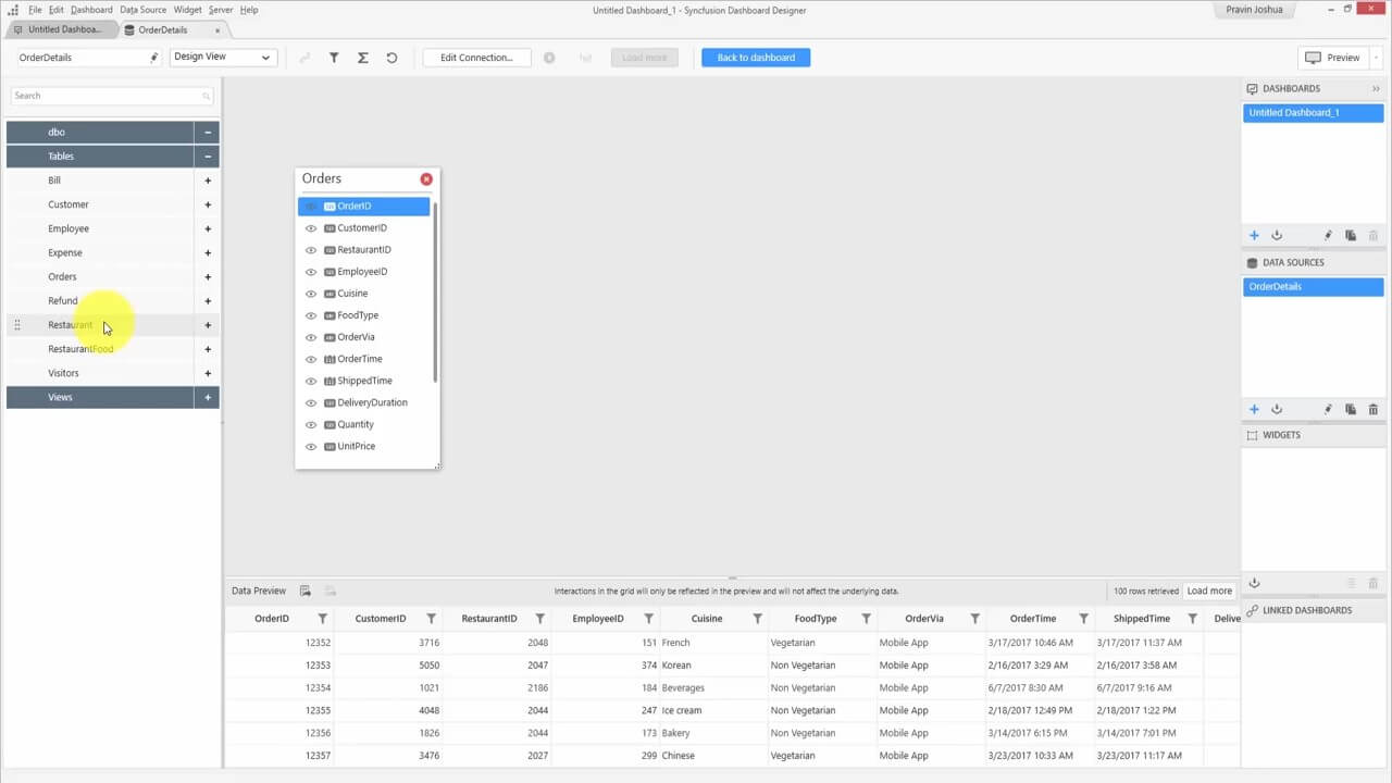
In the left sidebar, we’ll expand the Tables tab and drag the Orders and Restaurant tables onto the stage.
A Join Editor box pops up. The unique column is Restaurant ID, so we click MERGE.
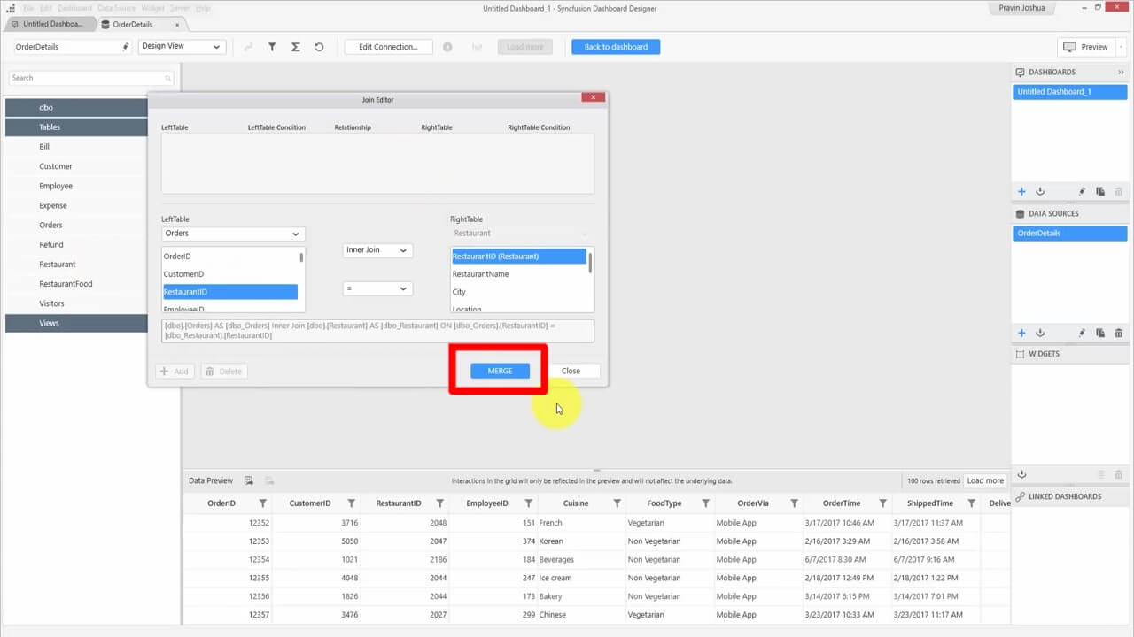
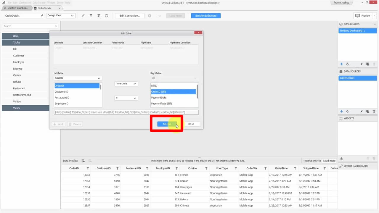
Then we drag the Bill table to the main space. We’re joining the orders table and bill table using the order ID column, so we click MERGE.
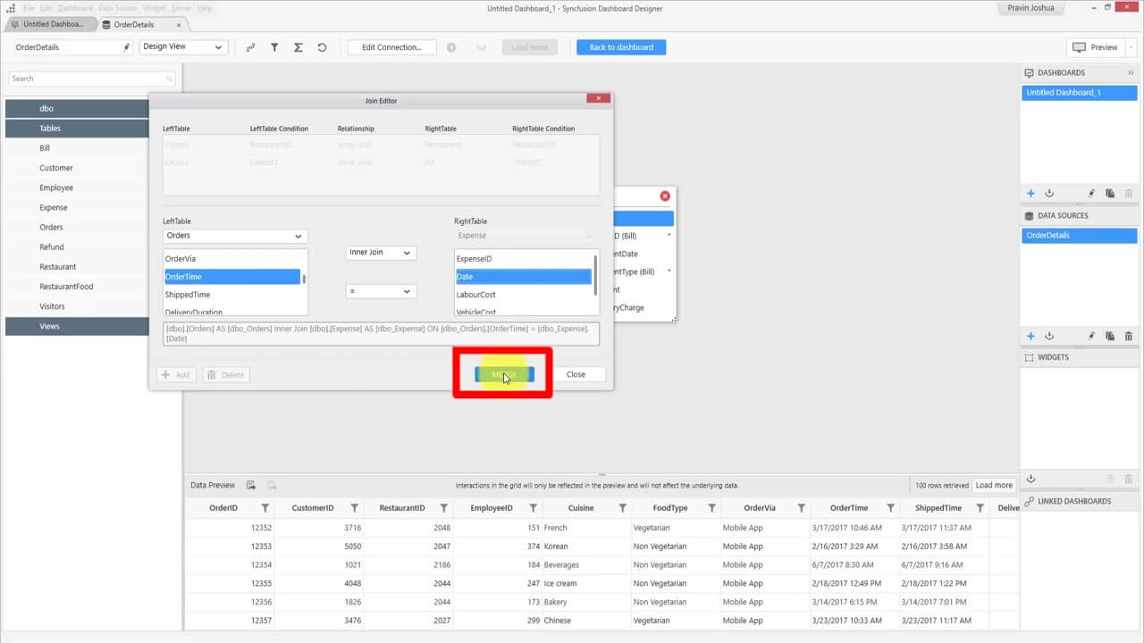
Next, we drag the Expense table to the main space. We join the orders table and bill table by choosing Orders from the LeftTable drop-down, OrderTime below it, and Date under RightTable. Then we click MERGE.
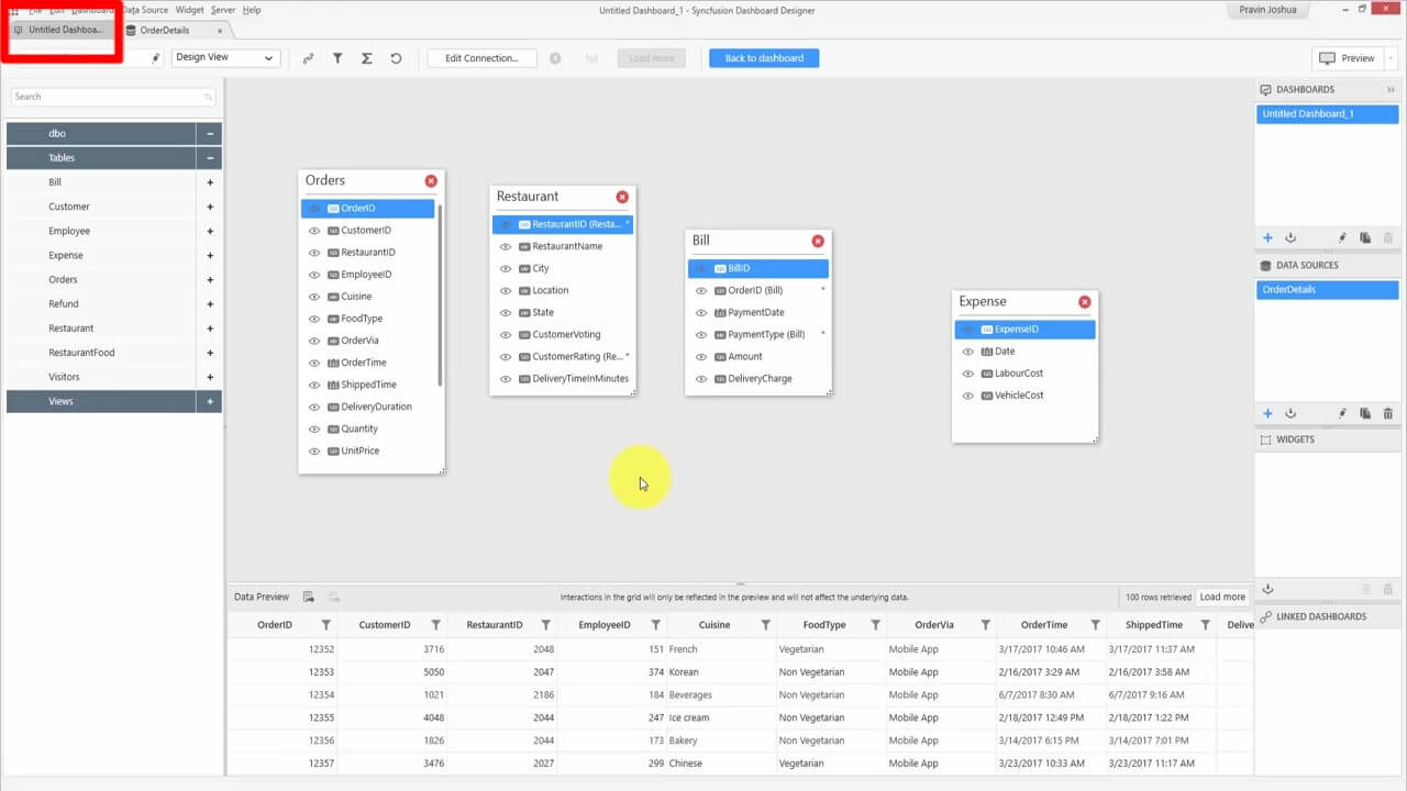
Now, we have the required details in our data source.
Creating a Total Revenue widget
Now we’ll create our first widget for our dashboard. First, we go back to the dashboard by clicking the tab at the top left called “Untitled Dashboard.” We can give the dashboard a name later, before publishing.
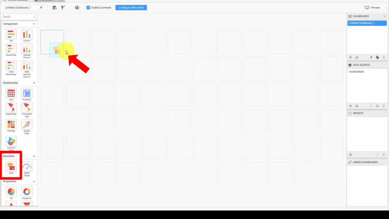
We drag the Card widget from the left side panel to the first box on the dashboard. I’m going to expand it to cover the top three boxes horizontally, but you can design the dashboard as you like. Then we can configure the widget by clicking the blue settings icon in the upper-right corner of the card.
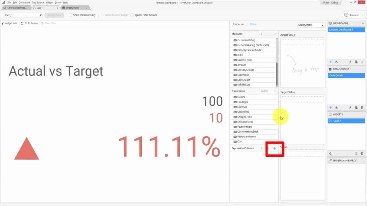
In our data source, we don’t have a field for total revenue, so we’ll calculate the total revenue ourselves. We click + in the Expression Columns box and drag it to the stage to create a new expression.
The Expression Designer will pop up. We’ll name the expression “Total Revenue.”
The amount and the delivery charge, which together equal the total revenue, are in the data source. The delivery charge is a percentage of the total amount. We can get the actual delivery charge value by multiplying the delivery charge by the amount. Therefore, we’re going to enter this expression into the Expression text box:
[Amount] + [Amount] * [DeliveryCharge]
We click Save and then Close.
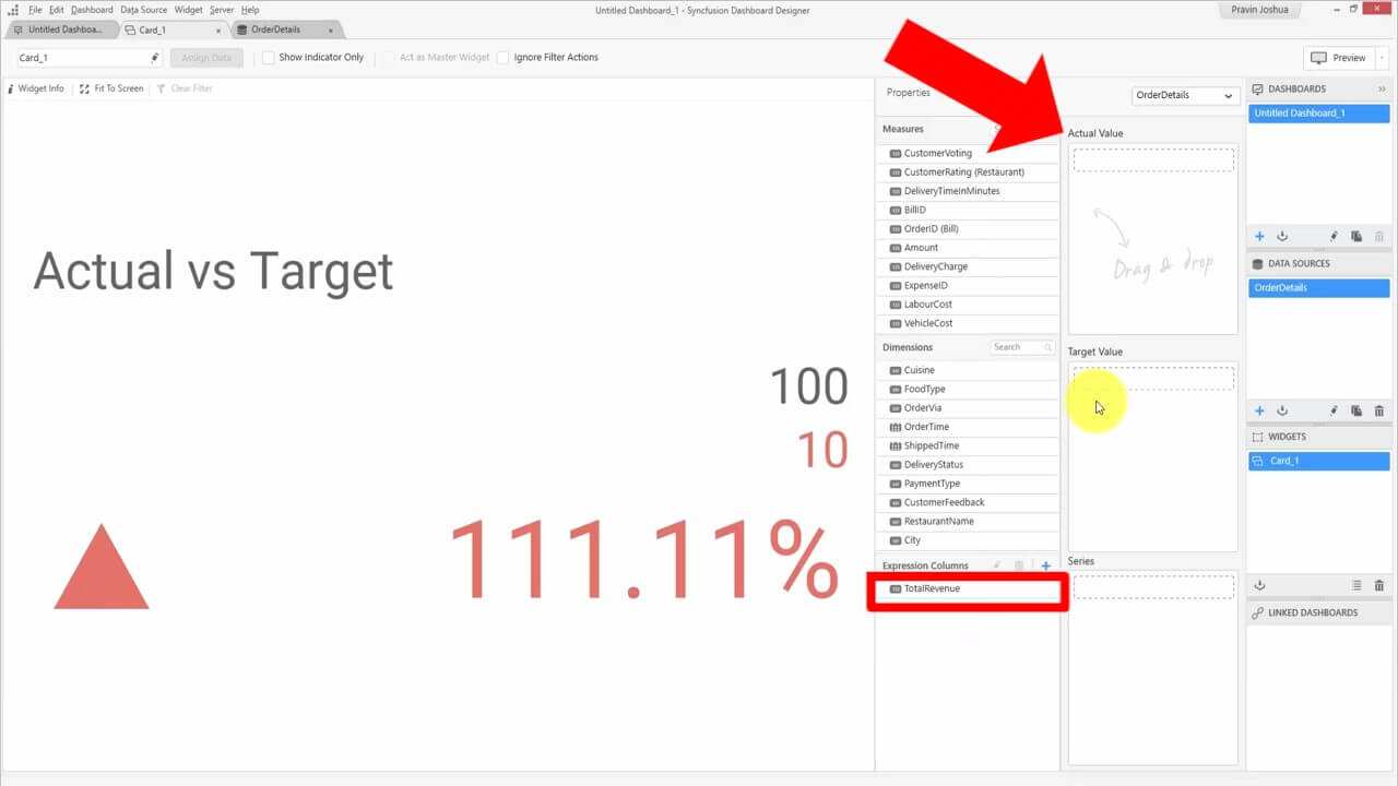
The expression was added to the Expression Column box. Now we’ll drag the expression to the Actual Value box.
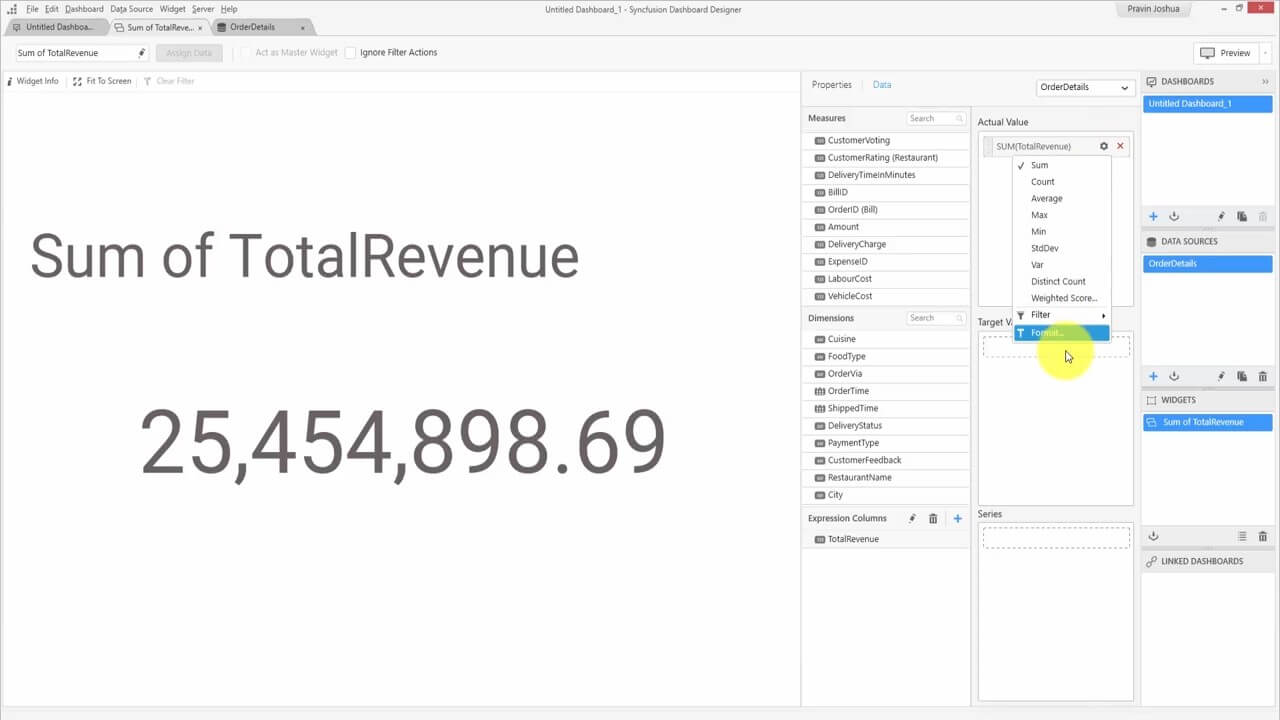
Clicking the settings icon for the expression, we’ll choose Format from the drop-down list.
And here we’ll change the options to match the following image:
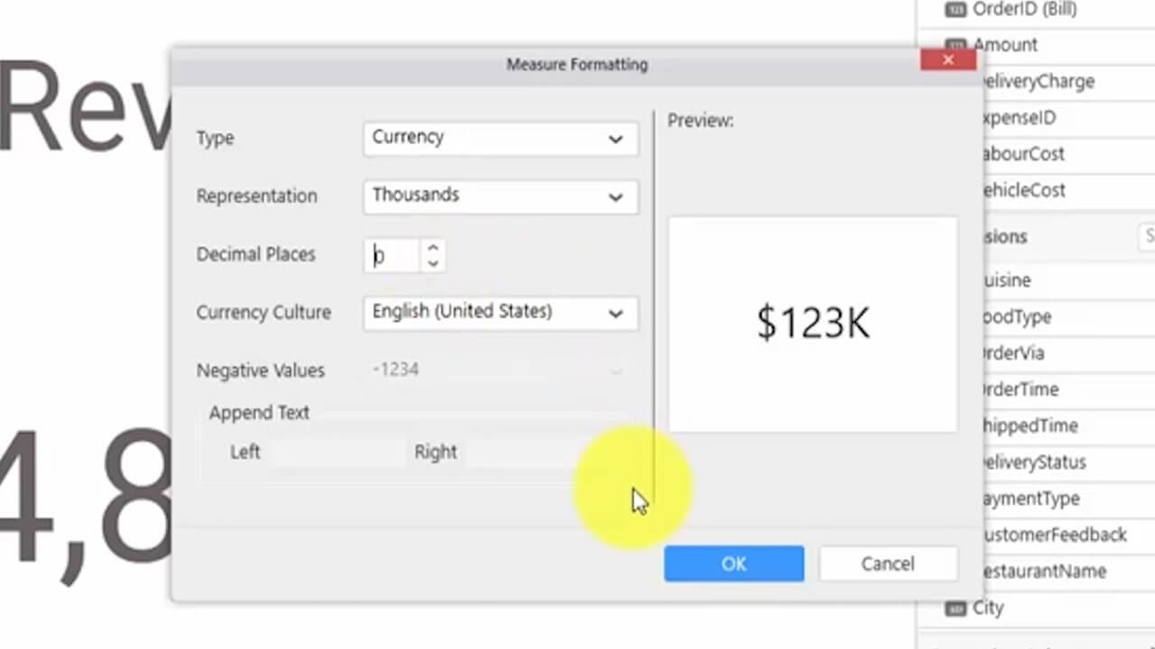
Clicking Properties, we can change the heading to “Total Revenue.” You can see what this widget now looks like by going back to the Untitled Dashboard tab.
Creating a Return Rate widget
Next, we want to add the return rate to our dashboard. If you look under the OrderDetails tab, one of the fields in the grid at the bottom is DeliveryStatus. The possible values are Delivered, Delayed, and Returned. We can divide the total returned orders by the total orders to get the return rate. So we click the icon at the top for the Expression Designer, and then click Add.
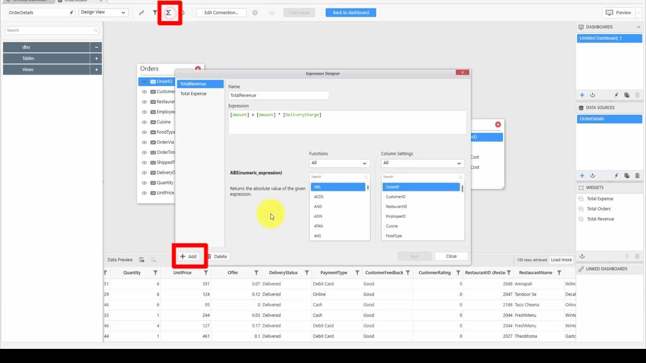
First, we name the expression “ReturnRate,” then enter this expression into the text box:
(COUNT(IF([DeliveryStatus]=’returned’, [DeliveryStats], NULL)))/COUNT([OrderID])
Let’s save the expression and close the designer.
Back in the Untitled Dashboard tab, we add another Card widget to our dashboard, expand it, and open the tab Card_2 by clicking on the blue settings icon. In the Data panel, we drag the ReturnRate expression field from the Expression Columns box to the Actual Value box. In the ReturnRate expression’s settings, we click Format, and change the Measure Formatting pop-up to match the following image:
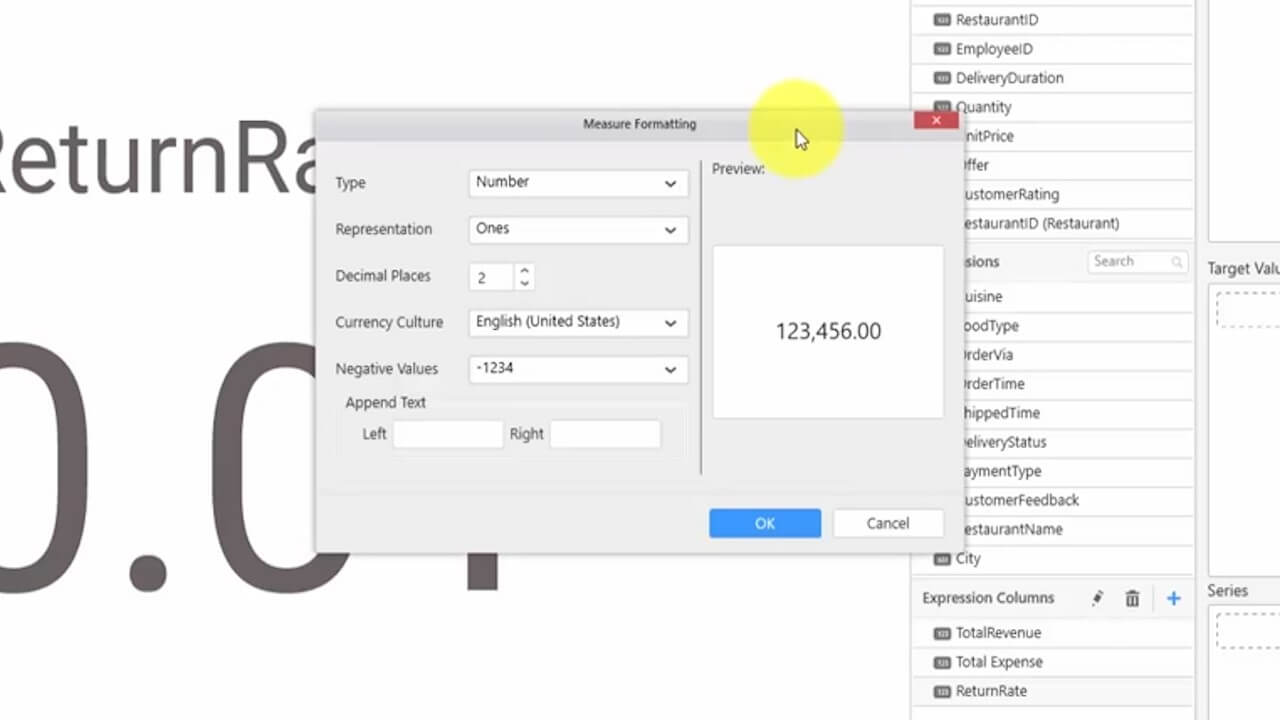
And then click OK.
Under the Properties menu, we’ll change the header to “Return Rate.” You can see the results on the Untitled Dashboard tab.
Creating a Total Orders by City widget
The next thing we want to do is compare orders amounts for different cities. For this, we’ll choose the Column chart from the Comparison section on the left sidebar, and drag it to the dashboard below the other cards. Expand its size as desired, and click the blue settings icon in the upper-right corner to bring up the Chart_1 tab.
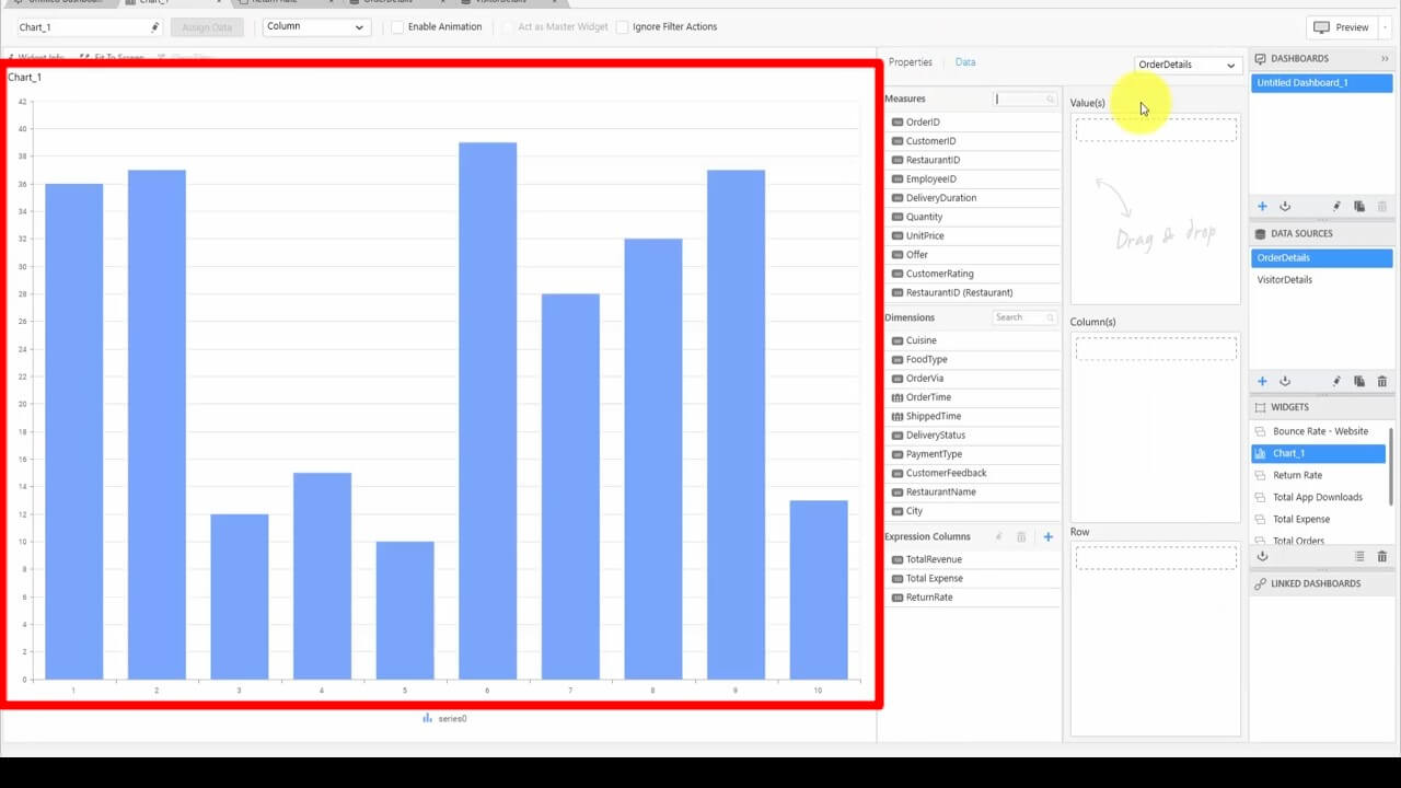
In our order details data source, we have the City field. We first drag the City field from the Dimensions box to the Column(s) box. Then drag the OrderID field from the Measures box into the Value(s) box.
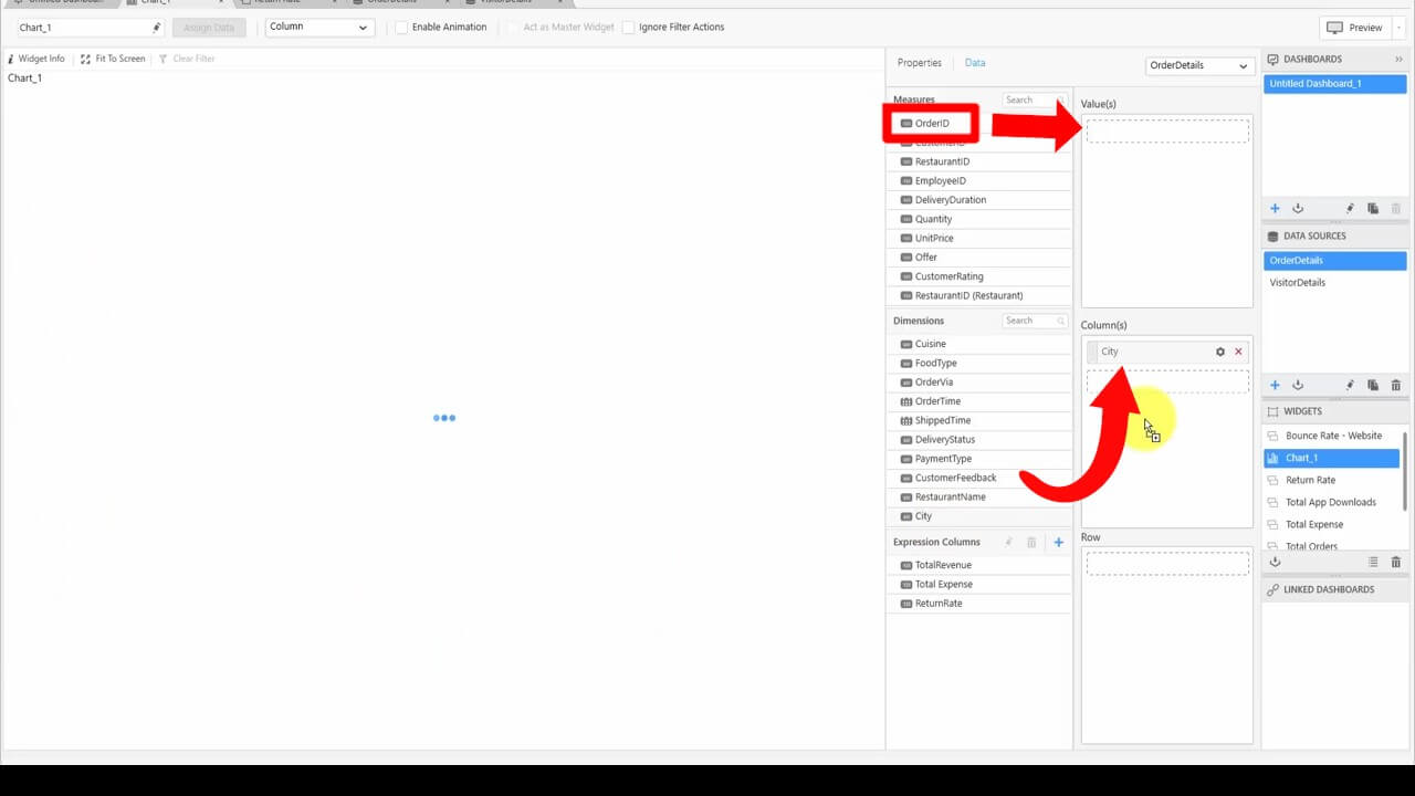
In the settings for the OrderID field, we change the aggregate to Count. Now, we have the order details of the different cities.
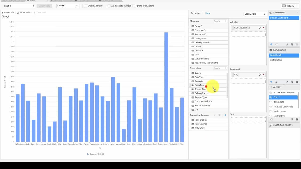
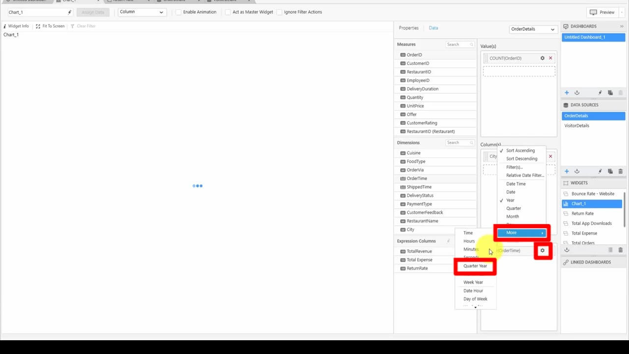
Say we need to check the order counts on a quarterly basis: We drag the OrderTime field to the Row box and change the aggregation to Quarter Year.
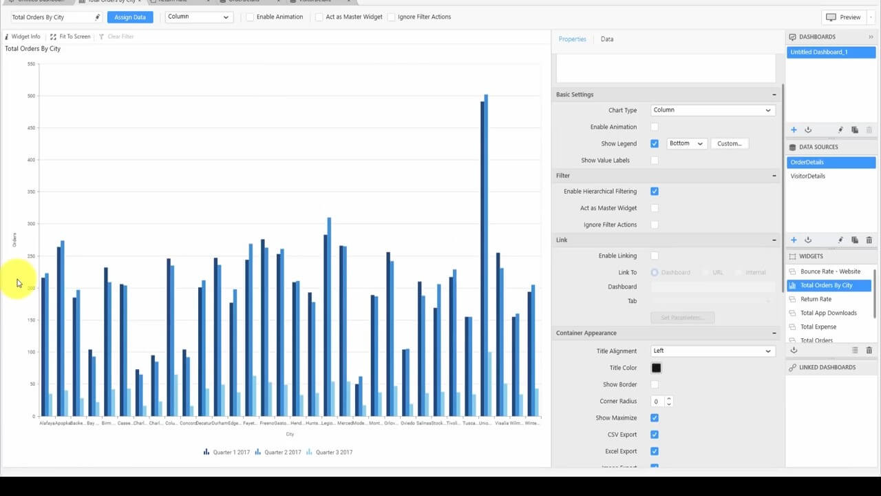
Now we have the comparison details of different cities and order counts for different quarters of the year.
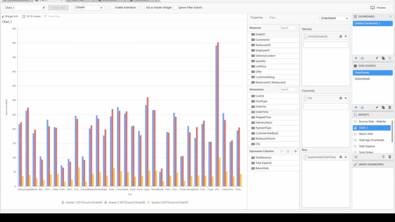
Under Properties, we can change the header to “Total Orders by City.” Scrolling down, under Series Palette, you can customize the color palette as you like. Above this, under Axis, we can also change the Primary Value Access Title to “Orders.”
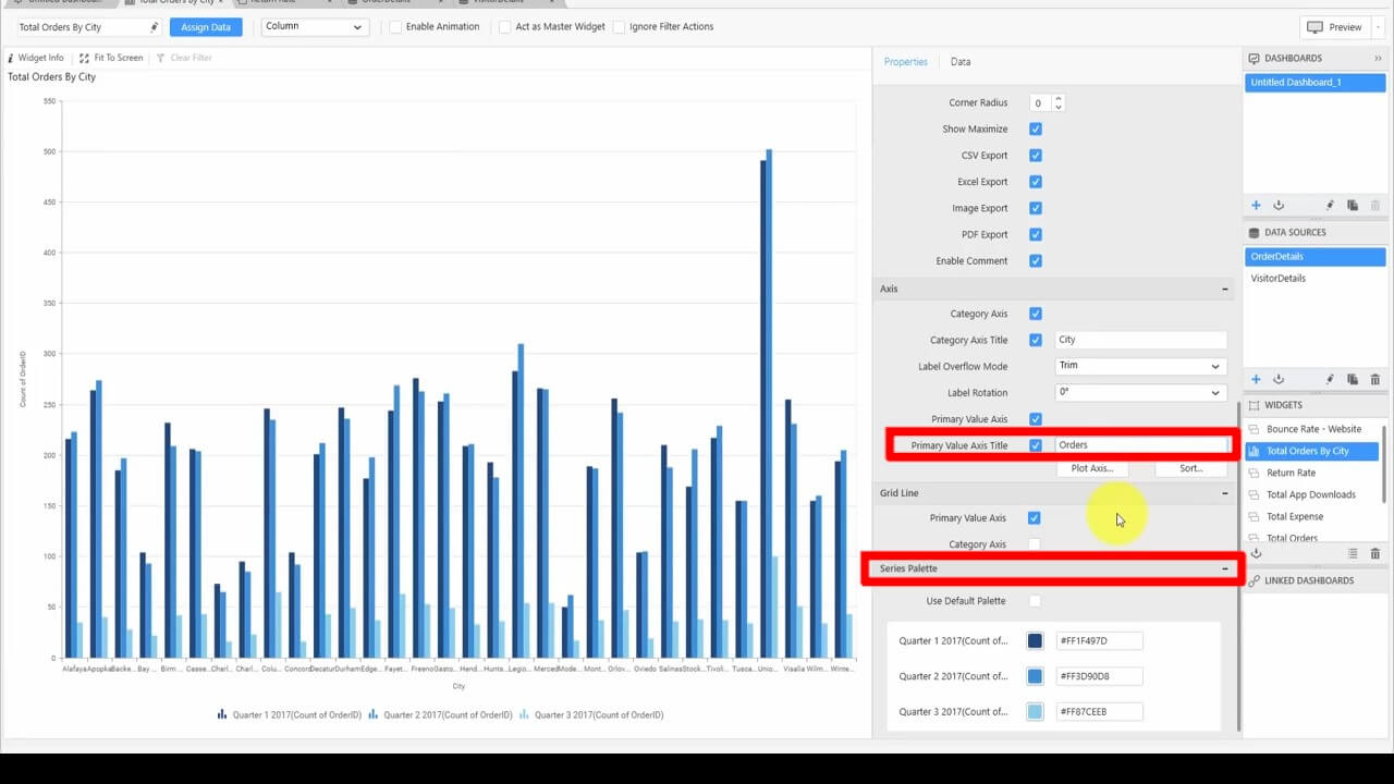
If you want to customize the legend, scroll up to Basic Settings and click Custom next to Show Legend. This is what we need. We have the plot of the city and orders for the different quarters of the year.
Conclusion
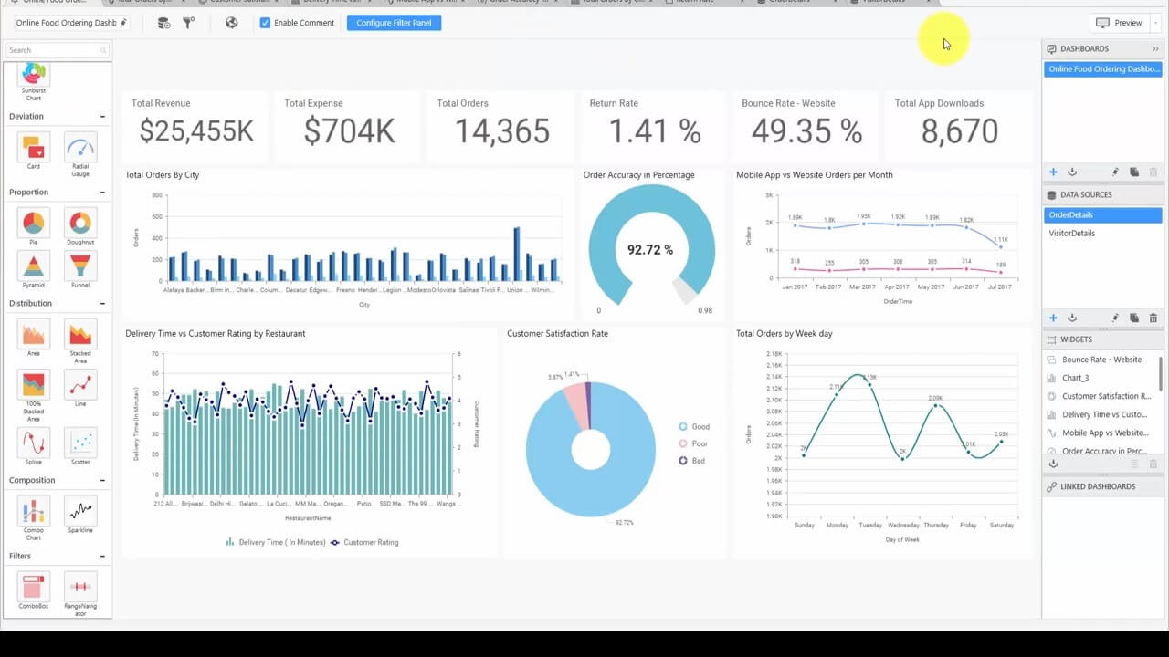
As you can see from the following image of the completed dashboard, this blog post was just a sampling of what you can do with your dashboards. For a look at how to make all of the widgets you see in this dashboard, watch our Dashboard Team’s video. We’ll be posting more how-to blog posts like this in the future, so let us know if this was useful, or what you’d like help with in the comments below.
If you liked this post, we think you’ll love these free e-books:
BI Solutions Using SSAS Tabular Model Succinctly
MongoDB 3 Succinctly
Hadoop Succinctly
Power BI Succinctly
R Programming Succinctly
Tell us about your dashboard successes in the comments!
