This blog is intended to give you a clear understanding of the best way to utilize the Essential JS 2 calendars package to choose the best-suited UI components to handle date-time values in your modern web apps.
From the package name itself, you knew that the package was going to have a calendar component. Yes, of course you’re right, but this package not only holds the calendar, it has a huge set of UI components (date picker, time picker, date-time picker, and date-range picker) to handle the date values as a single selection or range of selections in web applications.
The core intention of the calendars package is to cover all the possibilities of date-time value handling in the web with the most flexible and best-suited UI tools. They should help user interaction be smoother in applications and reduce the job of developers handling date-value codes in the development process.
As I mentioned earlier, the calendars package includes the following set of components:
What has been considered in developing these components?
UX design of components in calendars package
What will initially cause more users to choose one application over another? Most of them will go with the simplest and best UX design of the application. So, the best-designed application requires the best-designed subset of UI tools.
Here the components in the calendars package are made with a simple and excellent UX design that fits into our multiple-device world.
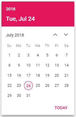
You can see in the following screen shot a component’s UX design covering all the required use cases for selecting a date and time as quickly as possible.
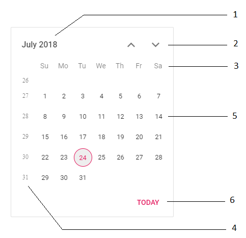
- Header text specifies the name of the current month that is displayed in the calendar table.
- Up and down arrows to navigate the previous and next months in calendar.
- Header of the days of the week.
- Week number of the year.
- Dates in calendar table.
- Today button in footer to quickly pick today’s date.
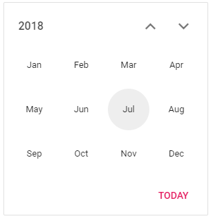
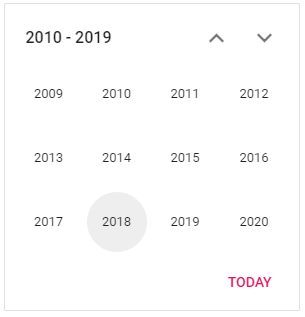
The header text of the calendar is clickable to drill down from month to year as well as year to decade and vice versa. It gives a nice experience to end users for selecting far off dates in an easy, fast way. Let’s see the UX of a drilled-down calendar in month view.
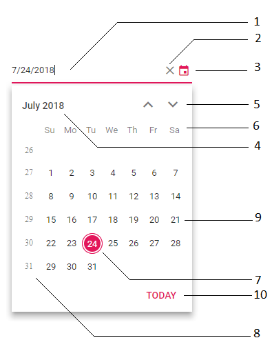
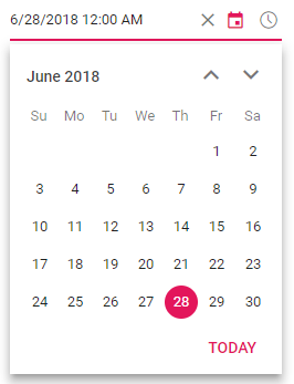
- Text box in which to enter a date value.
- Cross icon allows clearing of the value in the text box.
- Drop-down calendar icon to pop up the calendar and pick a date.
- Header that displays the name of the month, year, or decade shown in the calendar table.
- Up and down arrows to navigate the previous and next months in the calendar.
- Header with days of the week.
- Selected date.
- Week number of the year.
- All the dates in the calendar table.
- Today button in footer to pick today’s date in the calendar.
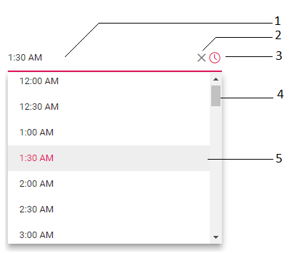
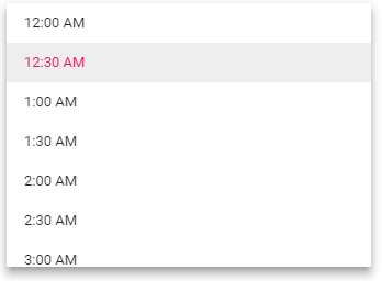
- Text box in which to enter the time value.
- Cross icon allows clearing of the value in the text box.
- Drop-down time icon to pop up the time list and pick the time.
- Default scroller to scroll and pick the time easily.
- Selected time value highlighted in list.
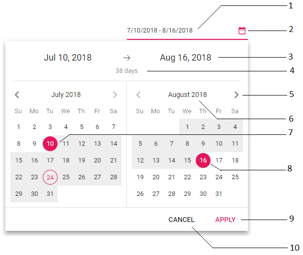
- Text box in which to enter the start and end date values.
- Drop-down range calendar icon to pop up the date-range calendar.
- Represents the selected start and end month.
- Represents the number of days in the selected date range.
- Previous and next month navigation pointer.
- Header text representing the name of the current month shown.
- Selected start date in left-side calendar.
- Selected end date in right-side calendar.
- Apply button to update the selected date-range value.
- Cancel button to cancel the selection of a date range.
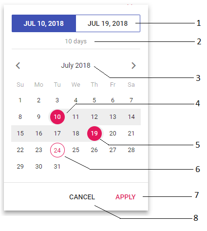
- Toggle button to change the start date and end date selection.
- Represents the number of days in the selected date range.
- Header text with the name of the month being shown.
- Selected start date.
- Selected end date.
- Today’s date is highlighted.
- Apply button to update the selected date-range value.
- Cancel button to cancel the selection of a date range.
From the UX design, it’s clear that these components are more user friendly in all devices because they cover all required use cases.
Functionalities covered in components
Not only do these components provide better user experience through UX design, they also cover all functionalities in the basis of the 80:20 rule with flexible options that will fulfill all business needs in modern applications. Here are these features:
Month or year selection—In calendar and date picker, these provide flexible options to select only the month or year as a date value.
Date range—Restricts the range of dates that can be selected.
Globalization—Supports globalization (internationalization and localization) to translate the names of months, days, and the today button text to any supported language.
First day of week—Change the first day of weeks in every month.
Disabled dates—Any date can be disabled to prevent selection.
Customization—You have complete control over the appearance of the date components.
Highlight weekends—Highlight every weekend in a month.
Week number—Show the week number of selected dates by enabling the week number options.
Formatting—Input values can be set to be custom formatted apart from the default culture-specific date format.
Validation—Allows only valid values to be entered in input by validating that values are not invalid, disabled, or out-of-min or out-of-max of the date range. The disabled and out-of-date-range values are set to be in a disabled state that prevents the end user from selecting them.
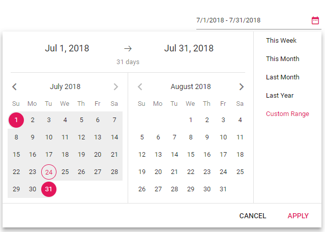
Predefined ranges—In date-range picker, define a preset of ranges to allow end users to select a frequently used date range.
When to use which component
Calendar acts as an inline component and is best suited when you want to visualize data on specific date.
Date Picker is a form component used to get or set a date value, so it’s best suited when only using a date as a value.
Time Picker is a form component used to get or set a time value, so it’s best suited when only using a time as a value.
Date-Time Picker is a form component used to get or set a date-time value, so it’s best suited when using a date as well as a time value.
Date-Range Picker is a form component used to get or set start and end date values, so it’s best suited when using a range of dates.
Summary
I hope now you understand the Syncfusion JavaScript calendars package and its available components, including their usage and when they best suit your applications. Stay tuned for other blogs about our Essential JS 2 components and their features.
Try our date-time components by downloading from the free trial or GitHub. Feel free to have a look at our online samples and documentation to explore other available options. If you have any questions or require clarification, please let us know in the comments section below. You can also contact us through our support forum or Direct-Trac. We are always happy to assist you!
If you like this blog post, we think you’ll also like the following free e-books:

Comments (4)
Hello! Is it possible to have users select time on the date range picker? And would that be mobile friendly as well?
Hi Faith,
At present there’s no option to select the time on date range picker. We have already logged a feature request on this requirement and sure it will be mobile friendly on selecting the date and time range. You could have track the feature status from this feedback https://www.syncfusion.com/feedback/5760/new-datetimerangepicker-control.
Also there’s an option to enter the date time range value in date range picker without UI interaction on selecting time, to do so please refer this sample https://ej2.syncfusion.com/demos/#/material/daterangepicker/date-format.html.
I’m using the date picker control and the situation is as follows:
In an application for booking appointments in a medical clinic, , I need to block a period of consecutive dates (for example, when a doctor is on vacations), showing an icon, so that the user understands why, in that period, the appointments are not possible for that doctor. Is this possible? Can you show me how (with code, if possible)? Thanks
Hello Fausto,
Yes. It is possible to show an icon for a specified date or a range of dates. In RenderDayCell event, you can get the details of the cell which is currently being rendered. With the help of this event callback, you can add the icon to the respective calendar date cell. Also you can set the property isDisabled of RenderDayCellEventArgs as true to block a certain date gets selected. Please find the code snippet and sampe below. In this sample we have added icons to the dates which are in the range between 10 and 20.
[code]
function customDates(args: RenderDayCellEventArgs): void {
/*Date need to be customized*/
if (args.date.getDate() >= 10 && args.date.getDate() <= 20) {
// To disable the current cell
args.isDisabled = true;
let span: HTMLElement;
span = document.createElement("span");
span.setAttribute("class", "fa fa-exclamation");
args.element.firstElementChild.setAttribute(
"title",
"Doctor is in Vacation !"
);
args.element.appendChild(span);
}
}
/*Override the default pointer events css from none to auto to display tooltip when hover*/
.e-calendar .e-content td.e-disabled {
pointer-events: auto;
}
/*When active set none to prevent click in disabled element*/
.e-calendar .e-content td.e-disabled:active {
pointer-events: none;
}
Sample Link : https://stackblitz.com/edit/special-dates
Regards,
Saravanan G