
 Farjana Parveen
TL;DR: Let’s see how to enable grouping in the Flutter DataGrid to organize and analyze data efficiently. This blog covers creating a data model, binding it to the grid, and grouping it by columns with expandable groups and caption summaries.
The Syncfusion Flutter DataGrid, also known as the Flutter DataTable, allows us to display and manage data in a tabular format. It offers features such as row selection, sorting, column resizing, row height adjustments, swiping, and more.
Grouping in Flutter DataGrid is a key feature that allows us to organize and categorize data into hierarchical clusters based on shared values within a column or multiple columns. This enhances data organization and facilitates the analysis and exploration of related records, especially in large datasets.
In this blog, we’ll see how to enable grouping in the Flutter DataGrid with code examples.
Steps to enable grouping in Flutter DataGrid
Step 1: Create the model and generate its collection
Begin by creating a model class. In this example, the Order class serves as the foundation for our data model, representing an individual order in an e-commerce system. Each order includes essential details such as the order ID, customer ID, product, price, and shipment details.
The OrderDataSource class is used to connect our data model (the Order objects) to a DataGrid. It acts as a data provider for the SfDataGrid widget in Flutter.
class Order {
  /// Creates the order class with the required details.
  Order({
    required this.orderId,
    required this.customerId,
    required this.product,
    required this.orderPrice,
    required this.city,
    required this.shippementPrice,
    required this.totalPrice,
  });

  /// Id of an order.
  final int orderId;

  /// Customer Id of an order.
  final int customerId;

  /// Product name.
  final String product;

  /// City of an order.
  final String city;


  /// Price of an order.
  final double orderPrice;

  /// Shippement price.
  final double shippementPrice;

  /// Total price (order price + shipment price).
  final double totalPrice;
}

/// Set order's data collection to data grid source.
class OrderDataSource extends DataGridSource {
  /// Creates the order data source class with required details.
  OrderDataSource({required List<Order> orders}) {
    dataGridRows = orders
        .map<DataGridRow>((order) => DataGridRow(cells: <DataGridCell>[
              DataGridCell<int>(columnName: 'OrderID', value: order.orderId),
              DataGridCell<int>(
                  columnName: 'CustomerID', value: order.customerId),
              DataGridCell<string>(columnName: 'Product', value: order.product),
              DataGridCell<double>(
                  columnName: 'Price', value: order.orderPrice),
              DataGridCell<String>(columnName: 'City', value: order.city),
              DataGridCell<double>(
                  columnName: 'ShippementPrice', value: order.shippementPrice),
              DataGridCell<double>(
                  columnName: 'TotalPrice', value: order.totalPrice),
            ]))
        .toList();
  }
}
Step 2: Create the data source and define the group structure
The OrderDataSource class is responsible for managing the data for the SfDataGrid widget. It accepts the list of orders and converts each order into a DataGridRow that the grid can display.
Here, the orders will be grouped by the Product column. This is achieved by calling the addColumnGroup() method on the OrderDataSource. This organizes orders by product type, making it easier for users to navigate large datasets.
Then, we’ll set the sortGroupRows property to true to enable automatic sorting of rows within each group based on the data.
Refer to the following code example.
class _OrderHomePageState extends State<OrderHomePage> {
  late OrderDataSource _orderDataSource;
  List<Order> _orders = <Order>[];

  @override
  void initState() {
    super.initState();
    _orders = _fetchOrders();
    _orderDataSource = OrderDataSource(orders: _orders);
    _orderDataSource
        .addColumnGroup(ColumnGroup(name: 'Product', sortGroupRows: true));
  }
}
Step 3: Create the Flutter DataGrid with columns
Now, create the SfDataGrid widget to display tabular data in a grid format. The data for the grid is provided by the _orderDataSource object, which is assumed to be defined elsewhere in the code.
The allowExpandCollapseGroup property is set to true to expand and collapse groupings. The GridLinesVisibility and HeaderGridLinesVisibility properties make both horizontal and vertical grid lines visible in the data grid.
Refer to the following code example.
@override
Widget build(BuildContext context) {
  return Scaffold(
    appBar: AppBar(
      title: const Center(child: Text('Order Details')),
    ),
    body: SfDataGrid(
      source: _orderDataSource,
      allowExpandCollapseGroup: true,
      headerGridLinesVisibility: GridLinesVisibility.both,
      gridLinesVisibility: GridLinesVisibility.both,
      columnWidthMode: ColumnWidthMode.fill,
      columns: <GridColumn>[
        GridColumn(
          columnName: 'OrderID',
          label: Container(
            padding: const EdgeInsets.all(8),
            alignment: Alignment.centerLeft,
            child: const Text('Order ID', overflow: TextOverflow.ellipsis),
          ),
        ),
        GridColumn(
          columnName: 'CustomerID',
          label: Container(
            padding: const EdgeInsets.all(8),
            alignment: Alignment.centerLeft,
            child: const Text('Customer ID', overflow: TextOverflow.ellipsis),
          ),
        ),
        GridColumn(
          columnName: 'Product',
          label: Container(
            padding: const EdgeInsets.all(8),
            alignment: Alignment.centerLeft,
            child: const Text('Product', overflow: TextOverflow.ellipsis),
          ),
        ),
        GridColumn(
          columnName: 'Price',
          label: Container(
            padding: const EdgeInsets.all(8),
            alignment: Alignment.centerLeft,
            child: const Text('Price', overflow: TextOverflow.ellipsis),
          ),
        ),
        GridColumn(
          columnName: 'City',
          label: Container(
            padding: const EdgeInsets.all(8),
            alignment: Alignment.centerLeft,
            child: const Text('City', overflow: TextOverflow.ellipsis),
          ),
        ),
        GridColumn(
          columnName: 'ShippementPrice',
          label: Container(
            padding: const EdgeInsets.all(8),
            alignment: Alignment.centerLeft,
            child: const Text('Shipment Price', overflow: TextOverflow.ellipsis),
          ),
        ),
        GridColumn(
          columnName: 'TotalPrice',
          label: Container(
            padding: const EdgeInsets.all(8),
            alignment: Alignment.centerLeft,
            child: const Text('Total Price', overflow: TextOverflow.ellipsis),
          ),
        ),
      ],
    ),
  );
}
Step 4: Configure the Flutter DataGrid to display the caption summary
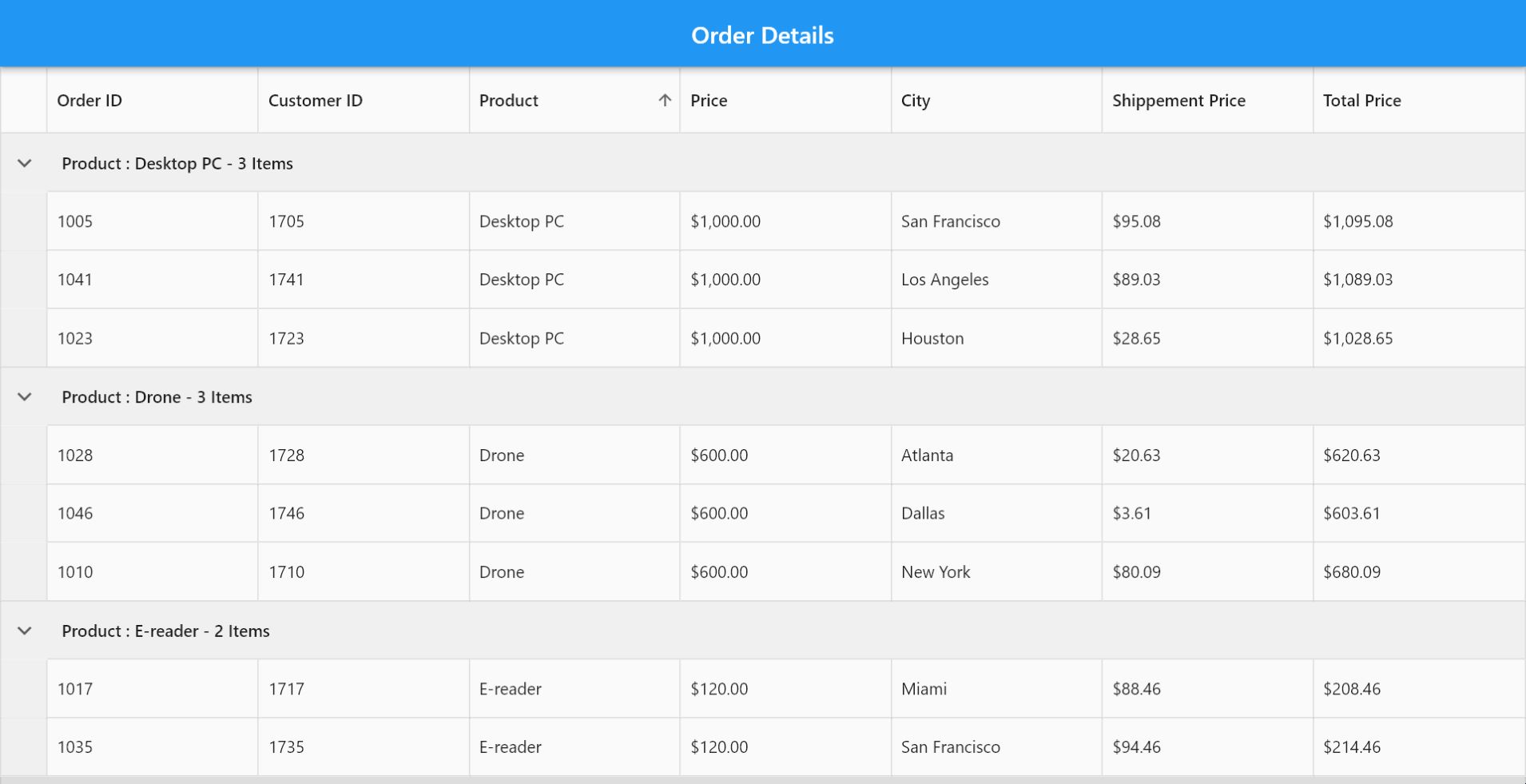
Grouping in Flutter DataGrid involves organizing and categorizing data based on specific criteria or field values. This feature enables grouping related records, forming a hierarchical structure within the DataGrid. Each group is represented by the CaptionSummaryRow displayed at the top, which holds the caption summary value of that group.
By default, the DataGrid doesn’t show the group’s caption summary value. To showcase the caption summary value, it is necessary to override the buildGroupCaptionCellWidget method. This method receives the caption summary value as a parameter. Consequently, we should return the required widget containing the summary value.
Here, we’ll override the buildGroupCaptionCellWidget method to customize how the group caption cell should be displayed in the DataGrid. The Text widget inside the Container displays the summaryValue, which is the string passed to the method. This will be the actual caption text for the group in the Flutter DataGrid. This method allows us to customize the appearance and layout of the group caption cell in the DataGrid by altering the padding and the display of the text.
Refer to the following code example.
@override
  Widget? buildGroupCaptionCellWidget(
   RowColumnIndex rowColumnIndex, String summaryValue) {
    return Container(
        padding: const EdgeInsets.symmetric(horizontal: 12, vertical: 15),
        child: Text(summaryValue));
   }
Refer to the following image.
GitHub reference
For more details, refer to the Grouping in Flutter DataGrid demo on GitHub.

Conclusion
Thanks for reading! In this blog, we’ve seen how to implement grouping in Syncfusion Flutter DataGrid, enhancing data organization and analysis in your Flutter apps. We hope you find the outlined steps helpful in achieving similar results.
If you’re an existing customer, you can download the latest version of Essential Studio® from the License and Downloads page. For those new to Syncfusion, try our 30-day free trial to explore all our features.
If you have questions, contact us through our support forum, support portal, or feedback portal. As always, we are happy to assist you!


 No spam, just valuable updates.