

TL;DR: Let’s use the React Bar Chart to visualize U.S. equity performance in 2024. We’ll collect data, structure it into an array, and bind it to the chart. Customization options like titles, strip lines, data labels, and annotations enhance clarity and insights. This interactive chart helps analyze sectoral trends and market movements effectively.
Welcome to the second episode of the Weekly Web Visualization blog series!
In this edition, we take a deep dive into the performance of U.S. equities in 2024, examining how different stock market sectors responded to key factors such as technological advancements, infrastructure development, and market volatility.
Our analysis comes to life through a visually engaging React Bar Chart powered by Syncfusion. This interactive visualization provides a detailed breakdown of sector performance, offering valuable insights into the trends that shaped the equity market.
Stay tuned as we uncover key insights and sectoral trends that defined the equity market in 2024!
Step 1: Collecting key data for 2024 U.S. equity performance
The first step is to gather accurate and relevant data. This visualization relies on the comprehensive 2024 market review published by Visual Capitalist, which provides detailed insights into the performance of various U.S. stock market sectors throughout the year.
This data serves as the foundation of our analysis, ensuring that the resulting chart effectively highlights sectoral trends, growth patterns, and overall market dynamics. Accurate data collection is crucial for producing a meaningful and reliable visualization.
Step 2: Preparing the data for React Bar Chart
To visualize U.S. equity sector performance using the React Bar Chart, we need to structure the data as an array of objects. Each data point is represented as an object, with fields corresponding to the X and Y axes.
Refer to the following code example.
export let equities: Object[] = [
    { index: 'Materials', change: -1.8 },
    { index: 'Healthcare', change: 0.9 },
    { index: 'Real Estate', change: 1.3 },
    { index: 'Energy', change: 2.3 },
    { index: 'Consumer Staples', change: 12.0 },
    { index: 'Industrials', change: 15.6 },
    { index: 'Utilities', change: 19.6 },
    { index: 'S&P 500', change: 23.3 },
    { index: 'Financials', change: 28.4 },
    { index: 'Consumer Discretionary', change: 29.1 },
    { index: 'Information Technology', change: 35.7 },
    { index: 'Communication Services', change: 38.9 }
];
Step 3: Creating Bar Charts
By utilizing the React Bar Chart component, you can transform raw data into an engaging, interactive visualization that effectively highlights the growth, challenges, and insights across various sectors. This powerful charting tool offers extensive customization options, enabling you to emphasize key trends and simplify complex data interpretation.
Let’s configure the React Bar Chart component by referring to the documentation. This will provide step-by-step guidance on implementing and customizing charts to meet your specific needs. Whether you adjust the chart appearance, enhance interactivity, or optimize for performance, the documentation ensures a smooth setup and helps you create a polished, professional chart.
<ChartComponent>
   <Inject services={[ BarSeries, DataLabel,  ChartAnnotation, StripLine, Category]}/>
   <SeriesCollectionDirective>
      <SeriesDirective type="Bar"></SeriesDirective>
   </SeriesCollectionDirective>
</ChartComponent>
Step 4: Binding U.S. equity sector data to React Bar Chart
The SeriesDirective feature allows you to seamlessly bind a data source, define the X-axis (sector names) and Y-axis (performance percentages), and fully customize the chart’s appearance to highlight the sector’s growth, challenges, and key insights.
<SeriesCollectionDirective>
  <SeriesDirective
      dataSource={equities}
      xName="index"
      yName="change"
      type="Bar"
   ></SeriesDirective>
</SeriesCollectionDirective>
In this example, the equities array, which contains the U.S. equity sector performance data, is bound to the dataSource property of the React Bar Chart. The index field is mapped to the xName property, representing sector names, while the change field is mapped to the yName property, indicating performance percentages.
Step 5: Customizing the React Bar Chart appearance
To enhance the appearance of the React Bar Chart, we’ll customize the various visual elements, such as adding a title and subtitle for context, data labels for clarity, and adjusting the chart’s background.
Adding chart title
Refer to the following code example to add a title and subtitle to the chart.
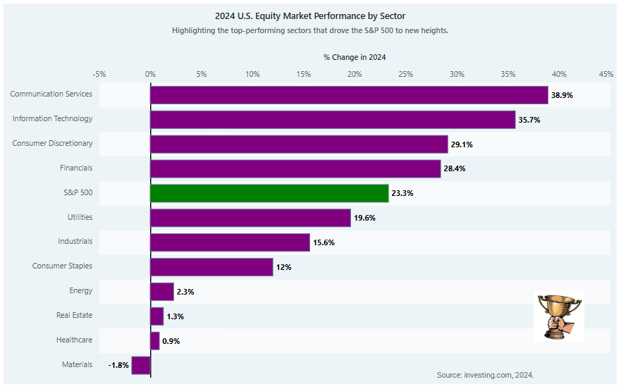
<ChartComponent id='charts' title='2024 U.S. Equity Market Performance by Sector' subtitle="Highlighting the top-performing sectors that drove the S&P 500 to new heights.">
</ChartComponent>
Customizing axis titles, tick lines, and grid lines
To modify the tick lines, axis lines, and axis titles in the React Bar Chart, we’ll use the majorTickLines, majorGridLines, and title properties in both primaryXAxis and primaryYAxis.
Additionally, the opposedPosition property allows you to render the axis in the opposite direction, and the stripLines property helps highlight specific grid lines.
Refer to the following code example.
primaryYAxis={{
   labelFormat: '{value}%', title: '% Change in 2024',
   edgeLabelPlacement: 'Shift',
   majorTickLines: { width: 0 },
   lineStyle: { width: 0 },
   opposedPosition: true,
   stripLines: [
      { start: 0, end: 0.1, visible: true, color: "black" }
   ]
}}
Adding recurring strip lines
To highlight chart areas at regular intervals using recurring strip lines, enable the isRepeat property and configure the repeatEvery property to define the repetition interval. This feature is useful for emphasizing specific ranges or thresholds across the chart.
To render strip lines, ensure that the StripLine module is injected into the chart’s services.
Refer to the following code example.
primaryXAxis={{
    valueType: 'Category', majorGridLines: { width: 0 },
    majorTickLines: { width: 0 },
    stripLines: [
       { start: -0.5, size:1,color:"#ecf4f7",
         isRepeat: true,
         repeatEvery: 1,
         visible: true },
       { start: 0.5, size: 1, isRepeat: true,
         repeatEvery: 2, color:"#f9fafc", visible: true }
    ]
 }}
Customizing data labels
To improve the readability and clarity of data points in the chart, you can enable data labels using the visible property within the dataLabel configuration. Additionally, you can customize the font style of data labels using the font property to enhance their visual presentation.
To render data labels, ensure that the DataLabel module is injected into the chart’s services.
dataLabel: {
   visible: true,
   font: {
      fontWeight: "bold"
   }
}
Adding annotations
Annotations help emphasize specific areas of interest on your chart. In React Charts, the annotations feature allows you to add custom text, shapes, or images to highlight key data points visually.
The content property within AnnotationDirective lets you insert HTML elements, such as text or images, directly onto the chart. To render annotations, ensure that the ChartAnnotation module is injected into the chart’s services.
<AnnotationsDirective>
  <AnnotationDirective content="<div style='color:#656b70'>Source: investing.com, 2024.</div>" x="80%" y="98%" coordinateUnits="Pixel"></AnnotationDirective>
  <AnnotationDirective content='<img src="https://encrypted-tbn0.gstatic.com/images?q=tbn:ANd9GcRQoVCQA2vNrULmkJpeVVtjU55OjCe7g3vXQw&s" height=80 width=80  />' x="Real Estate" y="40" coordinateUnits="Point"></AnnotationDirective>
</AnnotationsDirective>
Customizing the bar series
To modify the appearance of the bars in the React Charts, we’ll use the fill property to change the bar color and the border property to adjust the border color and width.
<SeriesDirective dataSource={equities}  fill="purple"
   border={{
    width: 1,
    color: "#648094"
   }}

/>
In 2024, the S&P 500 reached a new record high, with sector performance varying significantly. To emphasize key data points in a chart, we’ll modify their fill properties dynamically using the pointRender event. This approach highlights notable data points—such as the best- or worst-performing sectors, making the chart more informative and visually engaging.
Customizing the width of the bar and the space between each bar
To customize the width of the bars and the space between them in the React Bar Chart, you can use the columnWidth and columnSpacing properties within the SeriesDirective.
<SeriesDirective columnSpacing={0.2} columnWidth={0.9} />
Customizing the chart background
Let’s set the background property to specify a background color for the entire chart. This property allows you to apply any color or gradient to the chart’s background, enhancing the overall visual presentation.
<ChartComponent id='charts' background="#ecf4f7"></ChartComponent>
After running the above code examples, the output will appear as shown in the following image.
Reference
For more details, refer to the example for visualizing U.S. equities in 2024 using the React Bar Chart on StackBlitz.

Conclusion
Thanks for reading! In this blog, we’ve explored how to use the Syncfusion React Bar Chart to visualize the equity growth and challenges in the U.S. in 2024. Similarly, you can visualize other trends and price changes over time. We encourage you to try the steps discussed and share your thoughts in the comments below.
If you require assistance, please don’t hesitate to contact us via our support forum, support portal, or feedback portal. We are always eager to help you!


 No spam, just valuable updates.