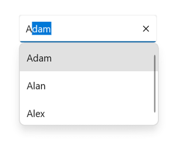
An Autocomplete control was one of the most-requested controls by our mobile app developers. We at Syncfusion understand the requirement for this essential control and have now delivered the .NET MAUI Autocomplete control in our 2022 Volume 3 release.
In this article, we will see the key features of the new .NET MAUI Autocomplete control and the steps to get started with it.
.NET MAUI Autocomplete
The .NET MAUI Autocomplete control is highly optimized to load and populate suggestions from a massive volume of data depending on the users’ input characters. It allows users to select one or more items from the suggestion list. It displays the selected items in the input view as text and removes the text when the close buttons are tapped.
Getting started with .NET MAUI Autocomplete
This section explains the steps to getting started with .NET MAUI Autocomplete control, populating it with data, and filtering the suggestions.
Step 1: Syncfusion .NET MAUI components are available on the NuGet Gallery. To add the SfAutoComplete to your project, open the NuGet package manager in Visual Studio. Search for Syncfusion.Maui.Inputs, and then install the NuGet package.
Step 2: Then, register the handler for Syncfusion core in the MauiProgram.cs file.
using Syncfusion.Maui.Core.Hosting;
using Syncfusion.Maui.ListView.Hosting;

public static class MauiProgram
{
 public static MauiApp CreateMauiApp()
 {
  var builder = MauiApp.CreateBuilder();
  builder
  .UseMauiApp<App>()
  .ConfigureSyncfusionCore()
  .ConfigureSyncfusionListView()
  .ConfigureFonts(fonts =>
  {
    fonts.AddFont("OpenSans-Regular.ttf", "OpenSansRegular");
    fonts.AddFont("OpenSans-Semibold.ttf", "OpenSansSemibold");
  });
  return builder.Build();
 }
}
Step 3: Import the SfAutoComplete namespace in the XAML page.
xmlns:inputs="clr-namespace:Syncfusion.Maui.Inputs;assembly=Syncfusion.Maui.Inputs"
Step 4: Then, initialize an empty autocomplete control like in the following code.
<inputs:SfAutocomplete x:Name="autocomplete" WidthRequest="200"/>
Step 5: Now, create the required data to populate the suggestions list. This includes creation of the example Person class, and PersonsViewModel with the list of Person objects.
public class Person
{
 public string Name { get; set; }
 public string SecondName { get; set; }
}
public class PersonsViewModel : INotifyPropertyChanged
{
 readonly IList<Person> source;
 Person selectedPerson;
 private string selectedItem;
 public ObservableCollection<Person> Persons { get; private set; }
 public List<string> Items { get; private set; }
 public Person SelectedPerson
 {
  get
  {
    return selectedPerson;
  }
  set
  {
    if (selectedPerson != value)
    {
      selectedPerson = value;
      OnPropertyChanged("SelectedPerson");
    }
  }
}
public string SelectedItem
{
 get
 {
  return selectedItem;
 }
 set
 {
  if (selectedItem != value)
  {
   selectedItem = value;
   OnPropertyChanged("SelectedItem");
  }
 }
}
public PersonsViewModel()
{
  source = new List<Person>();
  CreatePersonCollection();

  SelectedPerson = Persons.Skip(3).FirstOrDefault();
}
void CreatePersonCollection()
{
  for (int i = 0; i < 1; i++)
  {
   source.Add(new Person { Name = "Adam", SecondName = "A" });
   source.Add(new Person { Name = "Bob", SecondName = "A" });
   source.Add(new Person { Name = "John", SecondName = "D" });
   source.Add(new Person { Name = "Alan", SecondName = "E" });
   source.Add(new Person { Name = "Alex", SecondName = "F" });
   source.Add(new Person { Name = "Jacob", SecondName = "R" });
   source.Add(new Person { Name = "Peter", SecondName = "J" });
   source.Add(new Person { Name = "Clark", SecondName = "L" });
   source.Add(new Person { Name = "Ben", SecondName = "A" });
   source.Add(new Person { Name = "Dave", SecondName = "S" });
  }
  Persons = new ObservableCollection<Person>(source);
}
#region INotifyPropertyChanged
public event PropertyChangedEventHandler PropertyChanged;
void OnPropertyChanged([CallerMemberName] string propertyName = null)
{
  PropertyChanged?.Invoke(this, new PropertyChangedEventArgs(propertyName));
}
#endregion
}
Step 6: Finally, set the binding context to the PersonsViewModel, bind the ItemsSource with the Persons list and bind the DisplayMemberPath property with the Name property.
<ContentPage.BindingContext>
  <local:PersonsViewModel/>
</ContentPage.BindingContext>
<inputs:SfAutocomplete WidthRequest="200"
                       ItemsSource="{Binding Persons}"
                       DisplayMemberPath="Name"/>
That’s it. Our .NET MAUI Autocomplete control is now ready.

Key features in .NET MAUI Autocomplete
Text Search Mode
The TextSearchMode property of the .NET MAUI Autocomplete control regulates the control’s behavior when it receives user input. The available text filter modes are:
- StartsWith
- Contains
Placeholder Text
The PlaceholderText property prompts the user with information that can be searched using the Autocomplete control. This text will be displayed only if no items are selected and the edit text is empty. The default value of the PlaceholderText property is string.Empty (no string will be displayed).
Refer to the following code example.
<inputs:SfAutocomplete WidthRequest="200"
                       HeightRequest="40"
                       ItemsSource="{Binding Persons}"
                       TextSearchMode="StartsWith"
                       PlaceholderText="Search"
                       DisplayMemberPath="Name"/>

Color customization
Also, you can customize the border color, placeholder text, text color, and clear button icon color as in the following code example.
<inputs:SfAutocomplete WidthRequest="200"
                       HeightRequest="30"
                       ItemsSource="{Binding Persons}"
                       TextSearchMode="StartsWith"
                       PlaceholderText="Search"
                       ClearButtonIconColor="DeepPink"
                       PlaceholderTextColor="HotPink"
                       TextColor="DeepPink"
                       DisplayMemberPath="Name"/>
Upcoming features
This is the initial version of our Syncfusion .NET MAUI Autocomplete control. You can expect the following features in our upcoming releases:
- MultiSelection with chip UI
- Diacritic sensitivity
- Item templates
- Text match highlights
- Dropdown header and footer
- Custom filtering
Conclusion
Thanks for reading! In this blog, we have seen the features of the new .NET MAUI Autocomplete control available in our 2022 Volume 3 release. Check out our Release Notes and What’s New pages to see the other updates. You can download the Essential Studio® for .NET MAUI to evaluate this control.
You can contact us through our support forum, support portal, or feedback portal. We are always happy to assist you!


Comments (1)
Do we have a textchanged event planned for the autocomplete? This is great for a static list. However, I need to dynamically populate the observable collection. Example: Google address lookup.