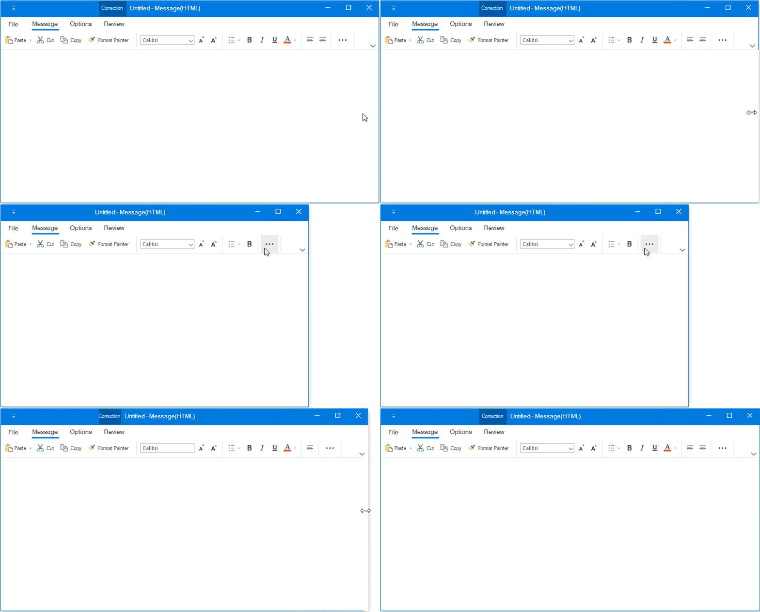
The Syncfusion WinForms Ribbon control is now available with a simplified layout. It displays the most-used ribbon commands in a single-line interface, allowing more screen space for compact viewing of the content.
For the best user experience, the other ribbon commands can be placed in the overflow menu. You can switch back and forth between the simplified and the normal layouts using the minimize button. This feature became available in our Essential Studio® 2020 Volume 4 release.
Why should you prefer the simplified ribbon layout?
The simplified layout:
- Provides a touch-friendly design.
- Shows the ribbon items in a single line, providing more vertical space.
- Allows users to choose ribbon items with less distraction than the normal layout.
- Shows the exact commands that the user wants, so it’s simple and straightforward to use.
In this blog, we will look at the new simplified ribbon layout feature in the WinForms Ribbon control and the steps to enable its custom features.
Setting up the simplified ribbon layout
Follow these steps to set up the simplified layout in the WinForms Ribbon control:
Step 1: Enable the simplified layout mode in Ribbon control
WinForms Ribbon control renders its items in simplified layout when the LayoutMode property is set to Simplified. The user can switch between simplified and normal layouts at runtime using the built-in minimize button located in the lower-right corner of the Ribbon control. To enable the minimize button, set the EnableSimplifiedLayoutMode property to true as shown in the code example.
private Syncfusion.Windows.Forms.Tools.RibbonControlAdv ribbonControlAdv1;

 this.ribbonControlAdv1 = new RibbonControlAdv();
 this.ribbonControlAdv1.LayoutMode = RibbonLayoutMode.Simplified;
this.ribbonControlAdv1.EnableSimplifiedLayoutMode = true;

 this.Controls.Add(ribbonControlAdv1);
Refer to the following GIF image.

Step 2: Set up items for different layouts
Moving ahead, the Ribbon items can be either set as the same among different layouts or can be made visible only in a particular layout by using the SetDisplayMode function in the Ribbon.
By default, the items will be displayed in both normal and simplified layouts. The RibbonItemDisplayMode is a flag of enumeration type that contains the following values:
- Normal: Displays items in normal layout.
- Simplified: Displays items in simplified layout.
- OverflowMenu: Displays items inside the OverflowMenu when the simplified layout is enabled.
Also, the RibbonItemDisplayMode enumeration property allows the following value combinations:
- Normal, Simplified: Displays items in both normal and simplified layout.
- Normal, OverflowMenu: Displays items in both normal layout and inside the overflow menu during the simplified layout.
- Simplified, OverflowMenu: Displays items in simplified layout.
- Normal, Simplified, OverflowMenu: Displays items in both normal and simplified layouts along with the overflow menu.
Refer to the following code examples.
// To display an item only in simplified layout.
 ToolStripButton pasteButton = new System.Windows.Forms.ToolStripButton();
 pasteButton.Text = "Paste";
 ribbonControlAdv1.SetDisplayMode(pasteButton, RibbonItemDisplayMode.Simplified);

 // To display an item only in normal layout.
 ToolStripButton boldButton = new System.Windows.Forms.ToolStripButton();
 boldButton.Text = "Bold";
 ribbonControlAdv1.SetDisplayMode(boldButton, RibbonItemDisplayMode.Normal);

 // To display an item in normal layout and inside an overflow menu during the simplified layout.
 ToolStripButton underlineButton = new System.Windows.Forms.ToolStripButton();
 underlineButton.Text = "Underline";
 ribbonControlAdv1.SetDisplayMode(underlineButton, RibbonItemDisplayMode.Normal | RibbonItemDisplayMode.OverflowMenu);

 // To display an item both in normal and simplified layout by default.
 ToolStripButton italicButton = new System.Windows.Forms.ToolStripButton();
 italicButton.Text = "Italic";
Step 3: Setting images for Ribbon items
For Normal layout mode, images will be loaded from the item’s image property and their size values can be set using the SetSmallItemImage and SetLargeItemImage functions of the ToolStripExImageProvider class. So, the images will fit inside the Ribbon items based on the display style and image scaling.
The simplified layout mode uses the 20 * 20 image size for the Ribbon items as standard. You can also set the size by using the SetMediumItemImage function in the ToolStripExImageProvider class like in the following code.
ToolStripButton pasteButton = new System.Windows.Forms.ToolStripButton();
 pasteButton.Text = "Paste";
 toolStripEx1.Items.Add(pasteButton);

 // Add image for the Paste button for simplified layout to image list.
 ImageListAdv imageListAdv1 = new ImageListAdv(this.components);
 imageListAdv1.Images.Add(Image.FromFile("..//..//Images/Medium Icons/Paste20.png"));

 ToolStripExImageProvider toolStripExImageProvider1 = new ToolStripExImageProvider(toolStripEx1);
 // Setting image list to the MediumImageList for the toolStripEx1.
 toolStripExImageProvider1.MediumImageList = imageListAdv1;
 toolStripExImageProvider1.SetMediumItemImage(pasteButton, 0);
Refer to the following screenshot.

Step 4: Add a new RibbonTab or RibbonBar
The Ribbon control allows you to customize the Ribbon and its items through the QAT (quick access toolbar) window, where users can add the Ribbon items to a new ToolStripTabItem or ToolStripEx class. The newly added ToolStripTabItem or ToolStripEx will only be visible in the layout in which the items were added originally.
In the following example, the LayoutMode is set to Simplified and a new ToolStripTabItem named Folder is created and added using the QAT window. This tab will now be visible only in the simplified layout and not in the normal layout that is the default behavior.
Refer to the following screenshots.


Step 5: Add new items to the QAT
The Ribbon control also allows you to add items to the QAT with the help of the QAT window or through the context menu shortcut. The items added in the normal or simplified layout will always be visible even when switching between layouts.
In the following reference image, the LayoutMode is set to Simplified and the Bold item was added to the QAT through the context menu. This item will now be constantly visible in both normal and simplified layouts.


Step 6: Resize the Ribbon control
While resizing the Ribbon, when the width of the window decreases and touches the last positioned item in the Ribbon, the appropriate item will be moved inside the overflow menu automatically. The same behavior will continue for each item when the window is resized continuously.
Refer to the following .gif image.

References
Documentation link: https://help.syncfusion.com/windowsforms/ribbon/simplifiedlayout
Conclusion
Thanks for reading! In this blog, we have looked at the newly introduced simplified layout and how to enable its custom features in the Syncfusion WinForms Ribbon control. These features will provide different UI layout options and they are available in our Essential Studio® 2020 Volume 4 release.
For existing customers, the new Essential Studio® version is available for download from the License and Downloads page. If you are not yet a Syncfusion customer, you can try our 30-day free trial to check out our available features.
If you wish to send us feedback or ask any questions, please use the comments section below. You can also contact us through our support forum, Direct-Trac, or feedback portal. We are always happy to assist you!
If you like this blog post, we think you’ll like the following blog posts, too:


