We’re thrilled to present the latest enhancements in our Syncfusion Blazor DatePicker and TimePicker components. We’ve enhanced the date and time inputs for optimal user experience, emphasizing accuracy and simplicity.
Our new date-only and time-only features allow you to input just the date or time as needed. These features, ideal for scheduling events, setting reminders, or logging data, are designed to minimize confusion, reduce errors, and enhance user experience.
Let’s explore these updates and see how they can transform your experience with our Syncfusion Blazor DatePicker and TimePicker components!
Prerequisites
- .NET 7 or above: Full serialization support for these types only came with .NET 7, so ensure you have .NET 7 or a later version installed in your development environment.
- Syncfusion Blazor Calendar packages: Available from Syncfusion Blazor components on NuGet and the official documentation. Remember the necessary licenses or trial keys.
Getting started with Syncfusion Blazor components
Before proceeding, refer to the getting started documentation for the Blazor DatePicker and TimePicker components.
Introducing date-only support for Blazor DatePicker
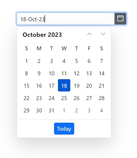
The date-only feature in the Blazor DatePicker empowers developers to configure the control to accept date inputs, removing the time component entirely. This streamlines the user interface and simplifies data entry, as users are now free from selecting a time.
Refer to the following code example.
@using Syncfusion.Blazor.Calendars

<SfDatePicker TValue="DateOnly" @bind-Value="@Value"></SfDatePicker>

@code
{
    public DateOnly Value { get; set; } = new DateOnly(2022, 11, 12);
}
The @bind-Value attribute establishes a two-way binding between the Value property and the DatePicker, ensuring seamless synchronization between the user input and the app’s data model.
With this elegant configuration, the DatePicker morphs into a date-only picker, enabling users to select dates without the distraction of time input.

Introducing Time-Only Support for the TimePicker Component
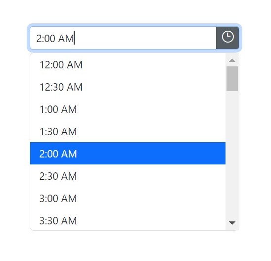
Similarly, the time-only support feature for the TimePicker component lets developers create a time-specific input, exclusively focusing on the time without any date selection. This is perfect for scenarios where users only need to pick a specific time, such as setting same-day reminders.
To enable time-only support, developers can use the following C# code.
@using Syncfusion.Blazor.Calendars

<SfTimePicker TValue="TimeOnly" @bind-Value="@Value" ></SfTimePicker>

@code
{
    public TimeOnly Value { get; set; } = new TimeOnly(12, 00, 00);
}
Once again, the @bind-Value attribute facilitates seamless interaction between the user input and the app’s data model, ensuring the selected time is accurately captured.
Now, the TimePicker is a time-only picker, allowing users to choose their desired time without distractions from date selection.

Date-Only Support Beyond the DatePicker
It’s worth noting that the date-only support extends beyond the DatePicker component. Other date-related components like Calendar and DateRangePicker also benefit from this feature. This enables you to create consistent and focused date input experiences throughout your Blazor app.
Conclusion
We appreciate your company in this exploration of the new date-only and time-only features in our Syncfusion Blazor DatePicker and TimePicker components. These enhancements have transformed how we handle date and time inputs in Blazor apps, offering users a streamlined and simplified interface.
If you’re new to Syncfusion, download a free trial of Essential Studio® for Blazor and start exploring its controls immediately.
If you have questions, you can contact us through our support forums, support portal, or feedback portal. Our dedicated team is always ready to assist you! Stay tuned for more updates.
Related blogs
- Syncfusion Essential Studio® 2023 Volume 3 Is Here!
- What’s New in Syncfusion Blazor: 2023 Volume 3
- Enhancing Data Visualization with a Nested Grid UI in Blazor TreeGrid
- Smartly Customize the Blazor Linear Gauge to Reproduce a Step Progress Bar


