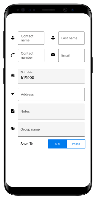
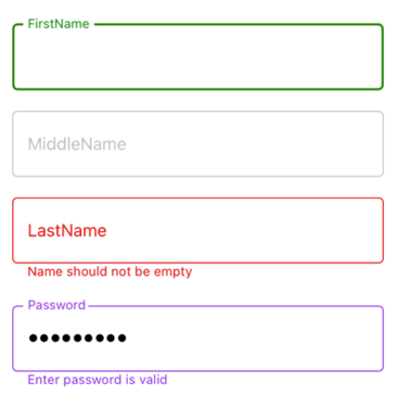
The Syncfusion Xamarin.Forms DataForm supports a floating label layout that includes features such as assistive labels, leading and trailing icons, and a password toggle icon to show or hide a password. It enhances the user experience of filling the DataForm by showing hints and error messages in a more intuitive way. In this blog, I will explain how to add a floating label layout in Xamarin.Forms DataForm control.

Before reading further, go through the Getting Started with Xamarin.Forms DataForm documentation.
Adding the floating label layout in the DataForm
By default, the DataForm arranges editors and their labels corresponding to data fields in the stack layout. You can enable the floating label layout in Xamarin.Forms DataForm by setting the LayoutOptions property of the DataForm or DataFormItem to TextInputLayout.
Refer to the following code.
<dataForm:SfDataForm x:Name="dataForm" LayoutOptions="TextInputLayout">
 <dataForm:SfDataForm/>
Editors supported in DataForm floating label layout
The Xamarin.Forms DataForm supports the floating label layout for the following editors:
- Text editor
- Password editor
- Masked edit text editor
- Numeric editor
- Multiline text editor
- Date editor
- Time editor
- Picker editor
- Drop-down editor
- Autocomplete editor
Features of DataForm floating label layout
Important features of the floating label layout are:
Container types
Containers help us enhance the appearance of the editor views and provide some contrast between editors and assistive labels. The three container types are:
- Outlined
- Filled
- None
Refer to the following code.
<dataForm:SfDataForm
        x:Name="dataForm"
          ContainerType="Outlined">
</dataForm:SfDataForm>
The default container type is Outlined. You can also set the container type to Filled and None.

Leading and trailing views
Adding a leading icon helps indicate the expected input types, such as birth dates, phone numbers, or passwords. Use the trailing icons to include clear buttons, error icons, voice input symbols, and drop-down symbols.
To add these icons, use the LeadingView and TrailingView properties in the TextInputLayoutSettings of the DataFormItem. Use the LeadingViewPosition and TrailingViewPosition properties to change the position of the leading and trailing views respectively.
Refer to the following code example.
dataForm.AutoGeneratingDataFormItem += DataForm_AutoGeneratingDataFormItem;

private void DataForm_AutoGeneratingDataFormItem1(object sender, AutoGeneratingDataFormItemEventArgs e)
{
    if (e.DataFormItem != null)
    {
        if (e.DataFormItem.Name.Equals("ContactNumber"))
        {
            e.DataFormItem.TextInputLayoutSettings = new TextInputLayoutSettings()
            {
                LeadingView = new Label()
                {
                    VerticalTextAlignment = Device.RuntimePlatform == Device.iOS ? TextAlignment.Center : TextAlignment.Start,
                    FontSize = Device.RuntimePlatform == Device.iOS ? 18 : 24,
                    Text = "F",
                    FontFamily = Device.RuntimePlatform == Device.iOS ? "ContactsIcons" :
                                                            Device.RuntimePlatform == Device.Android ? "ContactsIcons.ttf#ContactsIcons" : "Assets/Fonts/ContactsIcons.ttf#ContactsIcons"
                },

                TrailingView = new Label()
                {
                    VerticalTextAlignment = Device.RuntimePlatform == Device.iOS ? TextAlignment.Center : TextAlignment.Start,
                    FontSize = Device.RuntimePlatform == Device.iOS ? 18 : 24,
                    Text = "A",
                    FontFamily = Device.RuntimePlatform == Device.iOS ? "ContactsIcons" : Device.RuntimePlatform == Device.Android ? "ContactsIcons.ttf#ContactsIcons" : "Assets/Fonts/ContactsIcons.ttf#ContactsIcons"
                },
            };
        }
    }
}

Helper text, error text, and character counter
Displaying helper and error texts is essential to all types of form-filling. With these assistive labels, we can communicate to the users what type of input is expected. We can also show error messages when the typed input is not in the expected format.
Helper text label
Display a watermark in the editor fields to provide a hint for users. It can be set using Prompt. The helper text in the Xamarin.Forms DataForm floating label layout can be collapsed by setting the ShowHelperText to false in the DataForm or TextInputLayoutSettings.
Refer to the following code.
<dataForm:SfDataForm x:Name=”dataForm” LayoutOptions=”TextInputLayout" ShowHelperText="False">
  <dataForm:SfDataForm/>

Validation label
Also, the Xamarin.Forms DataForm allows you to display validation messages for the data provided.
Refer to the following code example.
private string _Name;

[Required(AllowEmptyStrings = false, ErrorMessage = "Name should not be empty")]
[StringLength(10, ErrorMessage = "Name should not exceed 10 characters")]
public string Name
{
    get { return this._Name; }
    set
    {
        this._Name = value;
        this.RaisePropertyChanged("Name");
    }
}

Counter label
Use this label to display the character count limitation in a given form field validation. To enable this feature, set the ShowCharCount property to true. The character limit can be set using the StringLength attribute.
Refer to the following code example.
dataForm.AutoGeneratingDataFormItem += DataForm_AutoGeneratingDataFormItem;

private void DataForm_AutoGeneratingDataFormItem(object sender, AutoGeneratingDataFormItemEventArgs e)
{
    if (e.DataFormItem != null && e.DataFormItem.Name == "Password")
    {
        e.DataFormItem.ShowCharCount = true;
    }
}

private string _Password;

[Required(AllowEmptyStrings = false, ErrorMessage = "Password should not be empty")]
[StringLength(10, ErrorMessage = "Password should not exceed 10 characters")]
public string Password
{
    get { return this._Password; }
    set
    {
        this._Password = value;
        this.RaisePropertyChanged("Password");
    }
}

Color customizations
Customize the in-focus, out-of-focus, error, valid message, and container colors to enrich the appearance of your application.
Refer to the following code example.
dataForm.AutoGeneratingDataFormItem += DataForm_AutoGeneratingDataFormItem;
dataForm.ContainerBackgroundColor = Color.Silver;

private void DataForm_AutoGeneratingDataFormItem1(object sender, AutoGeneratingDataFormItemEventArgs e)
{
    if (e.DataFormItem != null)
    {
        if (e.DataFormItem.Name == "Name")
        {
            e.DataFormItem.FocusedColor = Color.Violet;
            e.DataFormItem.UnfocusedColor = Color.Silver;
            e.DataFormItem.ErrorMessageColor = Color.DarkRed;
            e.DataFormItem.ValidMessageColor = Color.BlueViolet;
        }
    }
}

GitHub repository
You can get the complete code example for the Xamarin.Forms DataForm with floating labels on GitHub.
Conclusion
Thanks for reading! In this blog post, we’ve discussed how to add a floating label layout in our Xamarin.Forms DataForm control. This feature helps modernize the look of your data form by showing assistive labels, leading and trailing icons, and more. For more details, go through our floating label layout in Xamarin DataForm documentation. Try out the procedures in this blog post and leave your comments in the feedback section below!
The Syncfusion Xamarin suite has over 155 controls from basic editors to powerful, advanced controls like DataGrid, Charts, ListView, and RTE. Use them to build mesmerizing applications!
You can also contact us through our support forums, Direct-Trac, or feedback portal. We are always happy to assist you!
