Xamarin.Forms allows end users to create native user interfaces on Android, iOS, and UWP platforms using a single, shared C# codebase. It provides a multitude of customization options on each native platform, since the UI is rendered using different native control Renderer classes.
With over 40 pages, layouts, and controls built into the Xamarin.Forms library, you can do almost anything while building your native mobile apps on Android, iOS, and UWP. The best thing about Xamarin.Forms is the ability to completely customize each built in-control. In addition to that, you can use platform-specific APIs and custom controls. You can reuse your custom native control in Xamarin.Forms applications using the custom renderer concept.
There are two ways of creating a custom control:
- Using the built-in layouts and controls.
- Using a dummy wrapper class in the PCL/.NET standard project with bindable properties or in the renderer of each platform.
Simple ListView
In this blog post, we are going to create custom controls using the first approach. There are numerous custom controls in Xamarin. However, my favorite is the ListView, which is required in a majority of the applications we use.
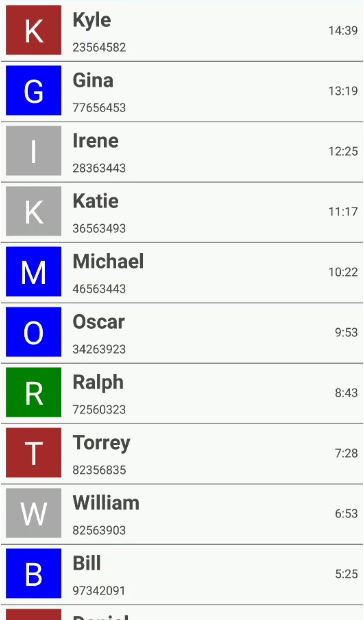
What if you could create your own ListView that could render any data with just few lines of code? What if you could provide options to customize the view loaded in it without too much coding? That is exactly what we are going to see in this blog post: a simple ListView that displays contact information like in a mobile phone.
To create a ListView, first we need to write a class that contains the properties of the control. The best part about any ListView is that it reuses items when we scroll. In other words, it creates only the child and rearranges the items that go out of the viewport when we scroll. This logic is adopted in here, as well, and thus we need a scroll container to control this logic flow.
Displaying contact information in ListView
A ListView is a data-bound control. Therefore, you must create a data model to bind to the control.
We’ll create a simple data source and bind it to our ListView. In this case, simple “contact details of some random users” have been modeled that generate random contact details containing a user name, user image, call time, and the contact number. In a real-world scenario, you can also bind the data from the services and database to render in the ListView control.
public class ContactInfo
{
    public string ContactName { get; set; }
    public string CallTime { get; set; }
    public string ContactImage { get; set; }
    public long ContactNumber { get; set; }
    public Color ContactImageColor { get; set; }
}
Model class with properties
public class ContactsViewModel
{
    public ObservableCollection Contacts { get; set; }

    public ContactsViewModel()
    {
        GenerateContactDetails();
        Contacts = new ObservableCollection();

        foreach (var cusName in CustomerNames)
        {
            ContactInfo contact = new ContactInfo();
            ...
            Contacts.Add(contact);
        }
    }

    private void GenerateContactDetails()
    {
        ContactNumbers.Add("Kyle", 23564582);
        ContactNumbers.Add("Gina", 77656453);
        ...
        ContactNumbers.Add("Liam", 28726937);
        ContactNumbers.Add("Jacob", 39283738);
    }
}
Populating the model collection
Implementation logic
The ListView class contains the required properties to customize the appearance of the custom ListView and a subscription to the Scrolled event. The properties in the custom ListView are:
- DataSource—To bind any collection to be rendered.
- ItemTemplate—To customize the views that need to be loaded inside.
- ItemHeight—To customize the height of the items, based on the views loaded in the ItemTemplate.
The following code illustrates the exact implementation of our SimpleListView that holds a custom view ScrollController as its content.
public class SimpleListView : ScrollView, IDisposable
{
    private ScrollController controller;
    public int ItemHeight { get; set; }
    public DataTemplate ItemTemplate { get; set; }

    public static readonly BindableProperty DataSourceProperty =
        BindableProperty.Create("DataSource", typeof(IList), typeof(SimpleListView), null, BindingMode.TwoWay);

    public IList DataSource
    {
        get { return (IList)GetValue(DataSourceProperty); }
        set { this.SetValue(DataSourceProperty, value); }
    }

    public SimpleListView()
    {
        this.Orientation = ScrollOrientation.Vertical;
        this.ItemHeight = 60;
        this.controller = new ScrollController() { ListView = this };
        this.Scrolled += this.controller.ListView_Scrolled;
        this.Content = this.controller;
    }

    public void Dispose()
    {
        this.Scrolled -= this.controller.ListView_Scrolled;
    }
}
Loading initial views in the ListView
First, we need to create the views that fit within the view area. This can be done in the OnMeasure override of the ScrollController class. Obtain the number of items that fits within the view by diving the height of ListView by the item height. Maintain the created views in a list along with their index and the BindingContext information.
protected override SizeRequest OnMeasure(double widthConstraint, double heightConstraint)
{
    if (isFirstTime)
        CreateView((int)Math.Ceiling(ListView.Height / this.ListView.ItemHeight));

    var totalheight = this.ListView.DataSource.Count * this.ListView.ItemHeight;
    return (new SizeRequest(new Size(widthConstraint, totalheight)));
}

public void CreateView(int count)
{
    for (int i = 0; i < count; i++)
    {
        ItemView template = new ItemView
        {
            Content = (View)this.ListView.ItemTemplate.CreateContent(),
            BindingContext = this.ListView.DataSource[i],
            IsEnsured = false,
            ItemIndex = -1,
        };
        viewItems.Add(template);
        this.Children.Add(template);
    }
    isFirstTime = false;
}
The created views maintained in a list can be arranged sequentially based on the index in the LayoutChildren override.
protected override void LayoutChildren(double x, double y, double width, double height)
{
    double yPosition;
    foreach (var item in viewItems)
    {
        yPosition = item.ItemIndex * this.ListView.ItemHeight;
        item.Layout(new Rectangle(x, yPosition, width, this.ListView.ItemHeight));
    }
}
Reusing the items in the ListView when scrolling
In simple words, pick the item, whenever it goes out of the view. Then the index and the data of the item are modified and rearranged either at the top or bottom of the list based on the scroll direction.
We need to maintain a property to store the offset value and call the OnSizeAllocated method whenever the scroll offset changes to refresh the view.
The following illustrates the code logic to reuse items in the ListView control.
internal void ListView_Scrolled(object sender, ScrolledEventArgs e)
{
    this.ScrollY = e.ScrollY;
}

internal double ScrollY
{
    get { return this.scrollY; }
    set
    {
        if (this.scrollY != value)
        {
            this.scrollY = value;
            this.OnSizeAllocated(this.Width, this.Height);
        }
    }
}

protected override void OnSizeAllocated(double width, double height)
{
    var start = (int)Math.Floor(ScrollY / this.ListView.ItemHeight);
    int noOfItems = (int)Math.Ceiling(ListView.Height / this.ListView.ItemHeight);

    foreach (var item in viewItems)
        item.IsEnsured = false;

    for (int i = start; i < start + noOfItems; i++) { var row = this.viewItems.FirstOrDefault(x => x.ItemIndex == i);
        if (row == null)
        {
            row = this.viewItems.FirstOrDefault(x => ((x.ItemIndex < start || x.ItemIndex > (start + noOfItems - 1)) && !x.IsEnsured));
            if (row == null)
            {
                CreateView(1);
                row = this.viewItems.FirstOrDefault(x => ((x.ItemIndex < start || x.ItemIndex > (start + noOfItems - 1)) && !x.IsEnsured));
            }
            if (row != null)
            {
                row.ItemIndex = i;
                row.BindingContext = this.ListView.DataSource[i];
                row.IsEnsured = true;
            }
        }
        else
            row.IsEnsured = true;
    }
    base.OnSizeAllocated(width, height);
}
Binding contact information to the custom ListView
Design your template and define a suitable item height for your template. Then render the custom ListView in the view.
The following code illustrates a simple template for rendering the contact information that we generated earlier.
<ContentPage xmlns="http://xamarin.com/schemas/2014/forms"
             xmlns:x="http://schemas.microsoft.com/winfx/2009/xaml"
             xmlns:local="clr-namespace:CustomControl"
             x:Class="CustomControl.MainPage"
             Padding="5,5,10,5>

    <ContentPage.BindingContext>
        <local:ContactsViewModel x:Name="viewModel" />
    </ContentPage.BindingContext>

    <local:SimpleListView ItemHeight="60"
                          DataSource="{Binding Contacts}">
        <local:SimpleListView.ItemTemplate>
            <DataTemplate>
                <StackLayout>
                    <Grid>
                        <Grid.ColumnDefinitions>
                            <ColumnDefinition Width="60" />
                            <ColumnDefinition Width="*" />
                            <ColumnDefinition Width="Auto" />
                        </Grid.ColumnDefinitions>
                        <ContentView Padding="5, 0, 5, 0">
                            <Label Text="{Binding ContactImage}" BackgroundColor="{Binding ContactImageColor}" TextColor="White" FontSize="32"  HorizontalOptions="FillAndExpand" VerticalOptions="FillAndExpand" HorizontalTextAlignment="Center" VerticalTextAlignment="Center" />
                        </ContentView>
                        <StackLayout Grid.Column="1">
                            <Label LineBreakMode="NoWrap" TextColor="#474747" Text="{Binding ContactName}" FontSize="16" FontAttributes="Bold" VerticalTextAlignment="Center" />
                            <Label TextColor="#474747" LineBreakMode="NoWrap" Text="{Binding ContactNumber}" FontSize="12" VerticalTextAlignment="Center" HorizontalTextAlignment="Start" />
                        </StackLayout>
                        <Label Grid.Column="2" TextColor="#474747" LineBreakMode="NoWrap" Text="{Binding CallTime}" FontSize="12" VerticalTextAlignment="Center" HorizontalTextAlignment="Start" />
                    </Grid>
                    <BoxView BackgroundColor="Gray" HeightRequest="1" />
                </StackLayout>
            </DataTemplate>
        </local:SimpleListView.ItemTemplate>
    </local:SimpleListView>
</ContentPage>
Note: The custom ListView creation in the previous code example is entirely explained with XAML logics. However, you can also do this with the code behind.
Congratulations on configuring a simple, custom ListView in your application. Just running the sample with these steps will render a beautiful ListView in your view.

Xamarin Forms Custom List View
The previous screenshot shows the outcome of the custom ListView. However, you might want to add some more customization options and advanced features. To see these, you can refer to the Syncfusion ListView and DataGrid components pages.
Conclusion
In this blog post, we looked at creating and configuring a simple custom control, custom ListView with customizable item heights and templates in Xamarin.Forms. Be sure to download the sample application to deploy a readily runnable sample and experience how easy it is to create a custom control in Xamarin.Forms!
If you are a current customer, we invite you to check out the Syncfusion ListView and DataGrid components for Xamarin. If you are not a current customer, you can always download our free evaluation to see them in action. You can also explore the ListView and DataGrid samples available on Google Play and the App Store, and learn about advanced features in our documentation (ListView, DataGrid).
If you have any questions or require clarification, please let us know in the comments section below. You can also contact us through our support forum or Direct-Trac or Feedback Portal. We are happy to assist you!


Comments (4)
When you compile and execute the above code, it will produce the following window with a custom control which is a customized button.
Hi ATMOSFERIS,
Based on your update, we couldn’t clearly get your requirement. Can you please update on the following queries?
* Did you face any issues when using the above example? If yes, can you please provide more details?
* Are you providing details about your custom control?
Hi, Instead of imageColor , how to use contacts imageUrl, I tried but not working, I took imageUrl as string in model
Hi SAYYAD,
In this blog, we have used the label control to create an image look-like appearance i.e., we have only showed the text with a background color. Instead of using the Label control, you can use the Image control to display an image from an Image URL. For further details, refer this documentation.
We would also like to let you know that we have our own ListView control. With our ListView, you can create any type of item appearance with the high performance. To learn how to display an image from a URL, see the Knowledge Base article below,
https://www.syncfusion.com/kb/11485/how-to-display-uri-images-in-xamarin-forms-listview-sflistview
Regards,
Neelakandan