TLDR: Discover the new Syncfusion Blazor 3D Charts component in the 2024 Volume 2 release! Transform your data into stunning 3D visualizations with features like multiple chart types, data binding, rotation, tilt, and interactive elements. Learn how to integrate and use this powerful tool in your Blazor apps.
Imagine stepping into a world where data leaps off the page, where two-dimensional graphs evolve into vibrant three-dimensional masterpieces. This is the magic of 3D charts, a dynamic canvas that breathes life into complex datasets.
We’re glad to unveil the new Syncfusion Blazor 3D Charts component in the Essential Studio® 2024 Volume 2 release. This trailblazing tool is not just about data presentation; it’s about transforming data into a story to add depth and clarity to your visualizations.
Let’s explore the features of this innovative Blazor 3D Charts component!
Blazor 3D Charts: An overview
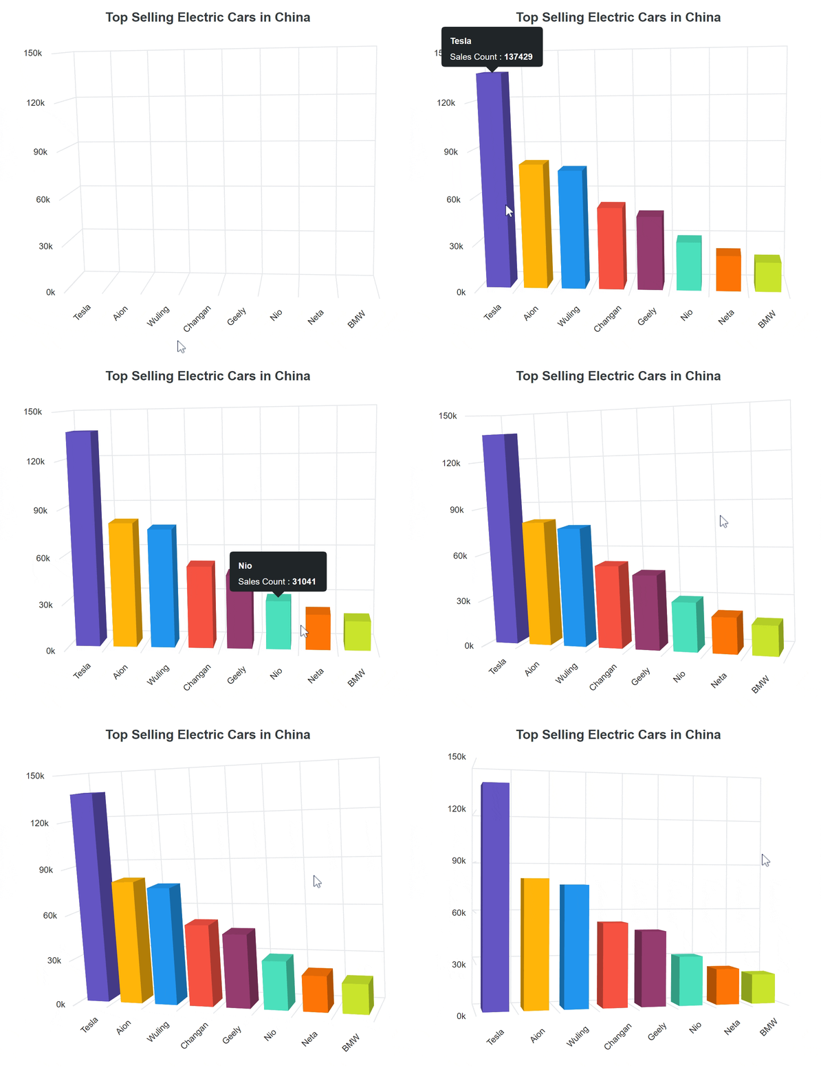
The Blazor 3D Charts component visually represents data in three dimensions, showcasing relationships and trends among variables. Unlike traditional 2D charts, 3D charts add depth to the visualization, allowing for a better understanding of data patterns.
Refer to the following image.
Key features
The key features of Blazor 3D Charts are:
Now, let’s delve deeper into each of these exciting features.
Chart types
The Blazor 3D Charts component offers six versatile chart types; all are easily configurable and have built-in support for visually stunning effects.
- Column: Represents data with vertical bars for easy value comparison.
- Bar: Utilizes horizontal bars to display data and facilitate value comparison.
- Stacked Column: Plots data points on top of each other using vertical bars for comprehensive visualization.
- Stacked Bar: Achieves the same effect as the Stacked Column but with horizontal bars.
- 100% Stacked Column: Illustrates the percentage distribution of multiple datasets within a total, with each column adding up to 100%.
- 100% Stacked Bar: Resembles the Stacked Column but uses horizontal bars, showcasing the percentage distribution of datasets within a total.
Refer to the following image.

Data binding
Effortlessly bind the Blazor 3D Charts component with an array of JSON objects or a data manager, supporting local and remote data binding methods. In addition to the chart series, data labels and tooltips can also be bound to your data.
Data labels
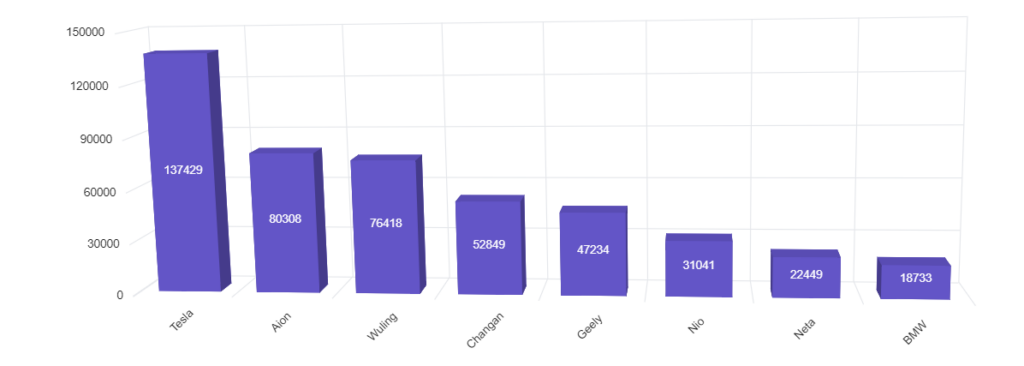
Annotate points with labels to improve the readability of data. Enhance these labels with HTML elements such as images, DIVs, and spans, creating informative and visually appealing data representations.
Refer to the following image.
Axis types
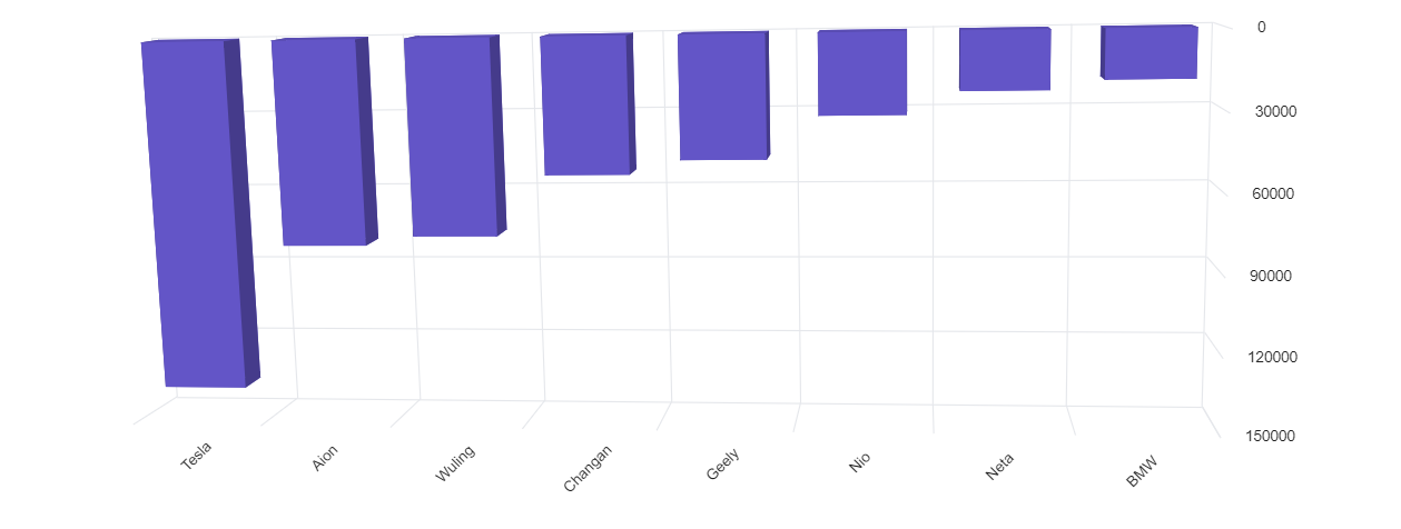
You can plot number, date-time, logarithmic, and string data types on the chart axis. The axis features include:
- Inversed axis: Flip the axis direction from its default orientation.
- Opposed position: Display the axis in the opposite position.
- Multiple axes: Include more than one axis on the same or opposite side.
- Smart labels: Add dynamic labels that automatically position themselves to enhance readability and prevent overlapping.
Legends
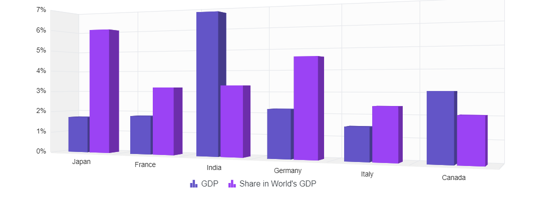
Provide additional information about the data series using a customizable legend. Labels and symbols aid viewers in identifying and differentiating between various series within the chart.
User interaction
You can also add the following interactive features to the Blazor 3D Charts:
- Tooltip: A small, informative pop-up box offering additional context, details, or information when users hover over or click on data points.
- Highlight and selection: Easily highlight and select data points for improved comprehension. Adding patterns and colors to selected data enhances chart interactivity.
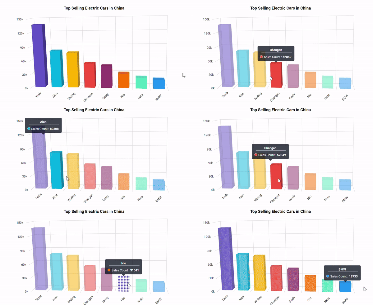
User interactivity features in Blazor 3D Charts
Rotation and tilt
In addition to the previous features, the Blazor 3D Charts supports:
- Rotation: Dynamically rotate the Chart from 0 to 360 degrees around a fixed point or axis in a three-dimensional space. Rotation can occur clockwise or counterclockwise.
- Tilt: Change the inclination angle of the chart along one axis, providing a different perspective.
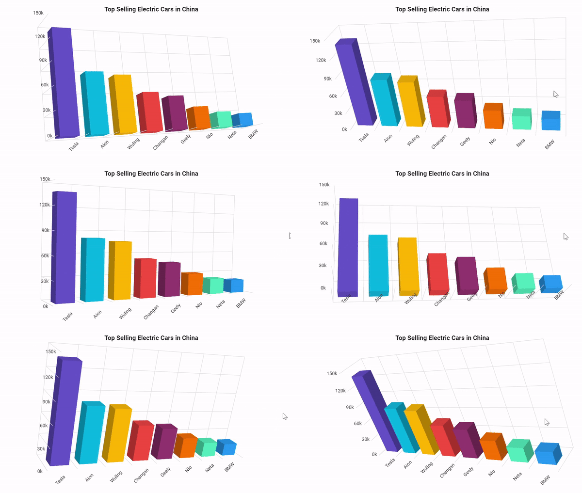
Rotation and tilt features in Blazor 3D Charts
Getting started with the Blazor 3D Charts component
We’ve explored the stunning features of the new Blazor 3D Charts. Let’s see how to use it to visualize data!
Step 1: Create a new Blazor Web App
First, create a Blazor Web app using Visual Studio 2022 via Microsoft Templates or the Syncfusion Blazor Extension.
You must configure the corresponding interactive render modes and interactivity location while creating a Blazor Web app.
Step 2: Install the Syncfusion Blazor 3D Charts NuGet package
To add the Blazor 3D Charts component in the app, open the NuGet package manager in Visual Studio (Tools → NuGet Package Manager → Manage NuGet Packages for Solution), search and install Syncfusion.Blazor.Chart3D.
Alternatively, you can utilize the following package manager command to achieve the same.
Install-Package Syncfusion.Blazor.Chart3D -Version 26.1.35
Step 3: Register the Syncfusion Blazor service
Open the ~/_Imports.razor file and import the Syncfusion.Blazor and Syncfusion.Blazor.Chart3D namespaces.
@using Syncfusion.Blazor
@using Syncfusion.Blazor.Chart3D
Register the Syncfusion Blazor Service in the ~/Program.cs file of your Blazor Web App.
Select the Interactive render mode as WebAssembly or Auto (Server and WebAssembly). If you select Auto as the interactive mode, you must register the Syncfusion Blazor service in both ~/Program.cs files of your Blazor Web App.
....
using Syncfusion.Blazor;
....
builder.Services.AddSyncfusionBlazor();
....
Step 4: Add the script resources
The script can be obtained from NuGet via Static Web Assets. To include the script reference, append it to the end of the <body> tag in the ~/Components/App.razor file as illustrated below.
<head>
    ....
 <script src="_content/Syncfusion.Blazor.Core/scripts/syncfusion-blazor.min.js" type="text/javascript"></script>
</head>
Step 5: Add the Syncfusion Blazor 3D Charts component
Add the Syncfusion Blazor 3D Charts component to the .razor file inside the Pages folder. If the interactivity location is Per page/component in the web app, define the render mode at the top of the component, as shown below.
@* Define the desired render mode here *@
@rendermode InteractiveAuto<SfChart3D>
</SfChart3D>Step 6: Populate the Blazor 3D Charts with data
To bind data to the Blazor 3D Charts component, you can assign an IEnumerable object to the DataSource property. It can also be provided as an instance of the DataManager.
Refer to the following code example.
<SfChart3D RotationAngle="7" TiltAngle="10" Depth="100" EnableRotation="true">
 <Chart3DPrimaryXAxis ValueType="Syncfusion.Blazor.Chart3D.ValueType.Category" LabelRotationAngle="-45" LabelPlacement="LabelPlacement.BetweenTicks">
 </Chart3DPrimaryXAxis>
 <Chart3DPrimaryYAxis Maximum="150000" Interval="50000">
 </Chart3DPrimaryYAxis>
 <Chart3DSeriesCollection>
  <Chart3DSeries DataSource="@DataSource" XName="Country" YName="Sales" Type="Chart3DSeriesType.Column"></Chart3DSeries>
 </Chart3DSeriesCollection>
</SfChart3D>

@code{
 public List<Chart3DData> DataSource { get; set; } = new List<Chart3DData>()
 {
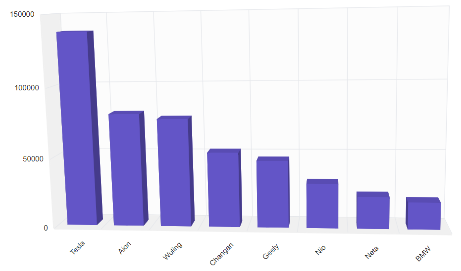
   new Chart3DData { Country = "Tesla", Sales = 137429 },
   new Chart3DData { Country = "Aion", Sales = 80308 },
   new Chart3DData { Country = "Wuling", Sales = 76418 },
   new Chart3DData { Country = "Changan", Sales = 52849 },
   new Chart3DData { Country = "Geely", Sales = 47234 },
   new Chart3DData { Country = "Nio", Sales = 31041 },
   new Chart3DData { Country = "Neta", Sales = 22449 },
   new Chart3DData { Country = "BMW", Sales = 18733 }
 };

 public class Chart3DData
 {
   public string Country { get; set; }
   public double Sales { get; set; }
 }
}
Now, map the Country and Sales data fields to the series XName and YName properties. Then, set the data to the DataSource property and the chart type to Column because we will view the data in a column chart.
Step 7: Run the app
Finally, run the app by pressing Ctrl+F5 (Windows) or ⌘+F5 (macOS) keys to launch the application. This will render the Syncfusion Blazor 3D Charts component in your default web browser.
After executing the previous code examples, we’ll get the output in the following image.
References
For more details, refer to the Blazor 3D Charts documentation and demos.

Syncfusion Blazor components can be transformed into stunning and efficient web apps.
Conclusion
Thanks for reading! In this blog, we’ve explored the features of the new Syncfusion Blazor 3D Charts component, which is a remarkable addition to our 2024 Volume 2 release. Try them out and leave your feedback in the comments section below!
The latest version of the Blazor Charts component is available for current customers from the License and Downloads page. If you are not a Syncfusion customer, try our 30-day free trial to check it out.
You can also contact us through our support forums, support portal, or feedback portal. We are always happy to assist you!


