Charts are powerful data visualization tools. They help convey complex data in an easily understandable and visually appealing manner. One key element in a chart that can enhance its clarity and visual impact is using markers.
A marker in a chart is a symbol used to represent individual data points, making them easily identifiable. They can vary in shape, size, and color and are often used to enhance the readability and visual appeal of data visualizations.
In this blog, we’ll explore how to use markers in the Syncfusion Angular Charts to highlight data points effectively.
Note: Before proceeding, refer to the getting started with Angular Charts documentation.
Preparing the data for the Angular Charts
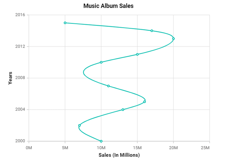
Here, we are going to plot music album sales from 2000 to 2016. We will create an object called albumSalesData with the year and noOfAlbums properties to store the number of albums sold in a specific year.
Refer to the following code example.
public albumSalesData: Object[] = [
   { year: 2000, noOfAlbums: 10 }, { year: 2002, noOfAlbums: 7 }, { year: 2004, noOfAlbums: 13 },
   { year: 2005, noOfAlbums: 16 }, { year: 2007, noOfAlbums: 11 }, { year: 2010, noOfAlbums: 10 },
   { year: 2011, noOfAlbums: 15 }, { year: 2013, noOfAlbums: 20 }, { year: 2014, noOfAlbums: 17 },
   { year: 2015, noOfAlbums: 5 },
];
Enable markers in Angular Charts
To enable markers in the Angular Charts, set the marker’s visible property to true. This configuration tells the chart to display markers for each data point.
By default, markers will not be visible, so enabling this property ensures they are rendered on the chart. This will allow viewers to see each data point clearly. You can further customize the appearance of these markers, such as their shape, size, and color, to make the data more distinguishable and enhance the chart’s visual clarity.
Refer to the following code example.
Index.html
<e-series-collection>
 <e-series
     [dataSource]='data' type='Spline' xName='year' yName='noOfAlbums'
     [marker]='marker'>
 </e-series>
</e-series-collection>
app.component.ts
public marker: Object = {
  visible: true
};
Refer to the following image.

Customizing the markers in Angular Charts
Customizing markers allows you to control their appearances, such as their shape, size, border, and visibility to better match the design and focus of your chart.
Refer to the following code example.
public marker: Object = {
    visible: true,
    height: 15,
    width: 15,
    fill: 'Yellow',
    shape: 'Square',
    isFilled: true,
    border: {color: 'red', width: 1.5}
};
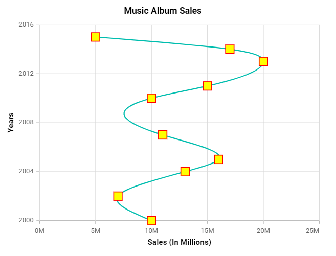
In the above example, the marker’s visible property has been set to true, and both the height and width properties are set to 15 to render enlarged markers. The shape is set to Square, the isFilled property is set to true, the fill color is set to yellow, and a border is also provided.
Refer to the following image.

Setting a custom icon or images
Setting images or icons as markers in Angular Charts is a great way to enhance visual appeal and convey additional information.
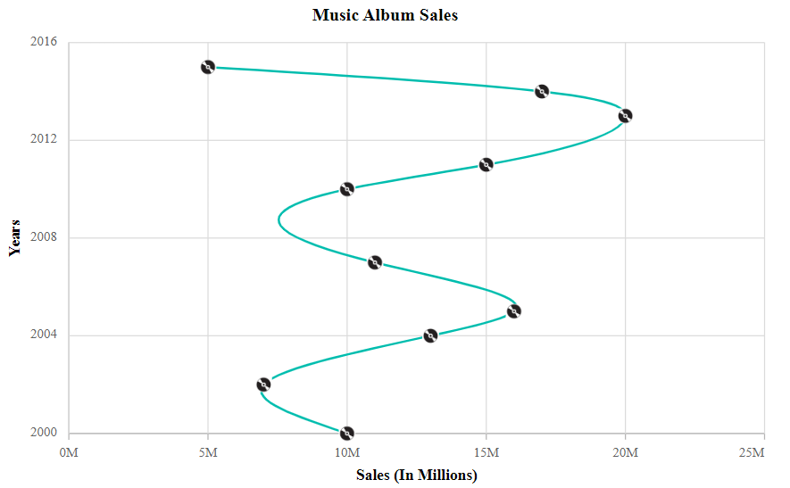
To set an image as a marker, you need to set the marker’s shape property to Image and then specify the image path using the marker’s imageURL property.
Refer to the following code example.
marker:{
  visible: true,
  imageUrl: './cd.png',
  shape: 'Image',
  width: 15, height: 15
},
Refer to the following image.

Reference
For more details, refer to the example for adding and customizing markers in Angular Charts on StackBlitz.
Conclusion
Thanks for reading! In this blog, we’ve seen how to enable and customize markers in the Syncfusion Angular Charts component for better data visualization. We encourage you to try this option and leave your feedback in the comments section below.
You can also check out our online demos and documentation for a more in-depth look at what you can do with the Angular Charts component.
If you are new to Syncfusion, try our control features by downloading a free trial.
For questions, you can contact us through our support forums, support portal, or feedback portal. We are always happy to assist you!


