In each new release, Xamarin always has some exciting new features for us. The Xamarin.Forms 4.5 release, too, contains a lot of improvements and some exciting new features.
In this blog post, I will take you through the features of Xamarin.Forms 4.5 that excited me. I recommend that you try these features:
- MediaElement (preview)
- VSM TargetName
- The stable release of AndroidX
- State triggers (Preview)
MediaElement (preview)
A long waits is over with the availability of the new MediaElement control. Finally, Xamarin.Forms introduces MediaElement, a video and audio player interface used to play media.
The various sources supported by the MediaElement include the web, using a URI (HTTP or HTTPS); a resource embedded in the platform application, using the ms-appx:/// URI scheme; files that come from the app’s local and temporary data folders, using the ms-appdata:/// URI scheme; and the device’s library.
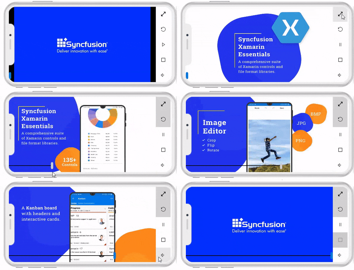
Its feature set includes aspect, auto play, buffering progress, duration, looping, keep screen on, position, and volume. All these features are really amazing. Using these features, I just created my custom player with these options: video position, full screen, looping, play/pause, stop, and volume adjustment.
Let me describe the APIs I used to create these options in detail.
View: I used MediaElement, Button, and Slider to create my player UI.
<Grid>
<Grid.ColumnDefinitions>
<ColumnDefinition Width="*"/> <ColumnDefinition Width="50"/>
</Grid.ColumnDefinitions>
<MediaElement x:Name="videoPlayer" Aspect="AspectFit" Source="ms-appx:///Assets/BestXamarinUIControlswithIncrediblePerformance.mp4" ShowsPlaybackControls="False"/>
<Slider x:Name="videoProgressSlider" VerticalOptions="End" Minimum="0" Maximum="100" ValueChanged="videoProgressSlider_ValueChanged"/>
<Grid Grid.Column="1" >
<Grid.RowDefinitions>
<RowDefinition Height="*"/> <RowDefinition Height="*"/> <RowDefinition Height="*"/> <RowDefinition Height="*"/> <RowDefinition Height="*"/>
</Grid.RowDefinitions>
<Button Grid.Row="0" BackgroundColor="White" FontFamily="SEGMDL2.TTF#Segoe MDL2 Assets" Text="" Clicked="Button_Clicked"/>
<Button Grid.Row="1" BackgroundColor="White" Text="" FontFamily="SEGMDL2.TTF#Segoe MDL2 Assets" Clicked="Button_Clicked_1"/>
<Button Grid.Row="2" BackgroundColor="White" Text="" FontFamily="SEGMDL2.TTF#Segoe MDL2 Assets" Clicked="Button_Clicked_2"/>
<Button Grid.Row="3" BackgroundColor="White" Text="" FontFamily="SEGMDL2.TTF#Segoe MDL2 Assets" Clicked="Button_Clicked_3"/>
<Button Grid.Row="4" BackgroundColor="White" Text="" FontFamily="SEGMDL2.TTF#Segoe MDL2 Assets" Clicked="Button_Clicked_4"/>
</Grid>
</Grid>
Video position: I used the Position property of type TimeSpan to describe the current progress through the media’s playback time. As seen in the following code, I calculated the percentage value based on the current value of the slider.
private void videoProgressSlider_ValueChanged(object sender, ValueChangedEventArgs e)
{
   var duration = this.videoPlayer.Duration.Value.Ticks;
   var slideValue = (sender as Slider).Value;
   var durationPercentage = duration / 100;
   var tickValue = durationPercentage * slideValue;
   var timeSpan = new TimeSpan((long) tickValue);
   this.videoPlayer.Position = timeSpan;
}
Full screen: The Aspect property of MediaElement of type Aspect determines how the media will be scaled to fit the display area. You can make the video fill the screen using this option.
this.videoPlayer.Aspect = Aspect.Fill;
Play/pause and stop: MediaElement has built-in methods for these: Play(), Pause() and Stop().
Volume: Using the API Volume of type double, the media’s volume can be adjusted. The volume is represented on a linear scale between 0 and 1.
this.videoPlayer.Volume = 0.5;
VSM TargetName saves you from repeating code
In a classic approach to updating a property of a control based on its state, we may look for direct properties to set values in different states, or we could watch for a change in the state of the control to update it in the code-behind. VisualStateManager (VSM) makes it easier for developers to specify the appearance of a control depending on its visual state.
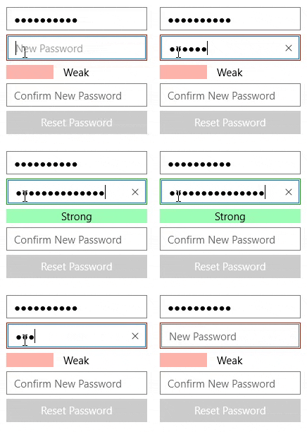
Now, VisualStateManager can target elements (in the visual tree) to set properties on any control within the same visual tree. This will help set the state on multiple controls. For example, I have a reset password page that contains a DataGrid with two Entries and a Button with the strength indicator views weak, medium, and strong. In a classical approach, I need to write a lot of code to set the state for each view. But now, with Xamarin.Forms 4.5, this is made simpler by setting the target element in a single element state.
<Grid x:Name="MainGrid" WidthRequest="200" HeightRequest="250" Padding="10" VerticalOptions="Center" HorizontalOptions="Center">
<StackLayout VerticalOptions="Center" Orientation="Vertical">
    <Entry  Placeholder="Current Password" IsPassword="True"/>
    <Frame x:Name="PasswordBorder" Padding="2" CornerRadius="0">
        <Entry Placeholder="New Password" TextChanged="PasswordEntry_TextChanged" IsPassword="True" >
            <VisualStateManager.VisualStateGroups>
                <VisualStateGroup Name="PasswordStrength">
                    <VisualState Name="WeakPassword">
                        <VisualState.Setters>
                            <Setter TargetName="PasswordBorder"  Property="Frame.BorderColor" Value="#ad1400"/>
                            <Setter TargetName="WeakGrid" Property="Grid.BackgroundColor" Value="#ffb4ab"/>
                            <Setter TargetName="MediumGrid" Property="Grid.BackgroundColor" Value="#00ffffff"/>
                            <Setter TargetName="StrongGrid" Property="Grid.BackgroundColor" Value="#00ffffff"/>
                            <Setter TargetName="StrengthLabel" Property="Label.Text" Value="Weak"/>
                        </VisualState.Setters>
                    </VisualState>
                    <VisualState Name="MediumPassword">
                        <VisualState.Setters>
                            <Setter TargetName="PasswordBorder"  Property="Frame.BorderColor" Value="#ad8a00"/>
                            <Setter TargetName="WeakGrid" Property="Grid.BackgroundColor" Value="#fcff9e"/>
                            <Setter TargetName="MediumGrid" Property="Grid.BackgroundColor" Value="#fcff9e"/>
                            <Setter TargetName="StrongGrid" Property="Grid.BackgroundColor" Value="#00ffffff"/>
                            <Setter TargetName="StrengthLabel" Property="Label.Text" Value="Medium"/>
                        </VisualState.Setters>
                    </VisualState>
                    <VisualState Name="StrongPassword">
                        <VisualState.Setters>
                            <Setter TargetName="PasswordBorder"  Property="Frame.BorderColor" Value="#02a60f"/>
                            <Setter TargetName="WeakGrid" Property="Grid.BackgroundColor" Value="#9effb8"/>
                            <Setter TargetName="MediumGrid" Property="Grid.BackgroundColor" Value="#9effb8"/>
                            <Setter TargetName="StrongGrid" Property="Grid.BackgroundColor" Value="#9effb8"/>
                            <Setter TargetName="StrengthLabel" Property="Label.Text" Value="Strong"/>
                        </VisualState.Setters>
                    </VisualState>
                </VisualStateGroup>
            </VisualStateManager.VisualStateGroups>
        </Entry>
    </Frame>
    <Grid>
        <Grid HeightRequest="20" ColumnSpacing="0" RowSpacing="0">
            <Grid.ColumnDefinitions> <ColumnDefinition Width="*"/> <ColumnDefinition Width="*"/> <ColumnDefinition Width="*"/> </Grid.ColumnDefinitions>
            <Grid x:Name="WeakGrid" Grid.Column="0" ColumnSpacing="0" RowSpacing="0"/>
            <Grid x:Name="MediumGrid" Grid.Column="1" ColumnSpacing="0" RowSpacing="0"/>
            <Grid x:Name="StrongGrid" Grid.Column="2" ColumnSpacing="0" RowSpacing="0"/>
        </Grid>
        <Label x:Name="StrengthLabel" VerticalOptions="Center" HorizontalOptions="Center" />
    </Grid>
    <Entry Placeholder="Confirm New Password" IsPassword="True"/>
    <Button Text="Reset Password" TextColor="White"/>
</StackLayout>
</Grid>
I set entry states “WeakPassword,” “MediumPassword,” and “StrongPassword” through Visual State Manager based on text length.
private void PasswordEntry_TextChanged(object sender, TextChangedEventArgs e)
{
    var entryObject = sender as Entry;
    if (entryObject.Text.Length < 8)
    {
        VisualStateManager.GoToState(entryObject, "WeakPassword");
    }
    else if (entryObject.Text.Length < 12)
    {
        VisualStateManager.GoToState(entryObject, "MediumPassword");
    }
    else if (entryObject.Text.Length > 12)
    {
        VisualStateManager.GoToState(entryObject, "StrongPassword");
    }
}

The stable release of AndroidX
AndroidX packages fully replace the Support Library, so now the original Android Support Library is no longer maintained. Based on this update, Xamarin.Forms is also migrated to AndroidX from the original Android Support Library. So, it’s time to migrate your existing apps to AndroidX to make your app compatible with Android 10. Updating to AndroidX libraries makes it easier for developers to consume Android packages. Hopefully, it will provide several advantages in Xamarin.Forms and Xamarin.Essential in upcoming releases.
Are you planning to migrate your existing app? Then, this blog will be helpful for you.
State triggers (preview)
Triggers allow you to change the appearance of controls based on events or property changes. Already, Xamarin.Forms has property triggers, data triggers, event triggers, and multi-triggers. With Xamarin.Forms 4.5, you can enjoy additional state triggers: adaptive trigger , compare state trigger, device state trigger and orientation trigger.
Adaptive trigger
A VisualState change can be triggered when the window is specified with a height or width.
<VisualState x:Name="Vertical">
     <VisualState.StateTriggers>
          <AdaptiveTrigger MinWindowWidth="0" />
     </VisualState.StateTriggers>
     <VisualState.Setters>
          <Setter Property="Orientation"
          Value="Vertical" />
     </VisualState.Setters>
</VisualState>
Compare state trigger
A VisualState change can be triggered when a property is equal to a specific value.
<VisualState x:Name="Checked">
     <VisualState.StateTriggers>
         <CompareStateTrigger Property="{Binding Source={x:Reference switch}, Path=IsToggled}"
                              Value="True" />
      </VisualState.StateTriggers>
      <VisualState.Setters>
        <Setter Property="BackgroundColor"
                Value="Blue" />
      </VisualState.Setters>
</VisualState>
Device trigger
A VisualState change can be triggered based on the device platform on which the app is running.
<VisualState x:Name="iOS">
  <VisualState.StateTriggers>
     <DeviceStateTrigger Device="iOS" />
  </VisualState.StateTriggers>
  <VisualState.Setters>
     <Setter Property="BackgroundColor"
             Value="Orange" />
     </VisualState.Setters>
</VisualState>
Orientation trigger
A VisualState change can be triggered when the orientation of the device changes.
<VisualState x:Name="Landscape">
     <VisualState.StateTriggers>
          <OrientationStateTrigger Orientation="Landscape" />
     </VisualState.StateTriggers>
     <VisualState.Setters>
     <Setter Property="BackgroundColor"
             Value="Orange" />
     </VisualState.Setters>
</VisualState>
Other interesting features
The Xamarin.Forms 4.5 update is not limited to these exciting features. You can check out other interesting features and enhancement in Xamarin.Forms 4.5 in the release notes.
Conclusion
I hope you, too, are excited about these new features available with Xamarin.Forms 4.5. So, why don’t you try them now? Start by downloading Xamarin.Forms 4.5 in NuGet. Don’t forget to set flags for preview controls and to try our Syncfusion Xamarin.Forms controls, which are compatible with Xamarin.Forms 4.5. I am sure you will definitely enjoy this combo of Xamarin.Forms 4.5 and Syncfusion Xamarin.Forms controls. You can also explore our Android, iOS and UWP demo apps!
If you come across any issues using our controls with 4.5, please contact us through our support forum, Direct-Trac, or feedback portal. We are happy to assist you.
If you liked this blog post, we think you’ll also enjoy:
[Blog] How to Use Xamarin.Forms Visual State Manager
[Blog] Easily Animate Your Xamarin Applications with Lottie Animations
[Blog] 7 Ways to Boost Your Xamarin Development Productivity
[Ebook] Xamarin.Forms Succinctly

