On Feb. 15, 2022, Microsoft released .NET MAUI Preview 13. In this preview release, .NET MAUI supports formatted text with label control. I enjoyed working with this feature in .NET MAUI apps.
In this blog, let’s see how the formatted text feature helps create labels with a hyperlink UI in .NET MAUI Preview 13 apps.
Formatted Text in Labels
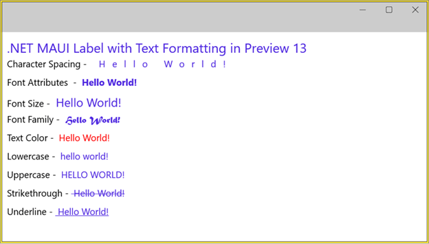
As you know, a label is a view that displays text with or without text wrapping. With the formatted text feature, now in a single label, you can choose multiple options for each setting using different span elements. For example, you can apply separate colors to the words in a single label. This will make the label even more decorative.
The span element supports the following options:
- CharacterSpacing: Applies spacing between characters to the belonging span of the label.
- FontAttributes: Applies font attributes to the text in the span of the label.
- FontFamily: Applies font family to the text in the span of the label.
- FontSize: Applies the font size to the text in the span.
- TextColor: Applies color to the text of the span.
- TextTransform.Lowercase: Transforms all uppercase characters of the text into lowercase.
- TextTransform.Uppercase: Transforms all lowercase characters of the text into uppercase.
- TextDecorations.Underline: Underlines the text in the span of the label.
- TextDecorations.Strikethrough: Strikes through the text in the span of the label.
Refer to the following code example.
<Label Margin="10" LineHeight="2">
 <Label.FormattedText>
  <FormattedString>
   <Span Text=".NET MAUI Label with Text Formatting in Preview 13 " FontSize="20" />
   <Span Text="Character Spacing - " FontSize="14" TextColor="Black"/>
   <Span Text=" Hello World! " FontSize="14" CharacterSpacing="12" />
   <Span Text="Font Attributes - " FontSize="14" TextColor="Black"/>
   <Span Text=" Hello World! " FontSize="14" FontAttributes="Bold"/>
   <Span Text="Font Size - " FontSize="14" TextColor="Black"/>
   <Span Text=" Hello World! " FontSize="18"/>
   <Span Text="Font Family - " FontSize="14" TextColor="Black"/>
   <Span Text=" Hello World! " FontSize="14" FontFamily="Matura MT Script Capitals" />
   <Span Text="Text Color - " FontSize="14" TextColor="Black"/>
   <Span Text=" Hello World! " FontSize="14" TextColor="Red"/>
   <Span Text="Lowercase - " FontSize="14" TextColor="Black"/>
   <Span Text=" Hello World! " FontSize="14" TextTransform="Lowercase"/>
   <Span Text="Uppercase - " FontSize="14" TextColor="Black"/>
   <Span Text=" Hello World! " FontSize="14" TextTransform="Uppercase" />
   <Span Text="Strikethrough - " FontSize="14" TextColor="Black"/>
   <Span Text=" Hello World! " FontSize="14" TextDecorations="Strikethrough"/>
   <Span Text="Underline - " FontSize="14" TextColor="Black"/>
   <Span Text=" Hello World! " FontSize="14" TextDecorations="Underline" />
  </FormattedString>
 </Label.FormattedText>
</Label>
Create a Hyperlink UI Using the Formatted Text Feature of Labels
I am going to use two options, TextColor and TextDecorations.Underline, to create a label with a hyperlink UI.
Create reusable hyperlink class
I have created a class named HyperlinkUI that is derived from span, where I have added a bindable property named LinkUrl.
Since span inherits the GestureElement, you can add the Gesture Recognizer to navigate using the LinkUrl property.
Refer to the following code example.
public class HyperlinkUI : Span
{
  public static readonly BindableProperty LinkUrlProperty =
   BindableProperty.Create(nameof(LinkUrl), typeof(string), typeof(HyperlinkUI), null);public string LinkUrl
  {
    get
    {
      return (string)GetValue(LinkUrlProperty);
    }
    set
    {
      SetValue(LinkUrlProperty, value);
    }
  }public HyperlinkUI()
   {
      ApplyHyperlinkAppearance();
   }void ApplyHyperlinkAppearance()
   {
      this.TextColor = Color.FromArgb("#0000EE");
      this.TextDecorations = TextDecorations.Underline;
   }void CreateNavgigationCommand()
   {
      //... Since Span inherits GestureElement, you can add Gesture Recognizer to navigate using LinkUrl
   }
}
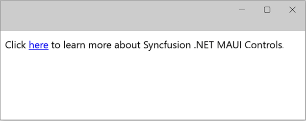
Now, you can use this HyperlinkUI as a span element in the labels. We can show the whole text or part of the text as hyperlink text.
Refer to the following code example.
<Label Margin="10" LineHeight="2" InputTransparent="False" TextColor="Black">
 <Label.FormattedText>
  <FormattedString>
   <Span Text="Click "/>
   <local:HyperlinkUI Text="here" LinkUrl="https://docs.microsoft.com/xamarin/"/>
   <Span Text=" to learn more about Syncfusion .NET MAUI Controls."/>
  </FormattedString>
 </Label.FormattedText>
</Label>
Syncfusion .NET MAUI Controls Are Compatible with .NET MAUI Preview 13
Syncfusion .NET MAUI controls are compatible with .NET MAUI Preview 13. You can install our control package (latest version: 19.4.53-preview) from NuGet Gallery and use it in your application.
Currently, Syncfusion offers nine controls: Cartesian Charts, Circular Charts, Scheduler, ListView, Tab View, Radial Gauge, Slider, Range Slider, Badge View, and Effects View. The suite also supports file-format libraries for Excel, PDF, Word, and PowerPoint files.
Check out our .NET MAUI controls road map for plans for our upcoming 2022 Volume 1 release and find more on our controls in their documentation.
GitHub reference
For more details, refer to the example for Creating a Hyperlink UI in .NET MAUI Preview 13.
Conclusion
I hope you enjoyed this blog and thanks for reading! For more details, refer to the article, .NET MAUI Preview 13. Also, check out the .NET MAUI Preview 13 release notes.
As I said, our Syncfusion .NET MAUI controls are compatible with the Preview 13 version, so you can easily use them in your app.
If you have any feedback, special requirements, or controls that you’d like to see in our .NET MAUI suite, please let us know in the comments section below.
Also, you can contact us through our support forum, support portal, or feedback portal. We are always happy to assist you!


