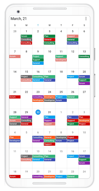
The Syncfusion Flutter event Calendar has seven built-in, configurable view modes that provide basic functionalities for scheduling, managing, and representing appointments efficiently. This calendar widget exposes a clean and convenient user interface for custom working days and working hours, and basic calendar operations such as date navigation and selection. In this blog, we will explain the following new features included in our Flutter Calendar in the 2021 Volume 1 release:
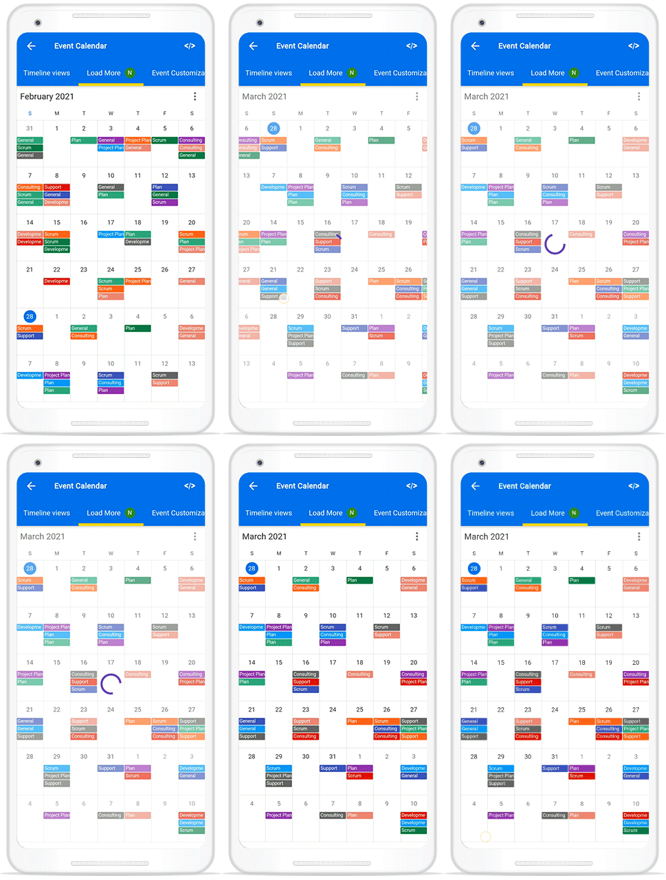
Load more data on demand
Load appointments on demand whenever a user switches from one view to another or scrolls to the start or end position of the schedule view. This feature loads appointments on demand for the visible date range with a loading indicator. This improves the loading performance of appointments ranging multiple years.
Refer to the following code example.
@override
  Widget build(BuildContext context) {
    return MaterialApp(
      home: Scaffold(
        body: SfCalendar(
            controller: _controller,
            loadMoreWidgetBuilder:
                (BuildContext context, CalendarLoadMoreCallback loadMoreAppointments) {
                  return FutureBuilder<String>(
                   initialData: 'loading',
                   future: loadMoreAppointments(),
                   builder: (context, snapShot) {
                    return Container(
                        height: _controller.view == CalendarView.schedule ? 50 : double.infinity,
                        width: double.infinity,
                        color: Colors.white38,
                        alignment: Alignment.center,
                        child: CircularProgressIndicator(
                            valueColor:
                                AlwaysStoppedAnimation(Colors.deepPurple)));
                   },
                 );
              },
            dataSource: _dataSource),
      ),
    );
  }
View navigation mode
Now, you can easily customize the swipe navigation through the viewNavigationMode property. This feature allows us to enable or disable the swipe interaction in the Calendar widget.
Refer to the following code example.
@override
  Widget build(BuildContext context) {
    return Scaffold(
      body: SfCalendar(
         view: CalendarView.day,
        viewNavigationMode: ViewNavigationMode.none,
    ),);
  }
Current time indicator
In the Flutter event Calendar, you can now display an indicator of the current time of day by setting the showCurrentTimeIndicator property to true .
Refer to the following code example.
@override
Widget build(BuildContext context) {
    return Container(
      child: SfCalendar(
        view: CalendarView.day,
        showCurrentTimeIndicator: true,
              ),
  );
  }
Header date format
Now, you can customize the date format in the header by using the headerDateFormat property.
Refer to the code example.
@override
  Widget build(BuildContext context) {
    return Scaffold(appBar: AppBar(title: Text('Calendar'),),
      body: SfCalendar(
        view: CalendarView.month,
        headerDateFormat: 'MMM,yyy',
      ),
    );
  }
}
Conclusion
In this blog post, we walked through the new features in our Flutter event Calendar available in the 2021 Volume 1 release. To see all the updates in this release, please check our release notes and What’s New pages. Try out these new features and leave your feedback in the comments section below!
You can also explore other features in the Calendar widget’s documentation, where you can find detailed explanations of each feature along with code examples.
For current customers, the newest version is available for download from the License and Downloads page. If you are not yet a Syncfusion customer, you can try our 30-day free trial to check out the available features.
We also encourage you to try out our Flutter project demos. You can contact us through our support forums, Direct-Trac or feedback portal. We are always happy to assist you!


