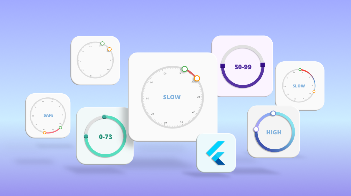
A simple and flexible radial range slider or a circular range slider is commonly requested widget in many platforms. In Flutter, we can easily create a range slider by customizing our Radial Gauge widget. In this blog, we are going to see how we can do this.
Radial range slider
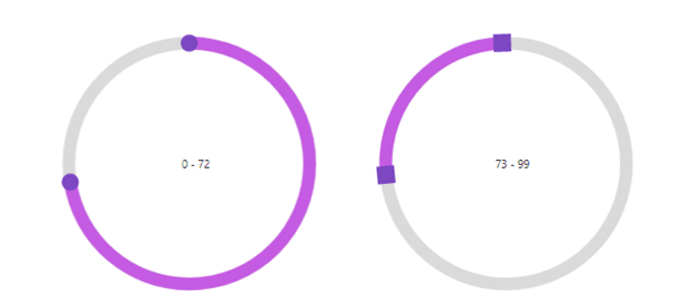
A radial range slider, also known as circular or round range slider widget, allows users to select a range of values. In the following image, the first range slider has a selected range of 0 to 72 and the other one has a selected range between 73 to 99.
Requirements of a radial range slider
Essential features of a radial range slider are:
- A circular track.
- Two thumbs.
- Ticks and labels to mark the values on the track.
- Ability to customize the track color in-between two thumbs to show the selected range.
- Touch interaction for the two thumbs to change the positions.
Looking at these requirements, it is clear that the Syncfusion Flutter Radial Gauge widget is the perfect match for creating our own radial range slider.
Let’s see how. To add the Syncfusion Radial Gauge to your Flutter project, refer this getting started documentation.
Creating a Flutter radial range slider
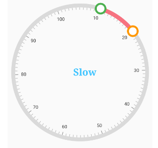
We are going to create a Flutter radial range slider with the use case of a pressure meter. This will update the pressure status based on the selected range as shown in the following image.

Please follow the steps to create the elements one by one.
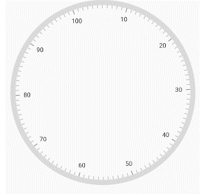
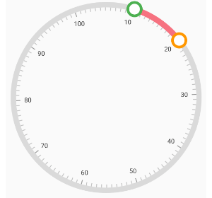
Step 1: Obviously, the first step is to create the slider track and add labels in it. We can easily do this with minimum lines of code.
SfRadialGauge(axes: <RadialAxis>[
      RadialAxis(
        //Sets the minimum range for the slider.
        minimum: 0,

        //Sets the maximum range for the slider.
        maximum: 100,

        //Sets the interval range.
        interval: 10,

        //Sets the minor ticks between interval range.
        minorTicksPerInterval: 10,

        //Sets the start angle.
        startAngle: 250,

        //Sets the end angle.
        endAngle: 250,
      )
    ]);
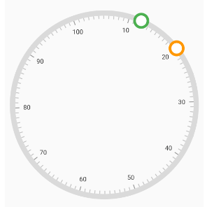
Step 2: Next, add the thumbs to the Radial Gauge along with the logic to handle the user dragging interactions.
//Add the marker pointer for creating thumbs in slider.
        pointers: <GaugePointer>[
          //First thumb
          MarkerPointer(
            value: _firstMarkerValue, // We declared this in state class.
            enableDragging: true,
            borderColor: Colors.green,
            borderWidth: 5,
            color: Colors.white,
            markerHeight: 25,
            markerWidth: 25,
            markerType: MarkerType.circle,
            onValueChanged: _handleFirstPointerValueChanged,
            onValueChanging: _handleFirstPointerValueChanging,

          ),
          //Second thumb
          MarkerPointer(
            value: _secondMarkerValue, // We declared this in state class.
            color: Colors.white,
            enableDragging: true,
            borderColor: Colors.orange,
            markerHeight: 25,
            borderWidth: 5,
            markerWidth: 25,
            markerType: MarkerType.circle,
            onValueChanged: _handleSecondPointerValueChanged,
            onValueChanging: _handleSecondPointerValueChanging,

          ),
        ],

/// Update the first thumb value to the range.
  void _handleFirstPointerValueChanged(double value) {
    if (value < _secondMarkerValue) {
      setState(() {
        _firstMarkerValue = value;
      });
    }
  }

  /// Cancel the dragging when pointer value reaching the axis end/start value, greater/less than another.
  /// pointer value.
  void _handleFirstPointerValueChanging(ValueChangingArgs args) {
    if (args.value < _secondMarkerValue) {
      _firstMarkerValue = args.value;
    } else {
      args.cancel = true;
    }
  }

  /// Cancel the dragging when pointer value reaching the axis end/start value, greater/less than another.
  /// pointer value.
  void _handleSecondPointerValueChanging(ValueChangingArgs args) {
    if (_firstMarkerValue < args.value) {
      _secondMarkerValue = args.value;
    } else {
      args.cancel = true;
    }
  }

  /// Update the second thumb value to the range.
  void _handleSecondPointerValueChanged(double value) {
    if (_firstMarkerValue < value) {
      setState(() {
        _secondMarkerValue = value;
      });
    }
  }
Step 3: Now, the thumbs are on track and we have to update the color of the track bar between two thumbs.
ranges: <GaugeRange>[
          GaugeRange(
              endValue: _secondMarkerValue, // We declared this in state class.
              sizeUnit: GaugeSizeUnit.factor,
              startValue: _firstMarkerValue, // We declared this in state class.

              startWidth: 0.06,
              endWidth: 0.06)
        ],
Step 4: Now we update the pressure value based on the range selected. For that, use the annotations feature in the Flutter Radial Gauge widget.
annotations: <GaugeAnnotation>[
            GaugeAnnotation(
                widget: Row(
                  mainAxisSize: MainAxisSize.min,
                  children: <Widget>[
                    Text(
                      '$_annotationValue', // We declared this in state class.
                      style: TextStyle(
                          fontSize: 25,
                          fontFamily: 'Times',
                          fontWeight: FontWeight.bold,
                          color: Colors.lightBlueAccent),
                    ),
                  ],
                ),
                positionFactor: 0.1,
                angle: 0)
          ]
After executing this code, you will get the pressure meter in your Flutter application.
Note: Get the complete source code from the Create Radial Range Slider in Flutter demo.
Different styles of radial range slider
You can also apply the following different styles to the radial range slider, available in our Syncfusion Flutter Radial Gauge widget.
- Change the shape of the range track.
- Apply gradient colors to the range.
- Apply gradient colors to the track.
- Customize the thumbs.
Let’s see how to do these with code examples!
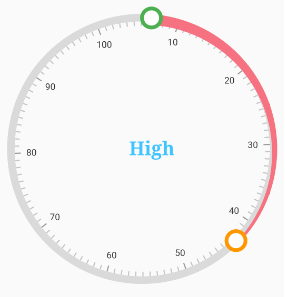
Change the shape of the range
You can change the shape of the range track with the start and end width properties of the Flutter Radial Gauge widget.
//Add the track color between thumbs.
          ranges: <GaugeRange>[
            GaugeRange(
                endValue: _secondMarkerValue, // We declared this in state class.
                sizeUnit: GaugeSizeUnit.factor,
                startValue: _firstMarkerValue, // We declared this in state class.
                //Set diffrent values to the start and end widths.
                startWidth: 0.08,
                endWidth: 0.02)
          ],
Note: For more details, refer to the Range Customization documentation.
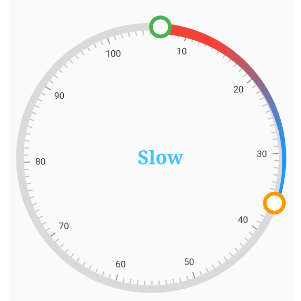
Apply gradient colors to the ranges
You can also apply gradient colors to ranges and the radial slider track.
//Add the track color between thumbs.
          ranges: <GaugeRange>[
            GaugeRange(
                gradient: const SweepGradient(
                    colors: <Color>[Colors.red, Colors.blue],
                    stops: <double>[0.25, 0.75]),
                endValue: _secondMarkerValue, // We declared this in state class
                sizeUnit: GaugeSizeUnit.factor,
                startValue: _firstMarkerValue, // We declared this in state class
                //Set diffrent values to the start and end widths.
                startWidth: 0.08,
                endWidth: 0.02)
          ],
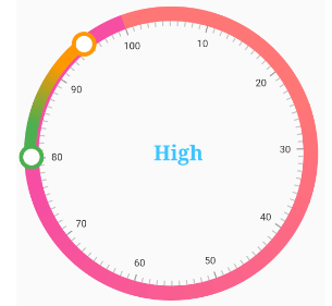
Apply gradient colors to the slider track
You can apply smooth and vivid color transition to the slider track line by specifying the gradient color.
axisLineStyle: AxisLineStyle(
            thickness: 0.1,
            thicknessUnit: GaugeSizeUnit.factor,
            gradient: const SweepGradient(
                colors: <Color>[Color(0xFFFF7676), Color(0xFFF54EA2)],
                stops: <double>[0.25, 0.75]),
          ),
Customize the thumbs of the radial range slider
Syncfusion Flutter Radial Gauge supports the following marker types:
- Circle
- Diamond
- Image
- Inverted triangle
- Rectangle
- Text
- Triangle
Since we use the marker pointers as thumbs for sliders, the same is applicable for the radial range slider, too.
To use these marker types as thumbs, just specify the type, as shown in the following code example.
MarkerPointer(
              markerType: MarkerType.circle,
            ),
Note: For more details, refer to the marker pointer documentation.
Resources
You can get a complete working demo for Creating Different Styles of Radial Range Slider using Flutter Radial Gauge.
Conclusion
I hope you have enjoyed reading this blog. Now, you have an idea about how to create a radial range slider in Flutter and apply different styles to it with the help of developer-friendly APIs in our Syncfusion Flutter Radial Gauge.
Please go through the complete user guide, and also check out our other samples in our Flutter examples. Additionally, you can download and check out our demo app on Google Play, the App Store, and our website.
If you have any questions about this control, please let us know in the comments section below. You can also contact us through our support forums, Direct-Trac, or feedback portal. We are always happy to assist you!
Related Blogs
- How to Design a Speedometer Using Flutter Radial Gauge
- Design a Temperature Monitor in 20 Minutes Using Flutter Radial Gauge
- Create Different Styles of Radial Sliders Using Flutter Radial Gauge
- Create Stunning Circular Progress Bars with Flutter Radial Gauge: Part 1
- Create Stunning Circular Progress Bars with Flutter Radial Gauge: Part 2

