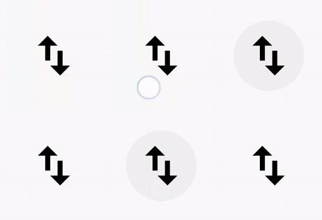
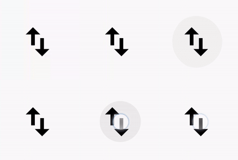
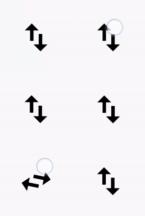
A modern-day mobile application can no longer be imagined without attractive animations. Mobile applications commonly include many animation types, like ripple, rotation, and scaling. These kinds of animations make the application highly interactive.
The options available in Xamarin.Forms to achieve these kinds of effects for iOS and Android are quite few. In Xamarin.Android, you can use RippleDrawable to add the ripple effect, but it is not available for Xamarin.iOS. Moreover, this effect works better when used as a separate feature. When you need to include multiple animations simultaneously, like ripple and rotation, you need quite a lot of tweaking in shared and platform-specific projects.
To provide these effects in a more efficient way, we are introducing a new component called Effects View in Xamarin.Forms for the iOS and Android platforms in our 2019 Volume 3 beta release. This control is available as a part of Syncfusion.Xamarin.Core NuGet package. It is a container control that can accept any type of view as its child. It provides effects like highlighting the background, ripple, selection, scale-up, scale down, and rotation. One good thing about this control is that these effects also work just fine in different combinations like highlight and ripple, ripple and selection, selection and scale, ripple and rotation, and so on.
Different effects
There are different types of effects available in Effects View. I will explain how to use them separately and then some possible combinations of them.
Highlight
The highlight effect can be achieved by setting the effect mode to Highlight. This effect will fade out automatically after completion.
<ContentPage xmlns:effectsView="clr-namespace:Syncfusion.XForms.EffectsView;assembly=Syncfusion.Core.XForms">

  <effectsView:SfEffectsView TouchDownEffects="Highlight">
     <Grid>....</Grid>
  </effectsView:SfEffectsView>

</ContentPage>

Ripple
The ripple effect can be achieved by setting the effect mode to Ripple. Like the highlight effect, this effect, too, will fade out automatically after completion.
<effectsView:SfEffectsView TouchDownEffects="Ripple">
    <Grid>....</Grid>
</effectsView:SfEffectsView>

Rotation
The rotation effect can be achieved by setting the effect mode to Rotation. The content of the Effects View will be rotated based on the value of Angle.
<effectsView:SfEffectsView TouchDownEffects="Rotation" Angle="180">
    <Grid>....</Grid>
</effectsView:SfEffectsView>

Scaling
The scaling effect can be achieved by setting the effect mode to Scale. The content of the Effects View will scale down or scale-up based on the value of ScaleFactor, i.e. if it is less than 1, there will be a scale-down effect and if it is greater than 1, there will be a scale-up effect.
<effectsView:SfEffectsView TouchDownEffects="Scale" ScaleFactor="0.8">
    <Grid>....</Grid>
</effectsView:SfEffectsView>

Selection
You can move to the selection state by setting the effect mode to Selection.
<effectsView:SfEffectsView TouchDownEffects="Selection">
    <Grid>....</Grid>
</effectsView:SfEffectsView>
You can also set the property IsSelected to true.
<effectsView:SfEffectsView IsSelected="true">
    <Grid>....</Grid>
</effectsView:SfEffectsView>

In both approaches, the SelectionChanged event will be triggered, which can be used for application-level customizations.
Scale and selection
As I mentioned in the introduction of this blog, apart from using these effects separately, you can also use them combined. Here are some examples.
Let’s set scale and selection for the effects mode.
<effectsView:SfEffectsView TouchDownEffects="Scale, Selection" ScaleFactor="0.8">
    <Grid>....</Grid>
</effectsView:SfEffectsView>

Ripple and scale
Another possible combination is ripple and scale. Let’s see how they behave.
<effectsView:SfEffectsView TouchDownEffects="Ripple, Scale">
    <Grid>....</Grid>
</effectsView:SfEffectsView>

Ripple and rotation
You can also use a ripple and rotation combination.
<effectsView:SfEffectsView TouchDownEffects="Ripple, Rotation">
    <Grid>....</Grid>
</effectsView:SfEffectsView>

Touch interactions
In the previous code snippets, you may have noticed that I set the different effects to the property TouchDownEffects. As the name implies, these effects will render during touch-down interaction with the Effects View control. If you need these effects during long-press or touch-up interactions, you can use the LongPressEffects and TouchUpEffects properties.
Another interesting aspect is that you can have different effects for different interactions. E.g., you can set Highlight for touch down and Ripple for long press.
<effectsView:SfEffectsView TouchDownEffects="Highlight" LongPressEffects="Ripple, Selection" >
    <Grid>....</Grid>
</effectsView:SfEffectsView>
Trigger effects through API
In addition to touch interactions, you can also trigger all these effects using the method ApplyEffects. All the parameters of this method are optional and can be used as necessary. If no parameter is passed, the ripple effect will be triggered. It accepts the following optional parameters:
‘effects’—Sets the type(s) of effect.
‘rippleStartPosition’—During interactions, the ripple effect will always start from the point of interaction. While using the ApplyEffects method, you can start the ripple from the left, right, top, or bottom position. Default is center.
‘rippleStartPoint’—Sets the exact x, y point from which the ripple should start.
‘repeat’—Sets the value for whether or not to repeat the ripple effect continuously.
Repeat and fade out the ripple
Ripple with fade out is one of the most common animations we see in mobile applications.You can achieve this effect by passing repeat in the ApplyEffects method and setting the FadeOutRipple property to true.
this.RotationEffectsView.ApplyEffects(repeat: true);
If you need to stop the ripple effect, you can use Reset() method.
this.RotationEffectsView.Reset();

Conclusion
In this blog post, we walked through our new Xamarin.Forms Effects View component and its usages in various scenarios. To learn more about the Effects View component, refer to our UG documentation. You can drop your comments in the section below if you need any clarification about this component.
We are likely to add more effects to this component in future releases. If you need support for specific effects in this component or have any questions, contact us through our support forum, Direct-Trac, or feedback portal. We are waiting to hear your feedback about this new component!


Comments (5)
Any plans for UWP support?
Hi Philippe,
Yes. We have plans to provide UWP support in our future releases.
Regards,
Samsudeen
really useful
can we use in normal them without using sync fusion them?
Hi Ashish,
If you are asking, whether it is possible to apply these effects to Xamarin.Forms framework controls like Image, Grid, etc – Yes. You can.
https://help.syncfusion.com/xamarin/effects-view/getting-started#initializing-sfeffectsview
Please let us know if further information is needed.
Regards,
Samsudeen