
 Satheeskumar S
TL;DR: The 2024 Volume 3 offers new user-friendly features for the Blazor Image Editor. It includes redaction support for concealing sensitive data and enhanced text/rectangle annotations. Users can now blur or pixelate areas, customize text background and outline, and add rounded corners to rectangles. These upgrades make image editing more flexible and secure.
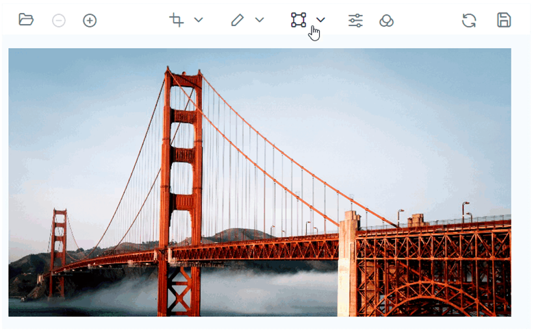
Syncfusion Blazor Image Editor is a user interface that allows users to edit images. It provides a range of built-in tools for rotating, flipping, zooming, and cropping images with user-selected areas. Additionally, it provides functionality to insert annotations, including text, freehand drawings, and various shapes like rectangles, ellipses, lines, paths, and arrows. It also includes filters and fine-tuning options to enhance the images. It supports keyboard interactions and events and provides a user-friendly interface optimized for touch interactions.
In this blog, we’ll see the new features added in the Blazor Image Editor component for the 2024 Volume 3 release.
Enhancements in Blazor Image Editor
Our latest update to the Blazor Image Editor brings substantial enhancements to the text and rectangle annotations and a new redact feature designed to boost your image editing capabilities. These improvements not only make the annotation experience smoother and more intuitive but also introduce powerful tools for concealing sensitive information.
Redact support
The redact feature in the Blazor Image Editor is a powerful tool that allows users to obscure sensitive or confidential information by applying blur or pixelation effects to specific regions of an image. This feature is essential for maintaining privacy and complying with data protection regulations, ensuring that images can be securely shared without exposing sensitive details. The redact feature is particularly beneficial for professionals working with sensitive documents or personal information.
In this update, we offer two types of redaction:
- Blur: Softens the selected area to obscure details while keeping the overall structure visible.
- Pixelate: Replaces the selected region with pixel blocks, making the details completely unreadable.
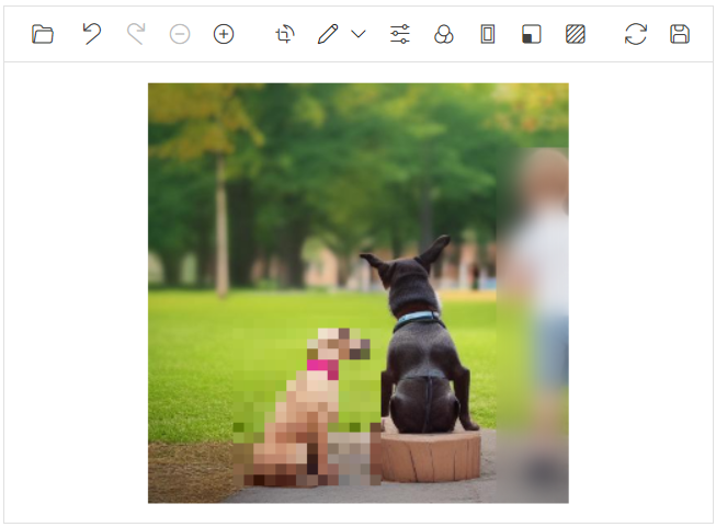
Redact support in Blazor ImageEditor
To apply redactions programmatically, we can use the DrawRedactAsync method. This method provides flexibility by allowing users to specify the redaction area and type directly through code. The following parameters are required:
- Redaction Type: Specifies whether to apply a blur or pixelation effect.
- StartX: The X-coordinate where the redaction starts.
- StartY: The Y-coordinate where the redaction starts.
- Width: The width of the redaction area.
- Height: The height of the redaction area.
- Value: Defines the intensity of the blur or pixelation, offering control over how obscured the selected area becomes. It ranges from 10 to 100.
This improvement makes it easier to securely manage images, particularly in environments where privacy and security are top priorities.
Refer to the following code example to perform z-ordering programmatically.
@using Syncfusion.Blazor.ImageEditor
@using Syncfusion.Blazor.Buttons
<div style="padding-bottom: 15px">
<SfButton OnClick="AddBlurRedactionAsync">Blur</SfButton>
<SfButton OnClick="AddPixelateRedactionAsync">Pixelate</SfButton>
</div>
<SfImageEditor @ref="ImageEditor" Toolbar="customToolbarItem" Height="400">
<ImageEditorEvents Created="OpenAsync"></ImageEditorEvents>
</SfImageEditor>
@code {
SfImageEditor ImageEditor;
private List<ImageEditorToolbarItemModel> customToolbarItem = new List<ImageEditorToolbarItemModel>() { };
private async void OpenAsync()
{
await ImageEditor.OpenAsync("nature.png");
}
private async void AddBlurRedactionAsync()
{
ImageDimension dimension = await ImageEditor.GetImageDimensionAsync();
await ImageEditor.DrawRedactAsync(RedactType.Blur, dimension.X.Value + 100, dimension.Y.Value + 100, 400, 400, 10);
}
private async void AddPixelateRedactionAsync()
{
ImageDimension dimension = await ImageEditor.GetImageDimensionAsync();
await ImageEditor.DrawRedactAsync(RedactType.Pixelate, dimension.X.Value + 700, dimension.Y.Value + 100, 200, 400, 10);
}
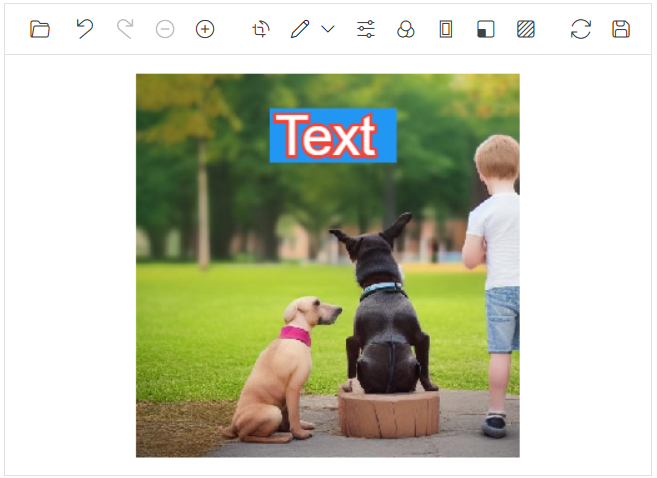
}Text annotation enhancements
The text annotation feature allows you to insert text easily into your images and fully customize their appearance. You can use the toolbar or the DrawTextAsync method to add text, then customize it by adjusting the color, font family, font size, and font style, including options for bold and italic text.
In this update, we’ve introduced two key enhancements: the ability to customize the background of the text and the addition of outline support, providing more creative control over your annotations.
Refer to the following image.
To apply text programmatically, the DrawTextAsync method offers flexibility, enabling users to specify both the text content and its customization properties directly in code. In addition to the existing parameters, we’ve introduced the following optional parameters to enhance customization further:
- fillColor: Sets the background color of the text.
- outlineColor: Defines the color of the text’s outline.
- outlineWidth: Specifies the thickness of the text’s outline. It ranges from 0 to 10.
These new parameters allow for greater control over the appearance of text annotations, making it easier to achieve the desired look.
Refer to the following code example to add text annotation programmatically.
@using Syncfusion.Blazor.ImageEditor
@using Syncfusion.Blazor.Buttons
<div style="padding-bottom: 15px">
<SfButton OnClick="DrawTextOutlineAsync">Draw Text Outline</SfButton>
<SfButton OnClick="DrawTextBackgroundColorAsync">Draw Text Background Color</SfButton>
</div>
<SfImageEditor @ref="ImageEditor" Toolbar="customToolbarItem" Height="400">
<ImageEditorEvents Created="OpenAsync"></ImageEditorEvents>
</SfImageEditor>
@code {
SfImageEditor ImageEditor;
private List<ImageEditorToolbarItemModel> customToolbarItem =
new List<ImageEditorToolbarItemModel>() { };
private async void OpenAsync()
{
await ImageEditor.OpenAsync("nature.png");
}
private async void DrawTextOutlineAsync()
{
ImageDimension Dimension = await ImageEditor.GetImageDimensionAsync();
await ImageEditor.DrawTextAsync(
Dimension.X.Value + 100, Dimension.Y.Value + 100,
"Syncfusion", "Arial", 70, false, false, "",
false, null, "", "green", 8
);
}
private async void DrawTextBackgroundColorAsync()
{
ImageDimension Dimension = await ImageEditor.GetImageDimensionAsync();
await ImageEditor.DrawTextAsync(
Dimension.X.Value + 100, Dimension.Y.Value + 300,
"Syncfusion", "Arial", 70, false, false, "",
false, null, "red", "", null
);
}
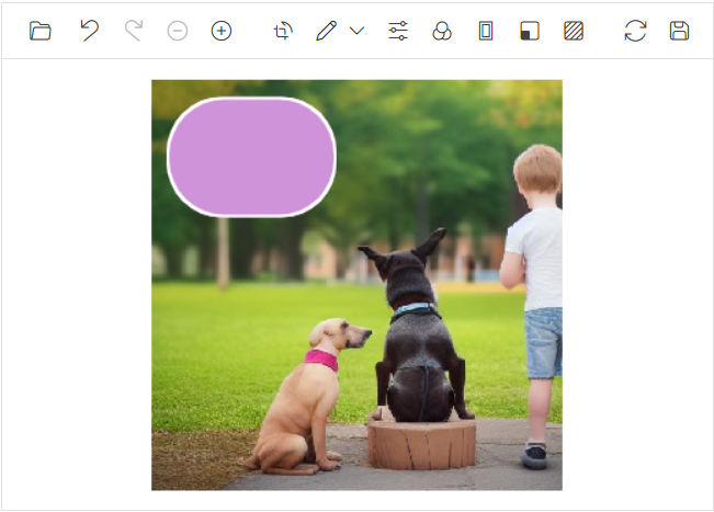
}Rectangle annotation enhancements
The rectangle annotation enables you to insert geometric rectangles into your images and customize their appearance by adjusting the stroke color, fill color, and stroke width. You can add this annotation through the toolbar or by using the DrawRectangleAsync method.
With this update, we’ve added a new feature that allows you to customize the border radius of the rectangle. This allows you to draw rectangles with rounded corners for a more polished and dynamic look.
To render rectangles programmatically, the DrawRectangleAsync method provides flexibility, allowing users to define both the rectangle and its customization properties directly in code. Alongside the existing parameters, we’ve added the following optional parameters to enhance customization:
- borderRadius: This parameter specifies the corner radius, enabling you to create rectangles with rounded corners. It ranges from 0 to 10.
This new option offers more creative control when adding rectangular annotations, allowing for smoother, more dynamic shapes.
Refer to the following code example.
@using Syncfusion.Blazor.ImageEditor
@using Syncfusion.Blazor.Buttons

<div style="padding-bottom: 15px">
    <SfButton OnClick="DrawRectangleAsync">Draw Rectangle</SfButton>
</div>

<SfImageEditor @ref="ImageEditor" Toolbar="customToolbarItem" Height="400">
    <ImageEditorEvents Created="OpenAsync"></ImageEditorEvents>
</SfImageEditor>

@code {
    SfImageEditor ImageEditor;
    private List<ImageEditorToolbarItemModel> customToolbarItem = new List<ImageEditorToolbarItemModel>();

    private async void OpenAsync()
    {
        await ImageEditor.OpenAsync("nature.png");
    }

    private async void DrawRectangleAsync()
    {
        ImageDimension Dimension = await ImageEditor.GetImageDimensionAsync();
        await ImageEditor.DrawRectangleAsync(Dimension.X + 100, Dimension.Y + 100, 120, 120, 4, "#fff", "blue", null, null, 8);
    }
}
References
For more details, refer to the Blazor Image Editor demos.

Conclusion
Thanks for reading! We hope you enjoyed this quick introduction to the new features of our Syncfusion Blazor Image Editor added in the 2024 Volume 3 release. Experience wonderful image editing with this component, and provide your valuable feedback in the comments section below.
Existing Syncfusion users can access the most recent version of Essential Studio® on the License and Downloads page. If you’re new to Syncfusion, we offer a 30-day free trial to test these exciting new features.
You can also contact us through our support forum, support portal, or feedback portal. We are always happy to help!


 No spam, just valuable updates.