
TL;DR: Explore the game-changing features of the Syncfusion Blazor AI AssistView component in the 2024 Volume 3 release! Integrate generative AI effortlessly into your Blazor apps, customize prompt suggestions, and create customized views for enhanced AI-driven user experiences.
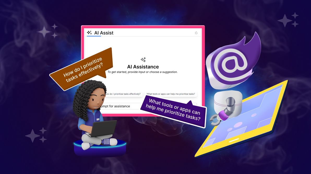
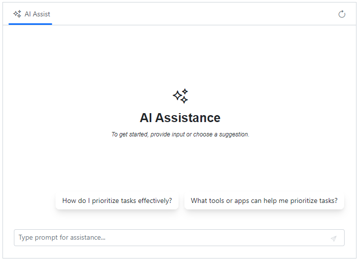
We are excited to introduce the new Blazor AI AssistView component in our 2024 Volume 3 release. This modern UI component is designed to effortlessly integrate generative AI services into your applications. It provides an interactive interface for sending prompts, executing commands via a toolbar, and viewing AI-generated responses in a user-friendly layout.
Refer to the following image.
The AI AssistView component offers the flexibility to create custom views, modify layouts, and adapt functionality, making it an essential tool for integrating AI services directly into your Blazor apps.
In this blog, we’ll walk you through the features and capabilities of the Blazor AI AssistView component.
Use cases
The Blazor AI AssistView component is versatile, making it ideal for various apps, including:
- Automated customer support: Empower users to resolve issues with real-time, context-aware responses generated by AI.
- Content generation: Leverage AI to assist with drafting emails, creating reports, or generating code snippets based on user prompts.
- Data querying and insights: Allow users to query their data and receive valuable AI-driven insights, supporting more informed decision-making.
Key features
The key features of the AI AssistView component are as follows:
- Predefined toolbar options
- Initial and on-demand suggestions
- Flexible header toolbar configuration
- Customized view creation
- Customized banner area
- Enhanced prompt and response appearance
- Customized footer section
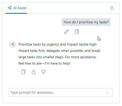
Predefined toolbar options
The AI AssistView includes toolbar options for streamlined interaction, such as copy and edit for prompts, and options like copy, like, and dislike for responses. These predefined tools enhance usability and efficiency.
Refer to the following code example to bind the ItemClicked event to handle custom toolbar actions.
@using Syncfusion.Blazor.Navigations
@using Syncfusion.Blazor.InteractiveChat

<div class="aiassistview-container" style="height: 400px; width: 465px;">
 <SfAIAssistView Prompts="@PromptsData">
  <AssistViewToolbar ItemClicked="ToolbarItemClicked">
   <AssistViewToolbarItem Type="ItemType.Spacer"></AssistViewToolbarItem>
   <AssistViewToolbarItem IconCss="e-icons e-refresh"></AssistViewToolbarItem>
  </AssistViewToolbar>
  <AssistView>
   <PromptToolbar ItemClicked="PromptToolbarItemClicked"></PromptToolbar>
   <ResponseToolbar ItemClicked="ResponseToolbarItemClicked"></ResponseToolbar>
  </AssistView>
 </SfAIAssistView>
</div>

@code {
    private void ToolbarItemClicked(AssistViewToolbarItemClickedEventArgs args)
    {
        if (args.Item.IconCss == "e-icons e-refresh")
        {
            // handling your actions.
        }
    }
    private void PromptToolbarItemClicked(AssistViewToolbarItemClickedEventArgs args)
    {
        if (args.Item.IconCss == "e-icons e-assist-copy")
        {
            // override default functionality and handle your actions.
            // args.Cancel = true;
        }
    }
    private void ResponseToolbarItemClicked(AssistViewToolbarItemClickedEventArgs args)
    {

    }
    private List<AssistViewPrompt> PromptsData = new List<AssistViewPrompt>()
    {
        new AssistViewPrompt() {
            Prompt = "How do I prioritize my tasks?",
            Response = "Prioritize tasks by urgency and impact: tackle high-impact tasks first, delegate when possible, and break large tasks into smaller steps. For more assistance, feel free to ask—I’m here to help!"
        }
    };
}
Refer to the following image.
Note: For more details, refer to the toolbar items in Blazor AI AssistView documentation.
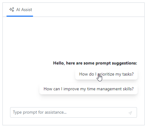
Initial and on-demand suggestions
This feature offers initial and on-demand suggestions, helping users start or refine their prompts. Customizable header text enhances these suggestions, offering better guidance and improving the user experience.
You can add suggestions using the PromptSuggestions parameter and set the header using the PromptSuggestionsHeader parameter.
Refer to the following code example.
@using Syncfusion.Blazor.InteractiveChat

<div class="aiassistview-container" style="height: 400px; width: 465px;">
 <SfAIAssistView PromptSuggestions="@suggestions" PromptRequested="@PromptRequest" PromptSuggestionsHeader="@promptSuggestionsHeader">
 </SfAIAssistView>
</div>

@code {
    string promptSuggestionsHeader = "Hello, here are some prompt suggestions:";
    List<string> suggestions = new List<string> { "How do I prioritize my tasks?", "How can I improve my time management skills?" };

    private async Task PromptRequest(AssistViewPromptRequestedEventArgs args)
    {
        await Task.Delay(1000);
        var isPromptFound = PromptsData.Any(prompt => prompt.Prompt == args.Prompt);
        var promptData = PromptsData.FirstOrDefault(prompt => prompt.Prompt == args.Prompt);
        var defaultResponse = "For real-time prompt processing, connect the AI AssistView control to your preferred AI service.";
        args.Response = isPromptFound ? promptData.Response : defaultResponse;
        args.PromptSuggestions = isPromptFound ? promptData.SuggestionData : suggestions;
        promptSuggestionsHeader = "Prompt suggestions for self-improvement and growth:";
    }

    private List<AssistModel> PromptsData = new List<AssistModel>()
    {
        new AssistModel() {
            Prompt = "How do I prioritize my tasks?",
            Response = "Prioritize tasks by urgency and impact: tackle high-impact tasks first, delegate when possible, and break large tasks into smaller steps. For more assistance, feel free to ask—I’m here to help!",
            SuggestionData = new List<string> { "How do I set daily goals in my work day?", "What is the most important thing to focus on?" }
        }
    };

    public class AssistModel
    {
        public string Prompt { get; set; }
        public string Response { get; set; }
        public List<string> SuggestionData { get; set; }
    }

}
Refer to the following image.
Note: For more details, refer to adding prompt suggestions in the Blazor AI AssistView documentation.
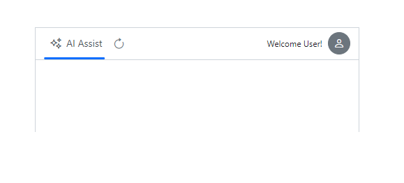
Flexible header toolbar configuration
The Blazor AI AssistView component includes a flexible header toolbar that can be customized to suit your needs. You can add and configure toolbar items for essential actions like reload, user settings, and more, enabling the execution of custom commands directly from the header area.
In the following code example, custom toolbar items are added using the <AssistViewToolbarItem> element, with options like Type, IconCss, and Template for further customization.
@using Syncfusion.Blazor.InteractiveChat
@using Syncfusion.Blazor.Navigations
@using Syncfusion.Blazor.Buttons

<div class="aiassistview-container" style="height: 400px; width: 465px;">
 <SfAIAssistView>
  <AssistViewToolbar>
   <AssistViewToolbarItem IconCss="e-icons e-refresh"></AssistViewToolbarItem>
   <AssistViewToolbarItem Type="ItemType.Spacer"></AssistViewToolbarItem>
   <AssistViewToolbarItem>
    <Template>Welcome User!</Template>
   </AssistViewToolbarItem>
   <AssistViewToolbarItem>
    <Template>
     <SfButton IconCss="e-icons e-user" CssClass="e-round"></SfButton>
    </Template>
   </AssistViewToolbarItem>
  </AssistViewToolbar>
 </SfAIAssistView>
</div>
Refer to the following image.
Note: For more details, refer to adding the header toolbar item in the Blazor AI AssistView documentation.
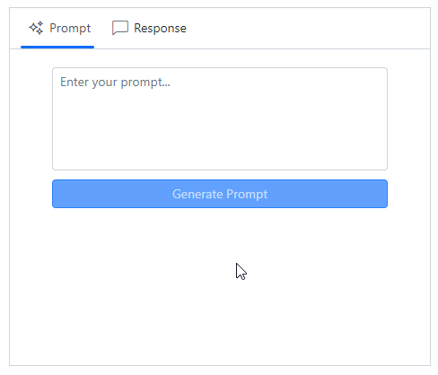
Customized view creation
With AI AssistView, you can create customized views to suit your app’s needs. Whether incorporating or replacing the default assist view, this feature allows for extensive customization, enabling a unique and tailored user interface.
The following code example customizes the default assist view content and creates a custom view for the response area. This showcases how you can customize the interface to enhance the user experience.
@using Syncfusion.Blazor.InteractiveChat
@using Syncfusion.Blazor.Inputs
@using Syncfusion.Blazor.Buttons

<div class="aiassistview-container" style="height: 400px; width: 470px;">
 <SfAIAssistView @ref="AIAssistView">
  <AssistViews>
   <AssistView Header="Prompt">
    <ViewTemplate>
     <div class="view-container">
      <SfTextArea @ref="TextArea" ResizeMode="Resize.None" RowCount="5" Placeholder="Enter your prompt..." @oninput="OnInput"></SfTextArea>
      <SfButton CssClass="e-primary generate-btn" @onclick="GenerateContent" Disabled="@disable">Generate Prompt</SfButton>
     </div>
    </ViewTemplate>
   </AssistView>
   <CustomView Header="Response" IconCss="e-icons e-comment-show">
    <ViewTemplate>
     <div class="view-container">
      @if (PromptsData.Count != 0)
      {
         PromptsData.Reverse();
         @foreach (var data in PromptsData)
         {
           <div class="responseItemContent">
            <div class="response-header"><b>Prompt:</b> @data.Prompt
            </div>
            <div class="content">
             @data.Response
            </div>
           </div>
         }
      }
      else
      {
           <div class="responseItemContent content">
            <span class="e-icons e-circle-info"></span>
            No prompt provided. Please enter a prompt and click 'Generate Prompt' to see the response.
           </div>
      }
     </div>
    </ViewTemplate>
   </CustomView>
  </AssistViews>
 </SfAIAssistView>
</div>

@code {
    private SfAIAssistView AIAssistView;
    private SfTextArea TextArea;
    private bool disable = true;
    private List<AssistModel> PromptsData = new List<AssistModel>();

    private void OnInput(ChangeEventArgs e)
    {
        disable = string.IsNullOrEmpty(e.Value.ToString());
    }

    private void GenerateContent()
    {
        var promptValue = TextArea.Value;
        PromptsData.Add(new AssistModel()
        {
            Prompt = promptValue,
            Response = "For real-time prompt processing, connect the AIAssistView component to your preferred AI service."
        });
        TextArea.Value = string.Empty;
        disable = true;
        AIAssistView.ActiveView = 1;
    }

    public class AssistModel
    {
        public string Prompt { get; set; }
        public string Response { get; set; }
    }
}
<style>

    .aiassistview-container .view-container {
        display: flex;
        flex-direction: column;
        gap: 10px;
        width: 80%;
        margin: 20px auto;
        font-size: 14px;
    }

    .aiassistview-container .responseItemContent {
        border: 1px solid #c1c1c1;
    }

    .aiassistview-container .response-header {
        border-bottom: 1px solid #c1c1c1;
    }
    .aiassistview-container .response-header,
    .aiassistview-container .content {
        padding: 10px;
    }

</style>
Refer to the following image.
Note: For more details, refer to the adding custom view in the Blazor AI AssistView documentation.
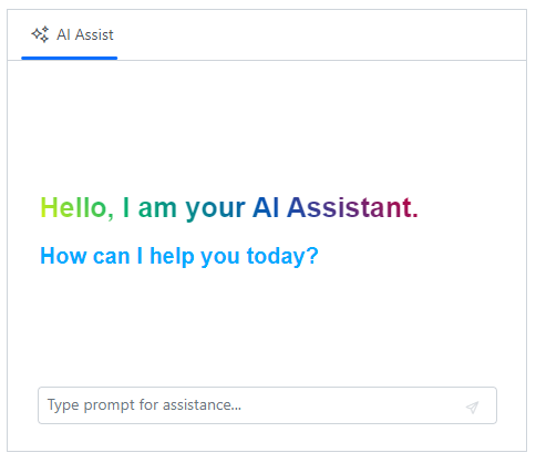
Customize the banner area
The banner area at the top of the prompt and response sections can be customized using a banner template. This customization allows you to display relevant information, such as welcome messages or an introduction to the integrated AI services.
In the following code example, the banner is customized to welcome users and offers assistance using the <BannerTemplate>, highlighting how you can enhance user interaction with meaningful content.
@using Syncfusion.Blazor.InteractiveChat

<div class="aiassistview-container" style="height: 400px; width: 470px;">
 <SfAIAssistView>
  <AssistView>
   <BannerTemplate>
    <div class="banner-content">
     <p>Hello, I am your AI Assistant.</p>
     <p>How can I help you today?</p>
    </div>
   </BannerTemplate>
  </AssistView>
 </SfAIAssistView>
</div>
<style>
    .banner-content {
        display: flex;
        flex-direction: column;
        font-family: sans-serif;
        font-weight: bold;
        color: #00aaff;
        height: 134px;
    }
    .banner-content p {
        margin: 0;
        font-size: 20px;
    }
    .banner-content p:first-child {
        margin-bottom: 10px;
        background: linear-gradient(45deg, #ecfb09 0, #07b36d 20%, #0754b3 50%, #b30747 80%, #b3070d 100%);
        background-clip: text;
        color: transparent;
        font-size: 25px;
    }

</style>
Refer to the following image.
Note: For more details, refer to the banner template documentation.
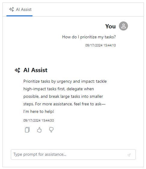
Enhanced prompt and response appearance
You can customize the appearance of individual entries using prompt and response item templates. This includes displaying additional information such as date and time and adjusting avatar styling, which adds clarity and provides extra context for each prompt and response.
In the following code example, the prompt and response items are customized to display additional information using the <PromptItemTemplate> and <ResponseItemTemplate> elements.
@using Syncfusion.Blazor.InteractiveChat

<div class="aiassistview-container" style="height: 400px; width: 470px;">
 <SfAIAssistView Prompts="@PromptsData">
  <AssistView>
   <PromptItemTemplate>
    <div class="promptItemContent">
     <div class="prompt-header">You
      <span class="e-icons e-user"></span>
     </div>
     <div class="prompt-content">@context.Prompt</div>
     <time>09/17/2024 15:44:10</time>
    </div>
   </PromptItemTemplate>
   <ResponseItemTemplate>
    <div class="responseItemContent">
     <div class="response-header">
      <span class="e-icons e-assistview-icon"></span>
       AI Assist
     </div>
     <div class="response-content">@context.Response</div>
     <time>09/17/2024 15:44:30</time>
    </div>
   </ResponseItemTemplate>
  </AssistView>
 </SfAIAssistView>
</div>

@code {
    private List<AssistViewPrompt> PromptsData = new List<AssistViewPrompt>()
    {
        new AssistViewPrompt() {
            Prompt = "How do I prioritize my tasks?",
            Response = "Prioritize tasks by urgency and impact: tackle high-impact tasks first, delegate when possible, and break large tasks into smaller steps. For more assistance, feel free to ask—I’m here to help!"
        }
    };
}
<style>
    .promptItemContent,
    .responseItemContent {
        display: flex;
        flex-direction: column;
        gap: 5px;
    }
    .promptItemContent {
        align-items: flex-end;
        margin-right: 20px
    }

    .responseItemContent {
        gap: 10px;
    }

    .promptItemContent .prompt-header,
    .responseItemContent .response-header {
        display: flex;
        align-items: center;
        font-size: 20px;
        font-weight: bold;
    }
    .promptItemContent .prompt-content {
        margin-right: 30px;
        padding: 5px 10px;
        font-weight: 400;
    }
    .responseItemContent .response-content {
        margin-left: 30px;
        line-height: 25px;
    }
    .responseItemContent .response-header span {
        display: flex;
        align-items: center;
        margin-top: 5px;
        width: 30px;
        font-weight: bold;
    }
    .e-response-item-template .e-toolbar-items {
        margin-left: 35px;
    }
    .responseItemContent {
        margin-left: 20px
    }
    .promptItemContent .prompt-header span {
        margin-left: 10px;
        height: 30px;
        width: 30px;
        background: #a2a2a2;
        border-radius: 50%;
        display: flex;
        justify-content: center;
        align-items: center;
        color: white;
        padding-left: 2px;
    }
    .promptItemContent time {
        margin-right: 40px;
        font-size: 0.7rem;
    }
    .responseItemContent time {
        margin-left: 30px;
        font-size: 0.7rem;
    }
</style>
Refer to the following image.
Note: For more details, refer to the prompt item template and response item template documentation.
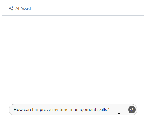
Customized footer section
The AI AssistView component’s footer section can be customized to replace the default assist view footer area. This flexibility allows you to design a footer that aligns with your specific needs, manage prompt request actions, and incorporate a customized design.
Refer to the following code example.
@inject IJSRuntime JSRunTime
@using Syncfusion.Blazor.InteractiveChat

<div class="aiassistview-container" style="height: 400px; width: 470px;">
 <SfAIAssistView @ref="AssistView" PromptRequested="@PromptRequest">
  <AssistView>
   <FooterTemplate>
    <div class="footerContent">
     <div id="editor" class="content-editor" contenteditable="true" @onkeydown="Callback">How can I improve my time management skills?</div>
     <button class="sendButton e-icons e-send" @onclick="OnBtnClick"></button>
    </div>
   </FooterTemplate>
  </AssistView>
 </SfAIAssistView>
</div>

@code {

    private SfAIAssistView AssistView;
    private bool isPromptExecuting = false;

    private async Task PromptRequest(AssistViewPromptRequestedEventArgs args)
    {
        await Task.Delay(1000);
        var defaultResponse = "For real-time prompt processing, connect the AI AssistView control to your preferred AI service.";
        args.Response = defaultResponse;
    }

    private async Task OnBtnClick()
    {
        await ExecuteActionAsync();
    }

    private async void Callback(KeyboardEventArgs obj)
    {
        if (obj.Key == "Enter" && !obj.ShiftKey && !isPromptExecuting)
        {
            await ExecuteActionAsync();
        }
    }

    private async Task ExecuteActionAsync()
    {
        var content = await JSRunTime.InvokeAsync<string>("getPromptContent");
        if (!string.IsNullOrEmpty(content))
        {
            isPromptExecuting = true;
            await AssistView.ExecutePromptAsync(content.Trim());
            isPromptExecuting = false;
        }
    }

}

<script>

    function getPromptContent() {
        var element = document.getElementById("editor");
        var content = element ? element.innerText : '';
        element.innerText = "";
        return content;
    }
</script>

<style>

    .footerContent {
        display: flex;
        border: 1px solid #c1c1c1;
        padding: 5px 5px 5px 15px;
        background-color: #f8f8f8;
        border-radius: 20px;
    }

    .footerContent .content-editor {
        width: 100%;
        min-height: 25px;
        max-height: 100px;
        overflow-y: auto;
        font-size: 15px;
        scrollbar-color: #c1c1c1 transparent;
    }

    .footerContent .sendButton {
        height: 25px;
        border-radius: 15px;
        border: none;
        background: #5c5c5c;
        color: white;
        align-self: end;
    }

</style>
Refer to the following image.
Note: For more details, refer to customize the footer using a template in the Blazor AI AssistView documentation.

References
For more details, refer to the Blazor AI AssistView component demos and documentation.
Supported platforms
The AI AssistView component is also available on the following platforms.
Platform | Demo | Documentation |
Conclusion
Thanks for reading! In this blog, we’ve seen the features of the new Syncfusion Blazor AI AssistView component rolled out in our 2024 Volume 3 release. These features are also listed on our Release Notes and the What’s New pages. Try out the component and share your feedback as comments on this blog.
Existing Syncfusion users can access the most recent version of Essential Studio® on the License and Downloads page. If you’re new to Syncfusion, we offer a 30-day free trial to test these exciting new features.
You can also reach us through our support forums, support portal, or feedback portal. Our team is always ready to assist you!