TL;DR: Let’s create a WPF Chart dashboard to visualize 2024 T20 World Cup stats. Learn to gather data, define classes, and arrange elements for interactivity. Customize charts and ComboBox selections for an engaging analysis of cricket statistics.
Welcome to the Chart of the Week blog series!
Interpreting raw data can be tedious and challenging. However, visual representations such as charts and graphs make this process significantly easier and more intuitive. When these visual tools are enhanced with interactive features, understanding complex data becomes a piece of cake.
We all recently enjoyed the thrilling matches of the T20 World Cup. Cricket brings out a mix of emotions—joy, grace, and sometimes sadness—creating unforgettable moments for players and fans alike. Everyone has their own favorite teams and players, and opinions vary widely.
In this blog, we’ll show you how to create a rich dashboard to visualize the 2024 T20 World Cup data using the Syncfusion WPF Charts. Unlike typical applications, a dashboard transforms raw data into visually appealing and easily understandable formats. We will specifically focus on visualizing country- wise T20 data using a combo box selection for an interactive experience.
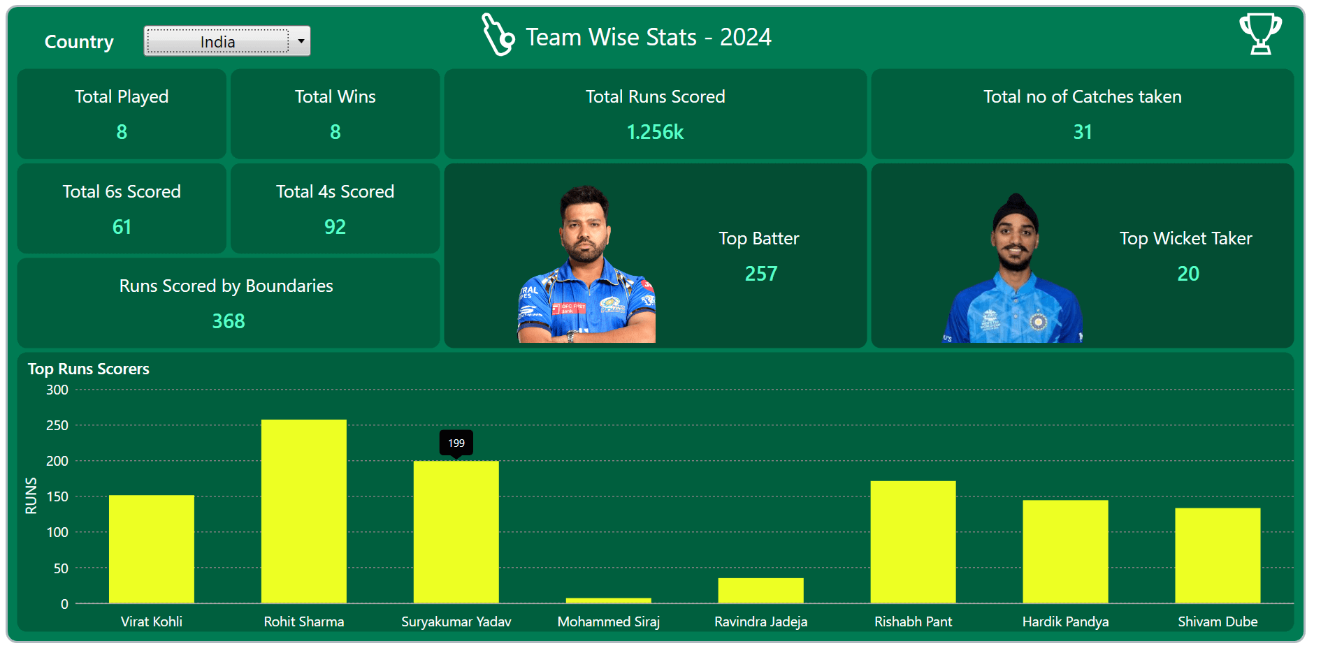
The following chart visually presents the discussed data, clearly comparing the 2024 T20 World Cup data, allowing you to gain insights briefly.
 Here, we will visualize the runs scored by the 2024 T20 World Cup tournament players. Let’s explore the steps involved in showcasing these details using the Syncfusion WPF Column Chart.
Step 1: Gathering the T20 data
Before creating the chart dashboard, we need to gather data on the 2024 T20 World Cup from ESPN Sports Media Ltd.
Step 2: Populating the data
To effectively manage and visualize cricket statistics, we’ll define two classes: PlayersData and CountryData. These classes will hold the necessary properties to represent individual player statistics and country-wide performance data, respectively.
PlayersData class properties
- Name: Represents the individual player’s name.
- Score: Stores the run values of the individual player.
CountryData class properties
- Play: Stores the overall count of matches played by each country.
- Wins: Represents the count of matches won by each country.
- Runs: Stores the run values scored by players by countries.
- CatchValue: Demonstrates the number of catches taken by the team.
- Score6s: Represents the count of sixes scored by the team.
- Score4s: Represents the count of fours scored by the team.
- Boundaries: Represents the runs scored by the team through boundaries.
- Batter: Represents the top run count data from the team on a country-wise basis.
- BatterImage: Stores the image of the best batter.
- WicketTaker: Represents the top wicket count from the team on a country-wise basis.
- WicketTakerImage: Stores the image of the best wicket-taker.
These classes will provide a structured way to manage and visualize cricket statistics, enabling us to create rich and interactive charting applications.
Refer to the following code example.
public class PlayersData
{
  public string? Name { get; set; }
  public int Score { get; set; }
}
public class CountryData
{
  public int Play { get; set; }
  public int Wins { get; set; }
  public string? Runs { get; set; }
  public int CatchValue { get; set; }
  public int Score6s { get; set; }
  public int Score4s { get; set; }
  public int Boundaries { get; set; }
  public int Batter { get; set; }
  public string? BatterImage { get; set; }
  public int WicketTaker { get; set; }
  public string? WicketTakerImage { get; set; }
}
Next, the data collection will be generated using the T20_Data class, which has the following properties that demonstrate the details of a T20 match.
public class T20_Data : INotifyPropertyChanged
{
  private int play;
  public int Play
  {
     get => play;
     set { play = value; OnPropertyChanged(); }
  }

  private int wins;
  public int Wins
  {
     get => wins;
     set { wins = value; OnPropertyChanged(); }
  }

  private string runs;
  public string Runs
  {
     get => runs;
     set { runs = value; OnPropertyChanged(); }
  }

  private int catchValue;
  public int CatchValue
  {
      get => catchValue;
      set { catchValue = value; OnPropertyChanged(); }
  }

  private int score6s;
  public int Score6s
  {
      get => score6s;
      set { score6s = value; OnPropertyChanged(); }
  }

  private int score4s;
  public int Score4s
  {
      get => score4s;
      set { score4s = value; OnPropertyChanged(); }
  }

  private int boundaries;
  public int Boundaries
  {
     get => boundaries;
     set { boundaries = value; OnPropertyChanged(); }
  }

  private int batter;
  public int Batter
  {
     get => batter;
     set { batter = value; OnPropertyChanged(); }
  }

  private string batterImage;
  public string BatterImage
  {
     get => batterImage;
     set { batterImage = value; OnPropertyChanged(); }
  }

  private int wicketTaker;
  public int WicketTaker
  {
     get => wicketTaker;
     set { wicketTaker = value; OnPropertyChanged(); }
  }

  private string wicketTakerImage;
  public string WicketTakerImage
  {
     get => wicketTakerImage;
     set { wicketTakerImage = value; OnPropertyChanged(); }
  }

  private ObservableCollection<PlayersData> data;
  public ObservableCollection<PlayersData> Data
  {
     get => data;
     set { data = value; OnPropertyChanged(); }
  }

  private Dictionary<string, CountryData> countryData;
  private Dictionary<string, List<PlayersData>> playersData;
  public ObservableCollection<string> CountryOption { get; set; }

  public T20_Data()
  {
     CountryOption = new ObservableCollection<string> { "India", "Ireland", "England", "Pakistan", "Canada", "United States", "Australia", "Scotland", "Oman", "South Africa", "Sri Lanka", "New Zealand", "Afghanistan", "Nepal", "West Indies", "Uganda", "Papua New Guinea", "Namibia", "Netherlands", "Bangladesh"};

     var executingAssembly = typeof(App).GetTypeInfo().Assembly;
     using (var stream = executingAssembly.GetManifestResourceStream("_2024_T20_Match.Resources.country_data.json"))
     using (var textStream = new StreamReader(stream))
     {
        countryData = JsonConvert.DeserializeObject<Dictionary<string, CountryData>> (textStream.ReadToEnd().Trim());
     }

     using (var stream = executingAssembly.GetManifestResourceStream("_2024_T20_Match.Resources.players_data.json"))
     using (var textStream = new StreamReader(stream))
     {
         playersData = JsonConvert.DeserializeObject<Dictionary<string, List<PlayersData>>>(textStream.ReadToEnd().Trim());
     }
  }

  public event PropertyChangedEventHandler? PropertyChanged;
  protected void OnPropertyChanged([CallerMemberName] string name = "")
  {
    PropertyChanged?.Invoke(this, new PropertyChangedEventArgs(name));
  }

}
In the above code, we’ve converted the JSON data to a collection using the StreamReader and JsonConvert.DeserializeObject methods from the Newtonsoft.Json package. Then, we stored the converted data in the appropriate properties.
Step 3: Defining the layout
Defining the layout is a crucial step in creating a dashboard. The layout determines the overall look and feel, making the dashboard visually appealing and easy to understand. A well-organized layout ensures that the data is presented clearly and intuitively.
To define the layout, we’ll add a Border and a Grid to arrange the elements neatly. Refer to the following code example.
<Border Margin="20" Padding="7" BorderThickness="2" CornerRadius="10" Background="#007B53" BorderBrush="#b0b8bf">

 <Grid>
  <Grid.RowDefinitions>
   <RowDefinition Height="50"/>
   <RowDefinition Height="*"/>
   <RowDefinition Height="*"/>
  </Grid.RowDefinitions>
 </Grid>

</Border>
Step 4: Arranging the elements in the layout
After defining the layout, we can organize the necessary elements for our app to create a compelling user interface. Here, we’ll focus on creating the following three key parts:
- ComboBox: To select and view T20 data of different countries.
- Labels: Placed inside the bordered views to represent country-wise data based on the ComboBox selected index.
- Chart: To display player scores for the selected country.
Step 5: Configuring the Syncfusion WPF ComboBox and header view
The Syncfusion WPF ComboBox control offers a versatile dropdown list that supports both single and multiple selections, using delimiters to separate the selected items. Here, we use the ComboBox to list and choose the country for the T20 match. Additionally, adding a header with a related icon for the dashboard can make the data more readable and visually appealing.
Refer to the following code example.
<Grid Grid.Row="0">
 <Grid.ColumnDefinitions>
  <ColumnDefinition Width="1*"/>
  <ColumnDefinition Width="2*"/>
  <ColumnDefinition Width="6*"/>
  <ColumnDefinition Width="1*"/>
 </Grid.ColumnDefinitions>

 <Label Grid.Column="0" Content="Country" FontSize="18" VerticalAlignment="Center" Foreground="#FFFFFF" FontWeight="SemiBold" HorizontalContentAlignment="Center"/>

 <comboBox:ComboBoxAdv Grid.Column="1" x:Name="type" HorizontalAlignment="Left" HorizontalContentAlignment="Center" Height="30" Width="160" FontSize="15.5" ItemsSource="{Binding CountryOption}"/>

 <StackPanel Grid.Column="2" Orientation="Horizontal" Margin="80,0,0,0">
  <Path Data="{StaticResource PathData1}" Stroke="#FFFFFF" StrokeThickness="2.5">
   <Path.RenderTransform>
    <ScaleTransform ScaleX="1.2" ScaleY="1.2"/>
   </Path.RenderTransform>
  </Path>
  <Label Content="Team Wise Stats - 2024" FontSize="23" Foreground="#FFFFFF" Margin="10,0,0,0"/>
 </StackPanel>

 <Path Grid.Column="3" Data="{StaticResource PathData2}" Stroke="#FFFFFF" StrokeThickness="2" HorizontalAlignment="Right" Margin="0,0,20,0">
  <Path.RenderTransform>
   <ScaleTransform ScaleX="1.2" ScaleY="1.2"/>
  </Path.RenderTransform>
 </Path>

</Grid>
Step 6: Arranging country-wise T20 content
Next, we’ll organize country-wise play counts, winning statistics, total runs, catches, 6s, 4s, runs scored by boundaries, and details of the best batter and wicket-taker by team, utilizing labels and borders.
Refer to the following code example.
<Grid Grid.Row="1">
 <Grid.RowDefinitions>
  <RowDefinition Height="*"/>
  <RowDefinition Height="*"/>
  <RowDefinition Height="*"/>
 </Grid.RowDefinitions>

 <Grid.ColumnDefinitions>
  <ColumnDefinition Width="*"/>
  <ColumnDefinition Width="*"/>
  <ColumnDefinition Width="2*"/>
  <ColumnDefinition Width="2*"/>
 </Grid.ColumnDefinitions>

 <Border Grid.Row="0" Grid.Column="0" Background="#005F3E" BorderThickness="2" CornerRadius="10">
  <StackPanel HorizontalAlignment="Center" VerticalAlignment="Center" Orientation="Vertical">
   <Label Content="Total Played" FontSize="17" Foreground="#FFFFFF"/>
   <Label Content="{Binding Play}" FontSize="19" FontWeight="SemiBold" HorizontalContentAlignment="Center" Foreground="#5AFEC9"/>
  </StackPanel>
 </Border>

 <Border Grid.Row="0" Grid.Column="1" Background="#005F3E" BorderThickness="2" CornerRadius="10">
  <StackPanel HorizontalAlignment="Center" VerticalAlignment="Center">
   <Label Content="Total Wins" FontSize="17" Foreground="#FFFFFF"/>
   <Label Content="{Binding Wins}" FontSize="19" FontWeight="SemiBold" HorizontalContentAlignment="Center" Foreground="#5AFEC9"/>
  </StackPanel>
 </Border>

 <Border Grid.Row="0" Grid.Column="2" Background="#005F3E" BorderThickness="2" CornerRadius="10">
  <StackPanel HorizontalAlignment="Center" VerticalAlignment="Center">
   <Label Content="Total Runs Scored" FontSize="17" Foreground="#FFFFFF"/>
   <Label Content="{Binding Runs}" FontSize="19" FontWeight="SemiBold" HorizontalContentAlignment="Center" Foreground="#5AFEC9"/>
  </StackPanel>
 </Border>

 <Border Grid.Row="0" Grid.Column="3" Grid.ColumnSpan="2" Background="#005F3E" BorderThickness="2" CornerRadius="10">
  <StackPanel HorizontalAlignment="Center" VerticalAlignment="Center">
   <Label Content="Total no of Catches taken" FontSize="17" Foreground="#FFFFFF"/>
   <Label Content="{Binding CatchValue}" FontSize="19" FontWeight="SemiBold" HorizontalContentAlignment="Center" Foreground="#5AFEC9"/>
  </StackPanel>
 </Border>

 <Border Grid.Row="1" Grid.Column="0" Background="#005F3E" BorderThickness="2" CornerRadius="10">
  <StackPanel HorizontalAlignment="Center" VerticalAlignment="Center">
   <Label Content="Total 6s Scored" FontSize="17" Foreground="#FFFFFF"/>
   <Label Content="{Binding Score6s}" FontSize="19" FontWeight="SemiBold" HorizontalContentAlignment="Center" Foreground="#5AFEC9"/>
  </StackPanel>
 </Border>

 <Border Grid.Row="1" Grid.Column="1" Background="#005F3E" BorderThickness="2" CornerRadius="10">
  <StackPanel HorizontalAlignment="Center" VerticalAlignment="Center">
   <Label Content="Total 4s Scored" FontSize="17" Foreground="#FFFFFF"/>
   <Label Content="{Binding Score4s}" FontSize="19" FontWeight="SemiBold" HorizontalContentAlignment="Center" Foreground="#5AFEC9"/>
  </StackPanel>
 </Border>

 <Border Grid.Row="1" Grid.RowSpan="2" Grid.Column="2" Background="#034D33" BorderThickness="2" CornerRadius="10">
  <Grid>
   <Grid.ColumnDefinitions>
    <ColumnDefinition Width="*"/>
    <ColumnDefinition Width="*"/>
   </Grid.ColumnDefinitions>

   <Image Grid.Column="0" Source="{Binding BatterImage, Converter={StaticResource ImagePathConverter}}" Width="240" Height="210" Margin="30,5,0,5"/>

   <StackPanel Grid.Column="1" Orientation="Vertical" VerticalAlignment="Center">
    <Label Content="Top Batter " FontSize="17" HorizontalAlignment="Center" Foreground="#FFFFFF"/>
    <Label Content="{Binding Batter}" FontSize="19" FontWeight="SemiBold" HorizontalAlignment="Center" Foreground="#5AFEC9"/>
   </StackPanel>
  </Grid>
 </Border>

 <Border Grid.Row="1" Grid.RowSpan="2" Grid.Column="3" Background="#034D33" BorderThickness="2" CornerRadius="10">
  <Grid>
   <Grid.ColumnDefinitions>
    <ColumnDefinition Width="*"/>
    <ColumnDefinition Width="*"/>
   </Grid.ColumnDefinitions>

   <Image Grid.Column="0" Source="{Binding WicketTakerImage, Converter={StaticResource ImagePathConverter}}" Width="240" Height="210" Margin="30,5,0,5"/>
   <StackPanel Grid.Column="1" Orientation="Vertical" VerticalAlignment="Center">
    <Label Content="Top Wicket Taker " FontSize="17" HorizontalAlignment="Center" Foreground="#FFFFFF"/>
    <Label Content="{Binding WicketTaker}" FontSize="19" FontWeight="SemiBold" HorizontalAlignment="Center" Foreground="#5AFEC9"/>
   </StackPanel>
  </Grid>
 </Border>

 <Border Grid.Row="2" Grid.Column="0" Grid.ColumnSpan="2" Background="#005F3E" BorderThickness="2" CornerRadius="10">
  <StackPanel HorizontalAlignment="Center" VerticalAlignment="Center">
   <Label Content="Runs Scored by Boundaries " FontSize="17" Foreground="#FFFFFF"/>
   <Label Content="{Binding Boundaries}" FontWeight="SemiBold" HorizontalContentAlignment="Center" Foreground="#5AFEC9" FontSize="19"/>
  </StackPanel>
 </Border>

</Grid>
Step 7: Configuring the Syncfusion WPF Chart
Let’s configure the Syncfusion WPF Charts control using this documentation.
Refer to the following code example.
<Border Grid.Row="2" Background="#005F3E" BorderThickness="2" CornerRadius="10">

 <chart:SfChart>
  <chart:SfChart.PrimaryAxis>
   <chart:CategoryAxis>
   </chart:CategoryAxis>
  </chart:SfChart.PrimaryAxis>

  <chart:SfChart.SecondaryAxis>
   <chart:NumericalAxis>
   </chart:NumericalAxis>
  </chart:SfChart.SecondaryAxis>
 </chart:SfChart>

</Border>
Step 8: Binding data to the WPF Column Chart
To visualize the 2024 T20 data, we will utilize Syncfusion’s WPF ColumnSeries.
<chart:ColumnSeries ItemsSource="{Binding Data}" XBindingPath="Name" YBindingPath="Score">
</chart:ColumnSeries>
In the above code example, we’ve bound the ItemsSource, XBindingPath, and YBindingPath properties to the Data, Name, and Score properties, respectively.
Step 9: Customizing the chart appearance
Let’s enhance the appearance of our WPF Column Chart by customizing its elements, such as the title, axis, series color, and size.
Add the chart title
Adding a title can help make the data presented in the chart more easily understood. Refer to the following code example to customize the chart title.
<chart:SfChart HorizontalHeaderAlignment="Left">

 <chart:SfChart.Header>
  <Label Content="Top Runs Scorers" FontSize="15" Margin="5,0,0,0" FontWeight="SemiBold" Foreground="#FFFFFF"/>
 </chart:SfChart.Header>

</chart:SfChart>
Customize the chart axis
You can customize the chart axis using the following properties:
- ShowGridLines: Adjusts the visibility of major grid lines on the axis.
- LabelStyle: Modifies the style of axis labels for better visual representation.
- TickLineSize: Customizes the size of ticks along the chart axis.
- HeaderTemplate: Allows customization of the axis title label.
- AxisLineStyle: Modifies the style of the axis line.
- MajorGridLineStyle: Adjusts the style of major grid lines on the axis.
These properties provide flexibility in adjusting the visual appearance and functionality of our WPF Chart axis.
Refer to the following code example.
<chart:SfChart.PrimaryAxis>
 <chart:CategoryAxis FontSize="13" ShowGridLines="False" TickLineSize="0" AutoScrollingDelta="8" AutoScrollingMode="Start">
  <chart:CategoryAxis.LabelStyle>
   <chart:LabelStyle Foreground="#FFFFFF"/>
  </chart:CategoryAxis.LabelStyle>
 </chart:CategoryAxis>
</chart:SfChart.PrimaryAxis>

<chart:SfChart.SecondaryAxis>
 <chart:NumericalAxis FontSize="13" TickLineSize="0">
  <chart:NumericalAxis.LabelStyle>
   <chart:LabelStyle Foreground="#FFFFFF"/>
  </chart:NumericalAxis.LabelStyle>

  <chart:NumericalAxis.MajorGridLineStyle>
   <Style TargetType="Line">
    <Setter Property="StrokeThickness" Value="1"/>
    <Setter Property="Stroke" Value="Gray"/>
    <Setter Property="StrokeDashArray" Value="2,2"/>
   </Style>
  </chart:NumericalAxis.MajorGridLineStyle>

  <chart:NumericalAxis.AxisLineStyle>
   <Style TargetType="Line">
    <Setter Property="StrokeThickness" Value="0"/>
   </Style>
  </chart:NumericalAxis.AxisLineStyle>

  <chart:NumericalAxis.HeaderTemplate>
   <DataTemplate>
    <TextBlock Text="RUNS" Padding="0,3,0,4" FontSize="14" Foreground="#FFFFFF"/>
   </DataTemplate>
  </chart:NumericalAxis.HeaderTemplate>
 </chart:NumericalAxis>
</chart:SfChart.SecondaryAxis>
Customize the chart color and size
The following code example shows how to customize the chart’s size and color using the SegmentSpacing and Interior properties, respectively.
<chart:ColumnSeries SegmentSpacing="0.3" Interior="#EDFF23">
</chart:ColumnSeries>
Incorporating panning and tooltip
To enhance readability, we can also enable tooltips to display detailed information and panning to scroll through series within a specific range. This can be achieved using properties such as ShowTooltip, ChartZoomPanBehavior, and AutoScrollingDelta.
<chart:SfChart.Behaviors>
 <chart:ChartZoomPanBehavior EnableMouseWheelZooming="False" EnablePinchZooming="False" ResetOnDoubleTap="False" EnablePanning="True">
 </chart:ChartZoomPanBehavior>
</chart:SfChart.Behaviors>

<chart:SfChart.PrimaryAxis>
 <chart:CategoryAxis AutoScrollingDelta="8" AutoScrollingMode="Start">
 </chart:CategoryAxis>
</chart:SfChart.PrimaryAxis>

<chart:SfChart.SecondaryAxis>
 <chart:NumericalAxis>
 </chart:NumericalAxis>
</chart:SfChart.SecondaryAxis>

<chart:ColumnSeries ShowTooltip="True">
Step 10: Enabling interactivity for the entire dashboard
Let’s enhance our chart dashboard interactivity using the ComboBox. This will also allow us to dynamically select different countries that participated in the 2024 T20 matches.
Here, we utilize the ComboBox’s SelectedIndex property to dynamically update the entire dashboard. This includes updating country-specific data and player details based on the country choosen in the ComboBox.
<comboBox:ComboBoxAdv SelectedIndex="{Binding SelectedIndex}" />In the following code example, we have created the SelectedIndex property to store the T20 data.
public class T20_Data : INotifyPropertyChanged
{
  private int selectedIndex;
  public int SelectedIndex
  {
    get => selectedIndex;
    set
    {
      selectedIndex = value;
      UpdateIndex(value);
      OnPropertyChanged();
    }
  }

  public T20_Data()
  {
     SelectedIndex = 0;
  }

  private void UpdateIndex(int value)
  {
     if (value >= 0 && value < CountryOption.Count)
     {
        string selectedCountry = CountryOption[value];
        if (countryData.ContainsKey(selectedCountry))
        {
           var data = countryData[selectedCountry];
           Play = data.Play;
           Wins = data.Wins;
           Runs = data.Runs;
           CatchValue = data.CatchValue;
           Score6s = data.Score6s;
           Score4s = data.Score4s;
           Boundaries = data.Boundaries;
           Batter = data.Batter;
           BatterImage = data.BatterImage;
           WicketTaker = data.WicketTaker;
           WicketTakerImage = data.WicketTakerImage;
        }
        if (playersData.ContainsKey(selectedCountry))
        {
           Data = new ObservableCollection<PlayersData>(playersData[selectedCountry]);
        }
     }
   }
}
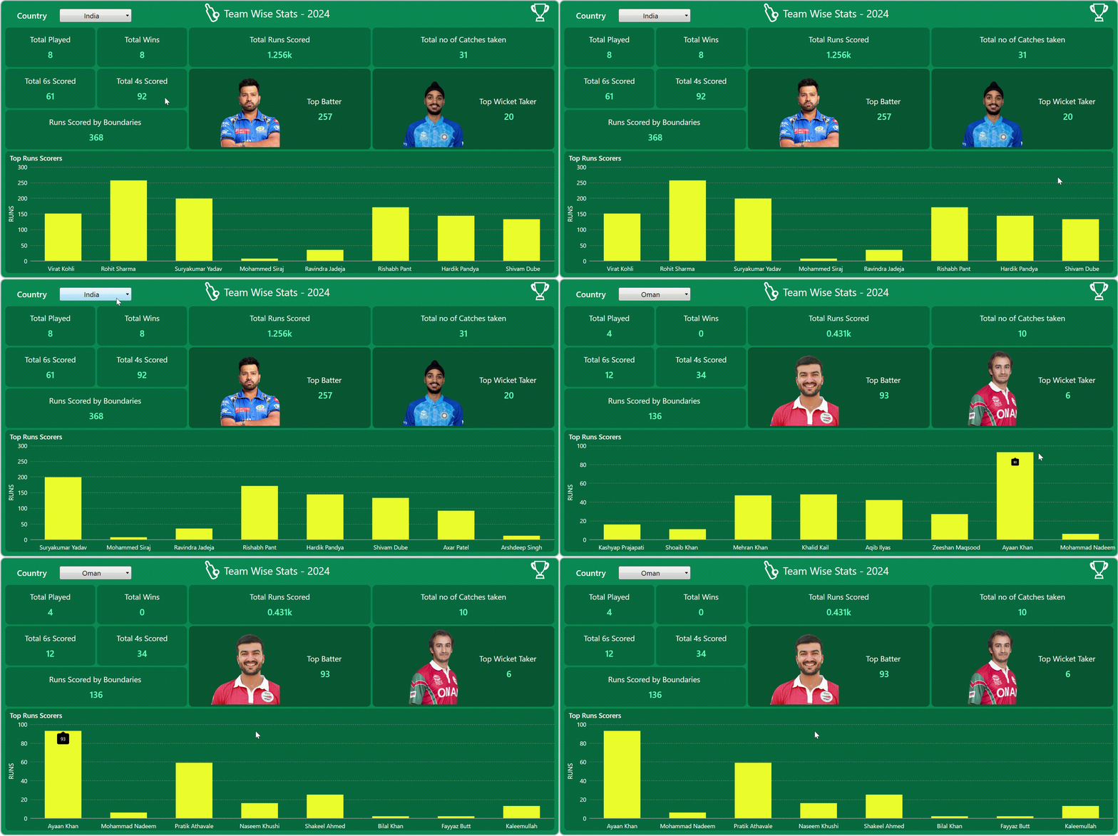
After executing the previous code examples, the output will look like the following image.

GitHub reference
For more details, please refer to the project on GitHub.
Conclusion
Thanks for reading! In this blog, we have explored how to visualize the 2024 T20 World Cup tournament data using the Syncfusion WPF Column Chart. We highly recommend following the steps outlined in this blog and sharing your feedback in the comments section below.
If you need any assistance, please do not hesitate to contact us via our support forum, support portal, or feedback portal. We are always eager to help you!
Related blogs
- Creating a WPF Doughnut Chart to Visualize the New European Parliament’s Composition in 2024
- Creating a WPF Range Bar Chart to Visualize the Hearing Range of Living Beings
- Creating a WPF Pie Chart to Visualize the Percentage of Global Forest Area for Each Country
- Creating a WPF Sunburst Chart to Visualize the Syncfusion Chart of the Week Blog Series


