TL;DR: Let’s craft a .NET MAUI Doughnut Chart to visualize the 2023 oil production data. We cover data preparation, chart configuration, and customization steps to create an interactive and visually appealing chart.
Welcome to our Chart of the Week blog series!
Today, we’ll visualize the world’s biggest oil producers in 2023 using Syncfusion’s .NET MAUI Doughnut Chart.
Despite ongoing efforts to decarbonize the global economy, oil remains one of the world’s most vital resources. It’s produced by a relatively small group of countries, granting them significant economic and political leverage.
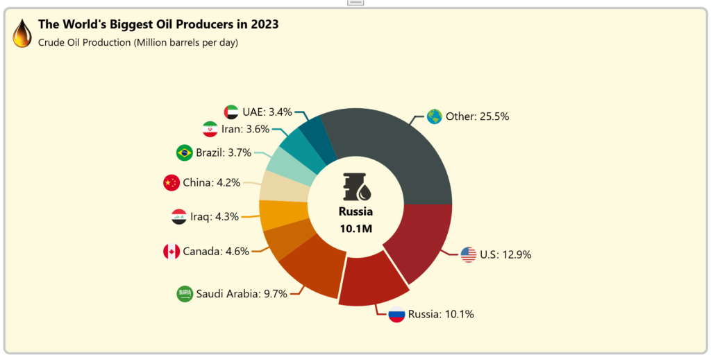
This graphic illustrates global crude oil production in 2023, measured in million barrels per day, sourced from the U.S. Energy Information Administration (EIA).
The following image shows the Doughnut Chart we’re going to create.

Let’s get started!
Step 1: Gather oil production data
Before creating the .NET MAUI Doughnut Chart, we need to gather data from the U.S. Energy Information Administration (EIA). We can also download the data in CSV format.
Step 2: Prepare the data for the Doughnut Chart
Then, we need to organize our data properly. This involves creating an OilProductionModel class, which defines the structure of our oil production data, and a WorldOilProduction class, which handles the data manipulation and communication between the model and the Doughnut Chart.
The data model represents the data we want to visualize. It could contain the properties to store the details such as the country name, oil production value, and country flag image.
public class OilProductionModel
{
        public string Country { get; set; }
        public double Production { get; set; }
        public string FlagImage { get; set; }
        public OilProductionModel(string country, double production, string flagImage)
        {
            Country = country;
            Production = production;
            FlagImage = flagImage;
        }
}
Now, create the WorldOilProduction class, which acts as an intermediary between the data models and the user interface elements (Doughnut Chart), preparing and formatting data for display and interaction.
Additionally, we need to configure the properties to update the exploding segment values in the center view labels.
public class WorldOilProduction : INotifyPropertyChanged
{
    public List<OilProductionModel> ProductionDetails { get; set; }
    public List<Brush> PaletteBrushes { get; set; }
    private double productionValue;
    public double ProductionValue
    {
        get
        {
            return productionValue;
        }
        set
        {
            productionValue = value;
            NotifyPropertyChanged(nameof(ProductionValue));
        }
    }
    private string countryName;
    public string CountryName
    {
        get
        {
            return countryName;
        }
        set
        {
            countryName = value;
            NotifyPropertyChanged(nameof(CountryName));
        }
    }
    int explodeIndex = 1;
    public int ExplodeIndex
    {
        get
        {
            return explodeIndex;
        }
        set
        {
            explodeIndex = value;
            UpdateIndexValues(value);
            NotifyPropertyChanged(nameof(ExplodeIndex));
        }
    }
    public WorldOilProduction()
    {
        ProductionDetails = new List<OilProductionModel>(ReadCSV());
        PaletteBrushes = new List<Brush>
        {
            new SolidColorBrush(Color.FromArgb("#583101")),
            new SolidColorBrush(Color.FromArgb("#603808")),
            new SolidColorBrush(Color.FromArgb("#6f4518")),
            new SolidColorBrush(Color.FromArgb("#8b5e34")),
            new SolidColorBrush(Color.FromArgb("#a47148")),
            new SolidColorBrush(Color.FromArgb("#bc8a5f")),
            new SolidColorBrush(Color.FromArgb("#d4a276")),
            new SolidColorBrush(Color.FromArgb("#e7bc91")),
            new SolidColorBrush(Color.FromArgb("#f3d5b5")),
            new SolidColorBrush(Color.FromArgb("#FFEDD8"))
        };
    }
    public event PropertyChangedEventHandler PropertyChanged;
    public void NotifyPropertyChanged([CallerMemberName] String propertyName = "")
    {
        PropertyChanged?.Invoke(this, new PropertyChangedEventArgs(propertyName));
    }
    private void UpdateIndexValues(int value)
    {
        if (value >= 0 && value < ProductionDetails.Count)
        {
            var model = ProductionDetails[value];
            if (model != null && model.Country != null)
            {
                ProductionValue = model.Production;
                CountryName = model.Country;
            }
        }
    }
}
Then, convert the CSV data into a data collection using the ReadCSV method.
public IEnumerable<OilProductionModel> ReadCSV()
{
     Assembly executingAssembly = typeof(App).GetTypeInfo().Assembly;
     Stream inputStream = executingAssembly.GetManifestResourceStream("OilProductionChart.Resources.Raw.data.csv");
     string? line;
     List<string> lines = new List<string>();
     using StreamReader reader = new StreamReader(inputStream);
     while ((line = reader.ReadLine()) != null)
     {
        lines.Add(line);
     }
     return lines.Select(line =>
     {
        string[] data = line.Split(',');
        return new OilProductionModel(data[1], Convert.ToDouble(data[2]), data[3]);
     });
}
Step 3: Configure the Syncfusion .NET MAUI Doughnut Chart
Let’s configure the .NET MAUI Doughnut Chart control using this documentation.
Refer to the following code example.
<ContentPage
    . . .
    xmlns:chart="clr-namespace:Syncfusion.Maui.Charts;assembly=Syncfusion.Maui.Charts">
    <chart:SfCircularChart>
       . . .
        <chart:DoughnutSeries>
            . . .
        </chart:DoughnutSeries>
    </chart:SfCircularChart>
</ContentPage>
Step 4: Bind the data to .NET MAUI Doughnut Series
To effectively display the oil production data, we’ll use the Syncfusion DoughnutSeries instance and bind our ProductionDetails collection to the chart.
Refer to the following code example.
<chart:SfCircularChart>
   . . .
    <chart:DoughnutSeries ItemsSource="{Binding ProductionDetails}"
                          XBindingPath="Country"
                          YBindingPath="Production"/>
</chart:SfCircularChart>
In the above code, the ProductionDetails collection from the WorldOilProduction ViewModel is bound to the ItemSource property. The XBindingPath and YBindingPath properties are bound to the Country and Production properties, respectively.
Step 5: Customize the .NET MAUI Doughnut Chart appearance
Let’s customize the appearance of the .NET MAUI Doughnut Chart to enhance its readability.
Adding the chart title
Adding a Title helps users understand the content of the chart more effectively. Refer to the following code example to customize the chart title.
<chart:SfCircularChart.Title>
    <Grid Margin="4,5,0,0" >
        <Grid.RowDefinitions>
            <RowDefinition Height="80"/>
        </Grid.RowDefinitions>
        <Grid.ColumnDefinitions>
            <ColumnDefinition Width="55"/>
            <ColumnDefinition Width="Auto"/>
        </Grid.ColumnDefinitions>
        <Image Grid.Column="0"
                Grid.RowSpan="2"
                Source="oil.png"
                Margin="0,-5,0,0"
                HeightRequest="60"
                WidthRequest="60"/>
        <StackLayout Grid.Column="1" Grid.Row="0" Margin="0,10,0,0">
            <Label Text="The World's Biggest Oil Producers in 2023"
                    Margin="0,0,0,6"
                    FontSize="22"
                    FontFamily="centurygothic"
                    FontAttributes="Bold"
                    TextColor="Black"/>
            <Label Text="Crude Oil Production (Million barrels per day)"
                    FontSize="18"
                    FontFamily="centurygothic"
                    TextColor="Black"
                    Margin="0,2,0,0"/>
        </StackLayout>
    </Grid>
</chart:SfCircularChart.Title>
Customize the doughnut series
Refer to the following code example to customize the doughnut series using the Radius, InnerRadius, PaletteBrushes, and other properties.
<chart:DoughnutSeries ItemsSource="{Binding ProductionDetails}"
                      XBindingPath="Country"
                      YBindingPath="Production"
                      ShowDataLabels="True"
                      PaletteBrushes="{Binding PaletteBrushes}"
                      Radius="{OnPlatform Android=0.6,Default=0.65,iOS=0.5}"
                      InnerRadius="0.5"/>
Customize the data labels
Let’s customize the data labels using the LabelTemplate support. Using the LabelContext, we can tailor the label content to display the percentage value of the corresponding data point. Additionally, use the SmartLabelAlignment property to arrange the data labels intelligently, preventing them from overlapping.
Refer to the following code example.
<chart:SfCircularChart x:Name="chart" Margin="{OnPlatform Default='0,0,0,0',iOS='-35,0,0,0'}" >
    <chart:SfCircularChart.Resources>
        <DataTemplate x:Key="labelTemplate">
            <HorizontalStackLayout Spacing="5">
                <Image Source="{Binding Item.FlagImage}" VerticalOptions="Center"  HeightRequest="{OnPlatform Android=20,Default=30,iOS=20}" WidthRequest="{OnPlatform Android=20,Default=30,iOS=20}" />
                <Label Text="{Binding Item.Country}" VerticalOptions="Center"  FontFamily="centurygothic"  FontSize="{OnPlatform Android=15,Default=20,iOS=15}"/>
                <Label Text="{Binding Item.Production,StringFormat=': {0}%'}" Margin="-4,0,0,0" VerticalOptions="Center"  FontFamily="centurygothic"  FontSize="{OnPlatform Android=15,Default=20,iOS=15}"/>
            </HorizontalStackLayout>
        </DataTemplate>
    </chart:SfCircularChart.Resources>
    . . .
    <chart:DoughnutSeries ItemsSource="{Binding ProductionDetails}"
                          XBindingPath="Country"
                          YBindingPath="Production"
                          ShowDataLabels="True"
                          LabelContext="Percentage"
                          LabelTemplate="{StaticResource labelTemplate}"
                          PaletteBrushes="{Binding PaletteBrushes}"
                          Radius="{OnPlatform Android=0.6,Default=0.65,iOS=0.5}"
                          InnerRadius="0.5">
        <chart:DoughnutSeries.DataLabelSettings>
            <chart:CircularDataLabelSettings SmartLabelAlignment="Shift" LabelPosition="Outside">
                <chart:CircularDataLabelSettings.ConnectorLineSettings>
                    <chart:ConnectorLineStyle ConnectorType="Line" StrokeWidth="3"></chart:ConnectorLineStyle>
                </chart:CircularDataLabelSettings.ConnectorLineSettings>
            </chart:CircularDataLabelSettings>
        </chart:DoughnutSeries.DataLabelSettings>
    </chart:DoughnutSeries>
</chart:SfCircularChart>
Adding a center view to the Doughnut Chart
Now, configure the CenterView property to add content about the selected data segment’s oil production at the center of the chart.
Refer to the following code example.
<chart:DoughnutSeries.CenterView>
    <VerticalStackLayout Spacing="{OnPlatform Android=3.5,Default=7,iOS=3.5}">
        <Image HorizontalOptions="Center"
                Opacity="0.8"
                HeightRequest="{OnPlatform Android=15,Default=50,iOS=15}"
                WidthRequest="{OnPlatform Android=15,Default=50,iOS=15}"
                Margin="{OnPlatform Default='5,0,0,0', Android='2.5,0,0,0'}"
                Source="oildrum.png"/>
        <Label HorizontalOptions="Center" FontFamily="centurygothic" FontAttributes="Bold" FontSize="{OnPlatform Android=10,Default=21,iOS=10}"  Text="{Binding CountryName,Source={x:Reference worldOilProduction}}"/>
        <Label HorizontalOptions="Center" FontFamily="centurygothic" FontAttributes="Bold" FontSize="{OnPlatform Android=10,Default=20,iOS=10}" Text="{Binding ProductionValue,Source={x:Reference worldOilProduction},StringFormat='{0}M'}" />
    </VerticalStackLayout>
</chart:DoughnutSeries.CenterView>
Add interactive features
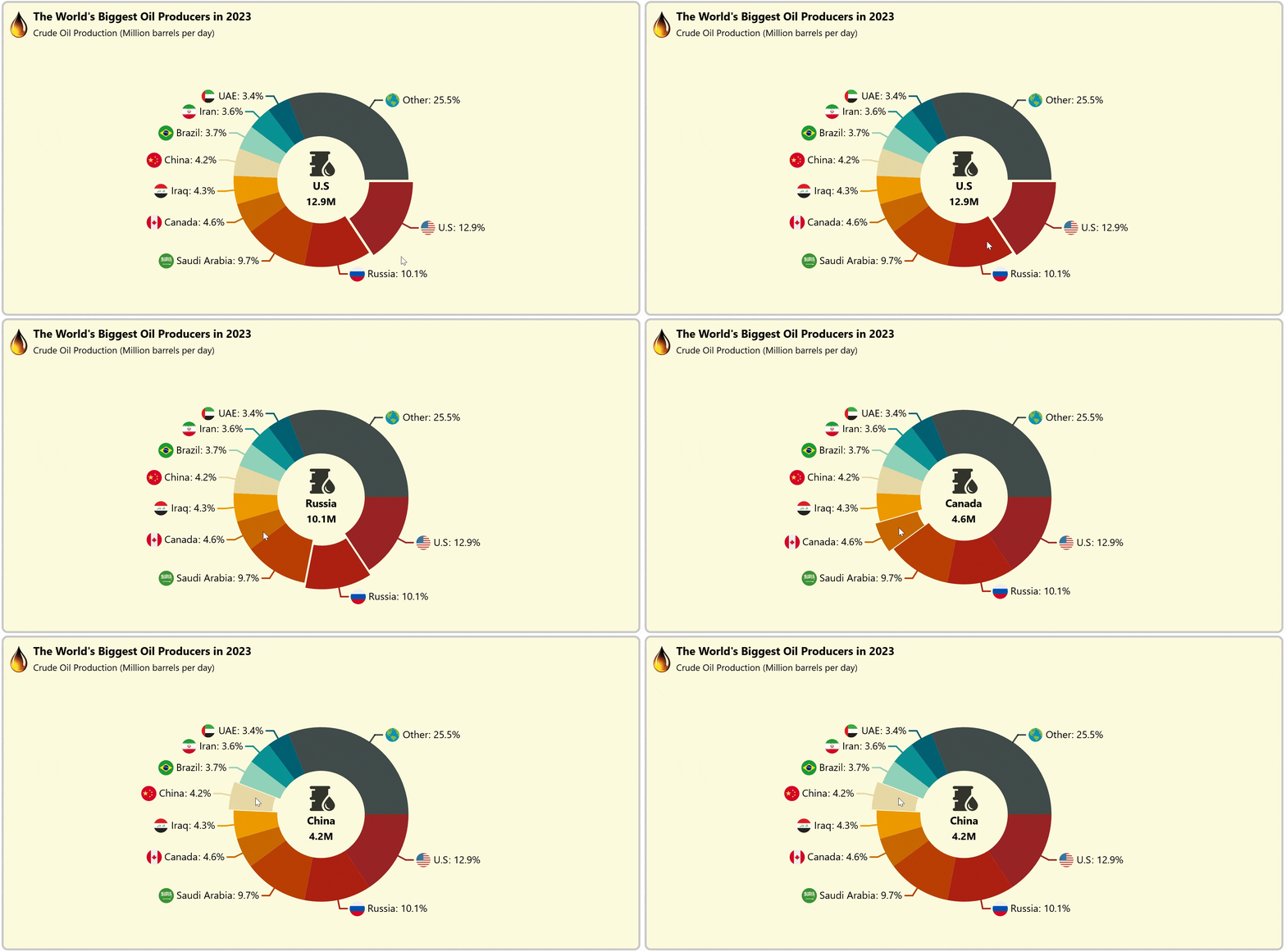
Using the ExplodeOnTouch property, we can add interactive features to view the data for the exploded segment in our Chart. Exploding a segment helps pull attention to a specific area of the Chart.
Here, we’ll bind the ExplodeIndex property to the series center view to show additional information about the data.
Refer to the following code example.
<chart:DoughnutSeries ItemsSource="{Binding ProductionDetails}"
                      XBindingPath="Country"
                      YBindingPath="Production"
                      . . .
                      ExplodeOnTouch="True"
                      ExplodeIndex="{Binding ExplodeIndex,Mode=TwoWay}"/>
After executing the above code examples, we will get the output that resembles the following image.

GitHub reference
For more details, refer to visualizing the world’s biggest oil producers in 2023 using the .NET MAUI Doughnut Chart GitHub demo.
Conclusion
Thanks for reading! In this blog, we’ve seen how to use the Syncfusion .NET MAUI Doughnut Chart to visualize the world’s biggest oil producers in 2023. We strongly encourage you to follow the steps outlined in this blog and share your thoughts in the comments below.
The existing customers can download the new version of Essential Studio® on the License and Downloads page. If you are not a Syncfusion customer, try our 30-day free trial to check out our incredible features.
You can also contact us through our support forums, support portal, or feedback portal. We are always happy to assist you!


