TL;DR: Explore what’s new in the 2024 Volume 2 release for our Syncfusion Essential JS 2 platforms! This update brings new components like the MultiColumn ComboBox and OTP Input and improvements to Timeline, TextArea components, Fluent 2 theme support, and more.
In our 2024 Volume 2 release, we have introduced many new features and components for our Syncfusion Essential JS 2 platforms. This blog delves into these key enhancements, enabling developers to create more interactive and informative apps.
Common updates
New components
Syncfusion Essential JS 2 has added the following two new components in preview mode:
MultiColumn ComboBox (Preview)
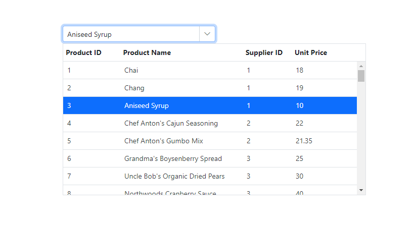
The MultiColumn ComboBox is a dropdown component that displays detailed information about items in a table-like structure in multiple columns.
Key features
- Data binding: Supports data binding from JavaScript object arrays and remote data sources using adapters like OData, URLs, and Web APIs.
- Grouping: Allows grouping of pop-up list items to enhance the user experience by organizing related items.
- Filtering: Provides advanced filtering capabilities to find and select items from large datasets easily.
- Sorting: Supports sorting items in ascending or descending order and single or multi-column sorting.
- Virtualization: Efficiently displays large datasets by loading data on demand.
- Templates: Customizes the appearance and layout, including header, footer, and list items in the pop-up list.
Refer to the following image.
OTP Input (Preview)
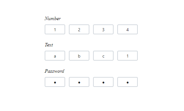
The OTP Input is a form component for inputting one-time passwords during multi-factor authentication processes.
Key features
- Input types: Allows specifying the input type as text, number, or password for the OTP input.
- Styling modes: Offers built-in styling options such as underline, outline, or fill.
- Placeholders: Allows setting a hint character for each input field, indicating the expected value.
- Separators: To specify a character to be placed between input fields.
- Customization: Customize the default appearance, including input field styling, input length, and more.
Refer to the following image.
Preview to production-ready components
The following components have been developed to meet industry standards and are now marked as production-ready for Essential JS 2:
- Timeline: It offers a structured way to visualize chronological events.
- TextArea: It provides a versatile text input control for longer-form text.
Fluent 2 theme support
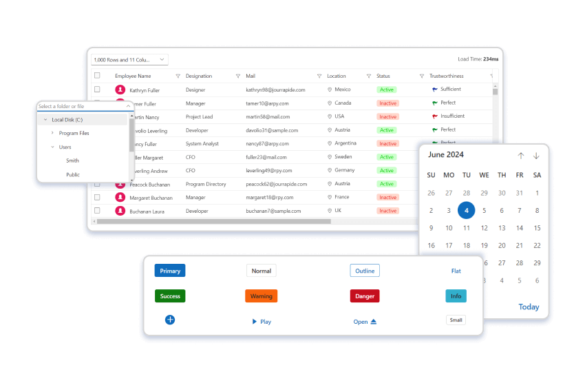
A new Fluent 2 theme support has been added to enhance the app’s visual appeal and consistency.
CLDR NPM package
A new CLDR NPM package supports internationalization without third-party dependencies, simplifying the process of localizing apps.
Component-specific updates
Charts
The Charts component has received the following updates:
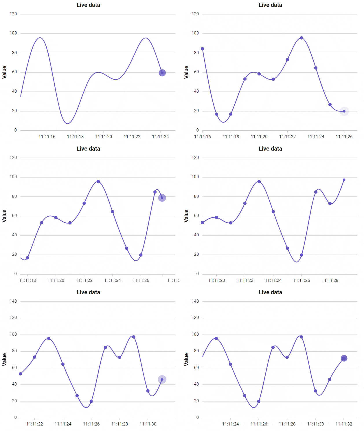
- Animation on data update: Users can enjoy smooth animation effects when adding, removing, or updating data. This feature supports animations for data updates in all chart types.
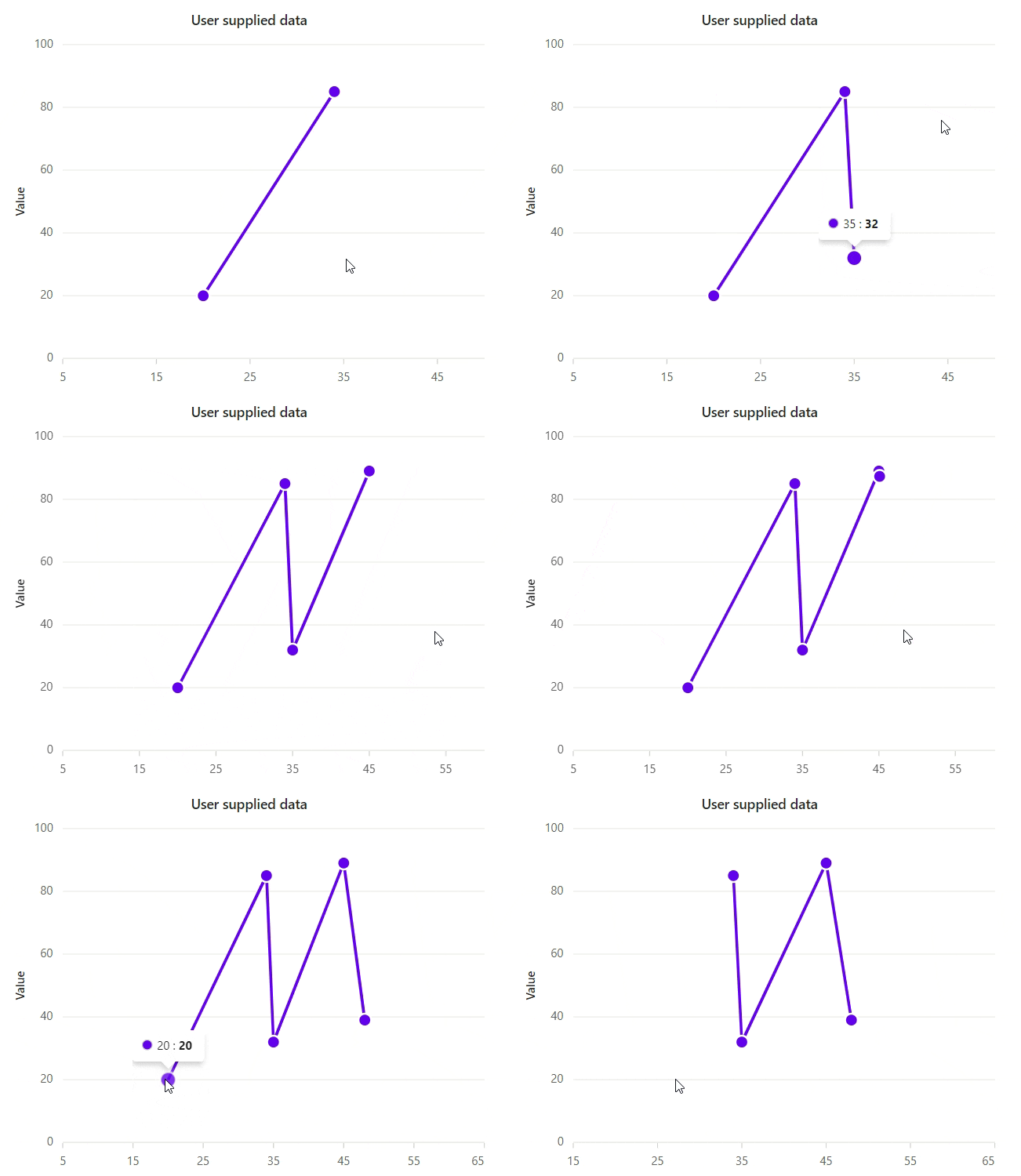
- Click to add or remove points: Users can interactively add or remove data points based on pointer coordinates during chart mouse events.
Word Processor
The Word Processor component has been significantly enhanced:
- Content control: This feature allows users to add new content controls or modify existing ones and bind data to content controls in a Word document. It supports various content controls such as Rich Text, Plain Text, Picture, Check Box, Combo Box, Drop Down List, and Date Picker. Users can design fillable templates, fill forms, and bind data to and from content controls. The document’s author can restrict editing for certain parts by locking content control as non-editable or add non-removable placeholders by locking content control as can’t delete.
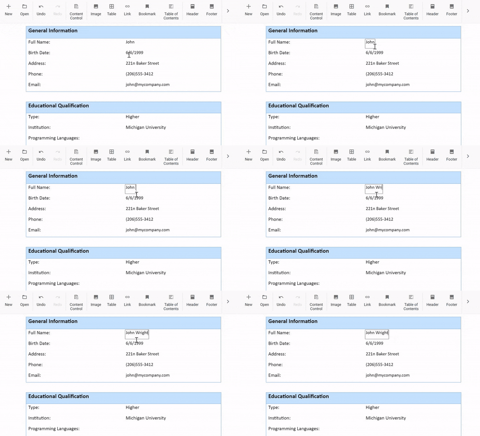
- Drag and drop selected content: Users can now drag and drop selected content within the Word Processor component.
- Optimize SFDT file size: The SFDT file size has been optimized to reduce storage requirements.
Dropdown components
Disable individual items
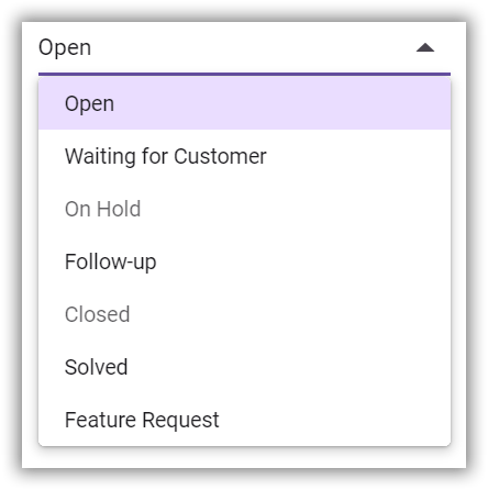
The Dropdown components (AutoComplete, ComboBox, Dropdown List, and MultiSelect Dropdown, ) now allow users to disable or enable individual items based on specific scenarios. Users cannot interact with the disabled items or select them as values within the component.
File Manager
Flat data rendering
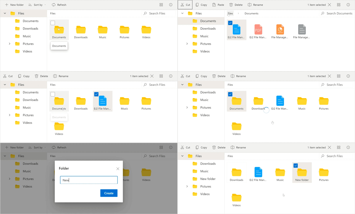
The File Manager now supports rendering flat data as an array of JSON objects, removing the need for AJAX requests and back-end URL configuration.
Gantt Chart
The Gantt Chart delivers the following new updates:
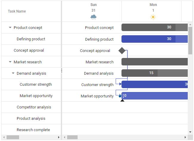
- Timeline template: You can customize the appearance of timeline cells using templates. Users can display images, buttons, or other custom content within the timeline cells, making the Gantt Chart more informative and visually appealing.
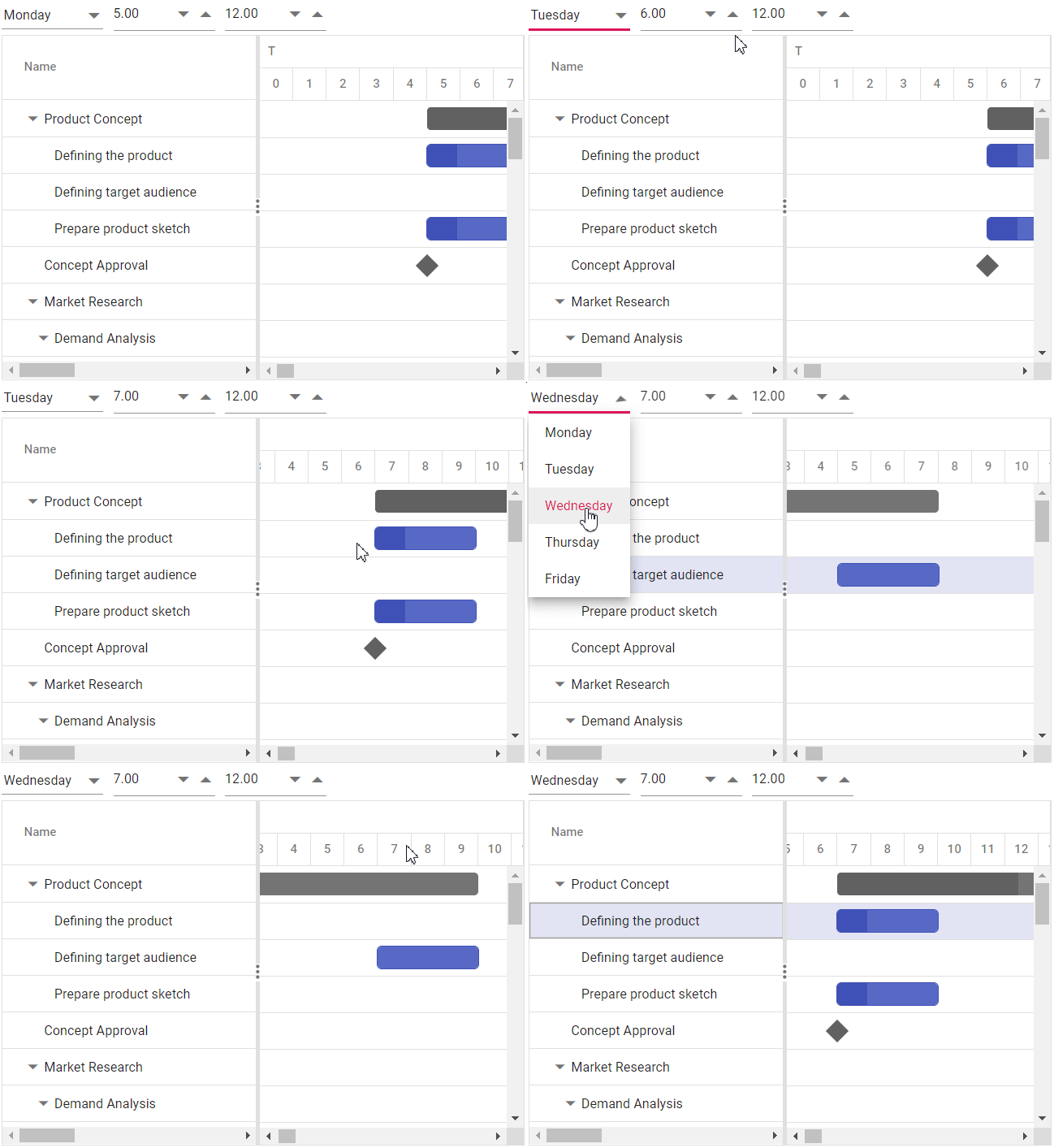
- Different working time ranges for each day: Users can now define different working time ranges for each day of the week, providing more flexibility in scheduling and managing tasks.
- Improvements in error handling: The actionFailure event notifies developers when the Gantt configurations are mishandled. This event has been enhanced to cover more cases, providing better feedback and diagnostics.
DataGrid
The DataGrid component has received the following enhancements:
- ODataV4 routing convention: The DataManager ODataV4 Adaptor has been enhanced to support custom action methods alongside the default GET, PUT, POST, and DELETE methods. This feature facilitates performing CRUD operations by invoking custom action methods when binding the ODataV4 service to the Grid.
- Performance improvement: Significant improvements have been made in lazy load grouping with sorting functionality. These improvements are particularly beneficial for scenarios involving multiple columns for grouping or sorting large datasets.
Image Editor
The Image Editor component supports the following vivid features:
- Annotation enhancement: Users can now draw multiple annotations simultaneously, enhancing creative flexibility. Furthermore, every action, including customizations, will be tracked in the undo/redo collection, ensuring a seamless user experience and making it easier to experiment with different designs.
- Z-Order support: This feature allows users to adjust the positioning of annotations. Types of z-order adjustments include Send Backward, Send to Back, Bring to Front, and Bring Forward.
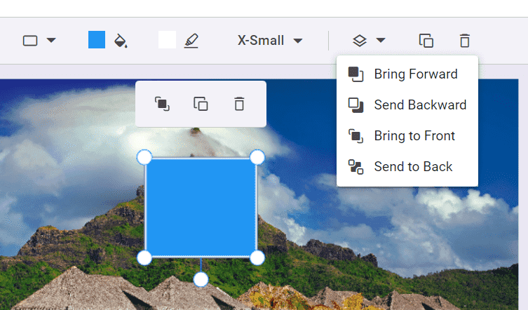
Z-order annotation rendering options in Essential JS 2 Image Editor
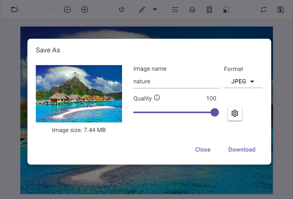
- Save support enhancement: Users can now save an image with a specified file name, file type, and image quality, providing more control over the output.
PDF Viewer
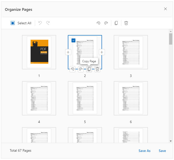
The new features added in the PDF Viewer component are as follows:
- Move pages: Users can reorder pages within their document effortlessly.
- Copy pages: Allows creating copies of existing pages.
- Undo and redo changes: Enables users to instantly undo or redo changes made in the Organize Pages dialog.
Query Builder
Drag-and-drop and separate connector supports
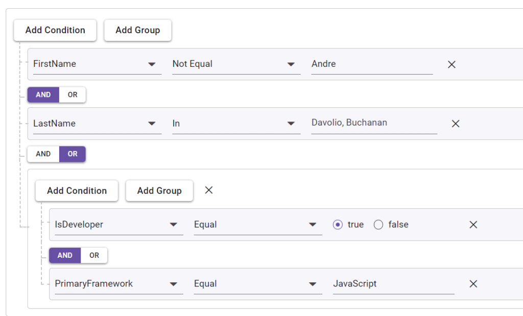
The Query Builder component now includes a drag-and-drop feature, allowing users to reposition rules or groups within it.
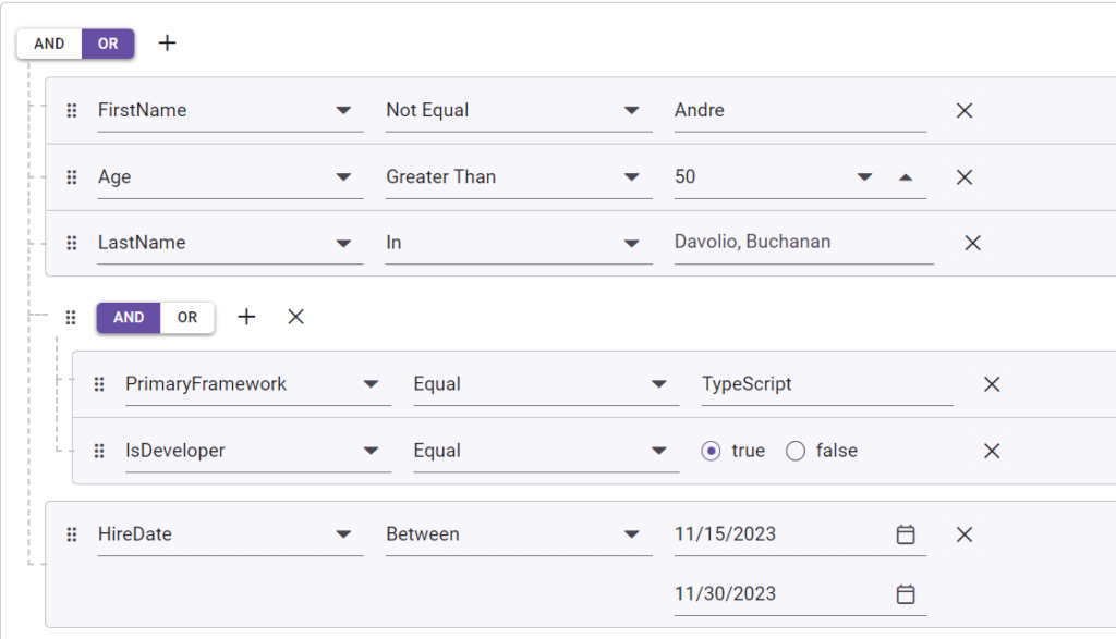
It also supports separate connectors between rules or groups, enhancing the complexity and precision of query construction.
Spreadsheet
The Spreadsheet component has been enhanced with the following features:
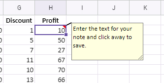
- Notes: Users can provide additional cell information by adding, editing, and deleting notes.
- Print: Users can print the active worksheet or the entire workbook with customizable options.
- JSON serialization: Users can extract cell values without formatting or formulas, similar to a CSV file.
TreeGrid
Improvements in error handling
The TreeGrid component has improved error handling with the actionFailure event, which now covers more cases and provides better feedback and diagnostics for configuration errors.
Conclusion
Thanks for reading! This article highlights the exciting new features and components added to the Syncfusion Essential JS 2 platforms for the 2024 Volume 2 release. To discover more about the features available in this release, please visit our Release Notes and What’s New pages.
The latest version of Essential Studio® is available for current customers from the License and Downloads page. If you are not a Syncfusion customer, you can start a 30-day free trial to try out all these components.
If you have any questions, contact us through our support forums, support portal, or feedback portal. We are always happy to assist you!

